Play game
The Chitinous Conundrum's itch.io pageResults
| Criteria | Rank | Score* | Raw Score |
| Topic | #48 | 3.683 | 3.683 |
| Visuals | #53 | 3.854 | 3.854 |
| WOWIE! (Overall) | #107 | 3.220 | 3.220 |
| Sound | #110 | 3.146 | 3.146 |
| Creativity | #148 | 3.146 | 3.146 |
| Fun | #178 | 2.854 | 2.854 |
| Simplicity | #213 | 2.976 | 2.976 |
Ranked from 41 ratings. Score is adjusted from raw score by the median number of ratings per game in the jam.
Leave a comment
Log in with itch.io to leave a comment.


Comments
Really Appealing visuals, Great job :)
Please consider rating my game too ^^
Very nice game! Fits the theme quite well. Good soundtrack. I like it!
Very metroid of you haha very cool asset! Nice game idea of glitching through walls :)
Metroid-like game! Love it! Was hard to get what to do in most places, you should have explained more how the bug mechanics work. Overall great game with badass visuals
Cool game. This reminds me of the old Metroid games but with more bugs.
Beautiful artwork, controls/jumping could have a bit of polish and definitely more feel elements (shake, world responsiveness, particles) because it feels a little lifeless (not speaking of an atmospheric sense here), and I don't know it's hard to see the bugs as part of the game, it seems like one of the hardest parts of the jam theme were to integrate the bugs in a way that it would feel like it's part of the game while still feeling like a bug rather than a feature, and that's hard to do. Overall super solid entry and this is work to be proud of with a lot of potential.
You definitely followed the theme but it felt very confusing at some parts. The player movement feels sick tho. :D
It was a little frustrating at the start but the more I played it the more I liked it. Nice game overall! Nice use of the theme too imo.
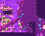
The visuals were amazing, but I wasn't a fan of the music. I got to the part pictured below, but then didn't know how to progress. The route shown isn't possible and there didn't seem to be a route alongside the top either.
Yeah, that section definitely would have benefited from more player guidance. There's a playthrough video in the description if you want to see the solution.
We can only take partial credit for the visuals. I wrote some scripts to set up parallax motion and some glitch effects, but the tiles themselves were part of a free asset pack. I linked to it in the description if you would like to use it in any of your projects.
Thanks for the feedback!
This is a pretty neat platformer with some amazing visuals! I really liked the art.
I enjoyed the bugs very much. It looks very good, it's a bit frustrating at times but it's a solid game! Congratulations! If have a time come to check mine, I will be glad! Good luck and congrats!
A nice game the pixel art is great i like how you used the pixelart pack from unity for this buggy game , it's often hard to great gameplay and great art but the gameplay was good. The puzzle very clever, a great game with great puzzle , a bit frustrating but fun.
oh this game is so beautiful, wow * - * i love how you sell how "unstable" the game is with all the flickering glitchy stuff in the background.
Interesting look and interesting game. The way the bugs are used is very creative but often causes that you get stuck -- very frustrating. But overall very good game
Very nice and complete game! Clever use of the wall glitching mechanic :)
I got stuck at one point on the way back (where the pillar is blocking the whole height of the screen)
I got stuck under this platform T_T but I was really pleased with the super nice aesthetic and great usage of bugginess vibes in the gameplay. This is an awesome submission
Very cool pixel art! I had a hard time with the gameplay, but the presentation is there.
Nice use of the topic for the mechanics of your game.
(I knew there was something with that platform haha I tried jumping there when going forward but took me a while to try it again when going back)
Loved the game, nice little puzzles and fun experimentation with collision bugs!
I would have given full points for art but as these are asset store assets and not created for the jam, I'm a bit unsure about how I should rate that. :/
btw my time:
I'm glad that you liked it! Yeah, I'm not really sure how scoring for that stuff is supposed to work? It's within the rules of the jam, but we certainly can't take credit for it...
That's the best time that I've seen so far from someone who wasn't directly involved in making the game! I made a runthrough that shows how to find the full game ending:
Oh interesting I didn't know you were supposed to get back again but kinda makes sense with the timer continuing to run. Also you used some strats I weren't aware of :D
Goodness I feel so dumb. At first I was like 'hey there are a lot of collision bugs here...that's...strange"
And then I recaled the game jam's theme.
Ahah it was a funny, very funny experience ! Good sound design, good design and art, good principle. Only complaint: for a further improvemente later I think you would like to, sometimes, give hint to the player on how he is supposed to continue.
But still, well done. Take the stars !
Thanks for the feedback! I had a completely different idea for how to implement the theme at first--actual error messages in the scripts were going to appear as platforms that you could jump on. But early in the process I noticed that I had messed up the the raycasting for obstacle detection and, well, here we are!
Definitely some hints would be a good idea. My wife and my brother (the composer) both got completely stuck on one section until I told them what to do!