An intriguing concept with an unfortunate subpar execution
So first, technical issues or well bugs and stuff like that:
Ok uh the first attempt at playing the game the playable characters duplicated themselves and well their dialogue did too and uh I could still move the duplicates while the other ones got stuck in a cutscene. Restarting the game seems to have fixed it, I might have accidentally clicked the start button multiple times but I honestly don't know what happened otherwise.
This one would be more of combination of both of feedback and technical issues but when the blue character finished with the first crystal there was no dialogue or anything I just got teleported back to the start without being able to access the first area again is that intentional?
The game didn't let me choose the type of arrows it got stuck with the poison ones so I just ended up getting stuck in the starting area with no way to recover the mana or whatever it is used to make them.
When I attempt to shoot an arrow I see a crosshair but it disappears instantly not letting me aim properly and even if I did try, I tried aiming at the snail and even hit it but it just didn't die
After hitting enemies, they still hurt me if I touched their corpse until they finally vanished
Now for feedback:
To be honest there isn't much I can think of besides repeating myself over the technical issues with fixing them, other than also including a way to replenish your mana at that second part because I didn't see a way to since enemies don't spawn there.
Overall this could have been a fun game but those issues didn't really want me to keep trying. Do wish you good luck with fixing all that stuff and anything really.
AntHoneyRose/ROSEHTRA
Creator of
Recent community posts
An interesting concept behind an interesting game.
So first, technical issues or well bugs and stuff like that:
There didn't seem to be any through my playthrough so congratulations on that.
Now for feedback:
I didn't see any option to quit the game or go back to the start or something similar so that would have been nice.
The gameplay is interesting but personally it didn't take me long before just mindlessly brute forcing through later stages as while they got bigger with more things, stuff didn't really get more complex, but that is more of a personal opinion than anything.
Overall nice game you got here with procedural generation too I would imagine.
A cute, neat and charming puzzle game that reminds me of slide puzzles (but done good).
*I played in the desktop version
So first, technical issues or well bugs and stuff like that:
I didn't seem to find any bugs or anything of the sort so congratulations on that.
Now for feedback:
More of personal but the transition between scenes (the box opening animation) feels kind of slow so I would suggest speeding it up slightly.
Other than that I don't really have any gripes or anything I would say its "wrong" or "needs improvement" for what its there.
Overall, good game that I can see it expanded into a full release if you were to ask me.
A very interesting take on Snake.
So first, technical issues or well bugs and stuff like that:
The music for the actual game (not title one) sometimes just doesn't play at all when moving to a different "stage".
And other than the already mentioned issues in the game page there didn't seem to be any other issue present unless I instantly forgot.
Now for feedback:
The title music is quite the jam but the other track is alright, maybe a little loud but like other games I've tried might be just me.
The game has quite the decently high skill ceiling but once you get the grip on the gameplay it's smooth sailing from there for the most part.
For the most part since it is still unfortunate about the whole speed thing because it is felt, the sudden brute speed change.
Overall fun game once you get the grip on the mechanics.
A cool concept for the Two Button diversifier.
So first, technical issues or well bugs and stuff like that:
The player can get kind of stuck to the walls when jumping, not completely as one can still move freely left or right depending of which wall is touched but it makes the aforementioned jump janky.
I could keep playing after my second Game Over, the health just went to the negatives instead while the Game Over pop up stayed there.
I got my first Game Over where you change the jump to the other mechanic but I feel like after restarting I skipped the part completely anyways or something because the priest just outright disappeared and I was switched back to the jump.
Now for feedback:
Quite unfortunate that there's no sound effects but I can see how it's intended to not have.
I would like to ask though. Is the music's composer the other member of your pair team?
I do agree with the others that the jump does need a little bit more snappiness.
The music is alright albeit kind of a little loud (at least for me).
Overall, it's alright, a neat little game that unfortunately fell as another victim to deadline rush (I know how that feels).
I didn't mention the shooting having delay but alright.
I see about the sweeping, I kind of figured but still to keep in mind.
About the jump, as I described you can jump and move, the issue is pressing the jump button again or holding it while already jumping, that ends up causing the character to not move at all, causing the jump to feel awkward even if the jump button is released as soon as one actually jumps, the first second/half a second one still is not able to move.
ABout the controls, that is fair, doesn't mean you shouldn't be wary because the actual arrow keys don't really work to aim, character only ends up aiming left and right with those, only the numpad keys actually end up working for aiming which again not all keyboards will have numpad and it's not that intuitive in contrast to just having the actual arrow keys.
Something I forgot to mention is to be careful with AZXC control scheme because of AZERTY and QWERTZ keyboards so I know multiple set control schemes and/or custom keybinds are next to impossible to implement in a game jam but this one is more for a post game jam if you plan on continue investing time on the game.
Interesting that the game launches with a pop up asking for network access when it's the first launch.
I don't know if it was me but I heard no sounds and no music at all other than a click sound when well clicking stuff.
Well other than that I tend to give out a disclaimer as tend to give very "tough" feedback but unfortunately I kind of can't with this due to having the slightest idea of how to play, I know time constrains and all that can prove challenging so I can see why there's no tutorial or any sort of guide (the only "guide" in the game isn't very helpful if that is even a guide) but I would recommend adding that if you keep working on the game. Shame I couldn't understand a thing as I was intrigued by the concept.
So I'm gonna be honest, I usually give very "tough" feedback but I won't in this case because well I only could open a chest, kill an enemy, keep moving around and that's it, I couldn't do a single other thing, I'm sure there's obviously more than just that but that was my game experience I tried to press the right keys including mouse clicks I was stuck.
Something I would recommend is I saw you post a version with bugfix, I suggest taking out that version and instead waiting until voting period is over to add that version alongside the game jam version on the same page, and change the original's name to include a tag "gamejam version/edition". This is to avoid any possible confusion.
It's quite unfortunate about the bugs but well it's a game jam, limited time, what can you do, stuff happens, wish you good luck for the future.
Quick edit: if you see 2 messages of my own that are exactly the same, let's just say itch is messing with me and not working properly, sorry about that.
Disclaimer: I fully understand this is a game jam game not everything can be done but even then I give very "tough" feedback so if you can't handle that kind of "criticism" it's ok just don't read my message.
When pressing and/or holding the jump button it cancels out the press/hold of the arrow keys and so one doesn't end up able to move, I know one can just jump and still move but the hold of the jump button is still common on platformers as said common implementation is to let players do a short or long jump depending on how long the button was pressed, in this game if you hold it you can't move in the slightest, you can move while jumping as long as the button isn't pressed but it just doesn't feel right.
I'd highly advice adding a mild warning for photosensitive epilepsy due to how the "lasers" (or what I assume they are) are presented, either that or tone down their brightness and/or remake them by going from a dark color to a light color slowly (but be careful with the light end not being too bright) as to prevent this.
The controls felt somewhat unresponsive at times, one the movement controls because of hte aforementioned but they are also "cancelled" if pressing the attack button, speaking of the attack the animation is a little slow (a little excessive on the anticipation side ) and could feel semi delayed at times, more on that later. Also sometimes it's also unresponsive because well I press attack but the character doesn't end up attacking at all sometimes. Speaking of after I got the shooting ability I wasn't even able to use it at any time I tried, I'm assuming it required the purple stuff but it isn't really clear if that is indeed the case. And also the C to interact could be changed to the up arrow in my opinion as most interactions if not all used by C are very similar and it's also kind of what players are used to in sidescrollers. The character didn't want to attack in any other direction other than left and right with the arrow keys, I see this is possible with numpad arrow keys but keep in mind not all keyboards will have them and it's more intuitive to just use the arrow keys instead.
Speaking of the purple stuff, the top right UI indicator could recieve more clarity in the sense of atleast a % from 0 to 100 of how full or empty the container is as it would be nice to know how much is required to heal and also to shoot (if this is what's required to shoot).
Back to the character animations, what you want to do in these types of games is avoid as much anticipation as possible to make the actions feels as responsive as possible and both attack and sweeping felt quite slow, especially sweeping so be careful with that.
Speaking of assets, consistency, this time on the light sources, I guess the background and the ground are fine but the enemies and that not so much as for example the main character seems to have this solid color with an outline that makes it look like pillow shading while the enemies have this more "defined" form via shading so be careful with that too.
The audio settings in menu I recommend slide bars instead of the current system or anything, there's tutorials on how to set up proper audio volume as decibels aren't like exactly managed 1 to 1 with % for example, this is a complicated topic I don't really want to touch on so I'll leave it at that.
All in all, very ambitious for a game jam, you got something in, that's already good in itself, the menu is quite impressive althought it would have done just fine with basic audio settings (muting and master, bgm and sfx volume) and basic video settings (fullscreen and resolution options) as the rest aren't really needed or well I didn't seem to see a need or purpose or didn't really understood what they did. I'd say it's still not bad, good job.
Disclaimer: I fully understand this is a game jam game not everything can be done but even then I give very "tough" feedback so if you can't handle that kind of "criticism" it's ok just don't read my message.
While it was an alright atmosphere, the levels were a little too dark to actually see what's going on.
The respawn mechanic is an interesting concept but flawed execution as having to backtrack from one end to the other to relit that one random torch/candle/something can prove to be quite the task and also not really intuitive in contrast to having the last lit one be the one that went out and while I do see that happen sometimes, a bug (I think it's one atleast) happens where that last one is relit anyways as soon or just when you are about to respawn without doing anything which ends up causing a light soft lock in the 3rd level.
The cage's metal sound can get kind of obnoxious and is kind of loud so be careful with that.
Instead of having to press escape then restart level everytime you could make a keybind for restarting the level instead
That is all I hae to say for now, interesting concept, alright atmosphere, it's not bad.
Disclaimer: I fully understand this is a game jam game not everything can be done but even then I give very "tough" feedback so if you can't handle that kind of "criticism" it's ok just don't read my message.
I atleast myself don't really see the theme application, it might be the story but it's a little bit of a stretch if you were to ask me.
It would be nice to have a counter either in UI or above player of how many "ammunition" they currently have as it is kind of hard to tell (at first glance for me atleast) how much I have left... also more clear feedback when you have no "ammunition" and also when you have "full" too as I see you can only have so much.
Slight Edit: It took me a second attempt to realize this is already a thing but it is still kind of hard to tell so I'd suggest sound effects too for when you have full and no ammunition at the very least.
The UI right now seems quite big, not that is a problem right now but it could be in the future if you were to add more UI elements (and also obviously continue working on the game) so I'd say just be careful with that.
The character sprite pops a little too much atleast in my opinion in the sense of it feels like a different style compared to most of the rest of the assets, remember, consistency is key.
It's unfortunate about the "You Win!" screen but that's the only bug I found and atleast you are aware of it so only thing I'll do with this one is suggest which I suggest you could add either highscore of coins alongside the coins of "this run", enemies defeated, it all depends on the focus of this screen and the game's goal obviously so do what you must.
These types of games benefit a lot from enemy variety, 2 enemies is already more than most but I'd say around 5 is the "sweet spot" in my opinion
All in all. Pretty fun and I like the concept, good job.
Disclaimer: I fully understand this is a game jam game not everything can be done but even then I give very "tough" feedback so if you can't handle that kind of "criticism" it's ok just don't read my message.
First off consistency is key, do not combine fonts like arial and pixel art assets, either use fonts like arial with vector assets or use pixel fonts with pixel art assets, same with the UI as the button for start for example is quite blurry on the edges and the other 2 menu options don't even have a button UI and atleast in my experience the O in info overlapped with credits. When using placeholder/premade assets make sure the styles go well together.
Do not just use solid colors as backgrounds especially for these type of games, doing a tileset for the "ground" with even slight terrain alterations and basic decoration can go a long way if done right.
It's really unfortunate to hear no music nor any sfx, there's also lack of visual feedback in shooting, hitting "enemies" and that. This type of game also benefits quite a lot from enemy variety so if you plan on putting time onto this take that into account.
All in all, that's all I can say for now, hey, you managed to submit and publish, that's already good enough and wish you good luck for the future.
Disclaimer: I fully understand this is a game jam game not everything can be done but even then I give very "tough" feedback so if you can't handle that kind of "criticism" it's ok just don't read my message.
First of all it's very unfortunate to see all of the missing features, it happens, just need to be more careful with time usage and not overscoping.
So the music is kind of loud and can get not very tolerable after a lil while, thankfully there's actual volume options but the default can be turned down to 50% instead of being close to 100% in my opinion and also be very careful with using very short loops as the "main background music".
What I would recommend is first adding in those missing features, atleast the main ones as otherwise it can't really be tested properly if you get what I mean and because atleast you are aware of them I won't mention them (but I will still give suggestions on how to improve if I can think of some).
The jump's gravity could be toned down as one falls way too fast and the movement feels quite stiff so be careful with that, try using "tricks" like coyote jump, input buffer and that, they are very important for a good amount of platformers to "feel good to play", obviously do be careful to not end up making the jump a "moon jump" either.
If a life/lives system is to be implemented I recommend when running out of life/lives to reset the level and give endless continues, it all depends if the level structure is gonna stay as it is or its going to be changed.
I'd also recommend any sort of feedback while fixing the furnace with that I mean it's impossible to tell how long it takes to fix it, the most simple might be a bar on top of the furnace to tell how much/long is left to fix it completely.
The snowmen could not just have a vfx but they could also have an animation for shooting too if you were only planning to add vfx as visual cue.
Also UI inside the levels not just for the lifes but could be for example how many snowmen are left (this one is not that necessary unless you plan to make destroying snowmen a possible secondary/main objective in a level, who knows) and how many furnaces are left to fix (this one on the other hand could be nice)
All in all, not bad, you got something submitted and published, that's great. I think this has potential to be it's nice little own arcade game.
Disclaimer: I fully understand this is a game jam game not everything can be done but even then I give very "tough" feedback so if you can't handle that kind of "criticism" it's ok just don't read my message.
The tutorial I believe could be improved in the sense of the text being formatted better as for example there's only a single page saying "WASD to move" while another ends up being quite a paragraph
I didn't end up needing to use the Turn up the Heat mechanic until close to the end, I won't lie that I did see this game played already in streams so I had an idea of "how to win" but the end can still feel like an endless stalemate without the use of the Turn up the Heat so I would advise in my opinion to remind the player that it exists in some unintrusive way shape or form if they haven't used it in quite a while.
The enemy (and ally units) variety could be expanded upon even if it's just 3 more enemies and ally buildings/units for more variety and 2 enemies is already more variety than most but just something I wanted to say if planning to continue to put time into this.
It's quite unfortunate there's no music so don't pass it up for next time.
The visuals felt slightly too bright atleast in my opinion and the sound effects were slightly loud too, I recommend to do even something like slight pitch randomization alteration to not have the same sound effects at the same pitch play out every single time.
All in all I might have forgotten some things but it's fun, I like the concept, turning the usual TD into a more real time strategic approach.
Disclaimer: I fully understand this is a game jam game not everything can be done but even then I give very "tough" feedback so if you can't handle that kind of "criticism" it's ok just don't read my message.
There didn't really seem a way to lose? Atleast not one that I found.
The Menu buttons are quite small (atleast on browser version) so you should watch out for that..
There's no feedback whatsoever with hitting anything, all I could "feel" I think was getting pushed back by cops and maybe cars too?
The Score is kind of not very visible so I would recommend first using a pixel font if it's not being used because of this being a game with pixel graphics to have consistency, second to add "flavor" to the score text, for example when you gain score it tilts and grows and then goes back to normal, make it colorful (but do be careful with not too colorful/bright/dark), etc.
The game itself lacks a lot of juice, endless runners tend to be carried by all the juice (it does depend on the style too) but yours could benefit a lot from it (if done correctly)
Consistency is key, and the cops sprites do NOT go very well with the rest of the sprites for example, another is the "fans" people sprites vs the "background" people sprites seem very different, if you're using placeholder/free to use assets make sure there is atleast some cohesion and consistency with styles.
The music is not bad but it is somewhat loud and also there's lack of sound effects so should be careful with that for next time, don't leave it at the last second, same with the menu
All in all nice running animation, you managed to submit and publish, good for you, just keep these things into account. Even endless runners are harder to make than they seem to be
Disclaimer: I fully understand this is a game jam game not everything can be done but even then I give very "tough" feedback so if you can't handle that kind of "criticism" it's ok just don't read my message.
The music feels very repetitive, quite loud and not much tolerable you should be careful with volume settings and try to avoid or maybe not avoid but be very careful with using very short loops as the main background music.
It's kind of confusing trying to figure out what to do, even after figuring out about the cooking in the oven (or whatever that is) I still had no idea what I was doing, my assumption was there's some recipes with the pepper thingies but it would be nice to have a list for them somewhere.
The spritework is alright but the ground tileset could use some improvement as it is "too busy" in my opinion (too distracting), some more "mosaic-like" ground coul help, the current one can be kept still but more as to give variety rather than being "the main ground tile" if you get what I mean.
There's no indication of where to "cancel" cooking, I only figured that was possible because of going down, instead of using the player to move through the cooking options you could add in a UI menu to make it easier to navigate for the player.
The hitboxes felt kind of interesting but the main complaint with enemies would be there's no feedback whatsoever when taking damage nor when doing damage and if there is (there might have been) it's kind of played at random as I did hear some random sounds playing sometimes, the main character's attack range is also perhaps too short and doesn't seem possible to be able to avoid damage sometimes, the attack also seems like a "Toggle" instead of "Holding" or even just by Pressing the attack button so be careful with that.
All in all hey you managed to submit and publish, good job, you should be proud and even if there's issues, use them as a learning experience. It's an interesting concept.
Appreciate the kind words, now to answer those questions.:
"what is the function of the four dot square button in management screen?": The vanilla factions have townscreens and that's the button to switch from clasic town view to said town screens but since mods don't and can't have them currently then it serves no purpose.
"Do you intend to post your other faction mods here too?":
Don't really see a reason for it right now but that might change in the future.
"Are the bots using the faction familiar with using the evolution chamber and so on (do they pay the premium, hindering them)? Or are their armies generated automatically?": Colony's AI seems to work just like other AI but they don't seem to use the Library oof Evolutioni s what I've noticed, that'd be more of a question for the dev ThingsOnItsOwn sorry. I do know their armies are not generated automatically unless they have mastery which gives them certain unit every X days.
Los assets son muy bien elegidos (te he pillado), la aplicación del tema (y las mecánicas) no son lo más original o innovadoras pero es una muy buena ejecución. Ahora, es un buen diseño de niveles pero los pinchos sobran, creo que se le puede sacar más jugo pero la duración está bien para la jam, es algo raro el movimiento de la trayectoria de la plataforma morada y estaría bien una indicación o mínimo hint de la trayectoria de la misma, me esperaba múltiples finales pero bueno. Está bien.
Estética muy agradable, música y sonidos bien elegidos (aunque la música no encaja mucho con el juego), la aplicación del tema y la mecánica son originales e innovadores. Ahora, iba algo lento, la barra de "edad restante" estaría mejor en una esquina de la pantalla y más grande, no hay mucho que se puede hacer cuando usas todos los hechizos ya que los enemigos se juntan y no ayuda mucho el movimiento resbaladizo del jugador.
Me has sorprendido, estética muy agradable, buena presentación, sonidos y música bien elegidos, mecánica original y algo innovadora, un buen diseño de niveles que SI aprovecha la mecánica y además tiene suficiente variedad con mecánicas secundarias aportando a la principal. Ahora, ese demasiado largo es algo convenientemente largo más que nada aunque si veo que a veces puede ser demasiada larga la lanza por pasarse a veces de a donde uno quiere ir, he encontrado un bug por accidente con los barriles y me he quedado atascado, aprecio que haya botón de reiniciar, le vendría bien una forma de deshacer por lo menos el último movimiento, solo el último como suficiente porque es algo duro tener que hacer todo desde el principio por un pequeño error accidental. Bien hecho
El bug: Así se quedo y tuve que reiniciar (estaba intentando hacer mini speedrun, 3 minutos)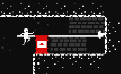
La estética es agradable aunque puede mejorar, la aplicación del tema no es lo más original pero la mecánica lo es más o menos y algo innovadora, presentación lo suficientemente bien. Ahora, es un buen diseño de niveles pero creo que se le puede sacar más jugo, aun así esta bien de duración para la jam (le hecho speedrun de menos de 2 minutos), le vendría bien una animación rápida o algo que alerta cuando la cuerda se hizo demasiado larga Y pasa del límite ya que es un poco brusco que se reinicie sin más. Está bien.
La estética es agradable, sonidos y música bien elegidos, es algo entretenido. Ahora, la aplicación del tema no es lo más original o innovadora, los puzzles en sí están bien excepto por la mecánica del reloj la cual creo que hasta sobra porque solo añade frustración innecesaria, estaría mejor reiniciar con R y dejar Z para deshacer el último movimiento (el cual le vendría bien tener esa opción). Está bien.
La estética es impresionante aunque falla un poco con los sonidos de daño y la música puede ser mejor elegida, la aplicación del tema es algo original e ingeniosa pero la mecánica no lo es y tampoco muy innovadora. Ahora, esa selección de teclas como controles es cuestionable, le vendría bien un modo en línea (online) en vez de solo local, la jugabilidad en sí es algo muy simple y no hace algo original o innovador que digamos. Está bien
Es satisfactorio ver como la ciudad se destruye, la estética es agradable y los sonidos y la música bien elegidos, la aplicación del tema (y la mecánica) no es lo más original pero algo ingeniosa. Ahora, esa forma de rotar el taxi es muy brusca y no muy intuitiva, le vendría bien poder mover la cámara con el mouse, tampoco hay mucha jugabilidad que digamos. Está bien.
La estética es interesante aunque hay que tener algo de cuidado con la combinación de estilos, la atmósfera interesante. Ahora, el menú le falta feedback y tener un rectángulo transparente negro enfrente no ayuda mucho a su visibilidad, falta mucho feedback y por lo menos pistas de cual es el objetivo ya que no está claro, no he podido pasar del "segundo nivel" ya que a veces no se mueve la cama y a veces si, poner vida en un HUD le vendría bien si es que tiene ya que tampoco está muy claro, ni he entendido donde están las colisiones hay que tener cuidado con eso, jugabilidad en sí se mueve algo lento el personaje y al final del día es de esquivar y darle cuando se puede a lo que se puede atacar. Es un buen primer intento.
La estética es simple y agradable, la aplicación del tema no es lo más original pero la mecánica si lo es y algo innovadora. Ahora, no es que sea frustrante (ese es el chiste), la cosa es los controles son irritantes ya que los objetos casi nunca se quedan agarrados por más de un segundo (o un segundo mínimo), una forma de reiniciar (con R) estaría bien ya que si has tirado los estantes está difícil progresar si el objeto requerido se ha quedado abajo, estaría mejor que el objeto requerido te lo marque también en una esquina en el HUD o algo por el estilo ya que no se siente muy bien mirar hacia arriba cada vez. Está bien.
La estética es agradable pero falla en la coherencia ya que el personaje tiene bordes solo oscuros pero hay cosas en el juego en sí que o tienen bordes negros pero no se pueden interactuar con algunos o no tienen borde ni negro ni oscuro, esos botones de menú podría haber algo más de claridad y feedback, la falta de sonido no le ayuda mucho, tenía una idea medianamente original en el diálogo pero la jugabilidad termina siendo un plataformero genérico de conseguir monedas, no está del todo claro el botón para interactuar con la mesa. Es un buen intento de todos modos.


