Indie game storeFree gamesFun gamesHorror games
Game developmentAssetsComics
SalesBundles
Jobs
TagsGame Engines

Bitwise Games

107
Posts
8
Followers
A member registered Jul 03, 2016 · View creator page →

Creator of

Recent community posts

Thank you for playing! I've received some similar comments in the past about the rhythm game. I have a couple ideas about what to do, but I haven't fully decided on anything yet.

I'm glad you liked the stories. I've tried to make some "funny" games in the past, but a lot of them just fell flat.

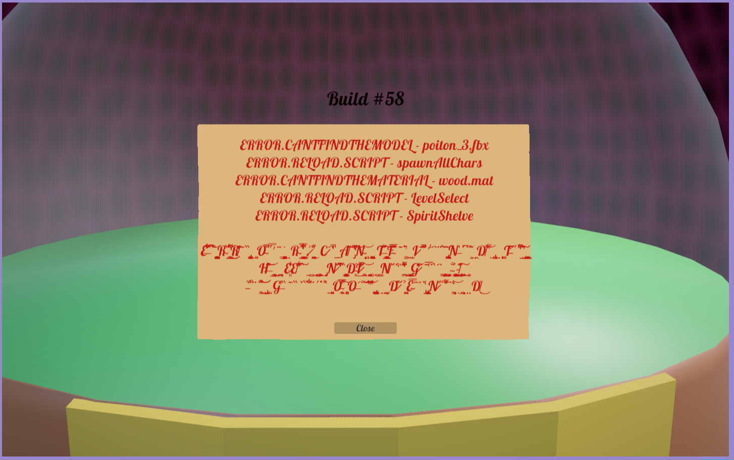
Right off the bat, I noticed a few graphical glitches that prevented me from starting the game (see attached images). They were kind of a pain to fix, since I had to search for the game's settings file in my PC's temp folder.

Nice sprite art and sound effects, and I like the forest ambiance track.

There doesn't seem to be a way to return to the main menu. A pause menu would be nice.

"Battle" and "Forage" look like buttons since they light up when you hover your mouse over them, but they don't respond to clicks.


Believe it or not, I've actually never played Warioware (although I did play Game & Wario on the Wii-U a few years ago). The biggest sources of inspiration for this game are Half Minute Hero, Octopath Traveler, Chrono Trigger, and a few others. Definitely agree with you on the polish (I haven't been working on this for too long), and I'll look into speeding up the transitions. Thanks!

Thank you for the kind words! You're 100% correct about the fish in the 3rd level; I'll need to take a look at that. I've also received similar comments in the past about the notes in the Wizard Dance mode, but I still haven't decided what to do. I'll have to think about it some more.

(1 edit)

Saw a whole bunch of error messages right as I started the game. Not sure what that was all about.

Camera controls are REALLY wonky. Maybe make it so that you have to hold a button down, or increase the friction so it doesn't slide so much.

Holding W while against a wall will prevent you from falling; might be something up with your collision detection.

I haven't played a whole lot of "tactics" games like this, so take what I'm saying with a grain of salt.

The writing/story seems interesting.

It feels odd that you'd left click on a character to select them, then right click to tell them where to go. Is there a reason why you can't use LMB for both?

I think there should be a bit more distinction between the player characters and the enemies. You can click on both of them and see all their info/stats/etc. so it might be hard to tell who's who.

Obviously it's still very early, but hopefully this turns into something bigger. Good luck with everything.

based SDLbro.

I think I found a bug. Does the level continue updating, even after entering the game over state? I died and it showed the game over screen, and then a split second later, my score increased slightly. I'm guessing I probably shot an arrow right before I died, and it hit something after switching to the game over screen. Might be intentional, just thought I'd let you know.

Cool little Hotline Miami clone. It'd be nice if the guns automatically disappeared when out of ammo. As it is now, you have to manually drop them and pick up a different one, while avoiding the one you dropped so you don't accidentally pick it up again.

There are a lot of spelling and grammar mistakes that can sometimes make it hard to understand the instructions. I'd really recommend getting a proofreader to go through and fix them.

This seems like it could be really cool, once it's closer to completion. Good luck!

Neat little strategy game.

- Since the background is solid black, it took me a while to realize there were other nodes surrounding the first node, and that I had to click on the dirt paths to expand.

- An option to fast forward through all the animations after clicking "end turn" would be nice

- Some of the buttons were kinda hard to click, since they overlapped each other. But I know this is very early, so you probably just haven't gotten to it yet.

I enjoyed this. Thank you for submitting it.

Thank you! I'm glad you liked the humor. Writing comedy has always been really hard for me, but I've been getting better at it.

Really nice art and sound effects. Definitely needs a way to rotate the camera, though. A couple of times I thought I was placing archers on top of walls, when I was actually placing them on the ground behind the walls. I also accidentally hit the trash can button and wiped out everything I had, so some sort of "Are you sure you want to delete" popup would be nice. UI scaling would be cool, too. I'm on a 4k monitor and the icons were really tiny.

The gameplay here is fun and simple. Good luck with this.

A more detailed tutorial and descriptions of the buildings would be nice. I'm a total brainelt (real typo) and I honestly had no idea what I was supposed to do. And I even turned on emotional support :(

Nah, don't worry about it. Ryzen 9s are built to get REALLY hot 💪.

Is there any way to limit the FPS? It's running at like 600 frames per second for me, and my CPU is getting kinda hot.

Thank you for playing! I'll keep working on it.

- I agree with you about the spacing of the notes in the WD mode. I have a 27" monitor, and I found myself having to constantly move my neck to fully see all of them. I've also gotten some similar feedback from others about the difficulty. I'll fiddle around with the numbers and hopefully make it more doable. 

- Diagonal shooting for the dragon might be a good idea. I'll also adjust the placements of the rocks (and their hitboxes).

- Oh man, I didn't even think about players with dyslexia. I myself am not dyslexic, but I've read that font and text color can sometimes help make it easier to read. I might have to think about that some more.

- The imp is definitely too fast right now, and I have some ideas about how to slow it down without ruining the fun. Maybe by next DD I'll have them implemented. 

- Thanks! I was kinda worried the TD levels might be too short. 

- When you say the shield is too small, so you mean when using it to deflect bullets? The idea was that you'd have to be right in front of a bullet in order to deflect it.

Thank you for the feedback!

Really nice artwork and sound effects, but I wasn't able to make it very far into the game because I kept dying lmao.

Unless I'm blind, there doesn't seem to be a way to quit the game. Alt+F4 did nothing and I didn't see a Quit button in the main menu.

I liked this. I can definitely see how it would be fun on mobile.

IMO more of the menus and popups should be navigable with just a keyboard, since the mouse isn't really used for anything.

Definitely agree about the imp moving too fast. I have some ideas in mind about what to do, I just haven't gotten around to implementing them yet.

The notes felt right to me, although so far I've only tested on my own computer. I'll look into this some more. 

Thank you for playing!

Catching a fish was a bit difficult because of how dark everything was, and there wasn't really any feedback (it took me a few seconds just to notice that a fish had bitten my lure). I wasn't really sure what to do after I caught it; I just walked around for a few minutes with it hanging on my reel.

Really nice combat system. I'm not sure if it's intentional or not, but I wasn't able to print guns after the tutorial. Pressing R didn't do anything.

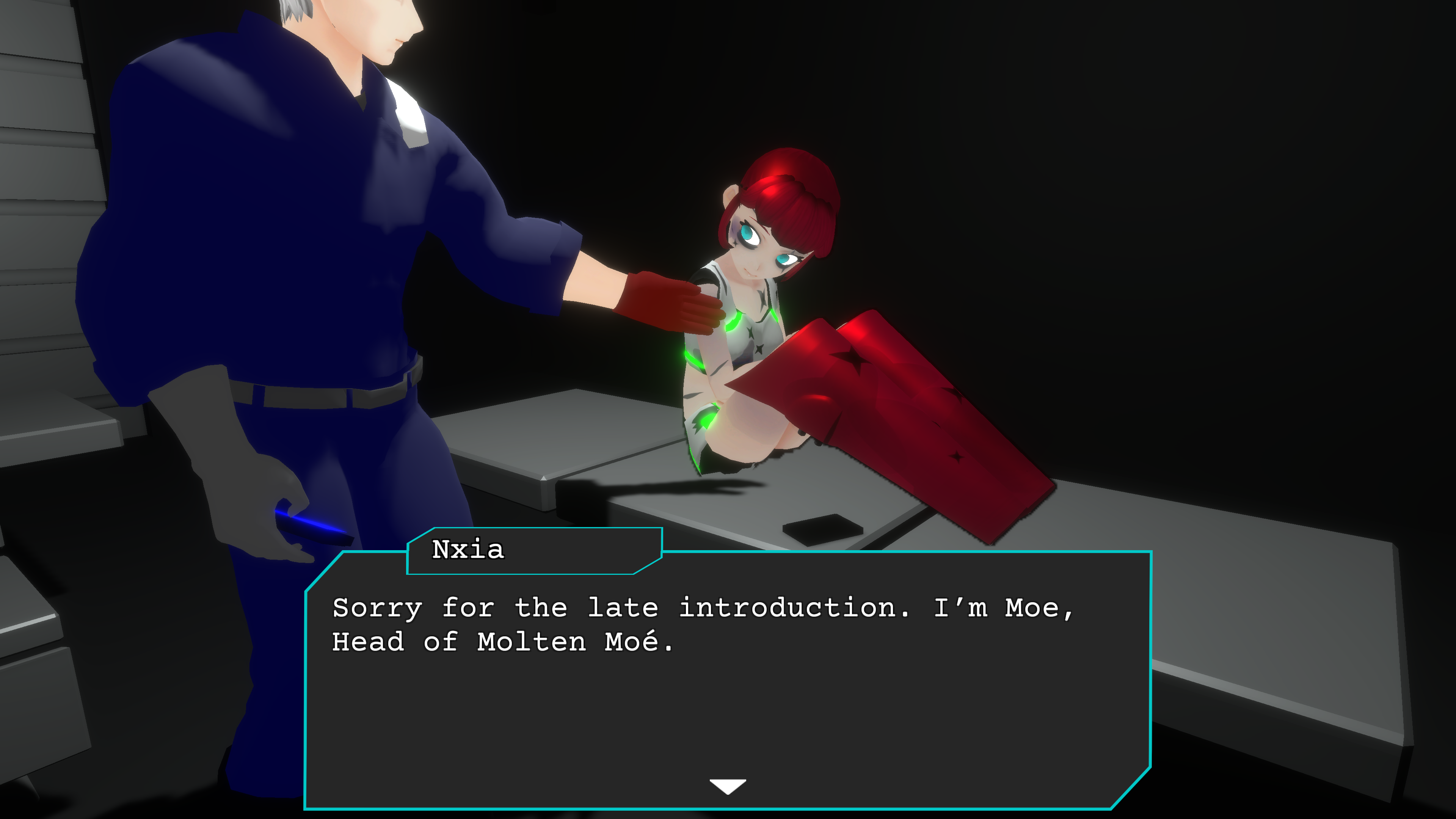
In one of the cutscenes, it looks like the character's names are wrong (see screenshot).

As others have already pointed out, it's hard to comment on the game overall since you're so early in development, but this seems like it could turn out really well, so best of luck to you.


I absolutely loved this. I was kinda put-off by the MS Paint style graphics at first, but they grew on me. The music is fitting, pinball is fun, and even though the gameplay is almost entirely luck-based, for some reason I just could not get enough.

Definitely looking forward to seeing more of this.

Yeah, I have an RX 6900 XT. The grass was still moving with the wind, so I'm not sure why I didn't see it being cut. Might be something on my end.

Unfortunately, I wasn't really able to play much. I used a mouse and, as others have pointed out, the camera sensitivity is so high that even when I stopped moving the mouse, the camera continued to spin around really fast.

The animations and sound effects could use some work, but the models and textures look nice.

Really nice setting and atmosphere. Kinda reminds me of OSRS in a way.

The first thing I did after the intro was cut some grass with a scythe. It would've been nice if there was some sort of feedback besides just the number at the top of the screen going up (maybe the grass disappears or becomes shorter). If you stay in one spot while cutting grass, the number at the top of the screen goes up much slower, but since there's not much feedback, it's hard to tell that you're supposed to move around.

Fishing is fun. Personally, I would say that S to reel in would make more sense than W, since you're bringing the fish towards yourself. But that's just me.

Scrolling the mouse wheel in the tutorial windows also moved the camera back and forth. Maybe if the mouse is over the tutorial window, disable forward and backward camera movement.

Good luck anon!

Some nice sprite art and music. The pacing of the combat felt a bit off for me, but maybe I've just been playing too much Bayonetta lately. I was confused by a few of the UI elements; there was an icon of a drop of blood which said something like 25%, and I thought that meant I had lost 75% of my blood and I was about to die. It also took me a little while to understand the cooking menu (when I only had one ingredient, I wasn't sure why the entire row was getting crossed out).

The controls were pretty intuitive (I used an Xbox 360 controller), and I liked the character customization options.

Good luck with this one.

I actually really like this. The controls feel right (I used a wired Xbox 360 controller), and the whole aesthetic is great. Might be just me, but I actually liked how there wasn't any background music.

Most enemies could be killed easily just by mashing the attack button over and over. Maybe give some of them the ability to dodge or parry or something.

Fantastic sprites, audio, and overall presentation.

There were a couple of enemies hidden behind the yellow crystal thingies. I'm not sure if that's intentional, but it made them hard to see. It might be a good idea to render the enemies on top instead.

Gun Buddy was able to find secrets for me, which felt like it kinda defeated the whole purpose. Maybe make it only shoot the walls if you shoot them first.

Excited to see this one on Steam.

- You're right, looks like the bottom fish might be bugged. Thank you for pointing that out.

- Definitely a good idea, I'll add this.

- I noticed that too, but it was sort of a lower priority for me. I'll take another look at it.

- I've been thinking about switching from WASD to ASJK, which is what Clone Hero uses. But in Clone Hero, the notes move vertically, not horizontally. I'll have to think about this some more.

- I have some more ideas for both of these game modes, but for this demo I wanted to get as many "basic" levels as possible made before making any more complex levels. In the future, these modes will be much more "involved".

- Thanks! I wasn't sure if anyone would like this one or not.

- I've never been complimented on my 10 second placeholder art before, lmao thanks.

- Each enemy has certain attacks they're weak to. The evil tree is weak to Fireball and Axe (because trees burn and are chopped down with axes). Those attacks will do much more damage than the other attacks.

- I hadn't thought about that, but yeah I guess you're right. I'll see if I can add in vertical scrolling as well as horizontal scrolling.

Thank you for the feedback!

My apologies, I totally just realized I made a mistake in the instructions for the fishing minigame. You're supposed to use A and D to move the hook, not the arrow keys. When a fish bites the hook, mash the left mouse button, while holding down either A or D (whichever one is opposite the direction that the fish is moving). Each time you click LMB, the fish will move ever so slightly closer to the top of the screen, and once it's out of the water, you will have won the level.

The idea for this game is to have around 10-15 different game modes (I've got a few more planned besides the ones already in the game), each with a whole bunch of levels.

Thank you for playing!

Thanks for the feedback. I'll keep working on it.

Thank you for playing! I was worried about the Letter Editing mode; I wasn't sure if anyone would like it or not.

Can I ask what you found difficult about the Wizard Dance mode? Are there too many notes, or do they move too fast, or what?

Started the game and immediately it said "that was dumb".

10/10

Windows gave me a firewall notification when I tried to play singleplayer. I've never made a multiplayer game, so I don't really know if that's normal or not, but it just seems odd to me. I also noticed that if I blocked it through the firewall, the game simply softlocked and I had to Alt+F4 and restart in order to try again. I feel like if there's something preventing the game from continuing, there should be some sort of notification and option to retry or exit.

Really impressive from a technical standpoint. Some others have already mentioned this, but occasionally when shooting the game would freeze for just a split second, but then it went back to normal. Apart from that, it runs great. Some minor bugs I noticed were enemies getting stuck at the edges of maps, and some other enemies suddenly floating in mid-air after being shot. Also, for some reason, the entire game window will occasionally disappear when turning fullscreen off, and the only way I was able to get it back was by forcing the game to quit and reopening it. Looking through the other comments here, I don't think anyone else has mentioned this bug, so it may just be on my end.

The player's score is determined by how many enemies they've killed, which means weaker enemies give exactly the same amount of points as stronger enemies, so there's not much of an incentive to target the stronger enemies. A good way to increase your score quickly is to just avoid the stronger enemies while focusing only on weaker enemies. I'm assuming this will probably change later, but it may be something to keep in mind.

It's looking really good so far. Hope to see more of this in the future.

Another fun fruit-themed frolic from our famous friend Pomao!

Not much too it, but it's fun to play. I am eagerly awaiting the sequel "Pancake Chef".

Where can I find the save files? I accidentally skipped most of the tutorial and I'd like to go back and view it again, but I can't find any way of doing it in-game, so my only other thought was to delete the save file.

Right off the bat, I noticed that the art and music were really good. The volume slider in the options menu was a bit buggy; the vertical bar can go too far to the left (I didn't check if it could go too far to the right). I also found a typo right at the beginning ("you hand" should be "your hand").

Looks really cool and I can tell you've put a lot of effort into it. Great job.