Thanks for your feedback. After reading some feedback I also think that the UI needs an overhaul or I'm working with images in the tutorial
CodingCoon
Creator of
Recent community posts
Thanks for the feedback. Yeah the UI seems to need improvements. There are always 2 numbers. The zero on the shell indicates, that no worker is on collecting shells. The -4 is the change you selected. You forced 4 shell collecting workers to collect something else, but no worker can do this, because there is none.
Good job, the simple art style looks nice and the environment is enjoyable. I need a while to figure out if I doing things right. Maybe a positive or negative sound effect would be nice to help me learn. And the speed boost is at the end really hard, maybe thats intended? If not add another booster to increase the effect radius.
Overall well done, the game is a good foundation for more things to do as an underqualifier lifeguard.
Nice Star Wars Vibes.
I like the variety between speeding over the landscape and the minigames. It could be a little bit faster at the beginning, cause I don't want to play the manual well, as much as it needs to get progress. Mini-games always reach a peak where they are fun, after which there should be a way to automate them and new mini-games or variations should emerge.
If you bring even more variety to the mini-games, fill the environment with more content, and avoid Disney lawyers :-) , this could become a really nice and relaxing game.
Yeah, I think this is my first completed survivors game. The beginning is a bit crisp, but after a while nobody can stop a full upgraded broadside of 7 cannons.
Could be a really nice game if adding funny pirate themed skills. I mainly need a net, when driving close to treasure without hitting the hitbox to collect it.
What does the icons on the right bottom mean?
Very cozy game and what a fantastic art style. I'm not sure if the phases between frenzy mode has a role, I only waited for this funny moments. :-)
You asked for feedback on the itch site, so here are some thoughts regarding game mechanics that came into my mind.
- it would be more pleasant if there is any kind of indicator that a fish will jump, maybe the fish starts to blink or there is a special animation
- fishes could give different points, but more points means it is harder to catch the fish, maybe because they fly faster or not so high as lower point fishes. That gave beginner players the change to train on easy fishes till they have the skill to get harder fishes for more points
- the frenzy mode feels to mighty, I mean it is fun, but the time in between is pointless, when I only try to avoid piranhas and wait for the time, where I don't have to react on a single flying fish and just run, getting points automatically.
- The movement of the piranhas is unpredictable, so dodging is imo impossible. Here an indicator is also necessary. I know that will make things to easy, but you can add seagulls from the top, which want to eat your fishes. So players have to look up and down for angry animals.
Overall really good job and very polished for a first single person made game. Keep on going.
I'm a bit fan of the choice of music, nice pirate flair with a touch of rock. Good job.
The game was fun. It's a little bit tricky to hit the enemies, but if you made it it feels very well. Sometimes its quite impossible to hit somebody, while rotating and the enemy follows you. Would be nice if acceleration and decceleration would have more impact on that, or maybe I'm to bad.
If adding some funny power ups and skills this game could be a really nice horde survivor with another setting as the known games.
Solid work, Pixel Art Environment and sound fits very well and gave a nice feeling.
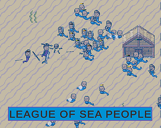
I would recommend to choose the key from the keyboard as attack button otherwise the player thinks there is a dependency between mouse and attack direction, which isn't. And yes I read the notice about the behaviour in the description, but it feels unintuitive. Or you could align the weapon around the player depending on the mouse and attack into that direction. That will give you more control about the direction, cause I had many trouble to attack with the spear on a crab that stands all the diagonal to me, without running into it and get a hit.
Solid work, I need some time to understand that it is a shell not a jellyfish (who can read has a clear advantage), so i was really confused about the movement direction. Maybe another animal could fix this confusing about movement direction.
Sometimes I hit 3, 4 or 5 bombs directly one after the other without the chance to rescue me. Maybe a short slowmotion moment at the edges would fix frustrating moments and give the player a special moment of "puh that was close, but I rescued myself, I'm so awesome".
Wow, thank you very much for the great feedback. Yes, the animated changing of regions was planned, but unfortunately had to yield to more important matters in the end. I will definitely incorporate that because I'm looking forward to the challenge. The icons are still from the concept for another setting. I think they will be changed again as well.
Everything fits together really well. I like the style and the setting around a digital world. At the beginning, I was a bit overwhelmed by the text on the left edge, and I couldn't read it calmly. And I was unsure if it's worth shooting the small enemies or if it's enough to just dodge them. But the game seems very polished for 14 days. Well done.
Thanks for your honest Feedback.
I'll think about better fitting icons and in the long run the wheel will be replaced by cells as well.
Most of the time I tried to maximize the income when having a large area and move the leader when the position is bad. In addition I should add more Information, so it is more clear what is going on.
Thanks for your Feedback.
Regarding the strategy:
I think it depends on the situation, if someone is strong in the middle, I try to take over the big space on the edges. If opponents are on the edge, you have to stand as close to them as possible in order to take a large part of the inner area away from them.
I like the clear design and art style and the music and sfx fits well.
As improvement I have only to say: when spawning the small octopus, I stand close to the mouth and clicked all the time. Maybe you could add another component like single tint balls to bring me to move or various spawn points. Otherwise the phase is wasted.
What happened here ^^ Finally I beat the boss, but I'm not sure what happened during the game, Maybe its a bug, but my spaceship disappeared and the screen gets blue:
Overall, nice idea. Navigating in space is very challenging, but perhaps that's intentional. The sound effects fit really well, and the art style matches quite nicely too. Despite their simplicity, the boss attacks feel powerful.
Maybe a small indicator of where the boss currently is would help, especially if the shotgun knocks me back to the edge of the universe again. lol
Hey, I hope you're feeling better; getting sick during a jam is just awful.
Visually, your game is already impressive, and I believe you've made a good start here.
The controls take some getting used to; sometimes my character just jumps up, then again, and again. For noobs like me, it would help if the bosses somehow gave small signs of what they're about to do, so I'd have a chance to dodge, run away, or stop them with an attack. Unfortunately, I'm failing miserably.


