Play Shotgun Argot
Shotgun Argot's itch.io pageResults
| Criteria | Rank | Score* | Raw Score |
| Presentation | #234 | 3.720 | 3.720 |
| Originality | #236 | 3.640 | 3.640 |
| Overall | #281 | 3.400 | 3.400 |
| Gameplay | #389 | 2.840 | 2.840 |
Ranked from 25 ratings. Score is adjusted from raw score by the median number of ratings per game in the jam.
What do you like about your game?
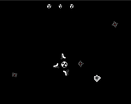
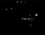
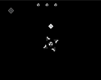
I am pretty satisfied with the mostly two color look
Leave a comment
Log in with itch.io to leave a comment.


Comments
i really liked this one, the presentation is excellent and the gameplay itself is original, i've never seen a game that controls quite like this and i like it a lot! the style of the ui all being printing to a console is also super cool and i love that as well, i think i might have to make a shotgun argot-like because i really like pretty much everything about this game. only suggestion is to get player customization in some way, maybe different loadouts and weapon types could do that.
Oh wow! I’m super glad you enjoyed it so much! I would love to see your take on it! I am also a massive fan of customization, so I also quite like that idea.
so i actually finished my shotgun argot-like for a different game jam i signed up for and then only made the game in the last 4 days lol. i deviated from the original quite a bit, maybe it's a shotgun argot-lite at this point. ironically i ended up not adding in any customization despite my advocation for it in my comment. thank you for the inspiration!
consider playing it here:
https://leaflight-studios.itch.io/wyrm-canyon
Oh my goodness!! This is so cool! I just checked it out and I’m truly honored. Thanks so much!
The controls took some getting used to, but once I figured them out it was super satisfying to play. Also love the aesthetic
Thanks!
Nice game, I like the aesthetics and the attack animations from the boss and enemies are pretty cool. Apart from the background problem mentioned by other people, I would also have liked a different animation when the cannons reappeared. I think it looks too much like the shooting animation and I was a bit confused at first.
Thanks a lot! I hadn’t thought of the animation thing, but now that you mention it, I’ll take a look into it! Hope you enjoyed it!
Cool polybius-esque atmosphere :) I'd just criticize that it's sometimes kind of hard to see in what direction you're moving when the background is just black.
Love the game concept, I struggled greatly with the movement but I think this is due to using wasd instead of arrow keys which I personally prefer. An in game tutorial might of helped but over than that a great game and interpretation of the theme! check out my YouTube as the game might feature :) https://www.youtube.com/@CBWB93
Thanks for the feedback! Yeah, I thought of adding customizable controls, but I never got around to it. I will make sure to check out your channel!
This game has a pretty neat atmosphere and aesthetic. Everything about it has a bit of haunting feeling to it.
I had a bit of a hard time with the movement, I'm not a huge fan of the inability to strafe in diagional directions. I got into a few spots where I felt like that would have been handy.
The fact that you are always moving makes some spots challenging but still feels fair.
Cannons also felt reasonably responsive... it still took some time to adjust to how the rotating works. I might have liked it more if it was tied to horizontal mouse motion, but I'm also aware that I have some weird preferences for controls sometimes.
Wow, I had never thought of the horizontal mouse motion, but it sounds like it could be really interesting! I kept the movement more restricted because I liked some of the uncomfortability, but I did get that note about diagonal movement during testing as well. It was more down to preference I suppose. Thanks a lot for the cool ideas, and I hope you enjoyed it!
Great aesthetics with your terminal look. And great addition of the endless mode.
Liked:
- Design
- Unique controls
- Boss. Felt good to fight against.
What could be improved:
- Movement: Personally I am not the fan of it but that not important. Problematic is the all black background. For the player it is hard to know if you are moving and in which direction. This works somewhat when enemies are on the screen. But a little discernible background would have been great.
- Movement direction: I would have liked the addition of diagonal movement. When focusing specific enemies it felt weird to not be able to directly follow them.
Thanks a lot for your comment! The background was one of the things I thought of adding, but ultimately decided not to, and I think it was a mistake. I now think it was possible to keep the feel of it with the added clarity. Well, you live a d you learn I guess. I’m glad you enjoyed it!!
It's got a unique vibe and I love it, solid game
Thanks a lot!!
I love the vibe, it really nails the 1980's aesthetic, kinda like a commodore game. as other's said, I think with some additional FX to show directionality of your character & if you've killed something will help the game feel. Overall, I really feel like this could be a classic arcade game, great job!
Yeah, death animations are one of the things that sadly didn’t quite make it in time. Thanks a lot, I’m glad you liked the vibes!
Everything fits together really well. I like the style and the setting around a digital world. At the beginning, I was a bit overwhelmed by the text on the left edge, and I couldn't read it calmly. And I was unsure if it's worth shooting the small enemies or if it's enough to just dodge them. But the game seems very polished for 14 days. Well done.
Thanks a lot for your feedback. I have seen different approaches work well with the smaller enemies, which is something I quite like. Glad you enjoyed it!
Visuals are very unique! As others have mentioned, perhaps a simple grid background would help ground the player in a more physical space but overall it's a pretty unique concept!
Thanks! Yeah, the background was a point of contention during testing. I might implement ways to get some more clarity of movement after the jam
I love the terminal aesthetic and writing. It adds a lot of flavour to the game.
I think something like a jet propulsion vfx would help explain why I’m moving in a certain direction and indicate where I’m moving towards, especially on the edge of the map where the camera no longer pans.
Hmmm, that’s also a good idea. I kind of knew that navigation clarity wasn’t the best, but I really liked the full black background, still kinda do. Maybe that vfx or some sort of indicator could be a way to have both. Really good idea, thanks!
Love the atmosphere! A background definitely would've helped with telling where I'm moving. Other than that, mechanics were solid!
If you were to implement an alternate control scheme, maybe being able to aim the cannons by following the mouse would be neat!
Yeah, I was thinking of adding controller support before, but I think the alternate control scheme would be very interesting indeed. I’m glad you liked it and thanks for your feedback!
cool artstyle with a spooky ambience
Thanks, glad you liked the artstyle!
great atmosphere! The dodging constantly keeps you at edge and the music and sfx are a perfect fit. For me it feels like “The Matrix” where they have to dodge / evade those octopus thingies with their ship. It just has this sci-fi feel to it that I like a lot.
Thanks! Funnily enough, The Matrix was indeed one of my inspirations for this, so I’m glad you thought of it. I’m glad to hear you enjoyed it.
very cool style of world.
Thanks a lot!
Really cool atmosphere! Wish there was some background for easier movement navigation
Thanks! Yeah, I was torn on the background till the end… I still don’t know what to do with it tbh.