Indie game storeFree gamesFun gamesHorror games
Game developmentAssetsComics
SalesBundles
Jobs
TagsGame Engines

creedencethedesigner

24
Posts
1
Followers
A member registered 94 days ago · View creator page →

Creator of

Recent community posts

There's a lot of potential here, and a lot of integrated systems!

As others said, it wasn't immediately obvious what to do. This could be resolved by a few different tactics. My personal preference is by making the things the player should be interacting with the largest on the screen, potentially even highlighting them in some way. Avoiding long and drawn out tutorials is a positive; so finding a way to show the player what a "correct" day could look like before pushing them into the deep end should be your goal. 

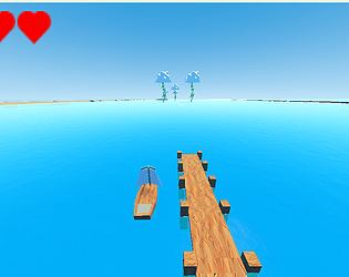
Thank you for sharing your feedback! In our panic to submit, I forgot to remove the spacebar reset (I was using that for debugging the boat and water physics). We had teamed up with a level designer who didn't end up delivering any level design, the project files became cursed, and then our sound designer was the only one who could edit the level so we crammed it together as best we could and exported the file haha.

I agree with your assessment, and we hope to achieve something better in the next gamejam we participate in :) 

Mine was such a journey of learning with water and boat physics! And we had some a great artist and sound designer working on it, I'm proud of what we accomplished (even if we didn't get to wrap up everything) https://itch.io/jam/brackeys-12/rate/2970078#post-10900674

I found your brain stem, if you would like it back 😂

Thank you for the kind words! 

Definitely good practice to experiment with these ideas :) The Games User Research Sig on YouTube has several really good ideas on teaching the player game mechanics, if you want to explore that! Here's one video I really loved:

Hear what? Sorry? I didn't hear anything (mwahahahaha)

Thanks for your thoughts! I wholeheartedly agree with the prebuilt settings/title/end screen. In fact, this is what messed me up, my prebuilt UI wasn't built robustly enough to quickly implement the title/end screen! So I'm starting from scratch next time to make it flexible enough :) 

Go for it! I think it's a cool concept :) I found this as a helpful reference point for puzzle elements: 

Hey there! I have a team with a 3d artist and game designer, and we could definitely benefit from a 3D animator! We're planning on working in whatever the latest version of Godot is when the GameJam starts :) Feel free to reach out on discord, mine is @creedencethedesigner

This was a cool thought here! Great job piecing this together!

Player experience issues I came across:

The only thing that really messed with my experience was not realizing what button to press to use the bathroom. I'd honestly just make part of the recognition that it's useable when the player gets nearby to tell you the button to press. 

Otherwise, the trolling made for decent gameplay, so no complaints there :) 

(1 edit)

Hey, I thought this was a really cool concept! 

A few player experience issues I had:

A big thing about keeping the player in mind is making the game obvious without tutorials. We can do things like when the robot rolls near a tool showing a highlight on that tool and the space bar, and when you're holding a tool and getting near the bathroom showing the enter key being tapped repeatedly. I.e. A tutorial is great, and I'm really glad it wasn't required! Design should reveal how the game works as much as possible without relying on the tutorial. 

This was a really cool concept! I enjoyed what's here, and the presentation was fun!

A few player experience issues I noticed:

When you upgrade your tools; the other tools are in the way. Since there's not really a value to using the older tools; I'd recommend hiding them as they upgrade. 

It took me a minute to realize click shop a second time would close the menu; I opened the garage and went to town several times in a row haha. Added an "X" here, or changing the word "shop" to "close" would help. 

This was really cool, and a great idea!

A few player experience thoughts here:

The way the tutorial was presented, I thought I was doing what I was supposed to and then found myself all out of sorts for a moment before realizing I had to click "check" a second time. One possible solution that came to my mind was to end the tutorial with a fadeout and fade-in, so it feels like the scene has been reset (you could even fake this with a quick texturerect/tween). 

It was easy to accidentally step on the wrong spot when walking between different ones. This could be solved with how they're arranged, or some way for the player to un-select items by walking over them a second time. 

This was a really cool concept, I love what you did here! 

A few player experience issues:

I couldn't see the health bar on my screen and my initial thought was the bottom bar was my screen. So I guess: increase visibility on health bar and include a way of showing damage done to the machine that's more than just reducing the bar (you might look at fighting game health bars for ideas here). 

A few iconic pieces for this style of game that I was looking for and didn't see: A pickup to improve damage output and some of the attacks coming toward you being destroyable. 


Overall, I really enjoyed it :) I just assume we're all doing a gamejam to potentially improve our work, so I try to share a few thoughts on improvements! 

This was a really cool game! I enjoyed the concepts here, and could see where it could go from here. 

A few player experience issues:

Something about the throw felt a little unnatural; perhaps it wasn't taking into account jump velocity? I'm not sure I can fully put it to words, but it was really close to great!

Having no lives felt a little unfair; it's really important to give the player an opportunity to learn a new mechanic through potential failures without sending them back to the beginning of the game. 

This was really good! I loved it! The level design was fun, and the art worked really well here, great work!

Only player experience issues I came across:

It didn't let me climb down ropes from the top. 

It took me a minute to realize I could move the character and didn't need to confirm my level setup to move forward. 

Some cool ideas here!

Here are some player experience thoughts:

The art style is good for such a short period of time; I appreciate what's going on here. 

Guiding players to what's happening; There are a few misleading "dirt paths" and open areas. I.e. When you pick up the draw bridge, the huge empty space encourages the player to go down (and then hit a dead end) and there's a misleading dirt spot that signals a potential secret area. 

Player walking paths; there are a few times where the tree collisions block what looks like walkable paths. 

Summary: 
So in future work; just keep in mind that everything on the screen can guide the player somewhere. Remove unnecessary distractions (paths that lead to nothing; random dead ends, random dirt paths) and focus on the "main path". Once you have the "main path" built, be intentional about including side/secret content. 

As far as "Supposed to", I have skeleton code prepared for a points screen and leaderboard system that I ran out of time to implement, and we even have an OST of 4 songs and some SFX that is sitting in a GDrive that I didn't have time to implement. This is my second gamejam, and the first gamejam I had enough of something to submit, so I appreciate your kindness!

RE: The theme; that makes sense as far as backstory, I guess I would say it just didn't come through when playing. I do UX Research for a living; and I honestly just skipped the paragraphs of text because that's what I see people do every time I observe them playing games or trying apps. 

Great little game! I didn't see anything that hasn't been done before, but ya'll did a good job piecing this together. 

I really enjoyed this! I think we took from similar inspirations, and took them wildly different directions! We were definitely inspired by Crazy Taxi and the Crazy Delivery minigame from Like a Dragon: Infinite Wealth;  Our goal was to emulate the chao.

I wasn't really connecting the dots between this and out of order, but a solid experience regardless. 

Some player experience pieces: 

The animation for the civilians entering the car was delightful

Sometimes it was difficult to navigate the map without penalties. Making a more stark contrast between road/non-road textures or doing some sort of path direction mechanic (arrow points down the road; maybe the road has an arrow on it, maybe there's a minimap, anything works here). 

The controls felt very solid.

Awesome! I will definitely be checking your game out; and thankfully they gave us an hour grace period to upload the fix :) 

Thanks so much for the heads up! First submission, so I didn't realize I needed to embed/zip file the pck file. Unfortunately I can't upload anything because of the jam timing, but I uploaded a zip file to Google Drive.  https://drive.google.com/drive/folders/1l_Qp5bHcD5pl9AeWeaj4JWTqotDfWQlf?usp=dri...