

Play game
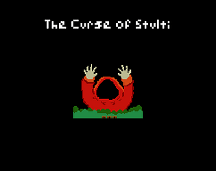
The Curse of Stulti's itch.io pageResults
| Criteria | Rank | Score* | Raw Score |
| Relevance to the theme picked | #2 | 4.563 | 4.563 |
| Execution | #4 | 4.063 | 4.063 |
| Overall | #4 | 4.050 | 4.050 |
| Enjoyment | #5 | 4.000 | 4.000 |
| Metroidvania | #8 | 4.063 | 4.063 |
| Sensory | #13 | 3.563 | 3.563 |
Ranked from 16 ratings. Score is adjusted from raw score by the median number of ratings per game in the jam.
Theme chosen
Classic. I interpreted this as a nostalgic feel, look, and sound to my game. Minimal Controls. Just classic.
Team/Developer
Solo
Engine
Godot 4
External assets
Everything in this game was created by me during the period of this jam.
Leave a comment
Log in with itch.io to leave a comment.
Comments
Enjoyment 4/5: Mostly enjoyable experience. Losing gold was a bit frustrating but besides that, no issue, and that's basically a convention at this point. Pacing was good.
Execution: 4/5: No noticeable flaws except a slight discrepancy on that sprite looking left into a tile. Maybe a few too many rooms, map could probably be a mite smaller without losing too much.
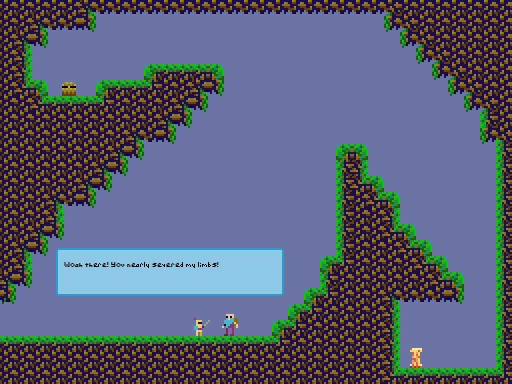
Sensory: 3/5: Graphics do the job here and are competent/unified. The old school aesthetic may ultimately hurt this one a bit, but it does still do the job. Textbox speed hurts the UX a bit, which for my purposes is going under this category.
Metroidvania: 5/5: Given the theme of Classic being present here, I think it's fair to say that you seem to be going for almost a proto-Metroidvania or parallel-but-not-Igavania-or-Super-Metroid thing, and you nailed it. (That might just be me reading my own failed entry's goal into yours, though.)
Theme relevance: 5/5: For basically the same reason. In a world where classic consoles had different resolutions, mutatis mutandis, this could have been on one of those.
Thanks for playing! Yeah, the boss's cooldown was intentionally longer. But you're not the first to mention the rest of the enemies cooldown, so I might have to adjust that. I've been avoiding jump sfx because generally, jump animations are feedback enough to the player I think. But since this game is more playful, a jump sound wouldn't be a bad idea to at least try out. And there actually is a wall slide sound, but I made it to quiet apparently.
Once I finish up some work, I'll get to your entry! Thanks again for the feedback!
The controls feel excellent, and the main character is really funny! I did have a great time playing it, the level design was good. I liked the fact that you get rewarded for fighting enemies, and it does not feel like farming at all. Overall, it is really well put together.
Maybe, to add some criticism, the background feels a bit too dead for my taste. Given the feel of the game, some simple background or, if you did not want any because of the classic theme, a more lively color would be appreciated (not in the cave, the cave is just fine).
Thanks for the feedback and playing my game! You're the second person to mention the backgrounds and I definitely agree. I did try to do a background for the forest/jungle area, but it looked so bad that I just decided to go with a flat color for every area. It is something I want to work on, but with my current art skills, I haven't been able to find that balance between background and foreground/rooms. So I decided that a static flat color would look better than something that would make peoples eyes hurt haha
Hahahahaha, don't worry, maybe a background is not necessary:
This, for example, gives a more jungly vibe.
And this more of a hell-like if that is what you were going for: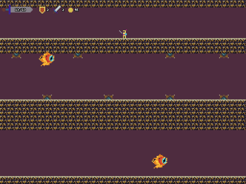
Finished at 100% good game i really like the feeling of progression.
Thanks for the feedback and playing my game!
Wow! This game is so complete in every sense! First of all, the theme fits so awesome. Just starting the game and hearing the first notes of the song, took me back to the classic computer games. The game feels very agile, and everything gave cool feedback. It's cool that it's about collecting coins because collecting them is very rewarding.
The variety of enemies is interesting and I liked the combination of getting rewarded for killing them, but they being slow enough to ignore, made it more relevant choosing when to fight.
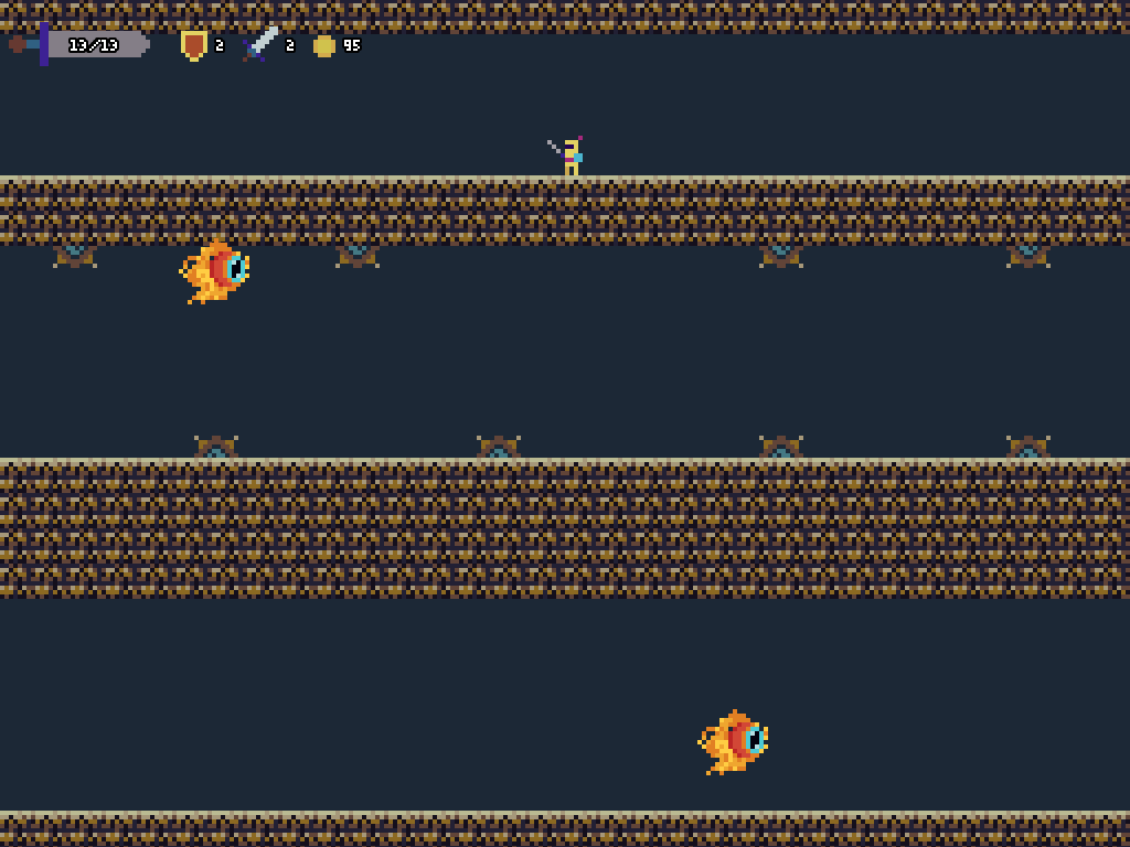
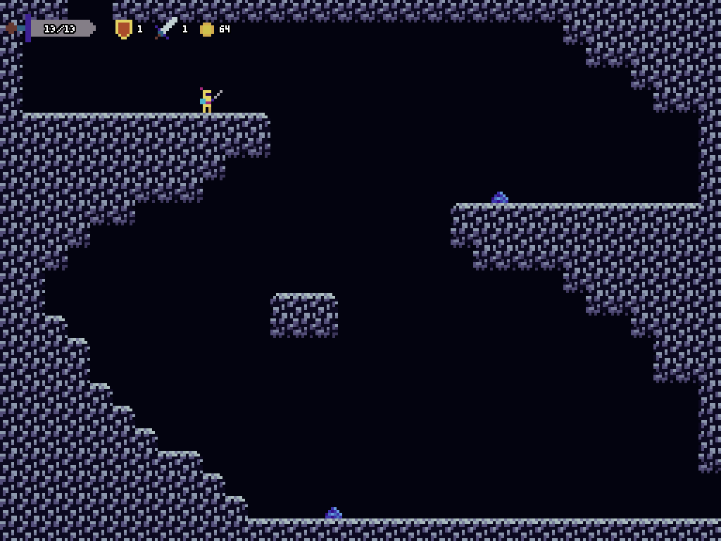
The changing of scenery is also very cool. Moving between biomes changes the music and enemies, traps, so that ties really well together the classic theme with the mechanics of metroidvanias.
The difficulty was good, and the skill expression as well. The map system was amazing, overall this game is full of details that make for a very complete experience. If I had to choose something to improve, I'd make the text more responsive. Sometimes it feels a bit slow, or not clear when it responds to input and when it doesn't.
Thanks for the feedback and playing my game. I wanted to polish the text by adding noise and a cursor to designate when the play could continue, but by the time I reached the polishing phase, I was exhausted and just wanted to make sure the game worked lol.
immediately got Castlevania II / Zelda II vibes from this. Overall I had quite a good time. The music was simple but catchy, I particularly liked the cave and temple music - I was nodding my head along to the tun but still felt that ominous dread. The controls felt good, jumps were tough but usually fiar. Collecting coins always feels good, and the chest coin fountains were particularly satisfying. I tended to skip the weaker enemies and just focus on whichever enemy would erupt with the most coins. :D
Some pieces of feedback:
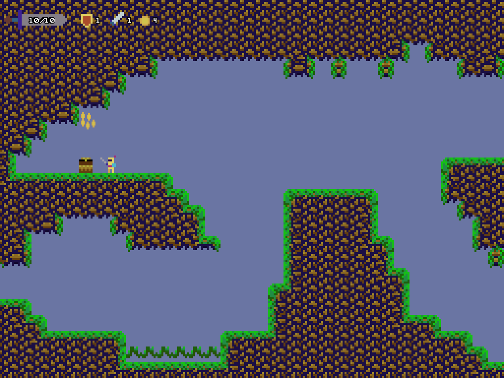
- I really liked the Stone of Returning combined with the shop mechanic. It made it super convenient to go back, purchase upgrades, and get back into the action. That said, I think the design would have felt a bit more Metroidvania-y if the town had served as more of a hub zone that you returned to naturally rather than teleporting. As it was there was very little in the way of backtracking, especially in the latter half of the game (which, given its distance, I understand why the Stone was necessary).
- I don't know if it was a purposeful decision or not, but having variable jump height would have been nice. There were some rooms where I'd launch myself into ceiling fire or ceiling spikes because I couldn't control the height of my jump.
- On the wall grab, I think it still needs a little something. The character's jump is so high that waiting for velocity to slow down means I could be pressing against a wall for quite awhile before I'll ever grab it (and inadvertently jumping straight into enemies when I wanted to grab the wall below them). I think some secondary checks around time pressed against the wall or something might help with this - it's really just because of the extreme character jump height though.
Oh yeah, and before I forget, the final boss was a good time. Once I figured out the safe zones I made short work of him, and the ending cut scene / post-credits scene were *chef's kiss*. Very good job!
Thank! I agree with your feedback. If I had put more time into how the map would look overall, I would have had it more towards the middle or desgined around its location rather than outward. I still havent implemented variable jump mostly because I messed it up the last time time I tried and it was a bit buggy. I think it would randomly boost you or something at the apex of the jump. Since then, I've shyed away from it. And the wall slide definitely needs more refinement. First time implementing it, so theres room for improvement haha.
Quite a funny little game, seems to me like you nailed everything.
The different areas increase difficulty very well, the crisp controls compensate for the close combat that is always more risky, there is reward for exploration (so much that I had to go back to see what were in the rooms that I hadn't explored in my first playthrough), combat was well done, and a good dose of laughs at the end.
If I had one thing to say, but it is just me nitpicking, it would be good to have an indicator of health on the final boss just to know if you're halfway through the boss or almost finishing it. But that's just a detail and does not change my rating at all.
Congratulations!
Thanks for the feedback and playing! I'm glad you enjoyed it. Regarding the boss, that was my original intent. But by the time I got to making the boss fight, I wondered if it would stick out as an inconsistency compared to the rest of the combat. So I just said, I'll stick with being consistent. I am working on tweaking it for the SMVM, so I'll probably make that change now that its been mentioned. I also want to add different difficulties. It was set up, but I didn't have enough energy to fully test and balance multiple difficulty levels.
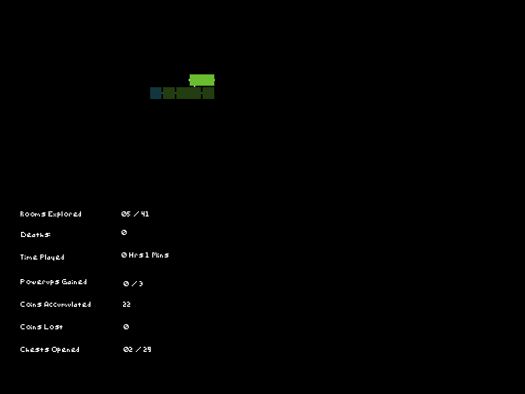
That was fun! You kept your scope small (or "classic") and just polished what you had really well. The pixel art is cute, I especially enjoy the bounciness of the slime enemies. Movement feels good, especially once you get some upgrades. Combat is simple, but getting freedom over what stats to upgrade keeps it engaging throughout the game. Most of the critiques I have are rather nitpicky, but here they are anyway: I wish enemies dropped their gold sooner so I didn't have to wait for their death animation to finish, some enemies are a bit too close to screen transitions so I bumped into them when going between zones, and I wish there was a clearer "point of no return" before the final boss, because I finished the game with 40/41 rooms seen, and I never got to back to explore that 1 room.
Oh yeah, and the ending made me laugh out loud.
Very solid job!
Thanks for playing and the feedback! The gold dropping timing was a bit of trial and error. I toyed with which state to put the spawning of coins in. I think the real fix would have been making death animations shorter. I like them and death animations I always find fun, so they tend to be a bit larger than other anims. Regarding room transitions and enemies, I do try to make sure that the player doesn't feel like it was cheap shot, but I always miss one or two. I also made the assumption that the player would recognize the end room by its size, a save spot, and chest. It was one of those assumptions where I was partially wrong. It seemed like there was a mixed reaction with playtesters about that as well.
And yeah, I laughed out loud when the image of the final scene popped in my head and usually if something makes me laugh during development, 99% it goes into the game.
Once again thanks for the feedback. It definitely helps!
Sure, happy to provide it! In case you wanted something more specific, one of the rooms I remember getting hit on a transition was the very first room after the town, when I came in from the right. I wanted to go back to the town after rescuing the smith (before getting the orb) and the slime is all the way on the right of the screen. I had plenty of health, so it wasn't a huge problem, but it did stick out to me in an otherwise very polished game.
Oh my god. I meant to remove that one, but it slipped by. It was placed there in the very beginning of development for testing and then I was going to remove it. Oops haha
I really appreciate the commitment to the theme, to the extent of having the controls in a manual in the description rather than the actual game. There's quite a lot of attention to detail in this regard that really brings this theme to life in this game, and the game is just so cleanly executed in its vision, that there really isn't much to critique. This is like a perfect example of what a jam should be, a concise, cleanly executed vision. As someone who's guilty of going overboard in terms of ambition a lot when it comes to game jams, a game like this is a really strong example of what can be done when you just have a strong and simple vision.
Thank you for the kinds words and playing my game!
Neat game! Don't have a lot to say, the cutscenes were very comedic, especially liked the ending lol.
One thing maybe, the backgrounds were a little repetetive which would make it hard to navigate if it wasn't for the map. Loved the remaining art though, super simple and sweet!
Thanks! I agree with the backgrounds. I'm still figuring out pixelart and when I attemt background art, it looks horrendous still. So thats on my list of things to improve on.
AWESOME! I got a surprise for you too Dan... I made a youtube playthrough for what my screen share can handle. Was excited to see some other developers in here I remember from previous game-jam! I gave this a 4/5 on first play though. Will upload the short play-though here soon! Great job. Simple and profound games here Dan!
Great job
Gamepad support, controller/game-play maps and simply and to the point. I loved the last game and this was just as good with a nice different story play and idea. Sorry for the my bird in the background, and horrible soundshare on my playthrough. Love the retro/pixel vibe and overall always producing a solid product here that is fun/easy and to the point
Thanks for the feedback and putting the extra effort to record some gameplay. And yeah, I remember you too! You were the only other person to do a duck themed game in MVM 22. I remember specifically how bad I felt when I couldn't even get past the beginning because I couldn't figure out what to do. I felt like I had failed you lol.
I'm not recording during this jam because I'm sick and feel like death. But yeah, I'll get your game. Hopefully I'll be able to provide more feedback than last time!
Oh, and I meant to update the page controls to mention the attack button was also the ui accept button. K isn't very intuitive to starting a game when using a keyboard and I think on gamepads its more intuitive to make the bottom action button be the "accept" button. Just one of those things I made during dev that I didn't think about until people started playtesting it.
I really enjoyed this. the knight is quaint and has character. Great work!
Thanks! As you give feedback to other games, try to be more in-depth with your feedback. Provide more detail in what you liked, what didn't feel quite right or what stuck out in the game. Feedback is very important in jams and helps us all to improve as developers :)
Apologizes for lack of detail! I wasn't sure if this would post on the games main page and didn't wanna clutter the page with a bunch of specifics or spoilers n things. (1st game jam tings lol) ANWAYS I found the movement and progression to be very rewarding and engaging. I didn't spend much time exploring but after I finished I had only missed 1 room and 3 chests. I really enjoyed your wall sliding with the sword. it feels and looks great gives a great dimension to the platforming aspects to the game as well. I did find it a lil hard to consistently attack where i was intending cause he's such a lil guy, but I am torn cause I love that he's a lil guy and should have a lil attack. I spent all my coins upgrading my attack power and ignored defense and was able to really start taking enemies out. were I compelled by a few more bosses I'd probably be grinding out to see if there's a max to any of your stats.
Coins pop out of the chests so satisfyingly that I felt so bad if any disappeared before I could make it to them.
The ending was a nice touch and quite funny, had me chuckling.
The Adventures of Link style homes immediately had me trying to walk thru the doors.
Haha thanks. Yeah regarding the attacks and small character size, I tried to really give the player a bigger hitbox without making it too big. I knew going in that would be a possible downside, but I liked that character art too haha. And I did plan on having the player go inside, but when I got to that point, I knew I didn't have time to do it and make sure it worked all correctly.