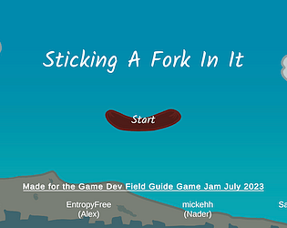
Yes, the game doesn't start unless there are two players playing. We ran out of time to put a bot in there. Sorry!
Draekdude
Creator of
Recent community posts
Hey, thanks for the play! Also thanks for the feedback! Yeah, I had a ton of clues, etc. ready to add into the game, but had a few game breaking bugs I had to fix and then wasn't sure if adding content would be OK. So I'm planning on doing that since it's sitting in a doc here on my PC to help fill out the story. What happened in the dark room? I had a gitch where you could get stuck in the wall from the vessels, but I thought I fixed that. Thanks again!
Fun game! I gotta be honest, when trying games for the first time, I really feel that all text should just be able to be skipped. It was hard to read and in tiny segments my wrist started hurting from continuously pressing the J button. I think if you set it up where the dialogue was short, but you could go back and talk to the NPCs more that would have been much better. I would also liked to have more standard control with return and space used instead of J & K. Art was really cool and the retro feel was awesome. Well done!
Interesting game! Since it was kind of two games together I'll rate them separately. Although a volume control for both would have been really nice.
Phase One:
Pros:
Simple controls, easy to tell what to do
Cons:
UFOs didn't seem to know where you were, so there was no reason to move your humans unless they were randomly lining up above you.
Way too simple. Needed something else to keep the player engaged.
Phase Two:
Pros:
Story was engaging. I wanted more of this.
Art was fun.
Cons:
I didn't know X advanced the dialogue, so I quit. Then I played a second time to see if it mattered if you avoided the UFOs and found the x button advanced the dialogue.
Too short, really needed a few more people to interview. Really interesting concept.
Thanks!
Julian
Man this was great! I wasn't quite able to figure it all out, but I want to go back and play some more of this later. My constructive feedback would be:
Pros:
Menu was awesome, I loved the effects and just how well it fit the game.
The concept is excellent. Funny, fun, engaging. Well done!
The controls themselves felt good.
Art was great, hilarious using the same faces.
Cons (just a little tweaking could easily fix):
It was a little hard to tell what options you had other than just attacking the guests. I didn't even know there were humans in the room until after attacking about 6-8 characters, since I would attack them and then they'd catch up to be and get me.
I have two monitors and during the game when the mouse disappeared it was still moving in the background. Every time it went to the second monitor I lost control of the game. I also had that happen with the menus, sometimes if I clicked next to the button the mouse would disappear making it hard to select something. Nit-picky, I know. haha.
Overall, I loved it. Well done!
Thanks for the feedback! I'll check that part out. When I was testing it the robots always forced me through the door (which is where you want to go) but I must admit, I didn't test the entire game towards the end as I over scoped myself. I'll see if I can fix it and will let you know in case you have time to try it out. Thanks!
Great feedback! I had door sprites that I just ran out of time to implement. If you were following the Director, most doors should be unlocked and you can use the interact key (E). If you're helping Naomi (which now that I think of it, I'm not sure I ever introduced her) the doors are locked and can only be opened by computers.
Fun game! I liked the use of a checkpoint. I think a progression system for your attacks could help break up some of the monotony you get in the game. Maybe different spells? Or power ups? Something so you don't just have the same attack over and over. Or maybe a special "freeze" attack that stops time for a couple of seconds to allow the player to get out of a situation. The dash was nice, but it seems like you're not invincible through the entire dash as I was passing through a spider, he moved with me and I died before I had stopped dashing. The core of the game was well done. Good job!
Nice short game! At first it was hard to tell what I was supposed to do. Then I saw there was an axe attack. The animation doesn't really look like an axe swing animation, but it works. I found that if you just walk all the way up to the tree they can't hurt you and one hit from your axe and they're dead. So I got bored after a ten or twenty and quit. The game was so simple, I wonder if adding another mechanic or making the trees move faster or changing something after a while could have helped? Also, if you walked to the edges you got stuck. Anyway, well done!
The game was fun and the voice acting was great! If this was done just for the jam, it was very well done. Some feedback: 1. The camera angles can be wonky and since they just SNAP to the next camera, it can be disorienting. I would use a transition between cameras to help this out. Or even allow the player to control the camera. 2. Since it's kind of a zoomed in view, I never really could tell where the coin trick would even help me. If the camera was zoomed out or if the player had control instantly the coin mechanic becomes more valuable. 3. The coin should make some noise. It was hard to tell that it did anything. Also have the guard say "What was that!?!" telling the player that the mechanic worked. 4. After getting past the guards the rest of the level was a cake walk. Maybe stagger the cameras? We want the player to have to do something, not just walk along the wall knowing they will not be spotted. 5. The ending was odd. You get to a door and you can't even tell if the player opened it. I did click on the door after I got there and the game froze so I had to redo it just to make sure that was the end. Anyway, well done!
Fun game. I don't think it used the theme at all, but it was fun. Of course I've played a million break out games, so this isn't something new, but it was a good remake of a classic game. The graphics were good, especially if you did them yourself! The sounds were OK, but I think they could have been expanded upon. Audible cues when your paddle changes would have been great! Especially when the paddle would change back to normal. If you're watching the ball with the big paddle, when it shrinks back to the small size, an audible cue would give the player an indication that the paddle is now normal size without having to look down to see. Another thing that would have been nice would be to know what the power ups do. So maybe some text like "Big Paddle Power Up!" or something. I think text would make it easier for the player to then associate the power up symbol with the functionality. I would have also liked to see power downs. In breakout you get power ups, but some times you get power downs. So you have to be careful to only grab the good ones in the harder levels. I would also like to have seen several levels. I think each level should be a bit faster and harder allowing the player to progress and really be challenged. I couldn't really tell if the second level was harder than the first. If you wanted to spiff this up a bit, you could also add an online leaderboard. That would have been cool to see my name on there and then check back in a month and see if anyone beat my score.
Anyway, it was a very solid working game. You should be proud!
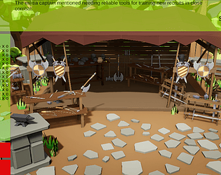
Thanks for the great feedback! I must admit, I cheated when it came to the layout. The free asset pack on the Unity Asset store had a sample scene and that's what I used. I placed the camera where I wanted it and then added a large stone fence behind the shop so it wasn't just black. Yeah, I contemplated doing labels, but in the end ran out of time and put my last bit of time into adding more rumors. I started with 5, but then thought that having a bunch where the game would just grab 5 of the bunch would be better. Is the text you're talking about on the Main Menu? I totally forgot to use backgrounds on that scene. Thanks so much for the kind words and for playing it!
OK, gave it another shot. I killed a few bosses, but would get smoked shortly after getting near the next boss. One of the issues I had was navigating around the platforms. I would get stuck and have to turn around just to get smoked by a bunch more enemies. I think if the difficulty level built, rather than being very difficult the entire time, it wouldn't be as frustrating. I mean, bosses are meant to be more difficult than the surrounding enemies, but the surrounding enemies were almost always the ones to wipe me out. It was fun though and interesting!
Checked it out now. Unfortunately as soon as you take damage the game crashes. But at least I got to see it! I ended up getting a third of the way (watched MurphysDad playthrough), but there's a point when you're in a corridor and there are two enemies behind you and when you jump over the next, since they turn around immediately they end up running into you. My feedback would be much of what I've seen before. Jumping is too floaty and running might be a touch too slow. Enemies should allow you to at least land before they turn around. I would have liked a few shorter levels rather than one very large level. Also, I skipped over stuff. If it's a speed running game, why have sections that can be skipped over? Was there something worth going into?


