Indie game storeFree gamesFun gamesHorror games
Game developmentAssetsComics
SalesBundles
Jobs
TagsGame Engines

Fabia Figueras

79
Posts
1
Topics
1
Followers
A member registered Jul 30, 2020 · View creator page →

Creator of

Recent community posts

Hey thanks for making the video! It feels strange but amazing at the same time as it was my ever first jam and I did not expect a video on it. 

I've been thinking on maybe adding some levels, but I would like to redo all the physics, because some part of it it was rushed and you could get stuck too easily (luckily you did not found those problems in the video :D ). 

I'll think and see what I want to do, because I liked the gimmick of not being able to go back to previous forms.

Yeaah... One thing I should implement is auto shooting (someone else commented on this too). This could put more of the player attention into the barrier. The rotation speed should be faster too. Thanks for the criticism!

Loved the idea and the art style. Good use of the limitation too with the jump animation. The lights gave the game a nice atmosphere. The only thing I could complain is that some of the platforms were too narrow to do the change comfortably, but they were only some of them. Good job overall!

Great game, simple yet addictive and rewarding. Great use of the Pico-8 engine. The controls felt smooth and never out of control (apart when you start dashing everywhere but its no problem there). Maybe you could add some powerups or health pickups?

Loving the animations and style. Feeling like the  platforms are times were too random and did not follow any plan. The colors are not explained properly so I was missing some kind of tutorial. I saw you have plans of following with the project. I encourage you to do that, you have a nice base.

The music was pretty epic. I'm missing some kind of instructions/manual inside the game to explain some of the mechanics in it.

Nice idea. Multiplayer would definitely improve the experience a lot. One thing that was not clear to me was what happened when getting hit, as I did not notice a diference between getting hit or not. Overall, good job and I hope you continue expanding it.

The collision problem makes the game feel bad at some point, like you should make the jumps but instead you get stuck. If you fix that the experience would improve a lot. Having jump on Space felt a little off. I could find myself pressing W a lot and then failing due to it not being jump.

Simple but effective on the use of the theme. Some of the levels are a little to hard, 

The concept reminded me of an old game (that I cannot remember the name now ^^') where you had to set orders to make them reach the finish. Nice presentation

Nice concept. Could be more fun if we had other mechanics apart from movement (bigger paint area, more blobs, instant color, etc) so you can have more replayability. But for 72h it's a good start

First things first, the controls can be improved a lot. Strange key layout. If I tried to jump at the edge most of the time the jump did not register. Losing all progress when falling is a little to harsh if you take into account the controls. Apart from that, I love the artstyle, it gives the game a totally different feeling from the other jam games. If you can improve the controls and maybe add some checkpoints, you have a great thing here.

Nice concept there changing the layout with the colors. Cool twist to the theme. Going back to a room and making new enemies appear can confuse a little, but the game feels great, although being simple. Some instructions inside the game could be an improvement too. Good job overall!

Nice concept! Started easy but each new level you had to think more and more about your movements and rotations. One problem being that at one point the game gets repetitive. Maybe you could add some mechanic (new block, faster blocks, block some path). But overall, great game and nice polish

Too chaotic at times due to too many things on screen, but good concept. Good job!

Thanks for the comments! I tried making columns of enemies but the problem was that the enemies in the back were shooting too, so at some point you had to block different types of bullets at the same time and it was impossible.

Automatic shooting could be a big improvement, I could see that being implemented.

Now the game works perfectly! I liked the art style, evoquing old times. I could maybe see a score counter so I can try to beat my scores and maybe some way to know my life (if I have any and it's not a one hit kill, I'm not sure). But overall, well done!

I wanted to add powerups but time got me and I had to release something. One of the planned powerups was a triple shot where the side shots would be inclined but I could not make it in time. Thanks for the feedback!

Could you check if the same thing happens to you with the downloadable Windows version? I'll try to reproduce it if I can and see if I can fix it somehow.

Good job on the theme and the limitation. I liked the idea of having a puzzle and seeing how I can do it to infect everyone. I didn't like that sometimes you have to be super fast changing the blocks or otherwise you lose. Changing it so you have a 'preparation' phase first, where you put the blocks where you think will be good and then an 'action' phase where everyone will start moving could make it better and not frustrating in some levels. Good job overall!

The concept is nice, but having that many tiles makes it difficult some times to remember what each one means and how they interact with each other. I could see it help if you reduce the number of them and maybe add a simple symbol or something to them so the player can remember what they do without having to go look at the instructions.

Good play on the theme. The game is enjoyable and replayable which is nice to have.

Nice use of the theme and good job on the limitation use for the particles. I could see the explosion size reduced a bit though.

Simple mechanic but effective. Nice job

Good job on applying the limitation. The controls were a little infuriating at times, but good job.

I could see some good things happening with the mechanic of painting the floor, but unfortunately you couldn't do more. I encourage you to continue trying and see if you can finish the project!

Good concept and play on the theme. I've still have nightmares about some of the temples in FFX but atleast your game was easier than those

Good concept, but the controls where sometimes not great and I had some circumstances where the effect of the paint did not work.

Great use of the concept. I really like that you have to focus on the color or otherwise your victory changes lower (although when I needed one color it never spawned, but at this point I assume my bad luck will never leave my side ^^'). The ball movement were a little chaotic some times and even making you lose color recharges or blue cubes, but overall I had a good time with the game. Congrats!

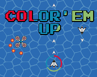
Unfortunately, the game froze after I saw the first enemy plane. I liked the screenshots and wanted to play it (it had that Star Fox vibe) but couldn't.

I had some problems with the resolution of the game. Could you try playing in fullscreen and see if you can see everything there? My UI was badly coded and if I changed the resolution this happens. Hope it can help

Nice concept. Maybe 3 tries only is a little to harsh due to the size of the board. Would love to see different boards to give it more replayability.

Nice concept. The keyboard scheme is a little strange, but good job overall.

Loved what you did with the theme. It's a pretty relaxing game but it gives a lot of satisfaction when you go piece by piece forming a beautiful color gradient. Amazing job on the game!

I really liked the idea and obtaining the power after each boss made so you are not overwhelmed by mechanics at the start of the game.
One big problem is the lighting. I could see it was an art decision, but it was difficult seeing what was near and what was far, due to the colors being the same when looking at two objects at different distances.

Fun concept but I think that some information is lacking, like what each of the colors does. You can see it by play testing, but it should be easier for the player to know what happens when you collect them. Good job

Nice presentation! The game is simple but fun, good job!

Good job on the limitation, 2 frames but you can still see what everything does. I had some problems with the terrain hitboxes though.

Cool concept, although I wouldn't really mind a warning or something before changing color, as sometimes you're too focused and when the color changes you can't change direction fast and that may cause you some problems. But I liked what you did with the theme!

Perfect, thanks!