Sorry to hear that - it is possible to get yourself into an unfixable situation, and unfortunately how it was designed ten years ago was to just restart.
josefnpat
Creator of
Recent community posts
> although sometimes I had to find a very specific tricky place where the wrench would work.
Yeah, the engines were added in the last hour of the jam, and didn't get the TLC the rest of the game got. We found the bug too late, and didn't have time to fix it.
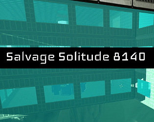
> Good game, I was surprised to see a polished 3D first-person game made in 3 hours!
Thank you for playing! Glad you liked it :)
> Ah, good old POLYGON Sci-Fi.
Obviously 3 hours is not enough to model all the stuff we wanted in the game, so we had to compromise by using an asset pack. Good eye :)
> think taking just a little bit of that time for recolouring or postprocessing would have made it look really unique?
That would have been a really great addition, you're right. We were panicking getting the game in one piece in 3 hours per person, so maybe next time :O!
>I had no problems navigating the ship, never got stuck on anything.
Don't jump out the window, whatever you do. 0 bugs.
> highlighting was very clear and the level had good sightlines so it wasn't much of a problem.
Yeah, that was a focus, as I didn't want players to just sit in one room, but also needed them to see everything in the ship. Glad you liked it!
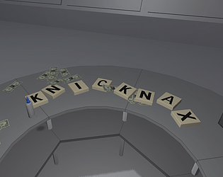
Very cool idea! I love the vibe that this game gives. I wish there was a mechanic that would make the font worse, or change what you're writing when you perform the wrong action, or don't write in the light - that would have been pretty silly. Also nice that you were able to submit to two jams! Nice work!
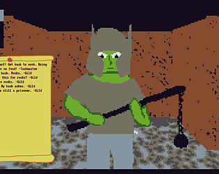
A nice demonstration of a visual novel system! The crocodile had me laughing. I loved the art and the music fit the theme really well. Maybe a bit more polish on the sound effects, considering they play constantly as you read the text. Nice work, hope you make something else with this framework you've made!
This is a really amazing entry! The music fit really well, the art was fantastic and exhaustive, and the poems perfectly fit. Some minor design complaints, like putting black text on a busy background, but honestly, this is just fantastic regardless. I can tell you did a ton of planning before making this game, great work!
Very nice usage of the Unity UI system! Not a big fan of the mixed fonts, and a lot of buttons are not hooked up ... but ... sometimes accidents happen :) I found having the modifiers next to your stat scores really confusing, because you never really used them. I wish I could see the dice roll to see how close I was to making a task. Regardless, nice little story for 4 hours!
I love seeing 3D in microjams like this! I love all the little bits you've added, including the changing colors on the loops etc. The controls are very hard, and I found my best performance was if I tapped spacebar instead of held it. Music fits well, wish there were some sound effects. Great work for 3 hours, hope you take this further!
Thanks Eldwood - I am now tracking your issue [here](https://github.com/josefnpat/roguecraft-squadron/issues/905)!
This is incredible, thank you so much.
Having spent years on this game, a lot of your critiques hit home - with such a small team, it's always hard to hit everything on the nail. Merely the fact that you have so much to say tells me a lot as well.
While RCS is no longer in development, I thank you so much for taking the time to review this. It means a lot to me.
If you're interested in any of my other games, please check out https://josefnpat.itch.io/yoko-redux
We've spent two months on it, and the UI/UX is much much less complex than a RTS game :)


