Play game
YOKO REDUX's itch.io pageResults
| Criteria | Rank | Score* | Raw Score |
| Use of the Limitation | #6 | 4.433 | 4.433 |
| Presentation | #9 | 4.233 | 4.233 |
| Overall | #12 | 4.000 | 4.000 |
| Concept | #19 | 3.867 | 3.867 |
| Enjoyment | #32 | 3.467 | 3.467 |
Ranked from 30 ratings. Score is adjusted from raw score by the median number of ratings per game in the jam.
Team members
4
Software used
Unity3D
Use of the limitation
Shaders
Cookies eaten
Mathf.Infinity
Leave a comment
Log in with itch.io to leave a comment.



Comments
Interesting game! I really enjoyed the sense of humor. Bold visual style choice, though all the blues made it difficult for me (I'm colorblind). The red definitely stands out though, which is the important part. On that note, I think the game would benefit from having slightly more straightforward puzzles, offset by also having many more interactable objects. I appreciate that all of the dialogue is voiced over, though if I'm being honest I would go with a different voice actor.
The "salt and hash" bit didn't make a lot of sense to me, though that could just be a missed reference on my part. One of the biggest things I felt was missing from the game was a sense of pressure; some kind of suspense, hook, conflict, or driving force that compels me to get to the end. It felt kind of like The Matrix - without any agents.
With some polish, a better voice actor, and a sense of pressure, I could totally see myself spending $5-10 on the full version of the game. Best of luck to you guys!
Thank you for the honest review! I'm glad you liked it - we're very much considering making this into a full game :)
Thanks for the feedback!
Existential android noire, not was I was expecting, but certainly unique! The camera jerking was a bit harsh, and I ended up backing up into oblivion on stage three, but props for putting together something with atmosphere. That's hard to do when you have all the time in the world, much more so when you have three days. Kudos!
I'm glad you had an adventure! Thanks for playing!
I love this, you've made such a good job !
The aesthetic is so nice, the atmosphere work perfectly, the voice acting is on point, and the narrative is really good too
My only complain if I had to find something to say would have been character controls, wich have caused me some hard times. But it works so well with the camera angles and the way the rest of the game is made. That it just goes well with the feeling of the game in itself so you're not even mad about it when you struggle with this.
Good job, as a game designer aprentice this is the kind of work that inspire me a lot and makes me want to work harder
Thank you so much for the kind words! I'm glad you liked the game :)
Woah, the production that went into this game - the voice acting, the environments, it was all real good! The colour palette worked very well too, especially in a 3D environment. One complaint I have is that the camera controls felt a bit disorientating, and some text boxes felt a bit long, especially when I accidentally had to listen to it all again, but overall it was a great experience, and great work!
Thank you, glad you liked the game!
Really ambitious project, so there's a lot to unpack here. I felt that it was well done, so I want to do it justice by being thorough here. All the little nitpicks are meant solely as constructive feedback. It's clear you guys put a lot of love and effort into this, so just know that this doesn't mean I didn't enjoy the game.
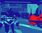
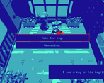
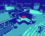
The visuals are really great, the low-poly atmosphere came together really well, and the music really helped sell the mood. The use of bright red to contrast the blue was used tastefully, so I'm glad it didn't end up being a major clash with all of the cool blue. I'm surprised how much modelling you were able to churn out in 3 days, so the fact that you were able to take all of that and also work all of that into your design is very impressive.
For the story/pacing, I felt that the scenes overstayed their welcome just a bit. The intro could probably be made so the narration and credits are going at the same time, as when the game crashed near the start of the game*, it felt a bit tedious to have to go through it all again with no option to skip. The VA could use a little work; it seemed just a little too dry at times, but even putting in VA at all must have been a pretty large chunk of time as it is. For the interaction system, I expected that, when I interact with an item that prompted several chunks of dialogue, they would be reset when I start interacting with another, rather than me having to keep hitting space to roll over to what I'm actually trying to interact with. Not a huge deal, but a small QoL thing.
The controls definitely took some getting used to. I understand now that, because of the static camera angles, making the character move along the actual direction of the keys could end up being disorienting, but it did feel a little clunky at times.
Gameplay was pretty enjoyable. Like I said, the atmosphere was done very well with the graphics and audio, and it generally wasn't too hard to get through the game. There was one point in I believe level 3 (?) that started getting frustrating though. When I had to find the area to input the trojan, that small area wasn't very prominent or noticeable, and I only found it by accident after about 5+ minutes of searching all of the rooms. I could just be dense and maybe others found it a lot quicker than me, but that was just my experience. Just as a note, there was also a corner in-between (I think) a vent and water-cooler that I almost got completely stuck in.
All-in-all, this was a big feat that you managed to accomplish in 3 days. I respect the major effort put into this, and it turned out as a very solid game. Great work on this!
* -
I think this was when I interacted with the terminal near the start a few times. I'll try and replicate it in a bit and edit this later if I canI see now that this was meant as a joke when I re-read the dialogue. As funny as it is, like I said, the long intro and having to restart so early after only interacting twice is a little rough.Thank you so much for the huge response!
I really agree with a lot of things you said here, but I will pick out a few things specifically to respond to:
> I'm surprised how much modelling you were able to churn out in 3 days
While we did do the level design and the character assets (along with rigging!) we actually used some low-poly asset packs from [Synty](https://assetstore.unity.com/publishers/5217). I think the shader saved our butts, as it kept the style really consistent, but not immediately recognizable as an asset pack.
> as when the game crashed near the start of the game
Yes, I'm a bit of a troll. The first time you use the terminal, it says "I better not touch it again. It will probably crash." and then it sets a flag. If you use it again, the game quits, as if it crashes. I know, a bit mean, but I thought it was kind of funny. Hope that wasn't too frustrating for you!
> The controls definitely took some getting used to.
We took inspiration from old point and click adventures like Grim Fandango with something called "Tank Controls". Some people love them, some people (reasonable, imo) hate them. If we had more time, they'd be gone!
>All-in-all, this was a big feat that you managed to accomplish in 3 days.
Thank you so much, I'm glad you liked the game!
Ah, I see. The shader definitely made it all feel consistent, so that was a smart move! I mean, I'm definitely not going to judge for using asset packs, I
abusedused a single sprite-sheet and font from Kenney for my game - as I can't do art to save my life, let alone do enough of it for a 3-day game jam. Especially in 3D!"Tank controls," that's what it's called! I knew there was a term for it, but I was struggling to remember, haha. I didn't hate it, per se, and like I said, I totally understand why it was a bit more practical for you to use them. I respect the homage to classics.
Incredible visual aesthetic and I think the limitation really brings out a strong visual style that works well for this game. I thoroughly enjoyed the presentation and the narration of the main character. The dialogue was very dry but funnier more so because of it, I was very engrossed in what was going to be said with each interaction.
The overall feel very much gave me enjoyable vibes of that to the golden PS1 days. Controls felt nice and the gameplay flow was consistent and balanced. I loved this game. Great job!
Thank you very much! I'm glad you liked the game! It's nice to hear the PS1 vibes. It's cathartic.
An amazing game! I loved the fixed camera angles and the color palette (Alone in the Dark meets Another World). The deadpan quotations of the narrator are hilarious!
This game as a strong memetic power: if properly expanded and polished, it could become a new "Stanley Parable".
I'm very happy that you liked it! Stanley Parable is one of my favorite games, so I'm glad you made that reference!
If you downloaded the windows build, and didn't have a grand adventure, there's a chance you ran the older build, "Yoko2.exe" - I have since updated the zip, but you want to play and rate "YOKO REDUX.exe"
Really cool game and concept. But I found the camera system a little disorientating and annoying. But otherwise, it was pretty good.
Thanks for the feedback :D
Truly a unique game
Whoa! Thanks for checking it out!
I loved this! The game felt very detailed despite only using 5 colours and the cube was very nice. But the game felt a little slow. Amazing game none the less!
I'm glad you liked it! Thank you for playing.
The mac build is not working for me. I really would love to try this game, from the comments it looks really exciting!
I made a big boo boo. I made the mac build, and forgot that windows strips all binaries of correct permissions. I have corrected the mac build, and uploaded it (`YOKO REDUX [gamejam_mac_d7b9758_rc1].zip`)
Thank you for pointing this out, and I hope you'll try the game!
Hey again, I played your game on stream and made a recording as you probably know. Here it is.
Thanks so much for doing what you do! Was super fun watchin you play through!
Thanks so much, that was awesome!
Beautiful game art and use of the limitations. Combined with the music and voice acting it really help to immerse you in the game and story.
Only thing to improve maybe was the movement controls that felt a little off sometimes and some long transitions between dialogues and scenes.
Congrats to the team for achieving so much in a short amount time.
Thanks for the feedback! We'll definitely be fine tuning them janky movement controls!
Loved it! The world felt large and full of detail and the colors worked wonderfully together. Levels were was well laid out and always felt like there was more to explore. Great game!
Your praise is greatly appreciated!
Oh. My. Glob. Please tell me this was the real Cyberpunk 2077. It will have made it worth the wait.
It is a kind of love letter to the PS1 era. The overwrought navel-gazing dialog. The outrageously earnest soap-opera voice acting. The dramatic camera angles. The primitive tank controls straight from Resident Evil 1. I couldn't stop laughing.
In addition, the color palette is just gorgeous.
Unfortunately, I hit a crash at the beginning of Level 3, during the stapler monologue, which doesn't allow me to continue.How eloquent! Thank you for the kind words! If you can tell me how it crashed, I'd love to know! I'm glad you liked the game!
Well, as the monologue from Office Space was running, the voice over suddenly cut out. The camera angle was transitioning from one screen to the next, but my character never reappeared. I tried spinning and moving in every direction, but I couldn't get the character back onscreen.
FYI, I'm running Windows 10.
Watched it on stream. Superb, really polished. 5/5 ☜(゚ヮ゚☜)
Glad you had fun! Thank you!
What a monolithic undertaking for a jam. Well done lads. The voice acting was great, the level design + art was interesting, and the references were fun (especially the companion cube bit). My only critique would be the non-camera relative movement - That took more than a sec for me to adjust to. (I'm also not sure if I missed it, but does the player ever get that serum that was mentioned? - I figured it would be after the password bit, but the game restarted).
Yeah, tank controls are an old relic, aren't they? If we press forward, we'll probably add point & click to the game! Thank you for the kind words!
> I'm also not sure if I missed it, but does the player ever get that serum that was mentioned?
There is no serum, it's a mcguffin <3
Oh god! Sunshine teach us more things about life ! Cool gameplay, I like thos type of gameplay, nice narration, nice ambiance, everything is great!
Sunshine, teach us more! Thanks!
This was amazing. The graphics, environments, camera shots, and even how the text appeared was great to see. The ambient music helped place me inside the game and the narration was a nice touch
I'm glad you liked it so much! Thank you!