Indie game storeFree gamesFun gamesHorror games
Game developmentAssetsComics
SalesBundles
Jobs
TagsGame Engines

sophieisconfused

113
Posts
A member registered Jun 12, 2020 · View creator page →

Creator of

Recent community posts

It should also change based on whether the country is near or far away from your territory.

The postjam patch is now out, if you're still interested.

Replying here to let you know the 2.0 patch is out.

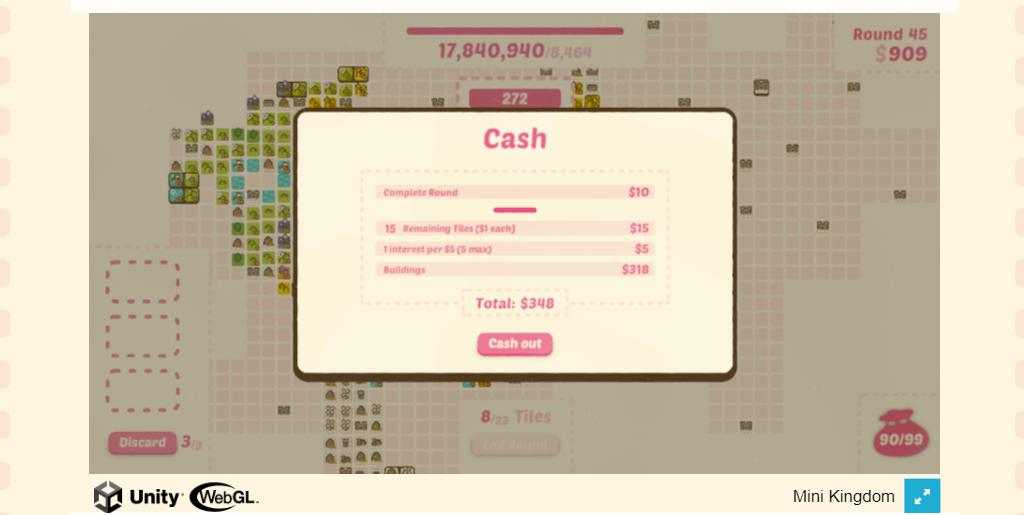
Remember, balance doesn't necessarily mean fun. It's insanely satisfying to watch the score grow into the millions. That's what makes balatro fun, and it's what makes this game fun. (I just spent an entire 3 hour class playing it again up into the tens of millions.)

Oh also, I definitely would recommend scaling more exponentially. You could take a page out of balatro's book and have a set standard number of rounds to win, or you could just scale it super steep and add a leaderboard to see if someone finds the limit to what's possible.

In case you're wondering, I scaled to absolute insanity by taking every single "add 2 to prairie each time it scores" and "add stars to terrain" option I could to build the GIGAPRAIRIE. I also got lucky and collected some "if the size of this terrain is greater than X..." added on.

One tip to make these strategies less busted. Make reroll cost scale rapidly per round. I got to a point where I was racking up crazy amounts of money to the point that I could reroll and buy everything I wanted a dozen times, increasing my power level and chance of getting what I needed super quickly.  I basically bought every prairie and prairie buff to the point I could guarantee they'd appear first draw every round.

Let me know if there's a limit to the number of rounds, so I can say I beat the game lol.

(1 edit)

I feel like I broke the game beyond all comprehension... (in the best way)

Or was it?

Gnomebert is simply the friendliest friend

I am in tears. I accidentally closed the window during round 14 and lost my progress.

Favorite game of the jam.

I knew instantly upon seeing the thumbnail description that this was going to be Rear Window themed, and I'm upset I didn't think of that first.

The black and white styling really works here, too.

My little piece of feedback is that it can be hard to remember how to get back to base. I would consider putting one of those little arrow indicators.

This took a while to figure out, but once I understood what I was supposed to be doing, It was a neat little competitive puzzle. 

The reset tooltip at the bottom of the hole is hilarious and useful! Great little detail!!

Overall, I love the concept here and there's definitely potential for a solid full release. The detail I like most is the flying money when you get hit. It makes the damage feel impactful.

The W to accelerate in space lanes either wasn't working or lacked any visual indicator that it was working. The ship stayed in the same spot on the screen and the enemies kept coming at the same speed.

The shooting mechanic is a bit clunky. The bullets either need to be bigger or faster to make it feel satisfying. As it stands, it's more optimal to just dodge enemies than try to kill them

I agree with other commenters that having gravity in this game probably wasn't the best move.  As you go down further, it's impossible to control the blobfish's momentum. If I were you, I'd turn off gravity and just allow the player to swim down on their own.

I found a small bug. Sometimes the sticky notes spawn partially off-screen at the top, which makes them impossible to grab. I had to reload the game the first time I played to circumvent this issue.

Here is a little tip. Your game doesn't actually scale up with the full screen button, so I would go into your game settings and find the button that says to allow fullscreen and turn it off.

You also need to put the directions in the description below the game. You can still do that now. I couldn't do the second level, because I don't know what button I need to change characters.

All of this is stuff you have to learn when you first start uploading games to the internet. I see that you're new, so no harm no foul. It'll just help your ratings for the rest of the jam.

Good job making something that works. That really is an achievement you should be proud of!

The speed of the bubble is a little bit slow, but I enjoy the concept greatly.

The description here says to build a structure, but the objects don't stack and under some unknown condition they disappear. What is supposed to be happening?

This is a decently solid little galaga clone. I think the shooting speed could be faster. It also doesn't say in the directions that you can hold the button. The game is way more pleasant to play that way.

This is definitely an underrated take on the character resizing gimmick. I like that the big boy ants have this sort of cocky bodybuilder look to them. I also appreciate that the color change makes it very clear which ant you currently control.

The splat that gets left behind when you die amuses me to no end.

The game totally violates separation of power, but I’m working with this as more of an alternate universe ethics sim rather than a civics sim. The scale is basically an unquestioned god in this universe, and the detective is merely feeding it information.

I appreciate the feedback. I did worry as I was making it about the time it takes to complete.

You’re also not the first person to dislike the hidden words mechanic, but I stand by the choice. I didn’t want this game to fall into the detective game trap where you’re just clicking buttons without thinking.

As for clicking back through whole conversations, you may have missed it, but there is a back button that backs you up from your current page. That makes it a little quicker to navigate and take a different path. I did consider a “journal” that takes notes for you of places to come back to, but I ended up cutting that for time.

All in all, you’re not wrong that the writing was ambitious, possibly to my detriment here. I underestimated how much time and work it was going to take, but once I’d concocted this story it was hard to slim it down any more than I did. I already cut two characters entirely, but I needed Dylan to be responsible and Lena for motive. At the point I realized it was a bit much for the time limit, it would have required starting over to remove any more.


Lastly, on the UX front, that footer was supposed to contain a settings menu with audio sliders and text accessibility settings. It ended up only containing the exit button, which I agree I probably should have just scrapped. That’s getting fixed in the postjam release anyways.

ah makes sense. I was trying to figure out if I was just doing it wrong, but I guess it was just bad RNG. RNGesus was not smiling upon me XD.

Aside from jamming to the soundtrack, I wanna add that it's hard to tell what scores and how much things will score.

I need a full length spotify version of that soundtrack. WDSTF is one of my favorite songs of all time I am livinggg.

I accidentally used anger management in the tutorial and burned all my red cards, nerfing myself the entire run. Might need some balance tweaks on that one.

The 1-bit style isn't really my thing, but it does kinda work here. It would be fun to implement alt color settings like Obra Dinn does.

I think the thing that's confusing people as far as tile placement is concerned is how to connect doors and how to determine what rooms contain. Your doors aren't clear enough for people to naturally understand them and line them up. For an idea of how to solve this issue, you can look at Betrayal at House on the Hill as an example.

Betrayal at House on the Hill

Each door has a bright yellow rectangle, making it easier for players to see them and understand them. In addition, the square is labelled with a symbol (also bright yellow) and text describing its function. Using these tricks in your game will make it more functional.

The music is definitely giving creepy horror doll. To fit that vibe, I would focus on adjusting the lighting and color scheme of objects to be a bit more dark, moody, and unsettling. I think this game has potential to really establish a spooky atmosphere with some tweaks.

It might be the pretty girls skewing my interpretations, but the style is really clicking with me.

What I don't understand is what do I need to do not to fail at upgrading rarity?

I got so lost so fast. having a lot of paths you can take right off the bat with interconnected chambers can be fun and exploratory, but it just led to me getting very confused. I think a smaller enclosed tutorial or more visually distinct areas/rooms might help.

This game is on at least four drugs. Which ones? I don't know.

Great job.

As other commenters have said, the execution of this game puts it above a lot of the other character rescaling platformers we've seen this jam. Well done. 

One nitpick. Sometimes my sizr changes involuntarily upon colision with a crystal. I don't know if that's meant to happen.

If I could, I would play this for hours. 

The reason I can't is because the CRT screen effect is making me dizzy and a little nauseous. If you end up releasing this game, please consider putting an option to turn that off in settings.  It's cool for sure, but it's made the game unplayable for me within minutes and I'm disappointed about it.

I definitely found the controls hard to manage on keyboard and trackpad. It might work better with a mouse.

The absurdity of making a wacky massive sword and swinging it around is so entertaining.

I think the CZ button layout is a little bit weird, but I don't know what would work better. 

As an aside, I wanted to chop actual grassssss.

I am actually very in favor of the pregame narrative. I think this game wouldn't be what it is without that. It's the secret sauce that makes this dish compelling, and if you decide to make a bigger paid release, that would sell people on it as a trailer.

Well done! Also, quick appreciation for the little sound effect of the beaver talking. I love it so much.