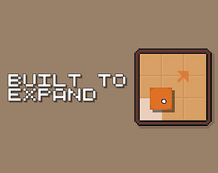
Regarding your suggestion, I did think about that, but didn't do it because then you could easily manipulate the shapes i.e. construct border with other pieces so that desired piece expands desirably and then removing the other pieces.
Witherik
Creator of
Recent community posts
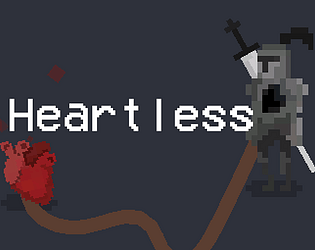
Found it very enjoyable until I ran out of upgrades, it felt challenging enough where I'd be excited to finally get an upgrade. Minigames felt very impactful at the start, where you increase your potential to get a good upgrade, but later in the run doesn't feel like they matter that much.
Personally I found the theme fit very well from a vibes / aesthetics perspective. The hero gives off Rocky-esque vibes, i.e. growing stronger, especially the poses after minigames, so I wouldn't write this game off as not fitting the theme at all!
Also bonus style points for sound effects, absolute gold :p
Yeah, I kinda ran out of time -> no time to come up with a good scenario, so it ended up being cheesy.
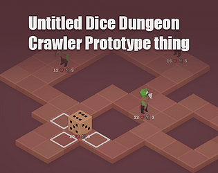
To beat it you basically want to always use 6s and always attack first.
Ideally I think maybe allowing the player and the enemy two moves instead of one, would've allowed for more interesting strategy, as of now the combat always revolves around getting yourself on 6, I think adding a drawback to higher numbers would be smart.
Never played a rogue like snake game, very unique idea.
The visuals look great, the snake pixels are perfect. The music and sfx fit the game very well.
The way you implemented enemies is very unique and makes for fun combat, I imagine there's room for even more enemy types with different pathing and stuff like that, if you were to keep making this ofc.
I didn't really understand the coins though, because it seems picking them up increases length (which wasn't very desirable) and I didn't find a second use for them.
A nice twist on the typeracer style games. Was very fun to play.
Probably a very dumb take by me, but while the graphics are awesome, I personally think this would be more welcoming with a clean, flat UI. To me, the current graphics give a impression of game you have to sit down for, I see this as more of a website-esque game. As stated, this is personal opinion and I'm not trying to take anything away from the current visuals, plus, your graphics and SFX really sell the battle aspect of Scrabattle.
If this gets consistent players, Scrabattle will probably replace my typeracer procrastination sessions :D
Nice way of flipping the limitation.
Visuals we're very nice, audio as well. The gameplay was enjoyable, stayed for the entire 10 minutes :)
Small suggestion by me: maybe communicate what the upgrades do, for example: I had no idea how the gun upgrades work, I just skipped them entirely on my final playthrough, because at least as I understood, they would just replace my current gun, with no apparent benefit. To be fair, having some obscurity on the upgrades, made me try them all, so there should be some balance in that regard.
I think you have ideas for the future already, if you plan on developing further: more enemies and upgrades are the obvious suggestions :D maybe some dynamic level/map events, could be a fun additions as well.
Overall great game <3
The idea of the great game is very good, it could be definitely be expanded on and made into a full game. However, the scope o the game was way too big for the jam. Everything works, but that's just it, it did get the idea across though, so props on that.
I do really think it has potential, add ship to ship combat, expand land combat, add more in-depth loot mechanics and you got yourself a real banger of game.


