okay, it needs an animation when I try to move but cant, not jsut a SFX but jiggle her sprite in that direction a bit otherwise its hard to know what isometric direction you even try to move in it doesnt make sense
also it needs to say press enter or space to get menu interaction. perhaps a tutorial or something or a note in the first room saying [ENTER] on it, and if you press enter the menu is read note, and then it says in a room you can press enter to bring up a menu of objects to interact with or somethign like that.
I like the tone the game has and the UI design. I spared the bastard by accident, which was a neat surprise. If that happens often in the game, you might need to hint at it. The controls felt a bit slow in battle, specially the second time I battled I tried to mash my way through combat.
I spared the bastard, I think Martha wants to fuck him. I like everything. Here are some suggestions.
Some kind of icons or symbols over all the interactable objects, pressing space does give you a list, I just think it could add some visual flair.
Animated overlays, bugs or spiders crawling past the screen occasionally, or similar stuff.
If you spare the bastard you should get something from him directly after the fight.
More ways to fuck around unnecessarily with dead bodies, perhaps some kind of usual option that will eventually with repeated use lead to something cool. Something like "unnecessarily poking of the body" or bring "bring a piece with you".
You probably know the rest, keep eating moss, moss magic.
I know it's probably an RPGMaker thing, but widescreen would be nice. There are some typos ("old an unpolished"). Orthogonal movement controls in an isometric environment is very confusing (it's hard to tell what door you're selecting). I think the dungeon segments would be better if they were fully first-person and did not have the character sprite on screen, since it confuses things. The combat is amazing. Very stylish, great music. No complaints there.
I think widescreen can be easily done, I just haven't touched the default settings too much. I did experiment with first person perspective early on, I might give it a second try and see how it goes. It would make it so the whole game is first person, which might be more immersive.
Love it, love it! I really like who you just change punches with the bad guy! I know you must have something more complex in mind already but the straight up punch, take a punch, punch fits so well with the atmosphere and the feeling of the game!
Just kidding, art and music are 10/10. Was really confused by the controls though. Stumbled between the rooms for a few minutes because i didn't know space was the interaction key.
Am intrigued by the possible plot and the magic that could be used in a next version. I didn't miss any magic spells for the demo, did i (had 0, just a rock and a flesh potion)?
Comments
okay, it needs an animation when I try to move but cant, not jsut a SFX but jiggle her sprite in that direction a bit otherwise its hard to know what isometric direction you even try to move in it doesnt make sense
also it needs to say press enter or space to get menu interaction. perhaps a tutorial or something or a note in the first room saying [ENTER] on it, and if you press enter the menu is read note, and then it says in a room you can press enter to bring up a menu of objects to interact with or somethign like that.
the scrolling background really helps.
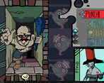
i like the combat screen / system, that was nice.
-Text Adventure esque gameplay was not what I expected. Kinda works.
-Combat UI feels(and looks) a lot nicer than last time, well done.
-I like how the guy exploded into gore, maybe just a bit excessive.
Hope to see more next time.
Perfect demo, just wish it was longer. Love the combat UI and cant wait to see more!
thank you very much!
short and intense. you clearly know how to make a game and how to create great art, but deliberately turned it into a meta-demo.
i'll definitely keep an eye out for this one
Thanks, next DD should have a beefier version
It's very cool, love it. You're one of the devs here I'm really enjoying watching go.
I'll do my best not to disappoint
Not bad at all, music is surprisingly good, shame it's so short
Thanks
Played the entire demo. Video:
I like the tone the game has and the UI design. I spared the bastard by accident, which was a neat surprise. If that happens often in the game, you might need to hint at it. The controls felt a bit slow in battle, specially the second time I battled I tried to mash my way through combat.I hope you will be able to keep working on it.
Thanks, hopefully next version will be much better
It's really good. If it wasn't for the RPGM UI, this would've been perfect. But it was really funny and well thought out.
Thank you, I need to work harder to work around the quirks of the engine
I spared the bastard, I think Martha wants to fuck him. I like everything. Here are some suggestions.
Some kind of icons or symbols over all the interactable objects, pressing space does give you a list, I just think it could add some visual flair.
Animated overlays, bugs or spiders crawling past the screen occasionally, or similar stuff.
If you spare the bastard you should get something from him directly after the fight.
More ways to fuck around unnecessarily with dead bodies, perhaps some kind of usual option that will eventually with repeated use lead to something cool. Something like "unnecessarily poking of the body" or bring "bring a piece with you".
You probably know the rest, keep eating moss, moss magic.
Love all these ideas, I can probably implement them easily.
Innecesary options that lead to weird outcomes is a must!
Thanks for playing
Where linux version
Engine can't export to Linux, millions must cry
Thought it was weird that the girl had no walking animation, so I assume it's like a point and click sort of thing?
But then I fought the Ugly Bastard and the presentation got more interesting.
I manage to defeat him by using the angry speech.
Overall, I hope there's more surprises.
Need to add a proper tutorial in the future
Thanks!
I know it's probably an RPGMaker thing, but widescreen would be nice. There are some typos ("old an unpolished"). Orthogonal movement controls in an isometric environment is very confusing (it's hard to tell what door you're selecting). I think the dungeon segments would be better if they were fully first-person and did not have the character sprite on screen, since it confuses things. The combat is amazing. Very stylish, great music. No complaints there.
I think widescreen can be easily done, I just haven't touched the default settings too much.
I did experiment with first person perspective early on, I might give it a second try and see how it goes. It would make it so the whole game is first person, which might be more immersive.
Thanks for playing!
Love it, love it! I really like who you just change punches with the bad guy! I know you must have something more complex in mind already but the straight up punch, take a punch, punch fits so well with the atmosphere and the feeling of the game!
Please continue developing this!
Will do!
Thanks for playing
"Disappointment strikes"
Just kidding, art and music are 10/10. Was really confused by the controls though. Stumbled between the rooms for a few minutes because i didn't know space was the interaction key.
Am intrigued by the possible plot and the magic that could be used in a next version. I didn't miss any magic spells for the demo, did i (had 0, just a rock and a flesh potion)?
Moar please.
A lot of stuff was made, but not implemented. There's technically a couple spells already, but they didn't made it into this demo, sorry.
Hopefully on next version I'll be able to expand much much MUCH more, because I am a bit ashamed of how short it is.
anyways-
Thanks a lot, I'm glad to know that there's an appeal to the current version as it is :)