Play game
Little King's itch.io pageResults
| Criteria | Rank | Score* | Raw Score |
| Fun | #317 | 3.348 | 3.348 |
| Audio | #368 | 3.217 | 3.217 |
| Game Design | #447 | 3.174 | 3.174 |
| Overall | #461 | 3.152 | 3.152 |
| Graphics | #463 | 3.348 | 3.348 |
| Theme | #555 | 3.000 | 3.000 |
| Innovation | #587 | 2.826 | 2.826 |
Ranked from 23 ratings. Score is adjusted from raw score by the median number of ratings per game in the jam.
How does your game fit the theme?
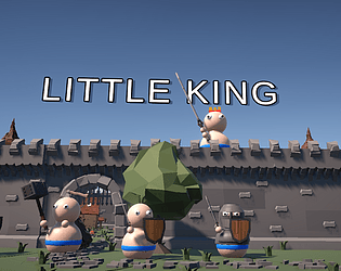
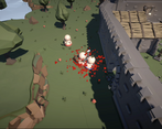
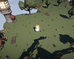
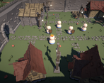
The game fits the theme "Calm Before the Storm" because it slowly starts out with the King (Player) being able to explore their small kingdom and getting to know the area until The player hears the raiding horns signaling what would be a chaotic turnover of the player's little kingdom.
Did you write all the code and made all the assets from scratch?
All of the code has been written from scratch. The player model and cosmetics for the models have been made from scratch by a 3D artist and by me. However, the environmental assets and weapon assets like the swords and axes were bought from the Unity Asset Store.
Leave a comment
Log in with itch.io to leave a comment.


Comments
Fun game! Really like the music and combat sounds. Also found the people charming. I think adding some time between waves would help to allow time to buy more troops.
Great submission with lots of potential for future improvements!
Also can you review our game? THX!
I agree with the comments below: you need to update the balance of the waves, make the enemies more visible, add enemy status. In my opinion, you can work with the animation of the main character's movement, make it smoother and more pleasant. In the end, the game is enjoyable to play, it's relevant to the theme, so great job.
bro ur game is so good, good job , but it was a bit hard i guess..? or im just noob idk lol
very cool game! i really liked it well done :)
cute funny graphic I love it xD
I like how easy it was to tell your units from the opposing team's by the clear difference in the color band. However, I realize now while writing that, there still could be a way to improve it. In case someone is color blind it may also be a good idea to have a pattern or shape to distinguish them more clearly. Also, the color is only towards the bottom of the unit. It was pretty obvious to me, but I wonder if a more prominent difference such as a difference in shapes / patterns or even a substantial difference in the design between enemy and friendly units could help improve it.
To me it was fine and it looked very clear, but if you were to continue to work on it after the jam that could be one area to consider.
Another way to improve it (unless I missed it) is it may be useful to be able to heal in exchange for gold, either at the shop or even one of the other buildings.
The custom 3d art looks great and matches very well with the purchased assets, and the gameplay works well and is very fun, nice job on this game!
Pretty nice little game! Only complaints are that your swords is shorter than it looks and bow aiming is offset to the left.
Cute weird fun little game, great job!
Cute game loved the visuals, that aiming was a bit weird but overall a really solid game, nice work!
Fantastic representation of the theme.
Congratulations on the submission! I had a fun time during my time playing - I love how wacky it is.
Constructive feedback:
There's a load of potential here and I'd love to see it worked on past the Jam. With a few updates, I can see it being a really engaging experience. Well done!
the art style was great i really liked it and audio but the controls were a bit off but! this game was very well made:D
Congrats on your submission! I love the artstyle and gameplay loop, it's simple yet very entertaining.
Here's my 2 feedbacks after testing it for 15-30 minutes :
1. The aiming system
There seems to be a slight offset when you shoot making it difficult to aim properly. If you used a raycast maybe adding an offset of height on the hit point could have helped. It entirely depends how you made the system work though. The arrows are very nice, seeing the juice particles at a distance is very rewarding ^^
2. Enemy status
Another small feedback would be the enemy health, we don't have a health bar or anything (which is completely fine) but having no feedback at all on the current health status can feel underwhelming. Maybe you could make it so depending on the health you show a different visual on the enemy with scars or wounds or even just juice dripping. Seeing the juice on hit is a already very good start :P
Overall, I feel like the game is very fun and interactive, with the shop system in place I feel like I could play endlessly. Continue like that!
I never thought of rotating the player based on raycast, I just used some strange technique of rotating them. I appreciate the suggestion, I can also do something to give more feedback to the enemy status. Other than that, thanks for the tips and playing!
well done!
Thank you!
Very wacky and fun combat style. Could use a tutorial, as I struggled to really know what to do while waiting for the waves to start.
Impressive looks as well for the jam time frame. The style itself is simple yet very effective. Nice work
Thanks! Not sure if you saw the tutorial after you pressed Start from the title screen or if it didn't show up, if it's the latter we'll look into it
Love the theme and audio! Juice is also quite fun. Controls felt a bit clunky but enjoyed the game overall!
Thanks for the feedback! Appreciate it
This game was a blast, well made, good fighting mechanics, and I loved the art style. Good job on your submission!
Thank you! Appreciate it