Play game
Retro Disco's itch.io pageResults
| Criteria | Rank | Score* | Raw Score |
| Theme | #147 | 3.778 | 3.778 |
| Innovation | #147 | 3.611 | 3.611 |
| Overall | #364 | 3.324 | 3.324 |
| Game Design | #482 | 3.222 | 3.222 |
| Graphics | #515 | 3.361 | 3.361 |
| Audio | #555 | 2.972 | 2.972 |
| Fun | #609 | 3.000 | 3.000 |
Ranked from 36 ratings. Score is adjusted from raw score by the median number of ratings per game in the jam.
In what way does your game fit the theme?
Rules of the game changes constantly and randomly.
Did you write all the code yourself and made all the assets from scratch?
Menu code I copy-pasted from a previous project, music & sound effects were downloaded from freesound with credits given to the creators.
Leave a comment
Log in with itch.io to leave a comment.


Comments
Damn, that's hard. Nice work! It really fits the theme.
The game is confusing to start with but you get used to it. It's a really interesting concept but there should be some sort of tutorial
Controls are a bit floaty, but it just makes it more chaotic, good job!
It took me a while to find out which one is an enemy and which one is a collectible. Overall well done! Very chaotic!
Interesting game! The controls are pretty janky, and it's a bit overwhelming at first, but it's still pretty neat intrerpretation of the theme with as many of the elements being randomized. Nice work!
A good game overall! We loved how we were able to decide between relative and absolute controlls. We think the game just needs a bit more pollish regarding the movement mechanics.
Overall a great entry!
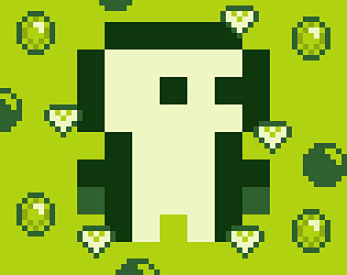
Great game! Loved the artsyle. I got a score over 1000!
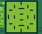
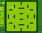
This is a neat game which drew me in. I found the gravity switching difficult at first but maybe grew to work with it. I found the movement also out of my control slightly and tended just to stick to the side wall instead of venturing out perhaps as you intended. A really cool take on chaos having traditional icons function differently making me have to think on the fly whether I wanted them. The aesthetics were nice and the weapons had a tactile feel to them. Overall, cool to see such a unique entry.
an interesting little shmup. i like the music you picked, it definitely fit in great. the gameboy aesthetic was also a good fit for the retro vibe of this game. the game definitely needs a tutorial, i had no idea what absolute and relative controls meant or what the gravity mechanic did. the movement code is janky, you jump way faster than you fall and the jumping went really high. i wish i had more control, especially when the gravity (and therefore gameplay) was changing as much as it was. however, once i got into it it made a lot more sense. it's a really unique concept to switch gravity, which definitely made the game really chaotic. it would have been cool to see some gravity-specific objects, maybe a jump-pad that only works when you are facing a certain direction, but that's for a post-jam version
Amazing GAME!!! Loved it :)
Love Art style
This is awesome! My one problem was understanding the mechanics at first, however it made sense over time, and was pretty dang fun!
i like it a lot, though it's a bit confusing at the start.
I love it, it was such a chaotic game to play that was constantly changing. great stuff.
The game is pretty fun, but I really didn't know what to do in the first 2 minutes of playing the game. The gravity switch is a pretty nice idea aswell, good job!
The game is fun! Good idea :)
Interesting idea! It'be nice to have a bit more info on controls and perhaps make the color of the enemies change too depending on what they do.
Otherwise really fits the theme!
It really messes with your mind, and I love it a lot!
A bit confusing, but interesting idea with the swap mechanic!
I like the idea but maybe a tutorial might help because I had no idea what I was doing.
It was confusing