Play game
Bullet Storm: Battle for survival's itch.io pageResults
| Criteria | Rank | Score* | Raw Score |
| Theme | #61 | 3.353 | 3.353 |
| Fun | #102 | 3.294 | 3.294 |
| Overall | #181 | 2.824 | 2.824 |
| Visual | #319 | 1.824 | 1.824 |
| Audio | #327 | 1.412 | 1.412 |
Ranked from 17 ratings. Score is adjusted from raw score by the median number of ratings per game in the jam.
Are you using any third party assets?
exploasion effects:https://bdragon1727.itch.io/retro-impact-effect-pack-all
Are you using any AI generated assets?
the game title
Did you use BulletFury?
No
Leave a comment
Log in with itch.io to leave a comment.


Comments
- Oh no legendary meme Godot icon is back! - It was funny :D But i think even simple rectangle sprite there will be better option?
- Cool idea with changing opacity of enemies depends of their health!
- Very nice enemies attack patterns
- Good implementation of theme with choosing cards :D
- I missed some music :>
Overall very solid entry i like that and plus for godot! :D
Felt like the right combination of effects would put the enemy through bullet hell, rather than the player. First time I've seen something like that.
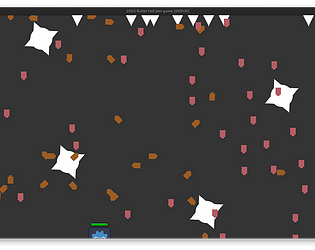
"Is that Godot logo in a jar? " This was my first impression. The health bar looks like jar lid for me.
Anyway, I picked up the shotgun and always pick the bonuses that increases fire rate. I shredded the boss' health in seconds!
This is a fun game. But I think it would be even better with more sfx and bgm added.
Perfectly fits theme! Interesting idea to give enemies buffs as a consequence!
Nice and simple game, I had fun playing it altho the fortresses got me in the end. Good job!
Well, the game works fine on a Mac! I scored 3 points and almost broke the spacebar :D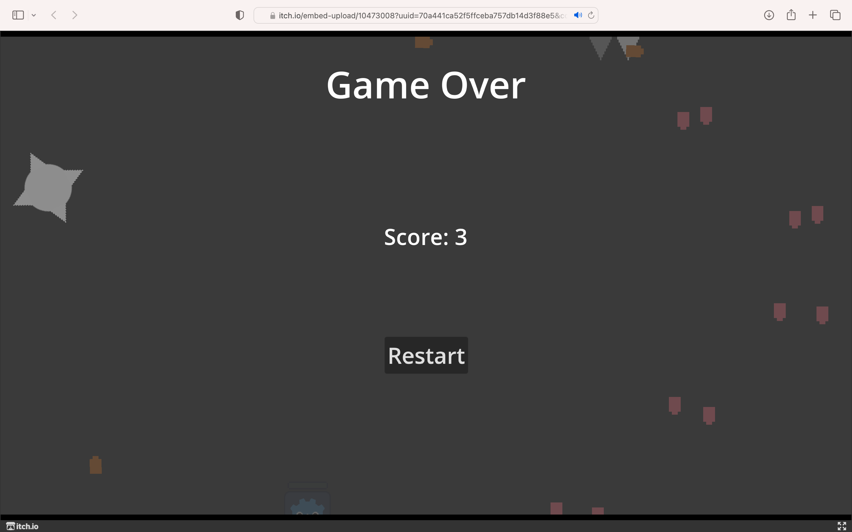
Nicely done with limited assets.
I liked the fact that the enemies had very clear base behaviours that set them apart in addition to the clear graphical differences.
I also like the +/- cards, but I think it would have been good to add a small symbol indicating the enemy type because I kept forgetting which was which :)
The card upgrades with drawbacks was the highlight for me, focusing on the consequences theme which a lot of the games I've played seemed to forget about. I think a huge improvement would've been to add audio and to change the player sprite (even a simple geometrical shape would've been good!)
I liked the enemy variations and enjoyed the Laser but I also think it got me killed when the Kamakazi's showed up lol. Sound was lacking and music too so if you are thuiunking of building it further start there :)
Made it to level 10. I tried to fight the boss 3 times, but boss was too powerful..
Quite impressive that all 3 enemies' upgrades affects the boss as well.
It would be awesome with some graphics and sounds!
I believe with a music background ,a particle system and changing the sprites of the player this can get the player to indulge in the game more, I really loved the small details you have in the game like the health bar getting underneath the player if it reaches the edge so it would be visible and the invincibility.
Overall good bullet hell foundation, good enemy variations, and Great Job !
Nicely done! Good fun.
Difficult, but fun game! Made it to level 5. Lots of great fundamental game dev stuff here. I wasn't too sure what the enemy names were, so I wasn't making very informed decisions when choosing power ups. Team up with an artist next time and you'll make a banger. Keep up the good work!