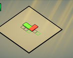
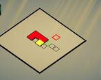
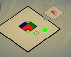
The game is pretty unique, I didn't found a game like yours anywhere in the jam. I had a hard time figuring out how the cubes should be placed. I found the arrows to be pretty confusing.
Play game
SCALE IT!'s itch.io pageResults
| Criteria | Rank | Score* | Raw Score |
| Overall | #139 | 3.368 | 3.368 |
| Gameplay | #161 | 3.105 | 3.105 |
| Audio | #163 | 3.105 | 3.105 |
| Innovation | #195 | 2.947 | 2.947 |
| Theme interpretation | #221 | 3.000 | 3.000 |
| Graphics | #240 | 3.000 | 3.000 |
Ranked from 19 ratings. Score is adjusted from raw score by the median number of ratings per game in the jam.
GitHub repository URL
https://github.com/bahadirisik/ScaleIt-GameOff2023
Comments
I played until I got to destroy 33 cubes according to the stats. The musical tune kept me going, at times like from a video game, at times like from a movie. Cheers!
Very cool game, the integration of the theme is successful, keep it up!
Neat! Funny game!
I spend some time to figure it out which direction is correct, maybe put some instruction or build one instruct level will be better and helpful.
I love strategic game and take time to think or plan. This game is really my type! And a very good interpretation of theme.
Good jobs!
Beautiful concept! You could continue developing it into a beautiful mobile game! However, it was difficult for me to understand in which direction the cubes would rescale given the game perspective which does not correspond with the arrows shown in the UI. Anyway, good job!
Nice puzzle game! Although tile directions in ui made me confuse at first, it's really enjoy to play.
I like this puzzle game. Honestly I would probably prefer it with just a straight top-down view, but it does work as drawn. I didn't get the correlation between the colors shown when placed versus what was shown in the UI, and I think that might have helped my brain connect the placed boxes with the options available. Other than those comments...I'd play this again if it goes beyond what's here!
I enjoyed the game but,
- First level with 1 ,2,3 number scheme was very confusing. I thought they were numbers for shortcuts or something.
- 3d and 2d orientations were not matching. A 3d UI with animations would benefit this game a lot.
- Puzzles were too easy. I am not sure if you can make them harder with these mechanics but I am not much of a puzzle player.
Rate no. 7
The good stuff:
- Surprisingly easy puzzle game, which is a nice change from all the difficult ones.
- The game looks and feels very polished.
- The UI looks great and fits the style of the game
The stuff to improve:
- In your google forms submission you said your game is good at sound, which I disagree with. The sounds you chose don't match the game's style, namely the background songs that are too happy imo, and the level done sound effect.
- The angled camera makes it much harder to figure out the directions. A simple way to fix this could be to add the arrow icons on the sides of the board as a guide. It's not a big deal as players can get used to it pretty quickly but it would be a nice addition.
Overall a very simple and well polished game, I enjoyed my time playing it!
Nice idea! I think the 45 degree tilt of the board makes the moves harder to interpret than they should be. The moves themselves could be rendered as blocks with the appropriate shape, with one green block matching the origin. Overall I really enjoyed it. Could make a great mobile app.


Leave a comment
Log in with itch.io to leave a comment.