Play game
To the Edge of the Map's itch.io pageResults
| Criteria | Rank | Score* | Raw Score |
| Music | #69 | 3.750 | 3.750 |
| Aesthetics | #69 | 4.114 | 4.114 |
| Sound | #156 | 3.273 | 3.273 |
| Story | #393 | 2.182 | 2.182 |
| Fun | #430 | 2.841 | 2.841 |
| Theme | #475 | 2.750 | 2.750 |
| Mechanics | #538 | 2.477 | 2.477 |
Ranked from 44 ratings. Score is adjusted from raw score by the median number of ratings per game in the jam.
How many people worked on this game total?
1
Did you use any existing assets? If so, list them below.
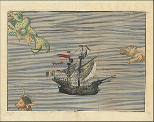
I used parts of medieval paintings as a base for my graphic game assets
Leave a comment
Log in with itch.io to leave a comment.


Comments
Really cool game love the art you chose, music is nice as well
Excellent work!
simple and nice 👍 there a ton of these kind of games out there, but never seen one like this :) everything matches just fine, theme, fonts, sounds, graphics .. well done 👍 if you plan to keep working on that, maybe some kind of scoring system wood be nice and eventually some kind of indication, how far it will be to the end of the world ;)
very nice, for a 3day participation submission 👍
would be nice, if you could rate my game and give me feedback aswell.
I really dig the art style and the music, very cool !
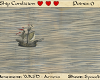
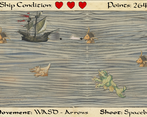
Gameplay-wise, I think maybe the canonballs could move straight without following the ship vertically.
I really dig the art style and the music, very cool !
Gameplay-wise, I think maybe the canonballs could move straight without following the ship vertically.
Very Unique Art style!
Great art style and nice medieval music! Keep up the great work!
i love the graphic style!
i love the graphic style!
Common game mechanic but the artstyle quite cool
I loved how this looked. The gameplay was fun but satisfying. great job!
Super great visuals. Well done! Did you got those as pngs? They look great. I can totaly see this artstyle and game to be expended upon.
art is amazing, game is simple but fun.
Simple but fun concept! I really enjoyed the artwork and aesthetics of your game!
I love the way you used the original creature designs and animated them , awesome aesthetics, and very fun all around. for 3 days work it is fantastic!
I think the art style is really cool. I will enjoy this game more if there are more challenge and more things to do!
I absolutely love the art style! Great idea using parts from paintings!
It lacks some gameplay variety, like powerups that change the way you shoot, make you invincible etc., but I had a good time playing it!
now here is a clever use of public domain imagery. the game is fun enough, but the wiggling sea creatures really sell this playable-old-sea-map-fantasy. music is a funny touch as well.
Pretty game
Haha, very nice. Sailed off the map on the first try. Great effort, especially for a first time game, and great use of medieval art. Of course one could have some more juice (blood and guts, wood splinters when hit) and mechanics (upgrades, health drops, etc) but honestly this was solid. With an ending too! GJ.
Glad you liked it, hopefully in the future i can use some of your advice to add more content and make it more polished. Thanks for playing
Pretty fun game, but how does this relate to the theme
Thanks for playing, i was going for a trapped inside a painting/map with the whole "life in two dimensions" theme. Though I wasn't able to implement a lot of the ideas i had to flesh it out a little bit more