This game have a great feeling, great graphics, great music, great presentation!
With some polishing in the controls it can become great in everything :)
Also: No fullscreen?
Play game
Gravity Flipper's itch.io pageResults
| Criteria | Rank | Score* | Raw Score |
| Gameboy Soul | #55 | 4.133 | 4.133 |
| Interpretation of the Secondary Theme | #77 | 4.000 | 4.000 |
| Overall | #89 | 3.707 | 3.707 |
| Soundtrack/SFX | #89 | 3.600 | 3.600 |
| Graphics | #115 | 3.733 | 3.733 |
| Gameplay | #166 | 3.067 | 3.067 |
Ranked from 15 ratings. Score is adjusted from raw score by the median number of ratings per game in the jam.
How does your game match the theme?
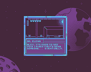
In "Gravity Flipper", players take on the role of Alex, an experienced astronaut sent on a mission to investigate the space station "Orbitron-7".
The game matches the Space theme by being set in outer space on board a space station. you are trying to reach the control room to shut down an experiment that is effecting time and space.
Comments
Thanks for the feedback! Sorry there is no fullscreen option. I ended up having to do more than I expected. I programmed the engine and a good chunk of the game my self and also ended up doing some of the art and all the level design. The options menu I wanted to add in ended up not making it in along with three more levels that I did design but was not able to polish/implement everything/balance. You can however upscale the window by running it with a -s <scale> argument. For example, if you are on windows open up command prompt in the location that you extracted the game and type `./GravityFlipper.exe -s 3` This will make the window 3 times bigger
nice short game! i think you guys really nailed the Game Boy vibe with the audio and visuals. the graphics are nice, and i really like the soundtrack! level design was great too! i was a little sad there wasn’t more. i was impressed that you got a nice working dialogue system as well. that’s something i didn’t have time for in my game.
the controls took quite a bit of getting used to (and many deaths). there’s a bit of jank: the player character gets stuck on the edge of platforms, but flipping gravity will free them up. the horizontal movement when in the air seems really fast which makes it really hard to control while you’re falling, and you get some weird momentum from that. the jump is just slightly too floaty for my tastes also, but works okay for the level design. besides those things, the gameplay was pretty cool. very similar to VVVVVV, it’s quite fun to flip gravity back and forth and fly through a room!
i gotta say, i’m lazy and if i didn’t know you, i wouldn’t have gone through the trouble to download OpenAL and edit the shortcut to upscale the game just to play it! great jam entry though, and if you can work on the controls a bit, add more levels, and make the game easier to get into i think it’d make an awesome full release.
i think i figured out what’s happening with the horizonal movement while in the air. if you press K, you continue to move horizontally in whatever direction you are facing (without pressing any keys). i think this is also happening when you flip gravity. it’s just that when you hit the floor or ceiling, it stops the horizontal movement. might want to look into that.
Very nice graphics and palette, it achieves a dark sci-fi mood instantly. The control got by, but definitely felt a bit floaty for how narrow the gaps were between spikes. I personally would like the jump and gravity button swapped, but that might just be my preference of jumping with spacebar
The art is cool; a lot of care went into the visual design. It's very sci-fi!
It'd be nice if there was some kind of window resize; I had to shrink my computer's resolution to play it.
The movement is really finicky. The gravity button often sent the character careening horizontally. Collisions also seem quite strange; the character would often get stuck in floors.
Is 'K' supposed to be pressable? I noticed that something happened when I pressed it, even though it's not listed in the controls. Though, all it did was break the physics and cause the character to float.
The soundtrack is cool!
Good work! Congratulations on the submission!
You can upscale the Game by running it with the -s <Scale> argument.
I don't think I have seen the character Careening horizontally before, but I did find by watching some people play after submitting that if you spam the gravity flip the collision box will start moving away from the character :( there is also a bug where sometimes you get stuck on edges. I think this is because we are adjusting how much force we are using to move based on if you are on the ground or in the air and we are using Raycast to check what we should do and when the center of the character is off the edge then it starts applying the in air force and I guess we changed it last min to where its to weak to over come the friction of the ground.
K is a left over feature that we didn't actually end up liking. It turns off gravity.
Thanks for all the feedback
Nice game! Really fun mechanic and it is satisfying to move through the levels
The game is crashing for me my I try to launch the exe unfortunately :/. I will check back later to see if its fixed because the game looks cool.
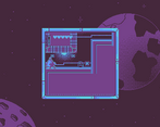
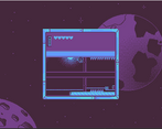
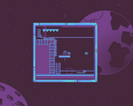
This is game is really cool! The art is very well done, only problem is it's hard to see since the game is rendered so small. Maybe making it bigger would help? I kept picking up items that I didn't know what they were for, since they were too small to see. It might be a good idea to add outlines or use a separate colour for objects that are interacted with by the player, to help them pop out from the background. The art seemed good, I just wish I could tell what was going on better.
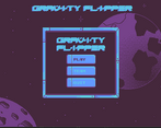
The other main issue with the game was the lack of a tutorial. The controls are displayed on the main menu, which does help, but they're also hard to read because the window is so small. When I pressed K, it caused me to levitate and sometimes clip inside of things? I'm sure this is just a simple bug, but it had a sound effect tied to it so it was hard to tell. Overall, the movement had some strange momentum mechanics in the air, which made me cautious to switch gravity, since it felt hard to control. It also might be more intuitive to switch the function space and W, but that also makes me wonder how it would play on an actual gameboy, with a physical D-Pad.
I know this all sounds really harsh, but I can tell y'all really put a lot of effort in, and I enjoyed it! The aesthetics fit the theme really well, and the idea is great! It would just really benefit from more polish on the movements side, and a little more clarity on the artistic side. Great job! :)
Thank you for your feedback. You can upscale the game by running it with a -s <scale> option.
We had a tutorial but removed it in favor of the controls on the frame. The K button turns gravity off but it really just made things harder and wasn't really needed so we didn't list it but it never got removed.
I didn't get to play, but I watched the video and here are my thoughts based on that.
Excellent choice of color palette. You're doing a lot with just 4 colors, and the contrast in value and chroma is really well chosen.
The gravity-reversal mechanic looks really interesting. The environmental puzzles look challenging. I'm not sure if there are enemies or pickups; those are standard ways to spice things up a bit more.



Leave a comment
Log in with itch.io to leave a comment.