Play game
Downfall Protocol's itch.io pageResults
| Criteria | Rank | Score* | Raw Score |
| Presentation | #96 | 4.536 | 4.536 |
| Overall | #766 | 3.726 | 3.726 |
| Creativity | #1702 | 3.500 | 3.500 |
| Enjoyment | #1775 | 3.143 | 3.143 |
Ranked from 28 ratings. Score is adjusted from raw score by the median number of ratings per game in the jam.
How does your game fit the theme?
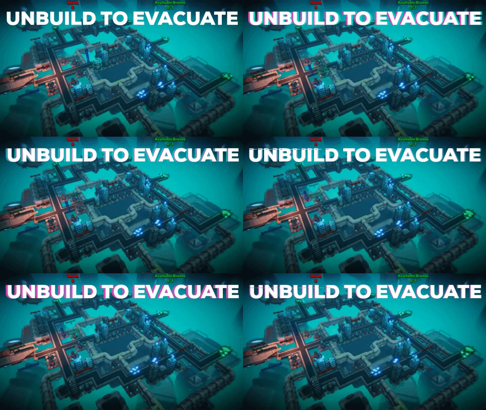
Instead of playing the role of a city builder, you unbuild it!
Did your team create the vast majority of the art during the 48 hours?
Yes
We created the vast majority of the art during the game jam
Did your team create the vast majority of the music during the 48 hours?
Yes
We created the vast majority of the music during the game jam
Leave a comment
Log in with itch.io to leave a comment.


Comments
Impressive art for the jam but I'm not even sure if I'd call this a game.
No in-game tutorial or anything means I have no idea what's going on and you can't really figure it out easily. So it kind of just seems like a slow paced click on stuff simulator. Not sure if there's much strategy to it if at all. Definitely need to spend more time thinking early on whether or not the idea will be fun, and focus on that fun above all else before letting the art team flex.
Also, a web build should be a high priority as most people arent going to wanna download when there's so many other things to play.
Don't mean to be a hater, what's here is impressive no doubt. But I feel this year especially so many people forgot to make their games fun.
Hi Bolt,
Sad to hear you didn't find it fun at all. I'm pretty sure you're coming from a good place, so no harsh feeling. But, let me clarify some stuff:
You may think that the only goal of a game jam is to just do something fun. It's cool if that's your goal, but for us, it is to challenge ourselves, learn and have fun doing it. Most of us build games professionally, as a living and have been participating in Game Jams for years, so don't worry, it's not that "we forgot to make the game fun" and we know what can be called a game (and def our project can 😉).
We had a ton of ideas way easier to execute and that would have been way more fun at the end as a 48-hour jam project. But we didn't find them as original, exciting and challenging to work on.
We knew very well where is the fun in this project and didn't need more time to "think early about it". We still 100% believe in it. What we needed was to start prototyping it, build the systems, iterate on the theme and what it'd bring back to the gameplay. And this is what we did.
We'd have loved to create a tutorial. We're very well aware that the game is really hard to understand without it. But we preferred to spend time on the game itself, until the last minutes, adding some of the systems that were designed and missing (the list is still long).
But thanks for the time you spend testing our game and sharing your thoughts, very much appreciated 🙂
Cheers
Impressive amount of polish, but gameplay is kinda blant. Seems that there is no deep puzzle element to it and without that game becomes boring really fast.
Thanks for posting :)
Yeah we know, we had a few ideas to make it more challenging but couldn't finish in time. We scoped for the initial team size but we lost someone in the middle of it so it made it very tight. We are still working on it and will probably post another build once we found the right balance.
We are also open to suggestions if there's any coming our way.
Thanks for giving it a try
wow this is a big team and it does have high levels of polish! good job!
Thanks :)
I won't lie, it is a different challenge to manage that team size but if done properly, that can lead to a very good vertical slice in a very short time. I must say part of the team here is quite experienced industry devs though so that probably have to be taken into account even though that doesn't guaranty success (proof being some of our past entries XD).
Looks and plays great, well done!
This is a crazy amount of detail for the time we were given. Amazing work!
Thank you!
Thanks for noticing, we had even more stuff in the backlog TBH XD
Well done. Fun and impressive looking... as always ; ) good job!
Thanks Nils! 😊
Seems really good, wish I had extra time to review it properly but I liked how it ran and it fit the theme well :D
Thank you! 😁
Extremely impressive graphics for the timeframe!
Thank you!
Really nice atmosphere and fun gameplay. Good job
Thanks for the kind words :)
I loved the 3D art and the Sci-Fi atmosphere, I am a huge fan. Well done !
Thank you!
Very good !!!
Thanks! 😊
Creative idea, polished and good looking game!But the game lacks soft tutorial (i am not a strategy guy) so I was clicking like an idiot over all buildings and eventually won. Also, there are text issues on high levels (camera too far away from 3d canvas), it was hard to read
Thanks for the kind review 🙂
Yeah we didn't have time to set a proper tutorial (we wanted to ^^), we only have the explanation on the game page.
UI readability is also known and due to lack of time as you can imagine 🙂
Some of the best I've seen! Nicely polished, and a great premise. There's definitely a lot you could build off of this. On top of that, the gameplay is engaging once you've gotten over the initial little "what do I do here?" bit, though the UI is hard to read.
Oh, and did I mention the visuals and music and background worldbuilding is really, really cool? With some more polish this could be an indie game I'd see on Steam and not think twice about. Very well done!
Thanks for the kind review :)
The UI is unfortunately what we tend to do last so sometime lacks a bit of polish. We have a whole backlog of UI fix and improvements on the pipe and we do agree that we could do something off of this first draft.
Thanks a lot for the great feedbacks :)
I really enjoyed your game! This one is definitely up there as far as keeping to the theme. Really a unique take on a tower defense game. The graphics are the cherry on top, I've got a weak spot for sci-fi and your game really hits all the right spots. I would love to see you take the concept even farther.
For suggestions, I also noticed some of the same issues with the UI. My native resolution is 1920x1080 so not sure if the game was running off of that but if so, the 10 for energy was split the same as WigHz with the 1 on the first line and 0 on the next. I also had a hard time seeing the energy levels on turrets when they were at the edge of the screen. A way around this could be to have the energy/health of the structure pop up at the mouse cursor when you mouse over the buildings.
Either way, really enjoyed this!
Thank you!
I'm glad you like our take on the theme! We were really interested to see if we could make a "reversed city builder/tower defense" work, even if we were a bit afraid of the scope and complexity of this kind of game. And no surprise, we struggled to do everything we wanted and the polish/tutorial are really lacking.
We'll investigate those issues, thanks a lot for taking the time to report them in a very clear way.
Cheers!
The visuals in this one, my goodness!
Some issues: the label showing energy had a line break in the number 10.
Energy: 2/1
0
It was not very clear if they flying things are good or bad. Green ones seem bad, but green is often a good thing.
At some point all my drones were occupied when I needed energy. Not sure if I can get them back somehow? Not sure if they got stuck in homes when the evac was full of people perhaps?
But the visuals... What's the secret sauce? Absolutely prettiest game I've seen so far. Volumetric fog?
Awesome work with this game, very impressive
Thanks! ^^
Do you remember the resolution you were playing the game? We'll check this line break :o
And you're absolutely right, we put a lot into this game in terms of assets/shaders and the cost is some misjudgement on the colour of the bad guys for example (we wanted to switch to red or a reddish purple but it was too late 😅). There's also def a way to get stuck if you're a bit bullish in the way you dispatch the dismantling drones and because we didn't had time to code a way to get them back.. yeah you get it, it's a sad game over (sorry 🤕).
Also yes volumetric fog is one of the secret. As having great artists 😁
Thanks again for taking the time to give us this feedback!
2560*1440 my screen says when I have the game running.
I think the main problem with the UI issue is because we changed the texts for resources towards the end and I didn't check it would still fit in the TextBox ><. When I saw it, it was too risky to even dare making a new build so we rolled with it. But we have a couple things in the backlog for UI/UX. Thanks for taking the time to play and the bug report anyway :)
I feel you, had some disaster control last hour too in our game. I think the menu is not that readable in the first scene, so I wanted to add a panel behind it, which covered up all other options panels and everything just went nuts :D
I guess some stuff will just have to be broken when shipping in order to avoid worse broken stuff :)
I loved this game. It is so fun and offers a new perspective to city building games.
Thanks for the kind words Yash!
It's a bit rough and lack a tutorial (we were probably a bit ambitious trying to do everything by ourselves 😅), but I'm glad you found it interesting! :)