Indie game storeFree gamesFun gamesHorror games
Game developmentAssetsComics
SalesBundles
Jobs
TagsGame Engines
A jam submission

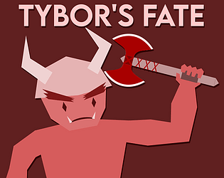
Tybor's FateView game page

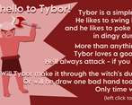
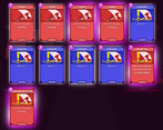
You draw the cards - he plays them. Badly.
Submitted by Aria-1834 — 1 hour, 4 minutes before the deadline
Add to collection

Play game

Tybor's Fate's itch.io page

Results

CriteriaRankScore*Raw Score
Enjoyment#5083.7223.722
Overall#8843.6673.667
Presentation#9473.8333.833
Creativity#18943.4443.444

Ranked from 18 ratings. Score is adjusted from raw score by the median number of ratings per game in the jam.

How does your game fit the theme?
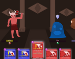
A card battler where you take the role of dealer.

Did your team create the vast majority of the art during the 48 hours?

Yes

We created the vast majority of the art during the game jam

Did your team create the vast majority of the music during the 48 hours?

Yes

We created the vast majority of the music during the game jam

Leave a comment

Log in with itch.io to leave a comment.

Comments

Submitted

Oh no frickin way, we really did have almost the same idea!!! That's so cool!!! But yeah, except the absolutley amazing idea the game just looks really clean, I love the artstyle, and the cards feel so juicy! You really managed to get the same feeling as when you play Spire and I'm really impressed!!!

I'm very very sorry that I mismanaged time and thought the voting ended at 9, so wasn't able to rate it, but belieeeve me I would have given it straight 5's (especially creativity with such a good idea ;) )!!!

But yea, again, absolutley stunning, wish I had managed to make mine as clean and juicy!!! Great work, really hope you still get a great rating!!! :D

Submitted(+1)

I'm waiting Slay the Spire mod to add Tybor in the game.

Developer

Aren't we all

Submitted

Nice entry, I liked watching the attacks unfold.

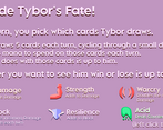
There are some things I'd like to mention, though. For example, I would prefer if I could see the stats when choosing which cards to give. Also, I didn't understand why sometimes I had to select all 5 cards and sometimes only like 2 or 3. More polish and animations and such would be nice, but I understand that 48 hours is not a lot of time.

These things aside, nicely done!

Submitted

Interesting idea, cool art, feels good to play. But I do see why the roles are usually reversed :D

Submitted

Very interesting inversion. I like the concept of suddenly being the deckmaster, feeding resources to the AI ! This would make a very nice idle game that would work well with many other mechanics. There might be some collider issues, as sometimes I had to click a few times around the cards before I got them, but that's perfectly fine in a 48h jam , surely it can be fixed post jam ^-^ Thank you for submitting this, I'll be playing it more ! 

Submitted

Cool game and unique concept. I like artstyle and the idea of you dealing the cards to the character and ultimately deciding his fate. I had some issues with clicking the cards (for some reason, it would select a card to the left of where my cursor is). Other than that, I found the gameplay a bit too easy, so it would be nice to add some more challenge to it. Overall, cool and creative game. Good job!

Submitted

Neat game with some good card variation. My main issue is that it feels nearly impossible to win in some situations, I made it to the stage with two slimes and the rock enemy and the rock built up enough strength to easily take me out in the end. I think some balancing could be done in that regard, but getting an equal balance between player and enemy strength in these kinds of games is not an easy task, so I commend you on your ambition to recreate this genre in 48 hours! I also did have the issue with the cards' hitboxes being shifted over a bit on the card select screen, but the card highlights did help me out when picking cards. I really like the concept, I think the main improvement to make is game balancing, but overall it's a neat game. Nice work!

Submitted

Great game, fun to play just like the original. You managed to put in quite a lot of content, and i like how the Tybor can see the beneficial card combinations to pick, good job!

Submitted

Sadly I couldn’t really play this game beyond the card selection screen because the UI is not scaling properly and I had to click on random parts of the screen to select cards! But the game does look pretty good :]

Developer

Indeed, I have learnt my lesson about playing too quick and dirty with UI coordinates and I can only apologise!

Submitted(+1)

We all love Tybor, even if he does lack self preservation.

Lovely game! I love the idea and implementation and the game is pretty fun!

Submitted

Wow congrats, this is a lot of work done for 48 hours. I love how polished it is.

Submitted(+1)

tybor my little baby

Developer(+1)

The only review I've ever wanted

Submitted

I can definitely see the Slay the Spire influence here! I love the art style, and the scale is very impressive!

Submitted

Cool idea, maybe a little too much time between actions the player can take? It'd be fun to have something extra to do while Tybor plays the cards he's been dealt. Cute artwork too!

Submitted(+2)

Love the construction paper look the characters have. The concept is executed well, but there's this weird bug where the collision detection for the cards is misaligned. Like I have to click 50-100 pixels to the right of the card for the game to pick it. It's a good thing they're highlighted when I mouse over them.

Submitted

I'm not a fan of games like these, but I can tell you put a lot of good effort into it. Good work

Submitted

Really cool graphic work ! Also congrats for the effort to have brought a variety of cards and ennemies in 48h !