Play game
Goethe's knot's itch.io pageResults
| Criteria | Rank | Score* | Raw Score |
| Style | #178 | 4.400 | 4.400 |
| Overall | #617 | 3.822 | 3.822 |
| Creativity | #1040 | 3.767 | 3.767 |
| Enjoyment | #1606 | 3.300 | 3.300 |
Ranked from 30 ratings. Score is adjusted from raw score by the median number of ratings per game in the jam.
How does your game fit the theme?
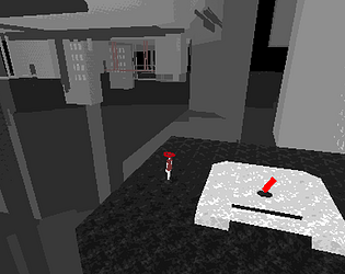
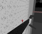
The game's environment is heavily inspired on the popular manga Blame!'s megastructure world. Our game has a great sense of verticality. You can also move big parts of the map around which contribute to the feeling of scale.
Development Time
96 hours
Leave a comment
Log in with itch.io to leave a comment.


Comments
this is cool, I liked it, but if the red character goes into the pink location, he won’t get out of there and then he’ll have to start the whole game over again
Really cool shaders! Also love the choice of multiple characters, very fun
Thanks :)
One of my favourite entries into the jam I've seen so far!! I love the style and the massive feeling of the world, the character swapping, the lack of hand-holding, it all comes together into something truly special. I managed to unlock the green character before unfortunately getting soft locked on an inescapable ledge, so my only complaint is that there's no way to 'hard reset' a character back to their original spawn. Regardless, I'm positive that I'll be back to explore more of this amazing environment you've created. Stellar work!
Edit: Came back & managed to beat it, what a game, 10/10 i love it
Wow, thank you so much for your compliments and feedback! I am so happy that you managed to get to the ending! This comment really made my day and fills me with motivation :)
Amazing PS1 GFX style.
A tutorial would have been great to introduce the characters switching mechanic / controls.
Also some indicator on interactable elements. Fun game nonetheless.
Great art and atmosphere. Unfortunately had no idea how what to do or where to go.
Really like the style on this one, has kind of a creepy vibe and I like the old school feeling of the camera angles. It would have been nice to be able to change the angle on the cameras, but I think keeping it somewhat fixed might be a nice compromise while still retaining that fixed camera angle feel. I did get a bit stuck on how to get the second character out
Thank you for your feedback and compliments :)
If exploration is the intended experience it's definitely there. I had fun exploring and moving pieces!
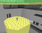
It was so atmospheric! I loved the contrast of the bright colors against the black and white. It was fun to run around the map trying to figure things out (and falling off cliffs haha).
Glad you liked it :)
The art is phenomenal! Love the aesthetic so much! I felt like I could get lost in this game for hours. But I do wish there were more landmarks so I could tell which area of the map I was on
Thank you! All this positivity is really making me want to make larger scale exploration game. Yup, player direction is not good :) Will have to improve on that going forward
I couldn't quite figure out how to progress once I entered the main level, but I really loved the art direction you went with! The uninterpolated run animations and the brutal lack of color on non-moving stuff is sick. Would love to see what else you make with more time!
Yup, the lack of direction is this game's biggest downfall, but I can say I learned a lot from it, it was fun :) Thanks for your kind words
For some reason the web build is really laggy for me :c
Are you on linux? Some linux distros have problems with it
Yeah, that's probably the issue
I really like the artstyle. A little bar in the corner showing the three characters, their numbers and which is selected or something like that would have been a great addition to make it feel more grounded. Some paths are hidden by the camera unless you go looking off the sides of things which both feels odd and also adds a bit to the mystery. unfortunately managed to get the blue character stuck but I think I'll give it another go later. Well done
Yup, there are unfortunately "a lot" of ways to get yourself soft locked. I really wanted to give the player room to explore. I learned a lot from this. Thanks for the tip! That bar would have been a great addition!
the different character and the way to combine / solve stuff was such an interesting take. and the visuals with the shadows especially at the start looked awesome!
I love the visuals for this game! It was also really fun switching between the characters and getting to explore differently because of their locations. Cool concept
Loved the vibes for this one, really strong visual style too!
Thanks!
I didn't expect to see a game of this scale (no pun intended) done in such a short amount of time. It was really cool flipping between the different characters and seeing how they influenced each other's paths. The artstyle and music really helped sell the kind of "huge scale but abandoned" atmosphere. This was awesome!
Thanks for your compliments, I'm pretty happy with the sense of scale!
I really liked the artstyle this was sick
Thank you for checking out the game :)
I found it a bit confusing to navigate the world since it's very big, which I guess in an of itself is impressive for a gamejam project. I also really liked the artstyle!
Thanks! Yeah I figured people would get lost :) It's also easy to get soft locked
good luck!