Play game
Gravity Drive's itch.io pageResults
| Criteria | Rank | Score* | Raw Score |
| Creativity | #3187 | 3.071 | 3.071 |
| Style | #3599 | 2.857 | 2.857 |
| Overall | #4572 | 2.548 | 2.548 |
| Enjoyment | #6460 | 1.714 | 1.714 |
Ranked from 14 ratings. Score is adjusted from raw score by the median number of ratings per game in the jam.
How does your game fit the theme?
You control a black hole that grows larger as you consume stuff.
Development Time
96 hours
(Optional) Please credit all assets you've used
Free Space Skyboxes
Matthew Guz - Status Effects and Auras
Modular Sci-Fi Weapons
vHierarchy
VisualX Studio Loading Screen Effects
Various Code:
Sebastian Lague's Boids algorithm
Sasquatch B Studios
Adam (git-amend)
Code Monkey
Leave a comment
Log in with itch.io to leave a comment.


Comments
Wish it had waffles
Hey there!
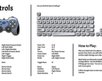
I only tried the WebGL build and maybe that was a mistake. The tutorial videos didn't load for me and the performance was pretty rough. That being said the controls were surprisingly intuitive and the visuals were also cool. I wish it ran better on web!
Definitely a really cool game!
Although the tutorial felt a little bit... lacking? It did not explain to me what critical mass is and how to reach it in time, but on the other hand it had cool videos that barely loaded on my machine. Kind of feels like the priority was a bit messed up there.
Another thing I did not understand is why I shouldn't just "bank" the things I collect as soon as I got them. I mean, they can't be knocked off and I still get to grow bigger in size?
All in all, it's still a really neat game. Having a pool of objects around you that get's bigger unlocks some special kind of satisfying feeling in me. And the controller support is really the cherry at the top. My takeaway from the game though is that I really should check out Katamarí.
P. S.: Thanks for checking out my game yesterday on stream. :)
The videos were intended to BE the tutorial and show you - rather than tell you - how stuff works. Sadly, they were far too large to meet the upload criteria and cuts had to be made. As far as your question about banking materials - yep, you are correct there is currently no penalty to just banking right away. It's something we thought about and were planning to add enemy damage to knock items off, but couldn't get it working in time. So consequently, the shields also are just cosmetic. But glad you otherwise enjoyed the game.
Hey, I’m a fan of your YouTube channel! Fun seeing your game here. I especially enjoy that your game has a GDD that is publicly viewable too. I am currently designing a bigger project with your template, and it works great.
But onto your game:
Positives:
Negatives:
Overall quite neat and jam packed with features! I’ll try making sure that I check out every jam game you do that I also participate in. Cheers!
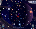
Glad you enjoyed the game and that you found our GDD template useful. To your questions - the WebGL build had a size limit, so unfortunately, we had to cut the video tutorials from it to meet the deadline - one of which explains the boost bar. Same for enemy damage and shields. We couldn't get them implemented in time, so you're right there's no penalty to just banking right away. Using the hover ability is a perfectly valid way to play. The pitch mechanics look more interesting seeing all the orbs scatter like stars - but we wanted to give the player options to avoid motion sickness, which is why the reset and stabilize mechanics also exist. As far as quota, that's a fair point. We could have been more explicit in that. The lower one is meant to track how many quota discounts you current have, as these are applied to all levels, whereas the top has your current mass (center) and target mass (outer ring). In terms of win conditions, there are also a few secret missions - items to find without gaining mass, or speed bonus without mass.
I like the Katamari Damacy concept, which fits with black holes in space.
Unfortunately all the tutorial, the mechanics, the powerups, were unnecessary. After you work out movement it seems you can level up infinitely and add time indefinitely just by moving around and pressing X on the controller.
I like the visuals even if it looks a bit cluttered. It was really hard to steer and control the ship.
I think this game would have benefited from having fewer mechanics. The tutorial is long, and the flight mechanics are cumbersome (and takes two hands on the keyboard and one on the mouse for a total of three hands.) If more time had been spent on the flight mechanics, this could have been quite good. Still liked the idea and ambition!
Yeah, in hindsight, the keyboard controls didn't get enough testing. I mostly used gamepad for testing. It's a lot more intuitive that way. Not your fault though. I should have designed it more clearly.