Indie game storeFree gamesFun gamesHorror games
Game developmentAssetsComics
SalesBundles
Jobs
TagsGame Engines

thisisnowtaken

108
Posts
3
Topics
2
Followers
1
Following
A member registered Jan 30, 2021 · View creator page →

Creator of

Recent community posts

Hello!

I wanted to know what exactly does this mean? Do all Unity games just get a 20% points bump or what? I'm guessing this is in place because the Madder Controller is only implemented in Unity? Are other game engines inelligable to win? If someonje wins, are their games required to be present at this event in Utah?

(1 edit)

I really liked this game! It's really polished (loved the UI and the transition effect!) and I love how we're controlling a flying croissant. I personally only found two things to criticise: It was sometimes a bit hard to tell what the enemy was supposed to be.

For example, I genuinely have no idea what that's supposed to be:


But honestly, that's not really a big problem, and my own game has graphics way worse than that. xD
And then, of course, the game didn't *really* have something to do with towers... I mean, sure, the tower in the background looks nice, but it is at the end just a background. But honestly, these are small issues and it doesn't really matter at all. Good job!

I think the controls could be improved by also supporting WASD and the spacebar. Perhaps it's just me, but the arrow keys always feel a bit... camped.

I'm also really confused as what to do about the "Germanballs" (On that note, what's a Germanball?). It seems that when I get up to a point the game just dumps a ton of them onto me and I die immediately.

Congrats to everyone for participating, and of course especially to the winners!

Also, thanks for posting the overall rating.

Thanks for hosting the jam!

I just quickly want to reinforce the idea for an "Overall" rating. I'm unsure how easy it is to add one after a jam has ended, but I think it'd be helpful to understand the placing in the jam. I don't know, I just enjoy being able to tell myself "I got place #518" instead of "Well, I was #3 in enjoyment and #14 in graphics"

(1 edit)

Huh, this concept reminded me of my game a lot... :D

The game is really well made, although the narrator was kind of repetetive after the first few deaths. The theme was implemented wonderfully, although I don't really see any educational aspect. I guess problem solving, coding, something in that direction?

I think the respawn time could've been made shorter. After you die, you immeadeately want to start playing again now that you know that that direction is blocked or not. But the long wait before the respawn animation and the respawn animation itself is a bit too long in my opinion. Clear markers for one unit of moving would also be a great addition, so that you never accidentally are one moving card too short to reach the end.

Anyways, it's interesting to see that someone had a similar idea, and the game is well made. Good job!

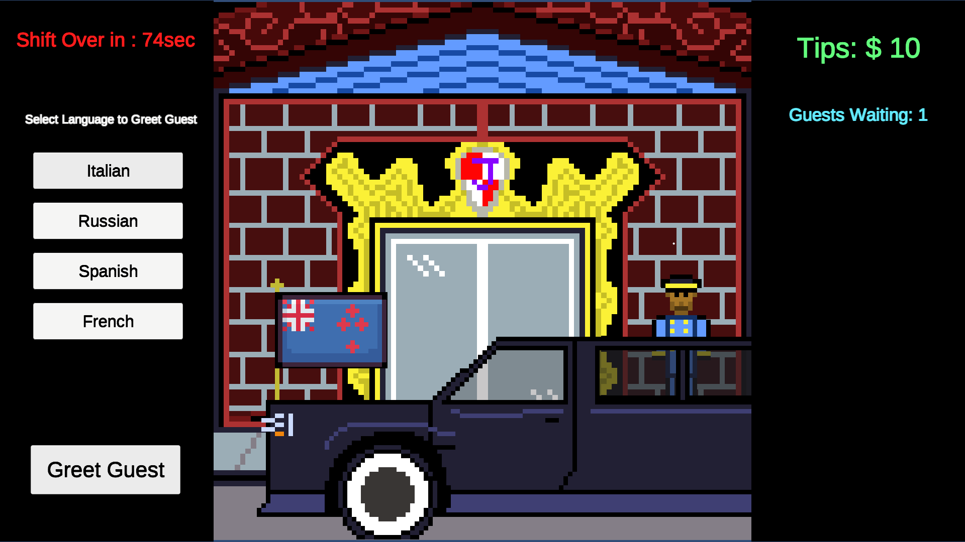
I really like the idea, and it is quite fun! A few times though it felt like the game was a bit bugged. I had the flag of Belgium come up, and the correct answer sounded to me like "Guten Morgen" from German. However, only a small part of Belgium actually speaks German.

Also, maybe I'm stupid but what exactly was I supposed to do here?


Also, big props to you for actually speaking the words yourself! Sure, it's not studio quality, but it added a nice little personal touch.

I find it really difficult to rate this game because it's so short. There's tons of feedback I could give but I think you're aware of most of it anyways (i. e. the bugged buttons). So instead I'm just gonna say: Congrats on making a game!

Ohhh, that was indeed the problem. Thanks for clarifying! Perhaps this could be communicated a bit better by maybe a sound icon or the sound of crushed glass being played?

I really don't want to be toxic but this person has spammed comments all over the place begging people to rate their game.

Woah, I loved that! Gameplay-wise there was nothing riveting, but I really liked reading about the different machinery. Were the sounds taken from a real factory?

I think the game could be improved by maybe adding some way of actually operating the machinery, as well as incorporating the theme a bit more. as as far as I can tell, there wasn't really any failure to learn from.

As someone who loves stealth games I loved this! But funnily enough, I got stuch on I think the second level? The guard always noticed me when I pushed a box, even though I wasn't in his range to see this. I'm unsure if that's a bug or if I'm just stupid. Also, nice music and graphics! Good job!

Maybe I'm just stupid, but the game felt a bit too hard for me. I couldn't really get to spawning the second type of monster, simply because I was already dead by that point. The music also felt a bit repetetive and the dying sounds too were repetetive, but also funny so it's fine. I kind of liked the "hand-drawn" artstyle.

Thanks! I'm glad you liked it!

(1 edit)

The game looks really good, but I didn't quite understand how it relates to the theme. Also, are there differences between the diffrent types of attack? Or are the changes purely visual?

Edit: After reading the other comment, I'm really confused. Crouching? What? Where?

That was a cool game! I love the idea of connecting the math problems to the world. Realizing that you can't use a number because you need it to bridge the gap was a really cool feeling and a "ohhhh I get it" feeling. Well done!

I believe you can do a double jump in that level. Weirdly, you can't do that anywhere else.

The artstyle is really cool, but the game doesn't really have something to do with the theme I think? I still nonetheless enjoyed it, but to be honest, I didn't quite figure out how to get around the dog. xD And then I fell off the map (I think?) and was effectively softlocked.

Bernd das Brot.

This wasn't really a game per se, but more of a linear story interrupted by quick time events. Which really isn't bad, I liked the idea! Also, great work on the art!

Woah, this is really well made! Honestly, I don't think I have any constructive criticism to say. The story is short yet interesting, the level design is great (I loved how there was invisible game design in the beginning to teach the player) and the visuals were fitting (Love that tilt on the tooltip!).

Did you use an AI voice for this though? Don't get me wrong, the voice fitted really well except a few times where the emphasis was wrong but it was fine. But: Man, AI voices are getting really scarily good.

The game doesn't really fit the theme (I guess failing and learning from that? But I didn't see the "educational" challenge), but I nonetheless enjoyed it and liked the control scheme. It was somehow really satisfying to spin my mouse wheel around. Also, I kinda got a jump scare at the last level. xD

I was surprised how much fun I had! It was really interesting trying to guess the conjugation based on the correct answers from before. Maybe I should go learn italian for real...

All in all, good execution, and also a good and fitting UI!

Thanks a lot, glad you enjoyed it!

I wanted to do a Scratch-like interface at first where you drag blocks around, but the thing is I started working on the game 9 hours before the deadline. xD I guess that also explains the lack of content.

Thanks again for playing and rating!

Wow, that was amazing! Really didn't expect a RPG with a small story line.

What confused me a bit was that the "souls" dissapeared after I died and respawned, but that's not really game breaking or something just me being stupid and not remembering who I already talked to. I also think that the theme could've been explored further. Having educational text in the books was a nice touch, but felt more like a "Oh shit we forgot to add something educational, uhhhh, uhmmm... THE BOOKS! Yeah, put something smart from ChatGPT in there!" xD

But besides these small hiccups, I loved the game! The art style was really cool and the city burning everywhere was cool. The ending as well as some of the dialogue was funny and well written.

Good job!

(1 edit)

Hey, I know it can be frustrating when your game doesn't get rates or not as many as one would like. But you have to understand that going around spamming comment sections is not the answer. Play other people's games, rate them and THEN leave a comment, preferably with feedback. Your game is linked below your comments anyway, and it is custom to play and rate all the games from people who played and rated your game too.

Not that bad, I was just really confused atfirst about why itwas shooting so weird. xD

Well, the game was made to be played with fullscreen. I personally found it easy to just go beyond the game window and the input would stop working. So I just made the game fullscreen by default to mitigate this issue.

I see you REALLY went with the 1-Bit theme, only adding one sound to the game. xD

It's really well made, but the control scheme is a bit awkward as the action buttons are all spaced out so much. And maybe I'm stupid (or just bad) but there wasn't a way to regenerate, was there?

But besides that, it felt like a good polished game!

Thanks for checking it out!

I did indeed redownload Doodle Jump for some blatant plagarism inspiration. Glad you liked it!

After the cutscene I really wasn't expecting to be the tower, that was a really fun twist! I personally think that it was hard to aim the missiles (nukes?). As far as I understood, the tower only shoots where it's moving? So with a keyboard, the tower effectively has only for shooting directions. I didn't try it out with a controller, so maybe the game plays better with one (On that note, props for adding controller support!) . Also, the font was a bit difficult to read.

All in all, great job!

Thanks!

Small fun fact: The funny piece is internally called a "Harry Potter Piece". :)

Thanks for replying! Hope your sleep schedule has recovered from that. xD

I of course already rated, and thanks a lot for rating my game as well!

This game is way too polished for a game jam entry, good job!

Maybe it's just me, but I often was unsure if the level is solvable in the state it currently is. It's hard to understand if you made progress or if you're softlocked. Maybe it would be possible to add an indicator when the level becomes unsolvable? It might be hard to program/implement though.

Also: This was a one person team basically!? WHAT!? How did you make the game THIS polished? Did you even sleep at all during the 4 days?

(1 edit)

That is a really smart puzzle game! I think allowing the player to rotate things would make everything even more complicated and interesting. Another idea would be to allow the player to select their own blocks which they want to manipulate. But those are just suggestions, and maybe you prefer the game that way.

Though I didn't understand the last level and completed it by sticking the character into the box until the character came out at the top of the cube. Pretty sure that was a bug.

(3 edits)

This is a really cool game! Admittedly I got stuck on the third or fourth level (The one with the fan) because I couldn't figure out how to get the fan off the ground onto the button, but that's probably just my stupidity.

I have no idea how you made this, but it is awesome!

Edit: I also love how the game loaded the fake sequence, broke and rebuild the fourth wall and also loaded my moth- WAIT WHAT

A really well made and polished game! I love the idea and it's a fun interpretation of the theme.

One small gripe though: I had 100 tomato soups in the "cooking station" and to transport all them to the alien, I had to do this 100 times: "Take" -> Switch to the alien -> "Serve" -> Switch back to the cooking station. I saw there was kind of like an upgrade to transport all of the food to the alien, but I just couldn't activate it, even though I had enough metal.

All in all, a super well made and polished game!

That's such a cool and creative idea! I personally was sometimes confused, because I had placed a card yet there was nothing. Only to realize that the height was way too big for my current position (As far as I understand, the number that is shown when hovering with a card is the height where the structure will spawn, right?) Maybe this could be communicated a bit better to the player. I don't know if it would fit the game but the game could for example disallow placement of structures that the player can't reach because of the height anyways. Or maybe get rid of that structure height mechanic at all?

Anyways, this is a really cool idea that was really well executed.

I loved the intro cutscene, it's really funny.

But the character feels way too slippery and floaty! The mouse slips around as if on ice when on the ground, and in the air it feels like a rock that I can't control. The first few levels were already hard because you need to land on small cubes and I would just slip right past them. You should definitely give the player more control.

Also, what's going on at the top? I think it's a cool idea to have the scientist look into the box, but why is he appearing and disappearing so fast? I guess it's a bug?

All in all, I think it's a cool idea, but these two problems (especially the first one) made the game way less fun then it could've been.