Play game
Mech Mayhem Manager's itch.io pageResults
| Criteria | Rank | Score* | Raw Score |
| Overall | #5 | 4.200 | 4.200 |
| Visuals | #5 | 4.486 | 4.486 |
| Fun Factor | #7 | 4.086 | 4.086 |
| Originality | #12 | 3.829 | 3.829 |
| Audio (Does not apply for Physical Games) | #13 | 3.800 | 3.800 |
Ranked from 35 ratings. Score is adjusted from raw score by the median number of ratings per game in the jam.
Is your game a video game or a physical game?
Video game
Was your game made solo or in a team?
PolyB (Art), Wolf Tone Recorders (Music/Sound)
Did you use any third party assets, if yes what assets did you use?
None
Did you use choose from one of the optional secondary themes?
We did not pick one.
Does your game contain 18+ content (Nudity, Gore, Language)?
No
Leave a comment
Log in with itch.io to leave a comment.


Comments
I really love these type of games! Specially when it comes to strategy and thinking ahead, overall the game was pretty solid in most categories so great job!
<3
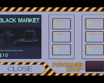
I had a great time with this game. From sound design to visuals, it was awesome. My favourite thing was the door closing animation. It was so sexy. I also like the inventory design. But i hate the fact that i had to depend on my luck for the desired item in black market. I wanted the advance core but it didnt came when i needed it. Also at one time scrap becomes so difficult to get. I had ton of money but no scrap. I wished you could buy the scrap from the black market. Over all it was fun looking into it.
Thanks for playing! I like the way the door animation and sound really pulls things together too.
Buying scrap was the number one thing I would have added if I had more time. I hoped to add another section of non component purchases and then a reroll component one as well. But alas, we ran out of time
Superb game! very polished, from gameplay, design to the pixel-art! Great work! kinda reminds me of the Front Mission Series! which I'm a sucker for
Thanks for playing. Glad you liked it! Front Mission is definitely a good series to be compared to. <3
Separately, I DM'd you some art questions on Twitter if you have time/care to answer them. I quite like your work. I'm @LosAlamosGames.
Great game! Really shows you took a core idea and polished it. I could easily see this being expanded upon as well.
<3
Really nice art style, nice gameplay and sounds/music fits very good. The UI is also very nice.
I first didnt notice you can sell the parts you bought, but found out how to do it. A little hint how to sell the parts would be nice.
But overall really good game :)
What I find super interesting is that we have a help menu that explains the harder to notice stuff, but just about no one sees it. Apparently the itch banners cover it 9n certain cases.
Either way, thanks olfor playing!
the animation and all the sound effects make the satisfaction from barely winning a duel feel so good
really well done on everything, especially the ui
<3
Really clean and great looking art assets, the ui is so well made! Those animations too during combat came out so nicely as well, makes it a lot of fun to watch the combat encounters play out. The game plays really well too, not a glitch in sight on our play through. Great job making such a nicely polished game :)
<3 Thanks for the kind words.
There actually is a glitch tucked away in there if you can spot it. Fortunately it doesn't impact gameplay in a real way and it only appears in certain circumstances and naturally it was a pain to figure out why it was happening so I said whatever and put the fix on the back burner XD
Nice and a bit addictive, love the wilhelm scream. Maybe the font size could be a bit bigger or more contrasted (I have a small screen and had to resize the page, writings got uneasy to read at times in the shop), but a well made and fun game
Thanks for the feedback and for playing!
Most of the smaller text is actually the default font size and I just went for it without considering it. For our reference what's the size of the monitor you've played on and the resolution?
I don't think many people give more thought than that on font :) I'm on a pretty common (for a laptop) 15.6, with 1366x768
Thanks for sharing. I will keep that in mind going forward. It just never crossed my mind that a 16px may cause issues in certain cases but is good to be aware of.
A short, but incredibly polished game.
Really well done.
Thanks for playing it. Glad you liked it!
This was very well done! Many little details, I love how the mech sprites are updated, and the style of the various interfaces is nice and consistent. the gameplay design is well executed too. I wasn't sure how to increase power when I wanted to utilize more weapons though. But customizing the mech brought me back to the old Mechwarrior days. I think I also heard a Wilhelm scream put in too :). Overall wonderful job on this!
You absolutely did hear a Wilhelm scream!
Great visual and audio design. Gameplay loop was also was just right. Simple yet satisfying, well done.
Thanks! Glad you liked it
Very stylish! A nice game to sit back relax and play. Good audio good visuals and a fun gameplay loop :0
<3
This is a pretty cool manager game, and i really like that this is like if the setup aspect of the Mech Warrior games was emphasized into its own Spinoff ^^
I really like the spritework and attention to detail here, the mech designs, the Hangar interface with the computer screen view of your mech and the oldschool "metal doors closing/opening over the screen" for transition that keep you immersed in the game, the music is also really cool and very fitting for the setting.
I just had a few small issues, the mech setup interface has some unintuitive stuff, for example the engine components which i assumed would be upgrades for the total power reserve, but for some odd reason i couldn't swap out the old engine i had to upgrade the reserve, so i tried unequiping things to just swap the engine but i couldn't figure out how to unequip something appart from swapping with parts i had in storage. So i feel some aspects here could use some revamps here and there.
Other than that it's really fun and engaging, once you've set everything up seeing your mech into battle is it's own reward XD
Cool game, i had real fun playing this, good job to you guys :)
Thanks for playing!
Our initial plan for unequipping was made more difficult by a default engine behavior that I never had time to fix. The difficulty swapping engine parts was something I didn't notice until the final play tests when I gave engine parts a Power Cost. Since they themselves have a power cost you have to be under the power cap in order to actually equip the component which ends up being really confusing. Thanks for sharing your experience with the UX. It'll give us guidance on how to fix things should we get around to it.
I see, well time do be short in jams so no worries :)
I'm sure you'll find some fixes, like i said the rest is pretty solid so it's really just about some of the small confusions to iron out.
I played this game longer than anything else in the jam, it's very fun. The help button really helped explain the more complex actions (like selling). The intel mechanic was a good way to figure out what to equip for a battle.
Thanks for playing.
You're exactly right about the intel mechanic. If we had more time we'd have liked to tune the game such that defense plays a much larger role in surviving your opponent than just stacking the best items and killing them outright. But alas, we didn't have time to lock that down.
Glad you enjoyed it!
I really enjoyed it! I couldn't figure out how to sell anything though. One thing I found a little confusing was the repair icon on pieces made me think it was a "scrap" or sell icon, maybe just using the classic "wrench" icon for repair for both the mech and parts would communicate it better. Overall you all made something that's really polished, fun to play, and a looks and sounds great!
Thanks for trying it out!
You can sell by dragging and item onto the Black Market button but this is only mentioned in the help screen.
You are totally right about the wrench icon being a more communicative way to say repair. That is certainly a good idea.
A very gorgeous-looking auto battler. I wish there was a way to get more energy (or, if there were, that it was highlighted a bit more) so that I could hulk out my mech.
Thanks for playing!
To get more energy you can use some of the engine items that will spawn in the shop. I think the max energy you can get is 7.
Awesome start for an awesome auto battler! Had a really nice gameplay loop, and the short rounds kept me coming back for more. Maybe some more tool tips over things like the black market and repair, and a window that tells you what resources you get after the fight (i'll admit I may have missed it if it is in the game.... i didn't pay too much attention lol). But yeah add some more story and fluff and more part variety and this could be fantastic.
And props to the sound guy for sticking in the wilhelm scream lol
Thanks for playing!
This is a nice and polished auto battling game that kept me going till I got wasted. Though as I went on I found that scrap quickly became the most valuable resource as it's tied to your HP and it's something that can't fixed with cash while for slots I found it more efficient to just replace them all with new stuff since cash couldn't restore HP while scrap can. I didn't found out quick enough to realize the death spiral I was heading into though. Aside from that, I think I might've been able to last indefinitely if I could've gotten a full set of the weapon type damage reduction items instead of relying on the vitality shroud which was only good as filler since it apparently can't take damage at all.
Thanks for trying it out!
In my notes I had it to look into adding more types of Black Market purchases, one of which was a purchase converting money to scrap. But as always in jams, I just never had the time to get to it.
It was really good, loved the art. Could use some more strategy I think, maybe I did got far enough, but it felt like I was never sold any new parts to start building strategically.
Glad you enjoyed it. That is definitely something we encountered, only we didn't end up having the time into addressing it.
Thanks for the feedback!
Relatable, deadline always hits you like a train
Doesn't it always. XD
Really really really good art! Gameplay was also super polished, well done!
<3