Play game
Paper Mech's itch.io pageResults
| Criteria | Rank | Score* | Raw Score |
| Originality | #17 | 3.923 | 3.923 |
| Visuals | #18 | 3.923 | 3.923 |
| Audio | #34 | 3.154 | 3.154 |
| Overall | #39 | 3.308 | 3.308 |
| Fun Factor | #48 | 3.000 | 3.000 |
Ranked from 13 ratings. Score is adjusted from raw score by the median number of ratings per game in the jam.
Is your game a video game or a physical game?
video game
Was your game made solo or in a team?
Solo
Did you use any third party assets, if yes what assets did you use?
SFX and Music were provided by LMGLolo and PeriTune
Did you choose from one (or more) of the optional secondary themes?
No optional theme.
Does your game contain 18+ content (Nudity, Gore, Language)?
N/A
Leave a comment
Log in with itch.io to leave a comment.


Comments
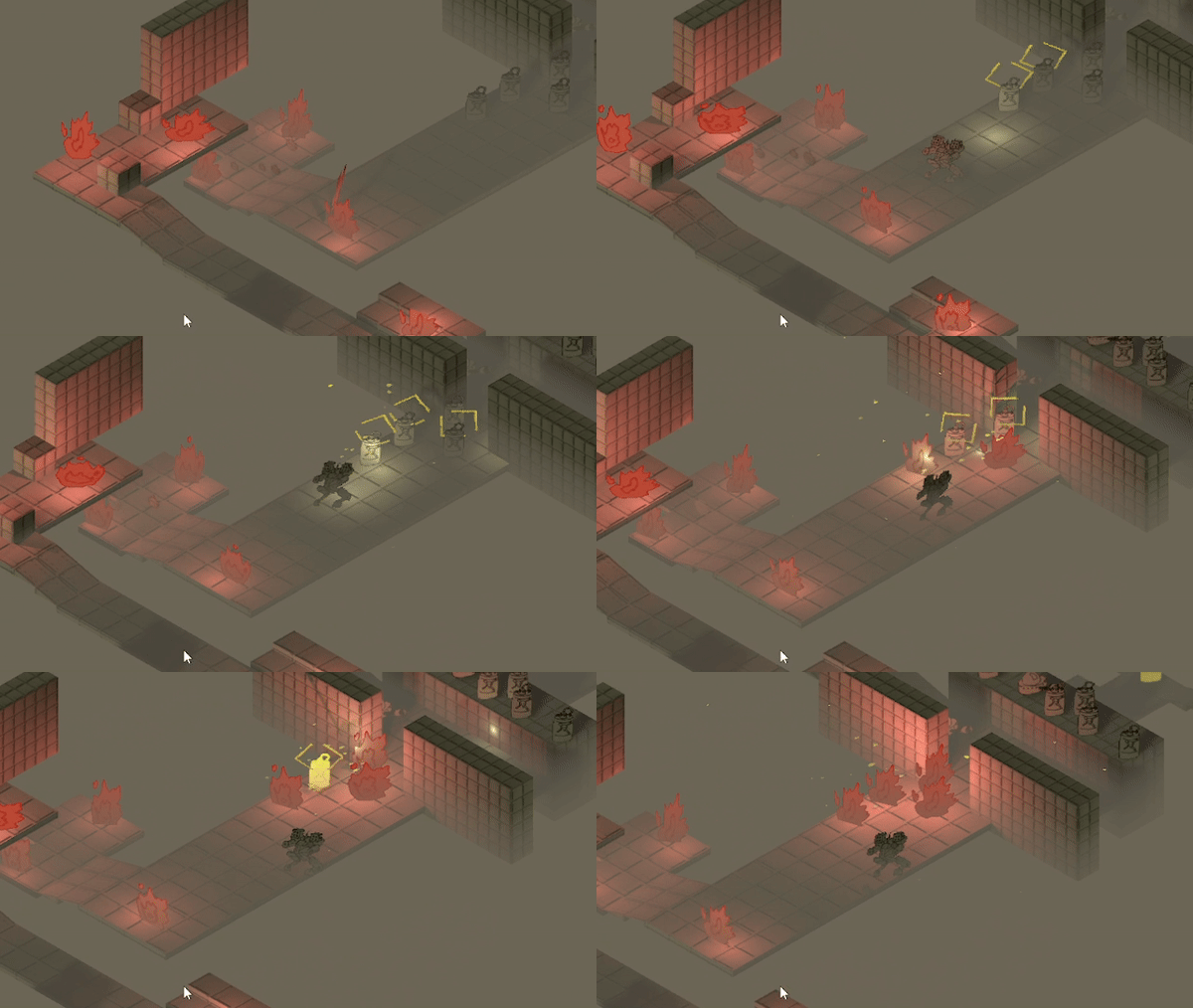
It is simple but manages to also be chaotic at the same time. There are some spots where the camera becomes a hindrance, particularly in areas of lower elevation. I thought the visual style was very unique and found your mix of hand-drawn elements and in-game effects interesting.
This is pretty cool and not too tough. I really enjoyed firing tons of rockets. Shooting missiles were pretty fun, though it took me a little bit to realize that they ran out and I had to let them restock before shooting more. I'd suggest going all out on the paper style and replacing the walls/floors with paper textures as well. Only real gripe if you might want to add one block height terrain to prevent the player from falling. Also might want to tone down the volume on the footsteps.
Thanks for the play and the advice!
The walls were actually paper too! - just not a very large texture.
ah, I didn't notice that. Maybe if the edges looked like they were ripped out of a marble notebook or were hole punched, haha, they might portrait it a bit better.
This game is absolutely chaotic and I love it! The aesthetics truly make this an action-packed adventure. Other commenters have mentioned the camera which I agree could use some adjustments, but also I wished that mechanically there was more than just strafing bullets and holding down SPACE without needing to aim or even take my finger off the button
Thanks for trying it!
I think I have a better camera system solution for 3D games now. where it always follows the player exactly, and only rotates if you are in an area that defines the rotation differently.
I wanted to keep it mechanically very simple, as it's main goal was a test for visuals and juiciness.
Mechanically - it's basically Pacman - visit all the spaces.
Really love the art style! I love these 2D in 3D type of games and with the sketchy style I think it looks totally unique.
I like how the audio, lighting effects, screen effects all go hand in hand in making it feel absolutely chaotic. Sound effects are really bold and intense which makes blowing up barrel seem so intense in a fun way. Same for the lock-on and rocket noises, just pure chaos in some areas.
Game controls really well, I like the slower movement choice, I think it works well with the maze like structure to not fall off every encounter. (but some encounters)
I think like some others said my only real critique would be the camera, it feels good in some spots but in the first area you drop down and the area underneath the camera puts most of the enemies out of view which makes it hard to approach those areas.
Overall really awesome game!
to many times in the deep but fun and chaotic way to blowing up
Fun and chaotic with a very charming art style!
Pretty cool looking and nicely stylized game, it looks super unique. Gameplay has alot of jucy effects to it, i especially like the hovering smoke clouds that emerge, looks very neat. Also the map design is very interesting and intriguing (even so it leads to some places where you can get stuck).
The main critique would be the camera, it doesn’t seem to use a proper look ahead so i can see what’s in front of me and/or what im currently targeting. The fights are also getting very chaotic, to a point where i don’t know whats happening anymore, what i’m hitting or whats hitting me and if it even matters. I think if i need to dodge all those rockets the map design doesn’t fit this very well, because i always only have a really small space to move.
It also feels a bit wired that the Mech is not looking into the direction he’s shooting or walking, if you want to show him from the front it might be a better idea to make the map top to bottom and flip the sprite for left and right targeting.
Thanks!
The camera I realize rotates around it's own axis instead of rotating around the player, making it difficult to see when at a high or low elevation.
Cool game, the lock on and shooting really gives the feeling of unleashing a salvo. I found the camera to be a little frustrating lagging behind the player and making it a little difficult to see ahead of you. other than that it was a pretty tight experience
Such an original experience and approach to a shooting game. Played through the entire level feel satisfied. Wishing to see a continuation to this game/level. The art style is well put together and the emersion is sublime. Soundtrack also hits the mark. Good job
What did you think of the controls? Particularly the auto jump, and "Platforming" portions?