Play game
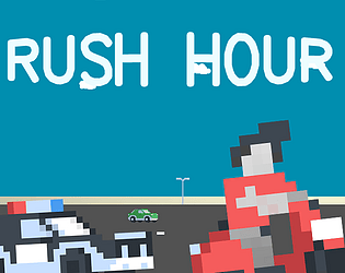
Rush Hour's itch.io pageResults
| Criteria | Rank | Score* | Raw Score |
| Presentation | #17 | 3.913 | 3.913 |
| Enjoyment | #20 | 3.478 | 3.478 |
| Overall | #23 | 3.554 | 3.554 |
| Use of the Limitation | #41 | 3.609 | 3.609 |
| Concept | #44 | 3.217 | 3.217 |
Ranked from 23 ratings. Score is adjusted from raw score by the median number of ratings per game in the jam.
Team members
Whisker Games (me)
Software used
The game was made using the Godot Engine and Adobe Photoshop for the art made during the jam
Use of the limitation
The story is not directly told. Why are you rushing through traffic in the first place? The story is told through the environment.
Cookies eaten
Sadly, none :(
Leave a comment
Log in with itch.io to leave a comment.


Comments
Really enjoyed playing Rush hour its got a simple but effective gameplay loop and I had to actually stop myself from playing more! thought the hitboxes for the cars seem a bit large, making them smaller would allow for a lot more near misses which will make the player feel great even though technically they should have hit the car, but that can be our little secret. I feel like if you make that change and maybe polish the game up a bit more you could totally put this on an app store.
Thank you very much!
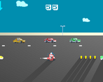
Rush hour takes me back to my days in the arcade, trying to get the top score on a very challenging game. There is a lot to like about this game with its simplistic controls It can be quite fun when you manage to dodge incoming cars as you speed off away from the police car.
Sadly however it was a little challenging due to the huge hit boxes on the vehicles. I would love to see a little more forgiveness and the coins not placed maybe so close to the cars? personal preference, maybe it's fine, the risk is also the reward!
The music becomes a little repetitive though this may just be dying an ample amount of times, so I heard the same music riffs for the duration of my playthrough.
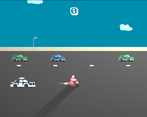
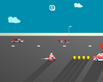
As a suggestion on how to improve the visuals, I think it would be possible to zoom the camera in a bit more and use up that wasted space that sits 1/3 of the screen. This will give you more view of the action (even if it reduces horizontal vision) and make it feel a little more personal.
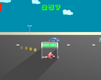
Also, I can see you tried to fake shadows from the bike, it looks off because shadows don't follow you in mid-air the remain on the ground where they are cast, it would probably have been good if you wanted shadows to have a separate graphic that was a circular/oval shape.
Enjoyment: 2/5
Ease to Play: 2/5
Concept: 3/5
Music: 2/5
Presentation: 2/5
Use of Limitation: 4/5
Polish: 2/5
Thanks for the detailed feedback!
I can't rate since I didn't participate in the jam, but enjoyed your entry! The stomp attack move is a hilarious idea and I like how you incentivise getting really close with the coin placement. Great work!
Thank you very much!
Nice job! The game looks great, and I like the car variety. I think that with more content/stuff to do this could be turned into a nice mobile game. Good submission!
Thank you!
Like the music, it fit the game pretty well, tells a story a bit even. Variety of gameplay seemed a bit repetitive with justt decreasing gaps, but the fact that there were lots of different cars added to variety. Really liked the fact that you get bonus score for dropping down on cars, it gave a bunch of challenge for those that want to get extra competitive.
Thank you for the feedback!
The controls are nicely presented and the game looks great. I figured out that the arrows mean speed up or speed down but this was not apparent at first, and I liked that there are different buffs when stomping on the cars. However, I wish there was more variety in player interaction to spice up the gameplay. Some of the cars’ collision boxes are a bit too big, especially on those with the shorter car texture. Overall, good job!
Thanks for the feedback!
I like the pixel art!
I think some of the car placements can make some sections impossible so you're relying on rng while you're playing it.
I like the concept and the controls, and the theme is on point!
Nice submission!
Thanks for the feedback!
Mechanics are not clear, I think the arrows are buffs? But I agree bonking cars is fun^^
Since text is not allowed in the game I included the controls on the game's page and tried my best with animations in the main menu, I'll try to make them clearer! Thanks for the feedback! Also arrows are for jumping and stomping
Sorry, I was unclear: I meant the arrows above the cars, the red and blue ones. Are they collectible boosters? I'm not sure, maybe add a little animation when they are collected...
It's okay :) The arrows are speed and slow boosts, when you collect them an icon shows up on the top left and there are some effects on the player character. I agree more player feedback upon collecting them would be great! Thanks again for playing!
It was a fun game. I lost many times trying to bonk every car, and get every coin!
Thank you!
fun game I enjoyed it cool art and music well done!
Thanks!
Hehe this is really cool. Nice work with the feel of it - overall it feels very nice to play and thats not easy. The jump / flip is really cool. And I loved the choice of music....you made some really good choices IMO. Nice one.
Thank you very much!
Game looks pretty cool!!
Thanks!
Very nice endless runner, it looks nice and the movement feels nice! Nice
Thank you!
you will score so high....
Thanks for playing :)
Great game! you should make it a full mobile game, it's already extremelly fun!
Thanks! That's a great idea!
Great game, love the pixel art, the jams are excellent and just a fun overall experience. Music is a tad loud though.
Thanks for the feedback!
This game was very fun to play, it would be nice for the car hitboxes to be smaller.
And hello fellow Godot user!
Thanks for the feedback!
That jump is sooooooooooo satisfying!!
Thanks!