Play game
ULTRAVIOLENT 2D's itch.io pageResults
| Criteria | Rank | Score* | Raw Score |
| Engagement | #219 | 3.375 | 3.375 |
| Overall polish | #260 | 3.125 | 3.125 |
| Overall | #318 | 3.014 | 3.014 |
| Creative use of art assets | #490 | 2.542 | 2.542 |
Ranked from 24 ratings. Score is adjusted from raw score by the median number of ratings per game in the jam.
Leave a comment
Log in with itch.io to leave a comment.


Comments
ultrafun game!
confuses only one: where is the restart button? :D
good job!
Thanks! And yeah, I definitely goofed and forgot the restart button haha
I'm not geting your game to work here, i really wanted to rate it, sorry.
Sorry to hear that, what is the error you're encountering?
No error game just don't open.
wow this is simple yet quite fun! good job!
Thanks! Glad you had fun!
Really nice concept! The variety of weapons kept me playing and trying out different strategies. I did just eventually stand in a corner, and I was able to fend off enemies for quite a while :)
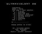
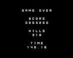
The title page was really nostalgic. I do wish you had added a restart input to the final screen, so I didn't have to reboot the game to try again!
I'm glad you liked it! Definitely need to nerf the corner camp strategy haha. I also just totally forgot the Restart button on the end screen Oops..
Just stay in the corner and spray that machine gun, baby! ahah
Simple game but I loved the variety of weapons and enemies. Keep up the good work :)
Thanks!
That was a fun game :) I loved THE BEES AND how moving and shooting felt really good and polished. I also really liked how you slowly introduced enemies, that kept the game intresting for longer. In terms of feedback, I felt that after the last enemy was introduced, the game became a bit boring. Oveall really good job, I had fun playing :)
Nice! Glad you liked it. I definitely wanted to add more enemies bu time constraints
The core mechanic is well done! It feels good walking around and shooting.
There's no real reason to do it tho, other then maxing out the score. It could use some progression mechanic like unlocking new weapons.
Also, ui scaling
Yeah, I had planned to have the weapons be unlocked through mini bosses, but gamejam time constraints ):
Lot of people having UI issues, I will definitely need to look into it post rating
I really liked the arcade feel of the game, almost seems like something that could be found in a cabinet back in the days. I wish there was bit more variety in the gameplay itself or maybe something to keep it a bit more interesting, like an ammo system, since as of now you can just keep shooting without any form of drawback whatsoever. Good job!
I'm glad you enjoyed it! Definitely inspired by arcade games. Fully agree that there's no incentive to switch guns except to see how they work hahah
Great game! I really liked it! Awesome work!
The different guns all seem to have their own strengths and weaknesses which I really loved, but I do wish there was some incentive to switch to and use the proper guns. Maybe an overheating mechanic - or regenerating ammo? Something that makes me /more/ inclined to switch between them (other than the strategic advantage that already exists, haha).
For sure. I always end up just running around with the Sniper until i die.
NOT THE BEES!
Hey nice game!
Like how you keep adding variety to the game to keep it fresh^^
i'm always wondering what's going to appear next.
Outside of that man there's alot of depth in this.
i'm ruining it by only using Uzi though lol.
Fun game!
Glad you liked it! I definitely had a lot of fun with all the guns. I wanted them all to feel good to use, even the pistol.
Yeah your game had a good "game feel" to it
Movement and shooting were pretty darn close to perfect. You nailed the core "feel", and it's amazing you managed to cram so many weapons into the game as well! I think a bit more juice and polish and you'd have yourself one heck of a shooter. Great work!
Glad you liked it! Definitely would have liked to put more juice in. Maybe I will continue work on it after the gamejam
You got the core game loop down, that's the most important thing!
The game's movement and shooting felt really precise, and it felt like there was a good difficulty progression. I like how simple it is to play, but gets increasingly more complex!
Thanks! I made sure to not have too many enemies at the start so players could get a handle on movement and shooting haha.
Nice game!
Thanks!
fun game with a nice clear difficulty progression! there were a couple little details that I enjoyed liked the cooldown bar being under the character as well as under the crosshair, each weapon having its own crosshair, etc.
I think that adding a little bit of juice, like screenshake, could increase engagement.
Well done!
For sure, screen shake was something i definitely wanted to get implemented but forgot about when it came down to it.. Oops! Maybe I will go and make a definitive edition of this game and add all the "juice" like that ;P
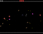
it rendered all streched on my monitor (1366x768), couldn't see all the UI..
Darn, a few others are having issues with scaling and rendering. I will definitely have to investigate it after the rating time is up
Very engaging game! Well balanced weapons and different enemies behaviours. I like how you can switch fast between weapons to make combos. It could have a bit more polished visuals but great game overall. Got to 200 seconds :)
Nice! Glad you liked it, Definitely would like to clean up some of the visuals. It can be hard to see the crosshair on the sniper rifle for example, which is why I added the laser line.
Needs a little bit more of the old ultraviolence! The fire cooldown bar was a good touch.
Thanks! Next time there will be more ultraviolence haha
Pretty nice game. There are a few issues (no screen bounds, scaling issue). But overall well done especially the shooting mechanic.
Glad you liked it! I will have to look into the scaling issues
I really like how you show the fire cool down just below the crosshair. However, it is very hard to see (little contrast with the background). There is also an scaling issue if your screen is set to above 100% (only works properly at 100%). Maybe you could have the hearts shown just above the player (same concept as with the fire cool down).
Hmmm yeah not a bad idea. I will have to investigate the scaling issues