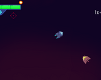
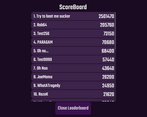
Play game
Legions's itch.io pageResults
| Criteria | Rank | Score* | Raw Score |
| Theme | #13 | 3.870 | 3.870 |
| Overall | #14 | 3.457 | 3.457 |
| Sound | #17 | 3.348 | 3.348 |
| Aesthetics | #22 | 3.478 | 3.478 |
| Gameplay | #27 | 3.130 | 3.130 |
Ranked from 23 ratings. Score is adjusted from raw score by the median number of ratings per game in the jam.
Leave a comment
Log in with itch.io to leave a comment.


Comments
The game is fun but a bit too hard for me.
The background not scrolling is a bit hard for me to see my speed.
Also nice to see another fellow godot dev! :)
Nice to hear that you had fun with our game. After the jam we will update the background and balance the game more.
The no background parallax or scroll messes with the feel of movement but besides that I really like the concept GG
We are glad you liked it. We will fix this after the game jam.
The no background parallax or scroll messes with the feel of movement but besides that I really like the concept GG
+: graphics, sfx, ui, idea
-: no background to see if you are moving or not
Thank you for the feedback, we are planning on updating the background after the jam finished
unfortunately it was unplayable in browser for some reason :'(
Can you specify? Did it not load or did something not work? We know about the limited functionality of the scoreboard but is there anything more?
Anyway, thanks for playing.
it has like 10fps or even less. i am using chrome latest version
Yeah, the game is not made for the web :D It was exported and indexed in the last 10 minutes before the deadline...
So I was expecting problems like this. What can be done, optimization and more time to polish was no longer, unfortunately :D
Wonderful! Maybe, it'd be better to make shield always active in defensive mode. I was spamming left mouse button to keep shield active
Thank you for your Feedback! We want to rework the switch system after the jam ended.
nice visuals. clean. easy controls. good use of sound and sfx. only issue for me would be pacing. the mouse movements and enemy attacks could be better.
Thank you for the feedback! Can you explain the issues you had with mouse movement.
the mouse movement lags idk if it's sensitivity related or trackpad on my end.
If you played the web build, the performance can drop really hard, causing lags.
Loved the concept and use of the theme! I had a bit of a hard time orientating myself - it might help to have a background with some sort of pattern on it, so the player can tell the ship is moving based on moving past the pattern (like stars, or something). My first few tries I didn't know I was moving, just thought I was staying in the middle of the screen haha. Overall nice work though, liked the sound a lot too!
Thank you for the feedback!! The background space dust was actually on our "polish list" but we didn't quite make it to that one. Did you manage to change the music in game? It changes based on your score multiplier :)
I was never quite good enough to work up a combo for the score multiplier unfortunately, but that's a really nice touch to change music accordingly!
It was really fun to write the music! It's basically two songs written on top of each other and some clever code to allow them to change in volume with the combo multiplier :]
Oh wow, super neat idea! That must have taken a lot of work to get the songs to line up nicely :>
Actually that's the easy part :D
Hey! Really liked the game! Some high paced gameplay is always welcome, really fun, congrats!
Gotta go fast!! :D
I think it's super satisfying to fly face first at mach speed into a legion of enemy ships with the beamsword on. Glad you liked it!
I definitely enjoyed the mechanic of absorbing attacks to power your own and I feel like it was executed well. I have to agree with martin with regards to the controls. I think adding a button would have declutter the one handed controls, but that is just my preference. The combo system really added tension and left no room for error or else your high score is jeopardized. A really good submission overall. Well done!
Thank you for your kind words and feedback! We wrote the switching issue on our to do list.
I disagree with RadioMans comment about the swapping in between modes.
It really confused me. I think having a button for the shield and one for sword would be nicer.
I kept switching back and forth really quickly which feels a bit cumbersome imo.
However the game is still a lot of fun to play! Great job!
Thank you for the feedback! We will update the system after the Jam ends-
I really like the swapping back and forth! it creates a lot to focus on and a lot of engagement! I wish parts of it were more intense, and the difficulty built more, and that sometimes enemies would stay out of my face. But overall really fun to play!
Yep, the game needs better AI, it's one of those things I neglected when writing the code :D
But otherwise I'm incredibly glad to hear that the game entertained. Good luck with the reviews!
Ho-ho, I have almost beaten the developer's record but those dudes with shields got me. Very entertaining game!
Love to hear that you liked our game!
Great stuff! Took me a second longer than it should to figure out what I had to do, but once I got it, had a nice first experience.
I'm glad you enjoyed our game. That you had trouble understanding the game is our fault we should have implemented a tutorial.
Might be a better way to do it than a tutorial.
For instance starting the game off with the shield active, and perhaps disabling the lance - then auto switching when you absorb your first energy.
Nice controls, lovely art, great music and good theme implementation.
Love to see that you liked it!
This had the most smooth gameplay from any game ive played so far. This is really great!
Great to see that you had fun with our game!
This is a perfect game for this game jam. The controls are great, the visuals, the gameplay, are fun and work great! But what I really appreciate is how you used stereo audio to predict incoming attacks. Its such a nice touch and lets the game be appreciated from up close without making it unfair.
Honestly, if you just explain the controls as part of the game (you did a good job explaining it in the itch page), no one would even think it was a game jam game.
Thank you so much, as a novice developer this means so much to me. And I think the rest of the team will find it heartwarming as well.
This is a perfect game for this game jam. The controls are great, the visuals, the gameplay, are fun and work great! But what I really appreciate is how you used stereo audio to predict incoming attacks. Its such a nice touch and lets the game be appreciated from up close without making it unfair.
Honestly, if you just explain the controls as part of the game (you did a good job explaining it in the itch page), no one would even think it was a game jam game.
I like the smooth feel of the game! the animations and movement are awesome. I din't get to shoot in the browser version though, so I was just roaming around, enjoying the ride and to be honest, i spent like 15 minutes doing so. It was very relaxing, thank you for this experience.
I love the concept of the game, but couldn't quite get a grasp of the controls. A suggestion I have to is bind the shield to right click and the sword to left click so you don't have to spend time manually switching between the two. I also wasn't sure how to use the mouse to control the ship, as it seemed to either move on its own or stay in place. If it was just me not understanding how to play, I'll definitely check out the game again!
Yes, it's true that the controls are a pain at first. But we wanted to reward the player for playing and learning. It's also a problem where we have to change the combat stance of the ship. The player uses the left button to absorb bullets at the right moment and then goes hunting for enemies with a powerful laser. But thanks for the comment. It means a lot to us and we know the game needs a lot more polish. Maybe we'll get to it after the jam. ;)
Good luck and have a great reviews!
Thank you so much for the feedback! I updated the instructions on the game page to make the controls more clear, and I added some helpful tips :]. I hope that helps!