Play game
Draco's Kingdom Climb's itch.io pageResults
| Criteria | Rank | Score* | Raw Score |
| Aesthetics | #11 | 4.143 | 4.143 |
| Sound | #18 | 3.321 | 3.321 |
| Overall | #33 | 3.268 | 3.268 |
| Gameplay | #56 | 2.964 | 2.964 |
| Theme | #110 | 2.643 | 2.643 |
Ranked from 28 ratings. Score is adjusted from raw score by the median number of ratings per game in the jam.
Leave a comment
Log in with itch.io to leave a comment.



Comments
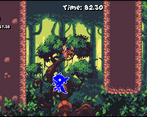
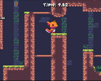
Really Really Enjoyed the artwork. It could use some extra refinement on movement mechanics, but overall they were also decent!
Nice work. Keep it up. :)
Really Really Enjoyed the artwork. It could use some extra refinement on movement mechanics, but overall they were also decent!
Nice work. Keep it up. :)
Nice work on the character!
the art is very beautiful, and the platformer gameplay was very well done, good work XD
Loved the aesthetics, really pretty game, the music was amazing and you nailed the theme.
The art was amazing, but i keep getting this message about server problem.
dang, I wonder why that is? D: I did lock the game behind the lootlocker servers working, I guess, which was definitely not a smart decision lol
Thought I left a comment on this one, but I guess I forgot to post it! The animation is adorable and you made good use of the assets! Getting set back can be a lil frustrating, but it's a nice platformer overall. Also very cool level map! Makes me wish I put something like that for my game's levels. Nice stuff :D
Thanks so much! I don’t know if the map was worth the time because I spent quite a while on getting it to work right instead of, say, balancing the levels, but as soon as I got the idea on like day 3 I couldn’t stop myself :p
Man this game looks amazing. The artwork and music is so well done. I do wished that cayote jump on the wall jump is there so it's easier to time it and the camera was a bit further away. But overall great jam gam.
Draco looks very petable.
Thanks! Agreed on your points, I will make both those changes when I can update this :)
Art and music were on point, it's a beautiful game. I didn't really like the wall jump that required you to jump towards the wall, but I know that this largely comes down to taste so it didn't effect your rating. Level design has a nice amount of branching paths to enable more speedrunning routes. One thing that I didn't like was losing all your stars after dying once. Given that it's a speedrunning game, I felt losing valuable time was enough of a penalty. Great entry for the jam overall, nice stuff.
Thank you, I appreciate the feedback! I didn’t notice stars got lost on dying, that wasn’t intentional. They’re also not necessary for 100%ing a level, which maybe should’ve been clearer… that whole part is a little underbaked, they should respawn too. 10 gets you an extra life at least :P
Ah I see, that makes sense.
I'm not sure if this is a good suggestion, but you could require stars to 100% a level, it incentivizes the player to "use the whole map" in a single run. You would probably have to remove the hidden stars from the game if you did this as it would be frustrating to complete if you couldn't find the last star. Downside is that there is some amount of backtracking, I'm not sure whether the positives outweigh the negatives.
Neat asthetics!
Thank you!
Well done on the character art.. He is really nice! the sound fits well too.. I like the little touch of the character walking along the loading bar
Thanks! Honestly if I could have spent the whole weekend on just refining the animation and doing little touches like the loading bar I would have :P
Great looking game, Im guessing you used premade assets?, id add some screen shots if i were you, you would probably have alot more ratings.
Thanks! Yeah, was going to put up screenshots today. The main character was done by me almost done entirely in the jam (had a basic sketch started), but the rest of the art was premade - though I recolored everything into the same palette ( https://lospec.com/palette-list/rosy-42 )
Visuals are truly awesome. I saw the DKC influence straight from the Thumbnail (and now that I look at it in the title as well, lol) and was pretty hyped, but I wish I had felt it more during gameplay. The roll attack and enemies did feel familiar, but the overall game feel wasn't really there for me. But I'm sure that's hard task, so no shame in not matching the feel of such a legendary game :D
I feel like the wall jump could be improved a bit. I personally don't like wall jumps where the wall jump will fail if you input the opposite move direction a frame too early. You already addressed the camera in the description, so I'll keep it at that.
All this being said, it's a cool game and lots of potential. Good job!
Btw, I initially also thought about making a DKC inspired game for this jam, but it would have been based on the barrel shooting passages instead.
Thanks so much for the great feedback, I really appreciate it! I hope not being quite as good as some of the best games of all time wasn’t too much of a let down 😄 It’s a double edged sword being so blatant about the influence. If I were to develop this further (which I want to) I think bringing in Dixie’s gliding in some form would help a lot. It’s also pretty inspired by Returns/Tropical Freeze which do feel pretty different compared to the SNES ones, but truthfully haven’t played either in years so it’s also just based on my (faulty, human) memory of how it felt.
I know walljump ergonomics can be a real contentious thing in platformers lol, I went with what felt “right” to me but I know some people really hate walljumps that require you to push into the wall vs ones where you kinda stick to it automatically and just input the direction you want to move to and vice versa. There’s an input buffer for the jumping part but not the direction part and that’s a great tip to change that didn’t occur to me, since it’s effectively like a… reverse buffer? I actually was thinking today it might be doable to just straight up give people a toggle in the options menu of which style of walljumping they prefer, but maybe there’s a way to bridge the gap.
A barrel game sounds like it could’ve been a blast! Looking forward to seeing what you did make when I get time today :)
I love the pixel art animations, and the character looks so cute 😍
The gameplay was hard for me to get used to. There are a lot of obstacle off-screen and you often find yourself doing blind jumps to progress. Perhaps the game is zoomed in too much, and maybe moving the camera toward the next obstacles would help. I also think the acceleration in the air is too low for precise platforming sections. I was stuck at the mushroom jumps in the second level because they get off-screen and the character and the platforms are so small. I know there are these little collectible stars that indicate where the mushroom is, but once you have collected them, they are not here anymore once you retry at the checkpoint. Still, you did a great job on your game. With a few tweaks to the gameplay, it has great potential 😊
Thanks so much! :)
I was trying to really replicate the feel of DKC2 in specific, at least in terms of zoom and character size, except wider cause we’re no longer bound by 4:3…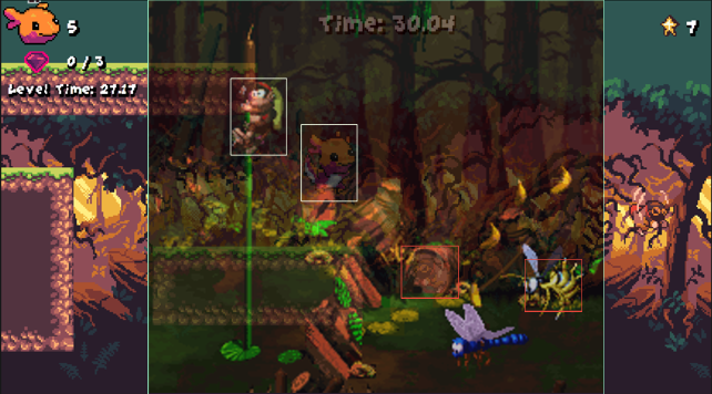 (also I literally just eyeballed this during creation so I’m pretty pleased with how accurate I got the character size relative to the game)
What I didn’t do, though, was really adjust the zoom for how much faster you can go, much more similar in pace to say Tropical Freeze which is quite a bit more zoomed out. I also struggled a lot to get a camera that actually framed things well and didn’t get nauseating with the parallax background, it was in a good place I think for the first level but then I started on the second level and it was disastrous. I was tweaking it up to the last minute and had to just accept it as being what it was. Goal was definitely not to make a like Meatboy-esque precision platformer and more just a fun one that you can blaze through once you get good at it, but I underestimated how much playtesting that takes to actually get the jumps to feel fluid and natural. The last section is imo objectively bad and unfinished, and I meant to make the stars respawn, but there’s only so much time :)
Love the characters and focus on wall-jumping!
For speedrunning purposes, restarting from the beginning of the level without a timer reset felt made me feel demotivated because I already ruined my run haha. Maybe frequent checkpoints so you're only penalized a few seconds for each death would have kept the gameplay moving forward more?
Love the style and aesthetics. Great music as well! Nice work!
Great point about the timers, i was just trying to facilitate RTA-style timers without thinking about how I could make the actual ergonomics or experience of speedrunning more fun. Glad you enjoyed it :)
very cute bro lol the animal is so cute XD, if you can rate mine, I'd be very grateful too :D
haha thanks :) I’ll definitely take a look today!
Best artyle and animation in the entire jam!
Great game!
aw thanks! Really appreciate it :)
Such great art and fun gameplay!
Thanks so much, glad you enjoyed!
The little axolotl sprite is sooooo cute! I was super drawn to this game after I saw him the first time! The pixel animation and work that went into the gameplay is 10/10. I am personally not the best with wall jumping, but I can tell it is very responsive, even with someone who isnt the best. haha! Amazing job! <3
awww thanks so much <3 I had a blast animating him and would’ve spent the whole time just doing that had I not had a whole game to do lol
very nice aesthetics
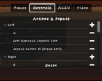
the controls were pretty confusing tho
Thanks! I’m curious what is it about the controls you found confusing? The walljumping, control layout, or something else?
still not sure how the crouch mechanic works, got stuck because of it.
maybe im just dumb tho
Oh, just hold the sprint button, if you end up in a spot where you stop holding it should still be able to move though
oh i got it now, thanks!
wanted to come back to say the game is super fun. good job!
thanks, I appreciate it! Thanks for giving it a second look :)