Play game
The Edge of Time's itch.io pageResults
| Criteria | Rank | Score* | Raw Score |
| Graphics/Animation | #153 | 3.130 | 3.130 |
| Theme/Limitation | #167 | 2.913 | 2.913 |
| Technical Implementation | #194 | 2.609 | 2.609 |
| Overall | #198 | 2.748 | 2.748 |
| Music/Sound | #198 | 2.609 | 2.609 |
| Fun/Design | #234 | 2.478 | 2.478 |
Ranked from 23 ratings. Score is adjusted from raw score by the median number of ratings per game in the jam.
How does your game apply the limitation (and optionally, the theme)?
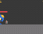
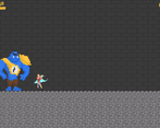
The Timekeeper has taken over the world, you must defeat him before his clock falls off the tower.
Team Size
Pair (2)
What main engine/tool/language did you use to construct the game?
Unity
Leave a comment
Log in with itch.io to leave a comment.



Comments
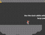
I could see myself spending a lot more time with this game if you tweaked the level design some and improved the movement. The dash triggering the direction of your mouse cursor, but not to the mouse, was tough to grasp and the distance you flew didn't seem to mesh well with a lot of the level design. I think you could have condensed a lot of the rooms and the movement speed and dash distance so that way as a player I could conquer each room more quickly.
I appreciate the generous checkpoints and jumping back into the action. I liked the soundtrack a lot. It's lacking some polish in sfx and animations and particle effects, but that's expected for jam games sometimes.
Overall, this was a fun play that I see nothing but potential with. Your team did a great job.
Thanks for your feedback!
nice main char and enemy animations. its a bit too easy to fall and get stuck in the cliffs in the beginning but I like the idea of buying time. I am getting a The Messenger vibes with this soundtrack.
Thanks for your feedback!
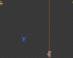
I think the game would be much better with a bit more animations - for instance, some trail effect when dashing and dying animations. The rope wasn't particularly intuitive to use, it would have been ok just to make you go up when you press the up arrow. Also I found a bit confusing that the dash was made in the direction of the mouse, I personally would have just set the direction to wherever the player was already going. Furthermore, it was a bit too floaty.
Thanks for the feedback. Definitely planning on some more animations. A few others have told me that the click to specify direction during the dash is annoying as well.
Yes I am aware of some collision issues. Try pressing R to reset on levels
GG!!!!!!!!
Thank you. Do you have any feedback?
others have already given all the feedback I found :(
At first I thought I would be playing as cupid...
I really like the looks of this. Especially the player character as he holds such a strong pose at pretty much all times.
The controls can get a little bit finicky especially during precise platforming. Very fun and good looking game though!
Thanks for your feedback!
Interesting game. The climbing controls are a bit confusing, but there’s lots to explore and a nice plot.
Thanks for the feedback!
Cool concept, level design and pixel art. The controls were a bit rough and the movement was a bit floaty. Overall good job!
Thanks for your feedback!
fun game love the art i like the way you implemted the theme of bieng on the edge although the jump isnt very good might want to work on that
Thanks for the feedback. Could you please elaborate on what is wrong with the jump?
jumping from platform to platform isnt very forgiving i get to the end and jump but it doesnt jump i just fall down. i dont know maybe you have a ground check at the bottem of the player exactly in the middle so when the player gets to the edge but is still on the edge and you try to jump you cant because the ground check is saying he isnt grounded. a good way to fix that is instead of using raycasts use sphere casting which would cover more of the player and it would work better. or you could setup 3 ray casts one in the center one on the right and one on the left and then you can ground check those. if you didnt understand what i am saying send me another message and ill try to explain it better.
lmao see what i mean tho?
Got it. Thanks!
Neat premise. I think a few quality of life improvements would have taken this to the next level. The mouse inputs felt unnecessary. Clicking on the edge of the screen just made it feel like it was meant for mobile. The dash was a little floaty. I had a few collision issues to where I thought attacking enemies wasn't registering. Being able to see further in front of me would have been helpful too.
I enjoyed the more detailed pixel art style though! Good job!
Thanks for your feedback! I've noticed some collision issues and I'll try and fix it after the jam.
Interesting game, but I felt the use of the mouse was unnecessary, didnt really have to point or click at anything, could've been on the keyboard, also fsr I couldnt jump when I was on the edge of platforms, leading to some frustrating deaths.
The ambience was cool.
Thanks for your feedback. The jumping problem is something I am unaware of. I'll take a look.
I had some problems with the controls, I think that maybe the animation is not cutting at the right time and give me some delay. I like the concept of adding time and can easily expand to a spelunky type of game. Nice entry.
thanks for the feedback
I had some problems with the controls, I think that maybe the animation is not cutting at the right time and give me some delay. I like the concept of adding time and can easily expand to a spelunky type of game. Nice entry.
Yes I agree the controls aren’t quite there yet. We’ve had a mix of people who like the current dash and attack system and people who don’t. Would you prefer a key for it instead that doesn’t affect direction? Thanks for your feedback.
right and alternate control option that allows me to tap a button (still can be mouse just not mouse position based)
Nice game. Some issue with the camera (if you are using cinemachine (witch I believe) reduce dead zone, and use "look head" it will make the camera go in the direction you are taking). I had a hard time with the rope... Otherwise it felt responsive, graphics are good, and I have fun. Well done.
Thanks for the feedback. We will make sure to fox the camera after the jam.
Really enjoyed the graphics of this game, but I definitely got turned around a few times. Specifically, I wasn't a fan of starting going to the left of the screen, and there was at least one point where I entered a wall on the left, which brought me to the next level, and then had to go back the way I came in. Other than than, very fun game! Great job!
thanks for the feedback
enjoyed playing! it took me a while to get around but managed it well. The game has simple straightforward controls, awesome art and it was fun! keep it up!
Thanks for your feedback! I feel that the world is far too big for the player and this might be causing the difficult navigation.
Nice game and the art looks good! Got lost a few times, but that's just me and my poor navigation skills. Jump was a acting a little strange at times and couldn't jump when i was walking around, but other than that the movement felt nice!
Thanks for the feedback!
Cool game with some neat mechanics. Controls were pretty responsive and physics felt nice. Only problem I had was with the camera follow. It lets the character get close to edge of the screen so you aren't able to see very far ahead what's coming up and it led to several "leaps of faith". Didn't keep me from having a fun time with your game though. Nice job!
You are definitely right. This is something we will take a look at after the jam. Thanks for the feedback!