This is great, but it's a little clunky for cubes. It would be nice if the layer group was split into 2: 1 for the back 2 tiles and one for the front 2 tiles... that way the preview is accurate to the environment it would be placed in
It seems like it should be theoretically possible with what's already there by duplicating groups but I couldn't get the plugin to update the offsets of the modified groups even if they showed up in the dropdown...
Cubellia
Creator of
Recent community posts
Thanks for the feedback! Yeah this is definitely designed first and foremost for those who want to dip their toes into music rather than those who are experienced composers (this was actually made for a specific person I know who lamented on not having something like this)
That said, I am ALSO a fan of the locrian mode and I would love to extend the functionality of the device. Not just with added modes, there are many things I thought about adding that just didn't fit an MVP or were a struggle to fit in the confines of the GBA: inversions / voicings, other chord types, the ability to break key... all of these I think are essential in actual interesting composition work, so this definitely is more of a toy as it stands.
Inspiration wise I think personally I get more out of using the sequenced arpeggio as a melody generator of sorts than the available chordset.
Thanks for the bug report as well, that's really frustrating since I know how to fix it pretty quickly... aaaah well.
Solid idea and I think it's framed well!
Unfortunately the enemies often come in unavoidable triplets across the screen before you have a chance to get any fish... maybe if we started with some fish off the bat it could have mitigated that some?
The fish were also sort of unintuitive as a whole, I didn't understand when I got them at first, since the logic of ramp -> fish is kinda random. I think maybe it would have been better to just have fish pickups, as boring as that would be.
It was doubly confusing because the animation on the ramp sort of reads like you're spinning out of control, so it seems like a bad thing... ESPECIALLY so because the bar goes from what looks like full to empty, so you think you've just taken damage or something. I'm assuming that was your fish stock, so maybe it would have made sense to have fish icons there as well rather than a continuous bar?
Also I think the moving particles effect was pretty cool. I don't know if it's supposed to be the ground, but if it is it's moving twice as fast as the enemies that are also on the ground 😅
I think all the art was nice! The penguin skis worked especially well for me, its cute lol.
I know this was a lot of nitpicky feedback but I DID enjoy the game a lot, once you get going with a nice stock of fish I think the game is really fun!
Very polished entry, cute graphics, and a pretty unique idea!
It was a little difficult to get the hang of, and Level 5 was particularly brutal, but I made it through.
I really loooove what you did with the wind direction, both mechanically and the way it was represented. Great execution!
I also like the way the scores were displayed, lovely touch that really makes the game feel next level even if it's kind of a small thing.
Oh by the way, as a fellow Godot user, might I suggest adding Numpad support next time? My keyboard doesn't do arrow keys easily so I was stuck with WASD ZX which is sort of awkward to play with. (I'm surprised it wasn't supported because I thiiiiink we used the same Nokia template). At the very least some alternatives to ZX on the other side of the keyboard might have made sense if WASD was included.
Final scores: 750, 500, 240, 310, 490, 510, 270, 440
Thanks! I can't take much credit though, ahah. It's modified from a Game Boy shader that Goofy Gourd put together (with Ocramius' dot matrix portion doing a lot of the lifting)
Solid game, simple and effective!
I think my biggest suggestion might be to implement the score somewhere on the screen while playing, or maybe some kind of combo meter. It'd be nice to know how well I'm doing, especially since everyone else is posting their scores lol (plus number go up feel good)
It might also be worth trying to increase the difficulty over time to the point it becomes impossible, like how some old arcade and puzzle games go faster and faster until they're unplayable. I noticed there was a difficulty ramp but it seemed to plateau fairly quickly and I didn't feel like I was being challenged beyond that.
I thiiiiink there may be a bug after a while, because at some point you have to wait years between drops... My final score was 415 but that was more because I quit after waiting around too long than skill issue.
I think the idea was very cute, and the iconography complimented it nicely. In terms of aesthetic the only thing I think would help is maybe music?
Overall nice entry!
Very pretty game!
I have to admit though I was a little lost. Lots of digging snow... and then gathering wood... and then attempting to fish? and then dying. I didn't really get the hang of it. Also the snow on the ground and the... snow on the lake had different keys for some reason?
It seems like a loooot of features packed into such a tiny game though so big respect for that!
Solid challenging little platformer, decent amount of variety in gameplay and clear graphics. The character feels pretty floaty in their jump, although I think that works in the game's favor because you really feel the pressure from the timer bearing down on you while you're waiting to land!
If you were looking to make adjustments to the jump, I think a variety in distance based on how long you hold down the jump key might be a good middle ground rather than increasing gravity overall, but the game works without it IMO.
The only other suggestion I might make is maybe some variety in music or maybe a longer track, it got a little repetitive by my 3rd death on the final stage.
Charming game!
My fav game so far eeeeasily
Simple concept, well executed, addictingly challenging. Lots of levels. Honestly idek what to add.
I think maybe one small note is that the floating spike platforms sorta read like clouds? But thats a pretty minor gripe since you learn what they are immediately.
Great entry!!!
I struggled to play this game because my keyboard is split between 5 and 6 T-T
I couldn't even use my keypad for input to know what it would have played like on a 3310... I can't help but wonder what it would be like if the controls were more in line with the Nokia...
I think the lack of any sort of backing made it difficult to orient myself too. Like a metronome or some other sort of backing track beyond just the visual feedback.
Overall though I would say it was well executed and has a lot of features, it's an impressive implementation!
Cute touches too like the exit screen, I loved that lol.
Interesting idea, especially using rhythm to curb spamming.
I think the rhythm aspect was a little bit frustrating since it was purely visual... I think a metronome or some sort of back beat might have helped a lot.
Even knowing the keys, I think it's tough for most to remember notes belong in which key based on text alone. Maybe it's good theory training though? From a layman gameplay perspective I would maybe invert or otherwise mark which notes are in the key you're in... or maybe even if the keys were laid out resembling a piano?
Aside from the game being technical though I could totally see playing this on a Nokia, solid entry!
sorry for destroying your game :( amazing dance tho
For a first game this was impressive! The way the bodies of water ripple out into frozen lakes was super neat.
In terms of level design it was maybe a little static, it didn't really feel like the game got any more difficult over time... though I appreciate how long the game was in spite of only having one mechanic though, at one point I wondered if it might have been procedurally generated.
Alas, the https://haitouch.ga/me/shingo/index link gives me the errors on both Firefox and Chrome still: 
Hey, thanks so much for making this! I just want to report that I think this update might have broken the standalone page.
On both Firefox and Chrome I get the errors:
'The following features required to run Godot projects on the Web are missing:
Cross Origin Isolation - Check web server configuration (send correct headers)
SharedArrayBuffer - Check web server configuration (send correct headers)'
THIS WAS AMAZING! FAV GAME SO FAR. MAIL ME TO ENGLAND YEEHAW
I don't think I've ever actually played a reverse metroidvania, I was always kinda skeptical of the concept, but this was super fun!!
You fit SO many mechanics in, and managed to make the game playable all the way through. Also the gameplay depth on top of that with dashing and low jumps and wall jumps?? hello??? So cool????
I want to say one thing I had issues with is the inflatable raft not working for all spikes, there was specifically a spike pit I think on the lower left part of the map I couldn't use it.
Some of the items were also a little confusing, although I really appreciate the effort to teach them with dedicated training rooms. The vacuum was kinda unwieldy and the broom room made me not really understand the height limit situation? I beat the room but in the real game I didn't feel sure how it worked so I didn't use it over the other items.
Actually can't lie I cheated the vacuum tutorial by flying over with the broom, killing myself to respawn by the button, and then vacuuming back (which was easier to do).
Ultimately I didn't really most of the items in the main game because there was a lot of redundancy (which is alright, I don't know if a game like this would work as well otherwise), I mainly stuck to my MVP the rocket boots with my #2 being raft. I think the stopwatch and the photo were the only ones I felt required to use. But that means I got to try and be creative with what I liked, and that's I think the fun part??? Idk
Also BLESS YOU for doing control reassignments. In a jam game?? Unheard of. Also I needed it because I have a layered keyboard and holding arrow keys while pressing other inputs is impossible for me.
Here's my score, though I am pretty tempted to try speedrunning it now that I know everything...
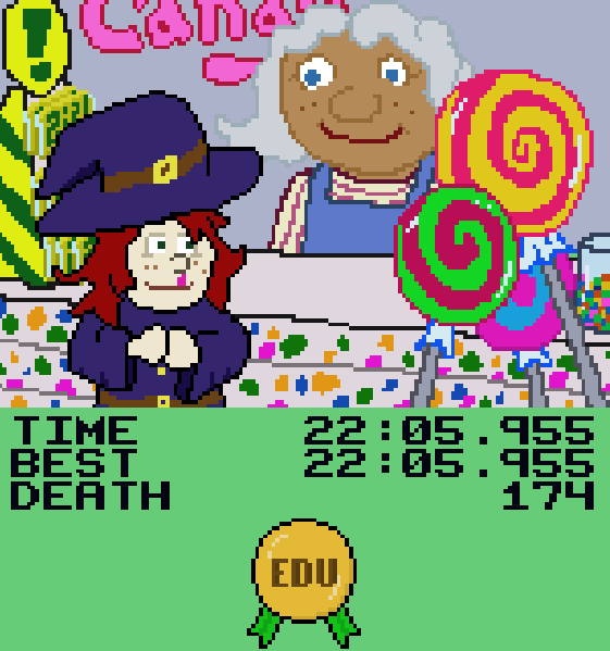
Also I love the ending cutscenes, very cute and funny lol. I'm sure your Dorothy and our Dorothy would get along lolol.
This was pretty funny lol, I enjoyed the sound design and art. I think gameplay wise the the main game is maybe a bit slow and easy, 10 gifts to get to the boss feels like it takes a long time, especially if you die to Krampus 😅
Which is a shame cos Krampus is pretty fun and challenging!
I think stopping to deliver presents in the middle of a shmup is an interesting idea, but at most the only consequence for stopping was maybe 1 health. Maybe if the enemies had been more aggressive and you had to keep flying back to the house before it left your FOV?
I hope you guys develop it some more, it sounds like you have some ideas!
Cute game!
I like the snowball mechanic, I wish it did more stuff. I felt compelled snowballs at everyone even though it didn't do anything to them, lol.
I think it also felt slightly disjointed that I (had to?) use my mouse in combat sections when I had been using my keyboard like twin sticks the whole time outside of it. That's a pretty minor thing though!
Overall solid entry!
This was surprisingly fun! Solid idea, well executed.
The level select was neat, too!
If I had one suggestion it'd be some kind of indicator as to where to the planet was since it's easy to lose track of once you go hunting in space. 😅
Unfortunately I bugged out around level 3 or 4 (whatever level had the distress signal ship you had to tow back), whenever I towed back to the planet it just restarted the level and there was weird overlapping with the UI messages so I couldn't finish the game in the end...
I'm also not really sure what it has to do with giving... I guess you're sorta giving the planets the thing to save them?
Fun game overall though!
Solid demo! Shame the art was all unreal test placeholder.
I really like how you handled the system; we did a similar delivery game and I wish we had managed to implement it as elegantly as you did, the give/receive icons and the distance trackers were all nice features!
I hope you keep working on it, I can't even imagine what it would be like with a bike but it sounds like it would be pretty cool!
Doesn't work on firefox so I had to use chrome :(
It's really cute! Love the lil penguin guy!!
It feels sort of chaotic and hard to control though, but I think that might just be the nature of pinball games. If I could make one suggestion I think it might be some feedback on the starting spring, like if you hold it down it squishes? I don't know if it controls the power level or not but it would be a nice bit of juice I think.
Also I might be wrong but it seems like the only way to restart is to refresh the page?
YEAH CUTE WITCH GAME LETS GOOO
The brewing part is really interesting, I would love to see more of that! The art is fantastic, I liked the animation and the chicken boss was pretty funny! You even got comboing attacks in there!
The platforming part was kinda difficult and the fact that there are no checkpoints or even a way to restart the game is just too brutal, especially with how long the forest is 😅
There's a part in the forest where I just fell through the floor. I know it can be a little tricky to restart levels properly in Godot but I think at the very least teleporting the player back to the start of the forest when they die or hit a reset button is essential... especially since you have to sit through the potion brewing tutorial every time. Cute death animation though.
Even in spite of that you guys got a LOT done for the jam!
Also the fact the health bar moved off screen when you jump was a funny bug. I'm guessing it was a sprite2d parented to the player instead of a control node lol.
Woah, this game has an awesome aesthetic! Love the black and white, had cool effects like the screentone shader, the UI was cool (although the resolution looks a bit crunchy)
I think maybe the shooting could have used some feedback like a sound effect for gunfire or muzzle flash or something because I couldn't really tell if I was firing at first... Also it looks like the gameover screen didn't scale quite right, on fullscreen its a red box that doesn't fill the screen, dunno if that's intentional. It has a cool animation though I'll say, and the start menu was sleek too!
The monsters are also very brutal in difficulty... in all of these cramped corridors it can be really difficult to leave because they overwhelm you very quickly and if they touch you you're basically dead immediately. Although I will admit by the end I was just running past everyone and jumping over them like a speedrunner lol.
It's unfortunate it has nothing at all to do with the theme... I don't know the circumstances of why starting late means it didn't get incorporated, but maybe you could have shoehorned a plot of having to kill all these guys to deliver a present to someone?
It's okay though, you still made something awesome!
Fun idea! I don't know if I was missing some controls because the fire rate seemed pretty low and if any elf touches you you basically die instantly...
There was also a part where I got cloned?? I think some instructions might help, I didn't even realize I could move at first😅
Still though it's fun to avoid to run around and avoid the elves, funny game lol.


