Indie game storeFree gamesFun gamesHorror games
Game developmentAssetsComics
SalesBundles
Jobs
TagsGame Engines

Ecks

407
Posts
3
Topics
13
Followers
5
Following
A member registered Oct 13, 2021 · View creator page →

Creator of

Recent community posts

Not much to say about this. It's an interesting concept and it would be pretty cool to see where it could go given more development time. But as-is it's a pretty basic game that ultimately results in clicking 1 different buttons.

I wanted to see how big the city would get and it did get fairly large after awhile but I got bored pretty quickly and then just mashed the button to see what would happen. Totally expected to be killed by the people or something but it just tells you there's a riot and reset your funding bar haha.

Maybe we'll see more in the future and if so I'll return with a more indepth review then :)

A short but cute little adventure about a rat.

The game isn't very long so neither will my review be! A fun little platformer that uses it's mechanics well. I enjoyed eating food and growing and how only certain things worked if you were a certain size. The button of course but the traps not killing you if you were too big was a pretty cool touch in my opinion and wasn't something I expected.

The graphics were pretty simple but everything was readable and there wasn't anything that confused me or didn't make sense. The audio is again pretty simple but it does the job well, although I liked the very human sounding "glomp" sound when eating stuff.

The camera/perspective was a bit too small for my liking as when I ran into the first mousetrap I had no idea what it was cos I couldn't see it and died instantly haha. Afterwards it's not an issue when you come to understand there are some hazards to avoid.

I like the chase mode too feels quite interesting though I wonder why I'm being chased by other rats?

Overall a very fun and cute little 5 minute adventure.

Hahaha what a strange and fun take on the theme.

I was kinda confused at first because it was a little confusing as to what I was supposed to do but after flying around a little it wasn't hard to figure out.

I didn't really understand how the farmers were hitting me I saw the crosshairs and just tried to avoid them as I assume they were a bad time and for the most part it worked out for me.

Managed to finish the game but it started to get super laggy after awhile and I stopped trying to poop on the farmers cos I think I was causing the lag myself with all the poop.

It was cool to see RPG farmers appear but I didn't really notice any impact from their appearance. It would have been nice to feel more threatened by the farmers because it was really easy just to swoop in and grab corn and then get more and more geese.  Overall it was a fun and cute little experience and a nice little twist on the theme and gameplay I would have never thought of myself.

Hahaha what a strange and fun take on the theme.

I was kinda confused at first because it was a little confusing as to what I was supposed to do but after flying around a little it wasn't hard to figure out.

I didn't really understand how the farmers were hitting me I saw the crosshairs and just tried to avoid them as I assume they were a bad time and for the most part it worked out for me.

Managed to finish the game but it started to get super laggy after awhile and I stopped trying to poop on the farmers cos I think I was causing the lag myself with all the poop.

It was cool to see RPG farmers appear but I didn't really notice any impact from their appearance. It would have been nice to feel more threatened by the farmers because it was really easy just to swoop in and grab corn and then get more and more geese. 

Overall it was a fun and cute little experience and a nice little twist on the theme and gameplay I would have never thought of myself.

(1 edit)

I hate this game, I hate this game so much. I cannot express how much I hate this game with all my body and soul. Not because it's a bad game because it just proves how bad I am at it and games in general and it exposes all my flaws as a person and a human being and has literally destroyed my life and stolen my cat.

No but seriously I suck at this game. I tried to brute force my way through it by just making giant piles and that got me nowhere. Then I accidentally restarted and lost all my progress (not that there was much to lose) and then even when trying to do it properly I still couldn't do it. This game is an ultimate test of patience and planning that I just do not possess and for that reason I'm out.

Graphics are good, I love the variety of items and the loot box style mechanic. Seeing "pity box" constantly though just felt like a slap on the face personally haha. I took that really personally, like I don't need your pity Gr0n. Take your box and shove it up y---- anyways yeah looks cool. Love the height gauge (not that I could go very high) but being able to scroll up to see the heavens that I will never reach is also kinda cool... I guess... From the ground most things look cool when you look up, shame I'll never be at the top looking down...

Very Ultimate Chicken Horse inspired with the building mechanics and hazards and such but with an interesting single player twist and goal. Looking at the game page I could see there were a ton of other items... but I guess those are in the fancy crates higher up... stupid high floating crates. I all seriousness this is just not my type of game so take my review with a pinch of salt. I'm clearly not the target audience for something like this and I just can't force myself through to finish it because of it. It's entirely possible that there are others who love this sort of thing. I know rage games and climbing things are super popular, but just not for me.

(1 edit)

I hate this game, I hate this game so much. I cannot express how much I hate this game with all my body and soul. Not because it's a bad game because it just proves how bad I am at it and games in general and it exposes all my flaws as a person and a human being and has literally destroyed my life and stolen my cat.

No but seriously I suck at this game. I tried to brute force my way through it by just making giant piles and that got me nowhere. Then I accidentally restarted and lost all my progress (not that there was much to lose) and then even when trying to do it properly I still couldn't do it. This game is an ultimate test of patience and planning that I just do not possess and for that reason I'm out.

Graphics are good, I love the variety of items and the loot box style mechanic. Seeing "pity box" constantly though just felt like a slap on the face personally haha. I took that really personally, like I don't need your pity Gr0n. Take your box and shove it up y---- anyways yeah looks cool. Love the height gauge (not that I could go very high) but being able to scroll up to see the heavens that I will never reach is also kinda cool... I guess... From the ground most things look cool when you look up, shame I'll never be at the top looking down...

Very Ultimate Chicken Horse inspired with the building mechanics and hazards and such but with an interesting single player twist and goal. Looking at the game page I could see there were a ton of other items... but I guess those are in the fancy crates higher up... stupid high floating crates.

I all seriousness this is just not my type of game so take my review with a pinch of salt. I'm clearly not the target audience for something like this and I just can't force myself through to finish it because of it. It's entirely possible that there are others who love this sort of thing. I know rage games and climbing things are super popular, but just not for me.

The HTML wizardry on show is insane. The game was built without a game engine and is so feature full and made with love it's absolutely insane.

So I like to write these things by getting the bad stuff outta the way first so let's do just that. The battle system honestly makes no sense to me at all. It really just felt like "random bull**** go!" every turn of just throwing cards at the enemy and honestly it worked for 99% of the game and I felt pretty much indestructible. Sometimes though when I tried to draw a card it just disappeared or showed up in my deck the round later but still flipped over and all around lots of very messy card interactions that had me thinking "is this a bug or am I doing it wrong?". The battle system was not really fun at all and without any information on what the cards actually did other than figuring it out via trial and error it was pretty much just all over the place.

The art is fantastic from start to end. The cards look fantastic I especially loved the animated ones. The shop keeper looked great as did the background and UI but the characters and monsters were SO much larger scaled compared to everything else it really broke the cohesion of the game for me. There's some weird scaling all over the place such as the characters looking too thin/squished and most of the monsters just being tiny sprite that have been re-sized 10x. Regardless of all the scaling issues it didn't make much of a difference in my enjoyment of the game and I still thought it looked really cool throughout. Not to mention the number of different backgrounds and enemies!

The audio was absolutely fantastic the music throughout the game was great and so well done and fitting but then when I finished the game... what the hell was that song? Hahaha it had such a British sense of "F*** it we're done let's just put something stupid and fun in that we care about". I actually loved it, felt very Monty Python nonsensical and just fun.

The pacing of the game was fine until I got to the end boss when it totally kicked my *** and pulling constant bad cards without being able to heal kinda sucked. I wish I could just keep pulling cards if I had energy cos having 10 energy and then just wasting it all every turn cos I had no cards to play felt kinda crap.

Overall an insanely well done game built in sprite of the various game engines available these days and is a pure technical and artistic marvel. I wish I enjoyed the battle system more but honestly with everything else going on for the game it's still super fun and clearly made with a lot of love.

A really fun and modern twist on the snake formula that scales it's difficulty super quickly.

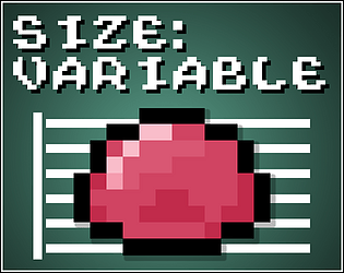
This image should help people understand how this game works.


I had a couple of minor issues that I'll get outta the way to begin. The keyboard controls not being listed on the game page and only after I have to figure them out myself was kinda a weird choice. The shape I was supposed to make was pretty hard to see sometimes due to the limited gameboy pallete. These weren't major issues but I thought I'd bring them up.

The art was fine, using a limited pallete and low res gameboy style pixel art is always a cool choice in my opinion. Nothing really standout to say about the art other than the fact the scaling/wall approaching was handled really well.

The audio is great, love the retro chiptune music and the old crunchy SFX.

The game is very easy to understand but very hard to master I think I got 31000 as my best score but when it starts throwing in 3 size shapes it just kinda breaks my brain haha. I know you just go back on yourself to delete it but still when you have a wall approaching you at high speed it leaves little room for the brain to function haha. Overall a fun little game, would be cool to see what happens if you get even further... Does it make you fit into 1 tile shapes?


A really fun and modern twist on the snake formula that scales it's difficulty super quickly.

This image should help people understand how this game works.

I had a couple of minor issues that I'll get outta the way to begin. The keyboard controls not being listed on the game page and only after I have to figure them out myself was kinda a weird choice. The shape I was supposed to make was pretty hard to see sometimes due to the limited gameboy pallete. These weren't major issues but I thought I'd bring them up.

The art was fine, using a limited pallete and low res gameboy style pixel art is always a cool choice in my opinion. Nothing really standout to say about the art other than the fact the scaling/wall approaching was handled really well.

The audio is great, love the retro chiptune music and the old crunchy SFX.

The game is very easy to understand but very hard to master I think I got 31000 as my best score but when it starts throwing in 3 size shapes it just kinda breaks my brain haha. I know you just go back on yourself to delete it but still when you have a wall approaching you at high speed it leaves little room for the brain to function haha.

Overall a fun little game, would be cool to see what happens if you get even further... Does it make you fit into 1 tile shapes?

Okay so I figured out the way to get the secret skins is completely random when you load the game.

SO FAR. I've found 4 different skins:

1. Default

2. Purple

3. Red

4. Retro

(Specifically not naming them to avoid spoiling it for others)

I refreshed about 50 times and saw all of those once with the exception of the purple skin which I saw like 3 times... I wonder if there's more.

NO I DID NOT HALLUCINATE. You have hidden secret things that I can't figure out how to access and I am going to figure out how you did it and how I can see it again!

Also don't feel obligated to leave a review for my teams submission in return I do this cos I want to not cos I expect something in return :)

Okay wow this is such a fantastic homage and IMPROVEMENT on the Plants vs Zombies formula that I wish more games would challenge!

Firstly let me get the few little issues out the way I had with the game. BLOOM. Bloom is way too damn high, why does everything need to glow? It's cool in moderation but I don't really see the need to have bloom on the health bar or hazard stripes. If it's a design choice that's fine. I just don't like bloom in general and always turn it off.

Not really an issue but... WHY ARE THERE HIDDEN/SECRET SKINS!? HELLO!? I accidentally died because I had to walk away from my PC and when I came back the mech was GUNDAM COLOURS!? WHAT! Then after refreshing 20+ times and even letting myself die again I could not get it to change back to a gundam. I even tried pressing different buttons on the start screen and could not replicate it. Am I going insane? Did I hallucinate this?

Pause button would have been nice, getting my mouse stuck in the game is a bit of a minor pain but not a massive issue.

Okay now that all that is out of the way...

HOLY GODS OF ALL THAT IS AND WAS. HOW DID YOU GUYS PULL THIS OUTTA YOUR *** IN SUCH A SHORT TIME FRAME?

WOW, just wow. I love defence games and as soon as I realised it was a lane based defence game I was 100% locked in. Not only am I defending a cool sci-fi version of Tokyo (which looks awesome) I also need to build oil rigs to generate income to fund my defence capabilities. It basically is the Plants vs Zombies formula just scaled (hehehe) up to 11.

Character controls great, running around and building stuff is SUPER simple and easy to understand and pick up. The enemies are super cool shark kaiju and don't think I didn't notice those little (giant?) metal bucket hats on some of them. Fantastic little touch.

I will say I found the game SUPER easy. Maybe because I know how these games work but I just built like 5 rigs at the start and immediately had MILLIONS and MILLIONS to spare. I could then just run around and throw down 2 max power turrets with walls infront of them in every lane and I was set for the rest of the game.

Graphics, I don't even know what to say. It's literally perfect the design, the cell shading. The animation. Not a single pixel out of place from the moving water, to the floating HUD to the awesome cityscape and Tokyo tower and MT.Fuji in the background. 

Again the audio is just absolutely on point, the SFX and ambience of the turrets firing and the music was so well placed that I literally cannot find a single thing to complain about.

I honestly don't know what else to say other than I love this so much. I would 100% buy this game and I want to see a full version of it in the future. The fact that this is the first game I've played in GMTK is insane and anything else is going to have a really difficult time comparing with this.

HOW DO I GET THE SECRET SKINS? ARE THERE MORE? THERE MUST BE NEON GENESIS EVANGELION SKINS!?

Cute little game, very easy to finish and win. Filled the map with markets and factories and now I'm a capitalist I guess? 🤣

I AM THE TRUE HOMUNCULUS MASTER! (The post-jam patch is so good and is still decently difficult but allows much more freedom to experiment and progress)

I'm Commander Ecks, and I approve of this post.

I love survive-like games and the style and mechanics of this one are really interesting.

Unfortunately the game really slowed down as the enemies just seem to spawn in unlimited amounts and eventually made the game unplayable but before then I had a good time.

I like the art and the style is really cool. The creatures are interesting and very shadowy/wispy which I thought was cool. The crafting screen was a bit noisy but wasn't too hard to figure out.

I enjoyed mixing the ingredients to get buffs it was a nice twist on just choosing what upgrade you got in other survive-like game.

I'm not really sure why I was lighting the lamps throughout the game though? Seemed kinda pointless?

Still it was a nice game and if the lag was fixed I'd really like to get into it more to see how far I could go cos I really loved the style and the systems you got going on here!

A really simple but nice 1 bit pixel art style game.

I really liked the 1 bit style and design of the monsters but the character kinda got lost sometimes when near other objects and it was hard to see where they were. I wish there was some sort of explanation for the compass at the top because I thought it was a timer at first and was so confused why it was pointing all over the place. It wasn't literally right before I returned to the original room with the potion that I realised it was pointing towards my objective.

The audio was retro and chiptune like and the SFX were nice and crunchy, very 1-bit retro game feel that I thought fit quite well.

I didn't see the point of using the sword at all to be honest as the bow just carried me through the game without any issues. I wish there was an explanation that there was wall jumping, it seems weird that the instructions in the first 2 rooms are so clear but then totally forget to mention the compass or the wall jumping. Still I got through the game fine.

I thought the level design was nice and falling back to the location of the 1st potion after getting the 2nd was nice. Although I think it might have been longer? Haha. Maybe that was your intention.

Overall a fun little experience and a nice little game :)

A very short but masterfully crafted prototype. I literally exclaimed "NO!" when it finished because I was so into it.

The only issue I had was that the frog (Who I've named Scott) feels a bit janky when the camera is up close? The actual movement is fine but the animation looks a bit jittery? Not sure if it's a collision thing or just an issue on my browser or something but it was very minor and not a huge deal.

Graphically the game looks fantastic the frog (Scott) so so well designed and animated and the jumping face he/it(?) makes is really well done. The environments are a bit bland but I feel like that's more of a "We don't have time to add more to this" choice than anything else. They still look great but I feel like with how amazing the character looks the environment needs to come up to match that.

The audio is great throughout, the use of SFX in all areas to communicate movement/changes with the environment and objects is prefect and the little Scott-frog noises are subtle enough to not be annoying but still blend into the mix very well. The music although not much of a focal point of the experience carries the rest of it well.

The gameplay is really simple and fun but above all communicates extremely well your goal and allows you to fail in a way that teaches you the mechanics further rather than punish you. For example you have to block the light on the final puzzle to move one of the pieces further to then block the snake behind it. Fantastically designed in a way that teaches the player without telling them anything. 10/10

I want a full game of Scott-frog in the Toadstone world and I want it right now. Give it to me. Give it to me now. Or I will riot.

A really cool setting with some well done voice over, music and graphics. But I find really infuriating to play.

So straight off the bat, I hate the shooting to light the way mechanic. It's not so much the mechanic itself that I hate it's the fact that I have limited ammo. I wouldn't mind if it was unlimited with a long reload between X number of shots or just a longer cooldown per shot or something. But the game itself already has a ton of cool traps/environmental hazards to deal with nevermind not being able to see because you ran outta ammo.

Not to mention if you get to later levels which are more open so you basically have to run around exploring and wasting your ammo just to figure out where to go, to then restart and then go the right way.

Maybe that's all part of your intended design and that's how you like it. It might just be a problem with me personally not enjoying that mechanic. I just didn't like it and found it annoying and after 5+ levels or so (after the small jumpad level) i gave up.

With the exception of the limited ammo mechanic the game has a really solid design and there's a lot to avoid and do as you progress and it is introduced gradually and well. The character moves great and the firing is spot on. The big weird bouncing ball of a bullet when you shoot a switch and then it comes back is a little weird but nothing major.

Graphically the game is great I especially liked the title screen and the introduction. You really show off the character in such a cool way and it feels almost wasted to then never really see them properly again with the top down / dark environment. The traps/hazards (with the exception of the pits of course) are all really well designed and communicated to the player.

On the audio side the music is an absolute banger. It kinda reminds me of The Fifth Element who used this weird industrial style rock that I loved and it felt like I was listening to something like that. SFX were solid across the board also.

Besides my previously mentioned issue/dislike of the lighting mechanic the game is a lot of fun. Would be cool to see more of the character and a more interesting/different way of dealing with the lighting the way mechanic.

A very somber story about a dog who wants to hear his masters final words.

Not sure why the master couldn't have written them in either of the 2 letters he wrote for the dog but that would have ruined the point of the game haha!

The pixel art is fantastic throughout I really enjoyed how the game looked. The body parts were a bit difficult to tell apart but once I figured it out it wasn't a huge issue.

Audio was a little stale with just the same BG music repeating over and over and with no SFX. Not a huge issue though.

The gameplay was simple but progressed well. I liked having to get the final words of the other 2 people to unlock the required items to finish the game and speak hear the masters final words.

I'm not sure if I missed something after hearing them but nothing seemed to happen to end the game so I assume you just ran outta time.

Overall a somber and sometimes witty little story with some really nice pixel art that I enjoyed :)

A very cute and fun potion mixing game with a seriously cool and complex puzzle game hidden within it.

I was randomly drawn in by the smug cat art on the thumbnail and had to play the game and I'm super happy I did. Ignoring the rather rough/low quality UI elements of the game there is a really solid game foundation here that I had a ton of fun exploring.

Normally I can't stomach puzzle games but the "inner mind" shadow puzzles were really cool and well designed. Even a dumb*** like me can just figure it out with enough attempts and trial and error. But despite my lack of braincells I can tell the puzzles are well designed and the mechanics have a lot of depth to them and are used in really interesting ways as the complexity games more and more tough as you go through the game.

The potion mixing was really basic, just put in the right number of colours and success! But it was the accomplishment of finishing the puzzles that made the potion mixing part feel worth it cos you know you had to work for that answer.

The character art is fantastic and I really loved seeing the cat's various facial expressions and the seriously diverse customer sprites. They were all super cute.

The music is good, fit the game well I thought and didn't become annoying. Some SFX would have been nice for summoning shadows/them dying/you dying/switch flipping/etc but honestly it wasn't a huge deal and didn't really stop me from enjoying the game. Overall a seriously fun experience that I wasn't expecting. With more polish, more patients and more puzzle mechanics I could see this being a really fun game if it was developed further.

A very cute and fun potion mixing game with a seriously cool and complex puzzle game hidden within it.

I was randomly drawn in by the smug cat art on the thumbnail and had to play the game and I'm super happy I did. Ignoring the rather rough/low quality UI elements of the game there is a really solid game foundation here that I had a ton of fun exploring.

Normally I can't stomach puzzle games but the "inner mind" shadow puzzles were really cool and well designed. Even a dumb*** like me can just figure it out with enough attempts and trial and error. But despite my lack of braincells I can tell the puzzles are well designed and the mechanics have a lot of depth to them and are used in really interesting ways as the complexity games more and more tough as you go through the game.

The potion mixing was really basic, just put in the right number of colours and success! But it was the accomplishment of finishing the puzzles that made the potion mixing part feel worth it cos you know you had to work for that answer.

The character art is fantastic and I really loved seeing the cat's various facial expressions and the seriously diverse customer sprites. They were all super cute.

The music is good, fit the game well I thought and didn't become annoying. Some SFX would have been nice for summoning shadows/them dying/you dying/switch flipping/etc but honestly it wasn't a huge deal and didn't really stop me from enjoying the game.

Overall a seriously fun experience that I wasn't expecting. With more polish, more patients and more puzzle mechanics I could see this being a really fun game if it was developed further.

An absolutely beautiful game that has an insane amount of polish and content for a 2 week dev period. 

So first of all let me get get the bad out of the way. The boss is unnecessarily hard. I didn't finish the game because of it, which up until that point was fantastic.

The reasons why the boss are too hard and irritating are that up until that point there isn't much difficulty in the game at all pretty much every other enemy is easy to deal with then suddenly the boss is insane! The left hand hits me 75% of the time and I can't get out of the way and the right hand sweeps waaaay too high if it starts while your character is jumping. Which are you 90% of the time of the fight to hit the boss. So it's only if you are sitting on the ground waiting on the attack does it actually go low enough for you to safely jump over it. Finally the fact that there's no checkpoint immediately before the boss and you have to do that big climb again from 3 rooms away was just too much for me.

Also the character moves too slow and without a dash or something it really drags things down.

Now that all that is out of the way let me just say that this game is absolutely beautiful, the pixel art, the character design, the tilemaps, the parallax backgrounds. It's all so well designed and crafted that I can't believe this was done in 2 weeks. What an insane level of polish. 

Not to mention the UI and items. The potions were super cool too, although I think the particles need to be turned down a bit as they made it kinda hard to see sometimes, even if they are cool.

The audio is fantastic from start to finish. The character SFX are varied and great as are the rest of the SFX through the game. The music is non-stop bangers.

With the exception of the slow movement speed and lack of dash the gameplay is great. Using the different potions to remove barriers and traverse the environment was great. By the end with the combination of the explosive potion and slime potion I felt like I was back in portal 2 jumping around and bouncing from place to place. I was super confused about the introduction of the explosion potion though cos it comes out of a thing on the ceiling and anyone would dodge that normally as it's an explosion right? Only after feeling stuck did I jump into it and realised it was safe and the intended way forward.

I played on keyboard and it was a bit iffy at times but nothing that stopped me playing or got in the way. I didn't realise for quite some time though I could aim my potions with the directions though so at first I was trying to line up my shots from a distance to throw them. Thankfully I figured it out.

I would have loved to finish the game but with the boss mechanics seeming really unfair and the lack of nearby checkpoint it just wore me down after several attempts.

Overall this game is fantastic is almost all regards with a few light tweaks I could see this being a full game on Steam in the future and It wouldn't surprise me at all.

Wow the pixel art and character design for this game is off the charts amazing. The mixing system is super interesting too.

Although I got super confused at first because even after reading the instructions in the game and on the game page I still couldn't figure out what the hell I was supposed to do. I just did random mixtures until I realised there was a sigil specifically for bottling the potion to use it and you had to combine the elements first THEN bottle it to use.

I really like the combination system but I don't get why bottling it has to be integrated like that, I feel like it should just be separate and take from a limited number of bottles per round or something. Having it as a sigil SUPER confused me.

Regardless once I figured it out the game became super easy haha. Just pump everything into death as much as possible and heal as much as you can if you need to. Chuck some poison on there round 1 if you can too to make it a little easier. I'd be very keen to see where this went given more complex battles and combinations.

As I said at the top the pixel art is fantastic I love everything from the menus / UI / characters / environments. It's all fantastic and the character designs are so cool!

The music is pretty intense too, when the "HEEEEEEYAAAAAAAH" kicked in I was like "okay okay I see where we're going with these vibes" very cool stuff.

I'd be keen to revisit the game in the future if you plan to do any updates after the jam. The system and art are really cool but once you figure out how the crafting works it kinda loses all strategy and you can just dumb-brain attack/heal as needed.

Still I had a ton of fun with the game and managed to beat all the fights no problem. Give me more!

Wow just when I kept thinking "Okay this must be the end" the game just kept going and offering so much more content and new mechanics. The portal 2 influence is very clear and very well re-imagined for this title.

Let me just quickly pass over the negatives of the game (very few).

The sound mixing was weird. The character audio was really low but then the goblin audio was really high. It just felt a bit unbalanced in some places. It wasn't a huge issue or really soured my enjoyment of the game just made me think "huh the sound is a little weird". Especially when you hit the goblin with light and it goes "ooh" is it supposed to be entranced by the light or something? Haha.

Anyways the graphics were great, a little stale with the same environment used throughout but given it's a gamejam it's not unexpected. The character and goblin designs were cool and I liked how well communicated everything was with their obvious colours and shapes. I really enjoyed bouncing around and navigating the levels and the cauldron checkpoints were a great touch especially later when I died a few times. I felt like the alchemy/mixing mechanic was a little under used to be honest. It was a nice surprise but maybe having the game open with a similar one to get the light potion would have been cool.

Unlocking my own bouncing potion afterwards was really fun and opened things up a lot. It felt a little glitchy sometimes where the character wouldn't throw the potion for some reason but for the most part it worked great! I especially loved the velocity/bounce height mechanic you guys did, it worked really well.

I liked that you included some cut/unfinished stuff at the end showing the eventual red potion and speed mechanics. Again it's all very portal coded but there's nothing wrong with that.

Overall I had a really fun time with this game it would be nice to see where it goes if you decide to keep developing it after the jam and I'd love to revisit it if you do.

A fantastic looking puzzle/platformer with some of the most well thought out and cool mechanics I've seen!

Firstly let me just point out that I almost immediately found a cheese in that you can jump as you are rising on the weighted blocks and it sends you SUPER HIGH. This isn't much of an issue until you get to the 2nd last level where you can just skip most of the level and go straight to the door.

The game looks great, the pixel art is 10/10 and the design of the character, props and environment items are all extremely easy to read and communicate the intent and goal very well. I was a little confused then I first started the game as I changed to gold and couldn't jump past the first little tutorial message. Once I realised changing has an effect on the characters movement though it was quickly resolved without further issues.

The audio is great across the board, very chiptune/retro with some crunchy SFX in there.

The puzzles were a lot of fun too, not to difficult either and had a really steady and well planned increase to the mechanic complexity. Besides the aforementioned cheese there weren't any mechanical issues. I did find the return to the original "charge point?" particularly hard on level 5 though, the first gold/spring trap seems to move much faster than the one later in the level and I died quite a few times.

I really enjoyed the changing metallic properties of the character it would be awesome to see it expanded in the future if you decide to develop the game further or add more levels. I had a lot of fun with this.


Our game Blood x Thirsty was made for the 14 day PirateSoftware PirateJam14 however after a lot of positive responses we're considering updating the game and releasing it on steam. We're looking for feedback and feature suggestions for future versions.

The gamejam version is currently free to play on browser here we'd love to hear from you!

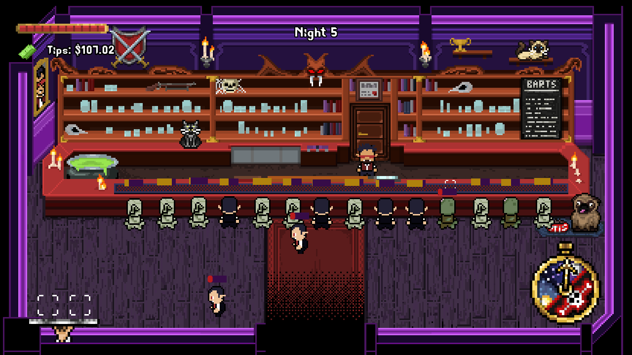
Blood x Thirsty is a bartending rogue-like where you need to choose the right ingredients to power up your brew and find the perfect balance between raking in your customers cash or getting them out the door quick enough to free up some spare seats. Fail to keep your customers happy and they jump the bar and attack you! Defend yourself and kick them out!

Anyone who makes it past night 12 (and beyond) will be commemorated in the top 10 tenders leaderboard on the game page. Warning: It's super hard!