Indie game storeFree gamesFun gamesHorror games
Game developmentAssetsComics
SalesBundles
Jobs
TagsGame Engines

CrazyInocentGames

64
Posts
4
Topics
8
Followers
16
Following
A member registered Nov 21, 2016 · View creator page →

Creator of

Recent community posts

BlockTron community · Created a new topic Bugs and Gliches

Any bug and glitch you find please report here.

I gonna list them here, so try to no repost, the same issue

  1. block override: when rotate pieces its posible t override the pieces on it(i'm not sure what to do with this i simply added it here so no repost, i was thinking in create a mechanic over it")

opinions?

What you think?

Opinions?

Sincerely its not much more that technicall interface demo, there is  not really a  game loop, for example  you have a button to start and  a slider to set the temperture right(the temperature wasn't clear),  you simply push the button and move the slider until is in the correct position aand win(the value of the heat is not even randomized), itself don't produce any sensation, you not feel stress to loss, or satisfaction add win, it not a idle were the point is be relaxing or work as a fidget toy.

For example there is a thing you could do to create a game loop, , instead of 2 minutes make it 20 seconds, don't let the player, know beforehand the heat , and don't let they control the slider until press the button, so they have to set in the correct positon counter clock. and each they release it display the value of for how much they miss (if 70 and the player put on 69 or 71 show a 1 ) with a second of delay, plus make the values of the slider don't go from 1 to 100 instead 2 randomized values(there are tricks to make it consistent there is a lot of youtube tutorials on the mather).  And this is only one of the multiple paths you can go from here

The end level interface  is confusing, to begin with the "won" message cover all, and there is 2 buttonss that quick you out of the game, I recomend to make it turn back to main screen, and put there the exit button(at least for demos and prototypes, these have errors and it's better don't frustrate the player with closing the game accidentally)

For the good side you have a solid interface, that can be reutilize to make quick demos. And a recomentation, learn how to export to html, more people gonna try you game if not have to download.

The dark mode, not a bad idea it look better but you are darkening all, generally it mean to change the shader or "theme", to key elements, generally the background and fontss, but shouldn't be applied to the cheffor the bread

Thanks for the feedback!!!.
More or less reach the same conclusions after record a gameplay 2 day after  i upload it. I have bad luck and the Heat and Freeze game appears in sucession 4  times.

Thanks!
Curios i didn't gonna add "warm" for the jam but i have the same impresion, plus i realize that only with the other 2 the player simply can continue smash ig the button, likely gonna add a 2 "destroy" game ,  where you have to press  in the extremes intead of the center.
I lack details and minigames to have the effect i want in the player.

Thanks, for the feedback!!
i think of add a hold the button and a total of 6 minigames, 2 per each way to use the button, right odds are you don't see the 3rd game

Thats not a bad idea, i want to put some signal or icon over the guy but lack of time to figure out own.

but really don't thing of a dialog globe i think i can combine both things 

Thanks!
For the limitation, it's a little like Wario Ware the idea is mess with the player atention, the button work diferent in the 3 minigames. in heat game press fast,"smash" the button  to ingrese the heat, in freeze same but it gonna lower  the heat, and finallly warn game(the one with the poker face)  it a "press in time"

Thought i realize after upload that being purely randomized in order , and be 2/3  probaability of be a smash the button game, well there is a high probability  you don't see the 3rd game,  the make hard to see it. I think too add a hold the button latter and 2 games per way to handle the buttton, and add a"tetris bag" for the order of minigames so they can repeat until all the games were played once, at most  1 of the game can happen 2 times follow.
The problem of minigames is small problems stand up like a sore thump

Frenetic and adictive.
The dash make it a little hard to control, whould lef to change cource while on dash, and aside  i can't figure how you mean to refill the heat mether

Very good, it feel like a retro arcade.

I think you could make the fire increase faster or add a item, that add some heat to the counter(not sure is there is one reach level 11).
Besides the green mushrooms are on proporuse i'm  not sure i continue mistaken it for 1up of  Super Mario Bros

I think i see the plung item but i don't reach to use, it could spawn morre frecuently if you increaese the frecuency of other  hazard, it don't let us see the use of the limitation.

i look great but it's a little confusing , not  the maze, but the interfaces are confusing i would improve the experience if you replace the  whole screen popups like the button with small animations. it simply interruct  the flow of the game and make you forget  the maze path in a artificial way(it feel like someone talk to you while counting money)

Funny, but it has some bug, i put the motorcycle, in horizontal a few times, you coultd either turn it in a game over or limit the rotation of the model(you can use a animation instead)-
Graphically look great, the low poly 3d work well with the color schemes.

The tap it's a little unpredictible, somethimes go to the other side of what i expect, not sure what logic follow. 
For the speed it run i add a small i con do idicate the direction it gonna move on tap.

it's simple but fun. i would add, a warning, a mark from were i
sometimes the collition work weird, and is counter intuitive to
as the meteors come in angles,. you don't need to limit to 2 position , cand ad more
I  can't really  count move to the left and right as to  actions, it's a toggle, itself the limitation open to 2 big ways to interpret it or you can make thwe button do diferent thing in fuction of if  you kick  press, press in succession, or hold each making a action,  of press the button do .  See this one of the jam https://itch.io/jam/mini-jam-162-heat/rate/2819089, it's mechanically similar game(but inverse it move automatically an you  can invert direction and stop it). Mine use same interpretation in a diferent way.
the other interpretation is to make 2 thing ad the same time like jump and .shot

it take me a while figure what lmb mean. 
Good Game!

(1 edit)

Funny and creative concept!.
Grapically look great, in special the effects,  but  i  think the ship feel a little out of place with the rest of the game, it look better with a more minimalistic style( it's hard to explain what i mean).
it's a good endless arcade game(the controls feel like asteroid), you can add a timer for a history mode or challenge mode

interesting twist to the use of  the limitaiton.

I remember me to flappy birds.

it's adictive.great!

Great! it only need backgroud music, and you could  made some improvements,  i think the characther isa little slow, for th wide of the screen and how the balloons ingreces the decent speed  while they cool dowwn(nice touch), all tenrativelly you could add some marker when the balloon is out of the screen ,  if you are next to a side and the balloon just appear near the other you barelly can catch it

look really good, there is the reescaling of the pixel art, it's stand out a little, with  the short time of the jam is a expected issue, you could use a shader or filter that  round the image in general to hide it until you have the properly scaled pixel art(and left the shader as a  alt style in options, a easter egg , or a price).
With the concept and the limitation, sincerely the bowfire not have propource beyond being a switch to fight the boss making it redundant for the gameplay
I insteand whould start with bowfire on, make the boss appear when the bowfire is off,. shif thing to maintain the bowfire on, and instead make that each you use action it push the enemies out of the fire,  in a way you have to strategice  if is better to burn the wood and gain more time, or  push the limes out.

it's a funny idle.

Its good, the  control need polish.
I would oriented it the level design to a challenge of precition, one after another, rather than go back and foward by to collect the start.

I like the concept and the aspect is great.
But i the controls  are not  ideal, make it frustarnt because  all is done with a single hand and it be better if have the move in one and the actions in the other.
You could add a test with the letter of each actions, and if you add a animation  when  press x even when it has no effect(could made 2 animation//sprite where it loock to camara 1 negating the action and the o ther yelling) can make easy to adjust to the controls.
It's has much potential, but when you put a timer  responsivity and comodity of the controls are key(its  they are well made you don't note it but if aren't stand out in a bad way)

Good, the Puzzle/levels are well designed, and the  dificulty go increasing organically.
For  the presentation the main problems is it lack cohecion( look to  pokemon Pearl and diamond remake thats what i mean), itself the graphics are and images are welll made, but they don't work toghether simply the small diferneces in color and style distract to much, it's more a question of trial and error i improve  for itself. If you could use a limited color pallete(lospec.com<--here are premade ones, are mostly for pixel art but can be used in other programs like gimp) you can avoid it a little, and when make background elements like the tiles,. go testing the characther over them to see if are cohecive, other trick is use less details in background elemets or inteactive one.
for the counter side animations are  good.

With concept and  use of the limitation, is solid but i lack something that make stand out.

Yep, I expected that the game was intuitive enought i want to add other visual effects(like blinks of certain assets), or some short of help., thought i'm not use if a "How to play" fit the game concept of simulate a retro pocket game, these games were arade to the core they expect you to loss and try again(well there is a thin line of that being great and  be frustrating.

Thanks for the feedback!!!

glad you enjoy

the Warn(poker face) one you have to press the button only once(instead of smash the button) when the heat is in the middle, you lose a life if not press or if press when is not in there .
I know it gonna made problems, i wasn going to add it for the jam, but i realize without this one you can simply  continue smashing the button and win

(1 edit)

I based the game meachanics on wario ware series, and the visual and sfx in pocket game devices like v-pets, tamagochi, game and watch,  and a lot of generic ones i have when i was a kid.  

Next version i gonna add a "help" in the main menu, with minimun detail. I'm more interesting in made  it the most intuibe posible and put the less instructions posible, maybe add a easy(as a disguised tutorial) and hard mode(unlock) instead

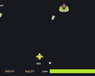
It was going be full keyboard, because gonna be other minigames that need more input , i opted to fix bug in the time i have(in fact i program a basic keyboard selector for the cave, but end disabling it, because can't reach the to implement it in main, mole and gameover).
Yeah I noted to late the sizee of the screen was to big, for experience i knew i don't have enought time to fixed it and rearrange the element in each screen in special the shot-em-up(i hardcode a few thig to save time).
Thanks for the feedback in special the coins issue(is the type of thing you don't noted for being the one made it),i think i can fix that adding a icon instead of the label in the hud).

Is a good shot em up, has room to imporvement. I add a  buy icon or somethig over the power upp of the rapid fire, is not intuitive,  besides the petals need more contrast with the background are easy to miss when the foes start to crod.

This is more to what you could do after the jam, Enemies need adjustment, either reduce their number or their lives, you could in the oppossite direction and turn it in a bullet hell(at least get closer to it). the diferent sprites and background are "disonant", i mean each thing apper to be draw in a diferent style, and contranst to much, they look good on its own but not as a whole.

The controls is rought, but the big issue are the gui,  should add transparency to it or sometthig allow you to see the upcomig foes, theey end hidden begin the bar.
Alternatively you could put a rect background and make the foes consider they are out  of the screen  if are behind that(look for a strategy game like  warcraft or age of empires, the older ones that were preerendered it gonna be more clear what i'm trying to say).
if you only could enable a extra skill you could nerf it and simply unlock it in level one(thought i get is not the intended is easier to display you idea that way in a demo or prototype, they are mean to be a atention catcher, adjusment gonna be made over it and the ability could be completely replaced or set a levels between them).

Visually look really good. Its easy to get tired of the way to trow the fireballs, and the inteerface is a little hard to figure in the battle, besides i recoment to  put a bigger button to the instructions or set it anothere way(at first i think was a banner, after it that the game freeze or was loading the close button simply hard to see)

Visually look really good. Its easy to get tired of the way to trow the fireballs, and the inteerface is a little hard to figure in the battle, besides i recoment to  put a bigger button to the instructions or set it anothere way(at first i think was a banner, after it that the game freeze or was loading the close button simply hard to see)

(1 edit)

The use of the limitation with the leaderboard  was creative. it's hard to see a twist in a slotmachine that works without real money.

Look really good, gameplay is interesting as has a strategic side, but the quantity of foes in screen at the same time, make the scenary to clustered to exploit that side of the gameplay.

I like the retro style,  the sword atack has to short range, make you stop,  and press in the  just moment,  for a sword feel to slow and heavy,  i think other weapon like a small heavy hammer, a mace or a dagger would fit more.