I got kinda stuck :( It looks amazing though and I really really hope you continue with this because it kinda reminds me of the old-style horror games where the atmosphere is the key part of the horror which I think works better than jump scares, I really wish the journal opened to reveal information as I was interested in the story!
MelStevenson
Creator of
Recent community posts
I mean the whole point of a rhythm game is to follow the music, the music was meant to have more of you hitting the notes with the voice than the music itself but I ran out of time so I had to reverse it T_T Kinda my first attempt at making anything without any help so just happy it kinda worked even if it was implemented poorly :)
I couldn't ever get to school but thats probably because i physically cant button mash to save a life! Its a really neat concept, and I had to laugh when I heard singing :D I think there could've been more of a visual way to represent the journey but again were so limited on time so i think it's fine as it is :)
Totally unrealstic, what kinda snail has floating eye brows? Gary could've used his power for good but instead he's dodging rocks? Bruh he could've been a doctor. But seriously great game, the concept was really interesting- wish there was sound, also Gary when he died just kinda looked annoyed also he still had health!
I liked it, but I got really confused with the input controls, I think if the space bar was just called shoot i would've understood about dragging stuff as I thought I had to drag the player and other objects, also the rotation is a bit messed up and sometimes i could never shoot the objects because it was at a 45 degree while the player moves like 65 degrees each time :/
Interesting game, I really liked the idea between changing between time, like pre-historic and futuristic ! I think if there was some sounds and or music and maybe a few more levels this would make a very interesting game! I think the checkpoints maybe should've been a bit closer to the jumping puzzles? But yea a great lot of fun :)
I got stuck on this level, thank you for the reset button, it was a lot of fun and I liked the choice of colour palette as i could identify what was what! I think the rotation would've been harder if you made it so the square was still very slightly moving every time you rotated because i could just save my square with my awesome time skills 
I actually manged to beat it! Was a bit confused to begin with as the colours are a bit confusing as I couldn't tell if they were on and off? I think it could've had more of a visual clue that you had to turn the page of the book as i didn't know i could do that until i reread the instructions. But it played really well, and I thought other than the colours that the visuals were appealing :)
Yea i enjoyed it, the assets were really good and I thought the choice of options were intresting. I think the ratios could've been a bit higher for the payout though XD Would've liked some music for hitting a big jackpot because you know we all like that shiny sparkly excitement to entice us for more! But yea spamming the spacebar and having music probably would've torn my ears off so maybe thats a good choice!
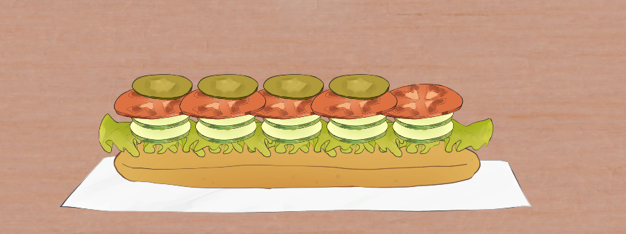
I made a vegetation option for Chloe! Thought it was really cool, the art is amazing! Would've liked some sound though, like just the awful sound of wet food slapping against each other can invoke emotion (disgust?) I'm guessing the food orders are always the same for individuals so that's where the ritual comes from? So I'm so used to a ham sandwich that I'd stick to the same order?

I really liked the concept considering that it's not often we associate negative compulsion disorder as a means of ritual, but for some people, I guess it's kinda an everyday thing that they go through. I think some animation would be nice for later updates, and maybe some sound or visuals to indicate that there's a timer as I didn't expect to run out of time!
Intresting concept, I don't think the platforms generated as intended as I ended up have to do massive leaps of faith and sometimes the platforms spawned on top of each other which was a little annoying aha, I also think it would've been better to have an end goal in mind- except kill the cat of course :D
I couldn't find the rat :( I didn't really get what i was doing at first but figured it out, I think it would've been better if the ghosts disappeared once the light was shone on them because all they did was move out the way and i could score more points by just following them! I did enjoy it though and I really liked the art
I do appreciate that it was multiple games, but I feel like you could've just really worked on one and that would've been much more fun. I really liked the bullet-hell game, while I really disliked the Find the Star game as the wall jumping didn't work and that cannon was such a tease :( The instructions on how to move and the objectives were clear and the art was really good!
Great concept, was super difficult- i am not poop! Instructions would've been nice, and I think it would've been better to go straight back into the game upon losing than go to the menu again, also if the ball goes off screen it automatically loses :( But I really enjoyed it and I really liked that it had music and a nice design :D !
I had no idea what I was doing :( When I finally realized it was a little annoying that the camera doesn't follow the ball and that it kept swinging so I couldn't grab the eye >_< Also a respawn when thrown would be good so I can keep trying over and over :) But I thought the concept was good and it was implemented well for the time it took !
Worried the name of the game is a little controversial ?
I don't understand what I'm meant to be doing? I'm floating around putting Adam bots everywhere- I would like to fight Adam-bot.
i really like the layout, the colour layout reminds me of DOOM
Is there anyway to implement Steam/Xbox controller input?
I think the concept is really cool
But I think the main issue is that the sprite is far to large so I struggle to get it through the holes and the char is a bit to fast at the moment so sometimes I end up completely missing them (but again I think this is due to the sprite being to big)
I also think that there could be a bit of music and a timer would be really good
On the first level the bomb disappeared before I could get to it- maybe the Collison box is a little to big? I'm not quite sure
But it looks really good, looking forward to seeing more :)
0/10 Justice for Goblins- From a Goblin
But seriously really liked the intro, although i think a skip button should be optional because some just don't wanna sit through it. I was a little confused with how to start the game and had to read on how to do it as I was just watching the menu screen. Also I think STORMVILLE might have to be a different colour just because its hard to see during the night bit.
I will admit i didn't really understand what I was meant to be doing- ovbiously I gobbled up all the plants because ya know girls gotta eat. But i didn't really understand what the objective was :/
Also maybe add some barriors so players cant walk into the green screen of doom!
But really liking the concept and cant wait to see how it turns out!
Wow! I'm really amazed by how much detail you've put into Lost Souls
I really like that you've gone for a top-down view as well as then I can see a lot of the surroundings. There is also a lot of diversity in content which I like
I would say that without any sound, it does feel a bit hollow, i think diegetic sound would work really great here, like the crackling of the torches. There isn't any challenge at this point in time.
I'm a little confused as to whether the main char is meant to be using a shooting projectile or a melee weapon? I also think stuff like the chairs need a little bit of physics so you can maybe knock them to the side a bit
I really like the idea
And I liked that I could pick the cat breed, and name them and maybe put clothes on them (in the future)
I didn't understand what I was meant to be doing with Adam the cat, I went to the shop to feed Adam, but it barred me from buying food :(
the states don't reflect the purchases at the moment and there is no visual ques other than the coins decreasing- so I don't know if I actually brought a treat.
F for Adam the cat
But I did really enjoy the concept, it reminded me of a Tamagotchi and with a bit of work I think it could work really well :)


