Indie game storeFree gamesFun gamesHorror games
Game developmentAssetsComics
SalesBundles
Jobs
TagsGame Engines

NightSpores

43
Posts
2
Topics
35
Followers
17
Following
A member registered Jan 20, 2020 · View creator page →

Creator of

Recent community posts

Thank you so much for playing and for your kind words!!💕 I'm new to writing character dialogue like this, so I'm really happy knowing you enjoyed it and that the jokes landed (the baby statues line was one of my favorites)!! I love comedy/horror settings and Eleanor and Sylvia were so fun to write for.

The art and animation were definitely the most time intensive and fun to do, so it means a ton that you liked it! Genuinely, it makes me so happy that you found so much to love about the game and characters!! I'm definitely not done with these two, either, so keep an eye out and I might end up doing some bigger projects with Eleanor and Syl in the future!

Also, I'm so excited to check your game out! The connection is a really fun coincidence, and I look forward to playing it soon!! :D

Gina and Quinn are both so charming and well-characterized! The sharp rendering style on the menu and background really stands out and looks amazing! Quinn's design is also great and her lineart is so clean!!

It was a really cute story and I'd love to see more of these two!

Thank you so much for playing!!💕I'm so happy you enjoyed it and I'd love to do more with these characters sometime soon!

This is so good it's unreal. The sound design is so well done and sets up the vibe from the get-go. The art is also really charming and the animated segments knock it out of the park! I wasn't expecting the fight mechanics at all, but they're well-polished and each fight is so unique! I hope there are more battles in the next chapters because they were some of the best parts of the game!

Overall, the story has me hooked and I'm excited to see the next chapter!!

Really great game!! Firstly, the artstyle and visuals are so cool! I love how you used monochromatic but differently hued tones for both Lenora and the background. It really gives a dim, nighttime mood. Lenora's sprite and animations are so charming too! The slow blinks, smiles, and different little animations like that really give her a ton of character!! The writing for both her and the guard is also great, it flowed really naturally and characterized them both so well. It left me really wanting to see more of them by the time it ended. It's all so memorable and very well done!

That being said, there's a bug you should know about! Itch won't let this install from the desktop app. This same thing happened to me on my submission, actually. Itch doesn't seem to like Renpy's pc builds on the desktop app, but works just fine if you put up builds separately for Windows, Mac, and Linux. I went on to a browser to download it and it installed just fine, but I figured you'd wanna know so more people can play it!

I love the vibes of this game! The art is so fun and I really like Emma and her demon's design! The pairing of "completely unqualified for the position" woman and "we should normalize workplace murder" demon is top tier. I really enjoyed it!!

This game is so good!! The art is incredible,especially with how unique and striking the color palette is! It fits the vibe of the game so well. The little red riding hood theming is great too. The way it's twisted for this game is a really cool take on it that I wasn't expecting at all.

Definitely one of my favorite entries in the jam!! Also, 10/10 bread, will be coming back for more.

This was really fun to play! Using the limitations of the jam (one screen, not showing the other players) as a device to keep the player uncertain was a really cool idea and I think you pulled it off great! It was also interesting having the one sprite be the board instead of another character! I love the art too! Overall, this is a great game with a really unique premise! It'd be fun to see more if you decide to expand it to a second trial!

The atmosphere you managed to build with so few assets is really incredible! The stark colors, the dithering effects, and the character art really pulled me in. The writing is also just stellar on it's own! I haven't played 10:16, but the amount of story and character in just 1000 words has me really wanting to check it out. Great job!!

(1 edit)

This is easily one of my favorite submissions for 02A2!! The story is so good and the characters are so well written. The art and character designs really sell it, though. It all ties in together super well stylistically and I loved how lively and in depth the background was!

Also the little keychains on the side were so cute! The Marcille and Falin one was my favorite

The art style is so cute and the point of view you set the player in is really unique!! I really enjoyed playing this

Hi again! I wanted to ask something regarding backgrounds! Is it allowed to use solid colored backgrounds as long as its generated in-engine? I'm currently doing a black screen with overlaid text for an ending segment and wanted to just make sure that this wasn't technically a second background. Clarifying a little more, if the black screen is okay, would a solid red screen also be alright? It's all generated using code in Ren'Py, so I just wasn't sure. Thank you for any help!

Thanks a ton!! That really helps to know

I'm writing out my first draft right now and was curious about something regarding word count. A few different branches lead to the same decision points. This means that I have decisions like "I'm out" that lead to the same passage of text but can appear from different routes. I know that the passage of text is only counted once, but is the choice text also only counted once? or is that counted for each time it appears? Thanks for any help!!

sooooo cute!! I love the very almost scrapbookish aesthetic it has!

Ofc! I remember one that stuck out to me was the rat throwing the dirt balls, as while eventually I realized it happened in a general pattern of attacks, the first few times I was within the range of the boss and was caught very off guard by the immediate attack and damage. It left me a little wary approaching the boss when i had first started just because I didn't have any idea when it would happen before I ended up learning their entire attack loop. I also did have a moment in the cat fight where I was killed by the beginning of phase 2 because I didn't know that a blade would be appearing from the middle. That second one is obv a much smaller thing, but those were the two I noticed. The rest of the telegraphs were great though! It felt very fair when I died most of the time and it was very fun learning the bosses. Something as simple as a warning indicator for the cat blade or a windup for the dirt throw would totally get rid of any problems I'd had! Super excited to see whatever you both make next! This has definitely remained one of my favorites as I've rated some of the jam games and the uniqueness of this one just really sticks with me. I'll definitely be playing once the third boss is added in!! :)

Such an amazing entry! I really love all the art on display here, everything feels really cohesive and matches the incredible music! I personally found the hub a bit clunky to navigate, but the player controls are top notch. The one issue I did end up having was that my health dropped super low and I couldnt find any way to replenish it, with the orange bar that seems to be for that not working. So my one suggestion would be maybe spending some more time on the central hub and making it a little more comprehensive for the player, since that's definitely where I was the most confused. However, that problem is completely overshadowed by just how cool the bosses are! The music, feel of the player, and giant boss designs just go so well together and are definitely the game's high point! There's clearly a lot of love and care being put into this and I'm super excited to see where future versions go!

I think this definitely has some potential! The weapons in the game are dynamic and definitely play off the makeshift theme, which I think is really cool! I would've loved to see the full crafting system since I think that what's here already is very good, but I also have totally been there before with jam time cutting off certain things. Musically the game starts off really strong and keeps up a really nice track the whole way, so great job with that! Controls are a bit rough, especially with the player feeling a bit too slide-y at points, but that's more of a nitpick. The visuals are really cool and I would have loved to see some more room layouts and more varied bosses with the art you had! Overall a good job and I think itd be fun to see what itd look like with the full crafting system implemented!

First thing's first, absolutely incredible art! From the environments to the character animations, all of the art here is really well made and the animations are so smooth. Audio-wise the sound effects and music are also really good, so lots to be proud of with this! I really just wish there were more. The single boss with one attack that also dies fairly quickly is really the biggest problem I think I have. This isn't to downplay the work at all, as what is there is really great! I just think that the art and effort already there could have really shined with just a little more to show, even if it were just a few more moves for the boss. Regardless, this game is really memorable and if you ever updated it with more content I'd absolutely play it!

I don't know how else to say it but this game feels juicy. The amount of polish and refinement is insane, especially for a game jam game. Every bullet, laser, and lighting effect just looks and feels so good. The makeshift mechanic fits right in, really nailing that vibe of becoming an unstable scrap heap of a fighter. The only problem I had was that the bosses themselves can feel very resistant to the normal bullets, which sort of lessens the impact of the normal weapon. Even this is partly remedied, though, by the overcharge weapon. Great work!

I know I'm echoing everyone else here when I say this, but the art is amazing! Perfect use of the theme, especially on the final boss. There definitely was some clunkiness with certain attacks not always happening when I clicked, but the positives heavily outweigh any problems. Loved the segment towards the end with the shield prefab especially, great job!

Loved this one! It was really funny from start to finish and throwing the bricks was actually surprisingly entertaining! I loved clumping them up into huge balls and watching them fly everywhere when they hit. The fourth boss definitely could use some tweaking as I found myself really uncertain as to where the beams hit and its health was gigantic, but even though I didn't beat it I still really enjoyed that boss too! It was a lot of fun and made me laugh with each new boss, great job!

I really love this game's concept! Immediately the amazing artwork really drew me in, and it definitely nails the theme! I did start to have issues with the controls and camera at points, mostly with the camera getting caught in weird places, but other than that this game is really fun visually. The boss designs are super cool, and the ability to see info about them in the menu is a very nice touch! 

Unfortunately, at least when I played, I didn't have any audio. I don't know if this is a bug or if the game doesn't have any sound, but if it doesn't I think some added sound effects or music could help give the player some more feedback during gameplay. That definitely doesn't stop the game from being fun though! I had a great time playing this and would love to see where it went if development continued.

I honestly think this game has a big chance of winning! Everything from the art, music, controls, and design just works so well together. It was so fun to play and the final boss especially had this really cool and satisfying feel to it. I saw some updates in the server that showed off these boss designs and was interested from the beginning, but this really made me invested! I'd definitely play this if it ever got a post-jam bigger release. Really well done!

This was amazing! The controls are super tight and I was immediately invested in the story. I did encounter a bug where I had to fight the second boss twice before progressing, but that was really the only thing I had trouble with. The art and music are amazing too! And even though some of the boss telegraphs could've been more clear, the fights themselves were well-balanced and just the right amount of difficult. It all just oozes personality and fun! Great job with this!

I'm so happy you enjoyed it! It was a really pleasant surprise to see someone find this project after all this time! and thank you for letting me know about those few issues you had. While I can't easily find the game's source file, all of the issues you encountered are things that I will definitely address in future games. 

Radish's story is one that I'm keeping in the back of my mind as a future, much bigger project, so noting the collision and slight confusion issues will definitely help when I eventually do it in the future. and I will definitely be putting some screenshots up!

Knowing that someone enjoyed the custom sprites and dialogue, along with the scripted events and puzzles that took so long to create is really inspiring, so thank you for playing the game and taking the time to leave such a nice comment! I hope that I'll be able to deliver more of all of that in future games!

Hehe thanks so much! I was looking all over the book and somehow missed that. This helps a ton! I can't wait to write all these ideas down. Brave Zenith really has so much openness for creation that its really exciting even though I've never done it before!

I'm really excited to be making some content and have quite a few ideas already, but I want to make sure I'm putting CRs that make at least some sense. I've never really done anything like this before and am struggling to figure out what to put for a weak enemy that appears in a group of about 1d6 + 4. I also am not entirely sure if the associated CR is based on that of a single monster or the entire group it might appear in. Does anyone have any advice for this sort of thing? Any help is greatly appreciated!

A Brief Post-Mortem for Echoed Eyes!

Hi everyone, unfortunately, I lost motivation to finish a decent, playable version of Echoed Eyes for the Jam. I got very sick after the first week and then a medication I've been taking has kept me very tired and out of it. It's not all bad, though!! I genuinely loved working on the project and my skill with RPGMaker, Aseprite, and game making in general has increased a ton! I got exactly what I wanted to get out of this project. I've learned a ton and am interested in doing more in the future! I realized that I don't really enjoy puzzle-crafting, but love building environments and doing spritework! This is really what killed the project, since I'd built so much with the plan for puzzles but then realized that none of the puzzles were really fun or interesting to make or play. However, I don't think that this project is dead yet! Radish, Dot, and the scraps of ideas I've made for this project are still very much alive in my mind, and I'm hoping to take this project somewhere else in the future! If I do, I think I'll focus more on RPG mechanics and story with puzzles being reduced massively. Despite my loss of motivation, I really loved this game jam and am so thankful to everyone who has participated for sharing their work and leaving replies on mine! I do intend to submit what I do have, but it's ultimately a starting area and isn't much. I hope you all like it!

1/17 Part 2! - It's  technically a day later but I'm up super late. I got a bunch done, though!

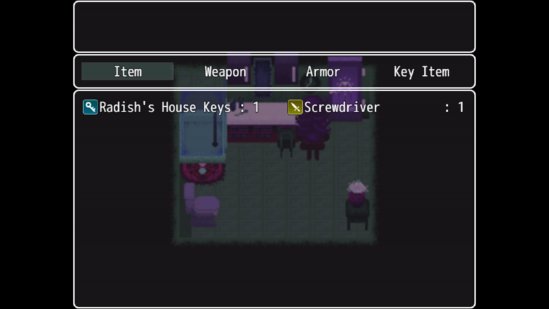
Hi again! I felt a lot better today and got back to work on my game! I managed to implement a lot of gameplay related mechanics, most importantly the ability for players to equip items and use them to interact with the environment! So now, the main puzzle and explorative mechanics of the game can easily be put in.


It's a little crude for an interface, but I think I won't bother changing it since it's not that important in terms of what I need to spend time on.


Hoppy can now forfeit the deposit on her apartment! Interactions like this are going to be really commonplace so I'm happy to have finally gotten it implemented!

In addition to building the whole tutorial sequence, I was also able to create a new character and the beginning to the main area!


It's very basic right now, but Radish is no longer the only person in the game! I've decided that instead of creating an outside world, I want to build a heavily enclosed, "backrooms"-esque environment. Dot is going to be one of the people Radish can meet!


Since she's a side character, I only made her a single portrait, but I'm really happy with it!! I also realized that she was a lot easier to draw than Radish, so I think I'm getting more adept at spritework!


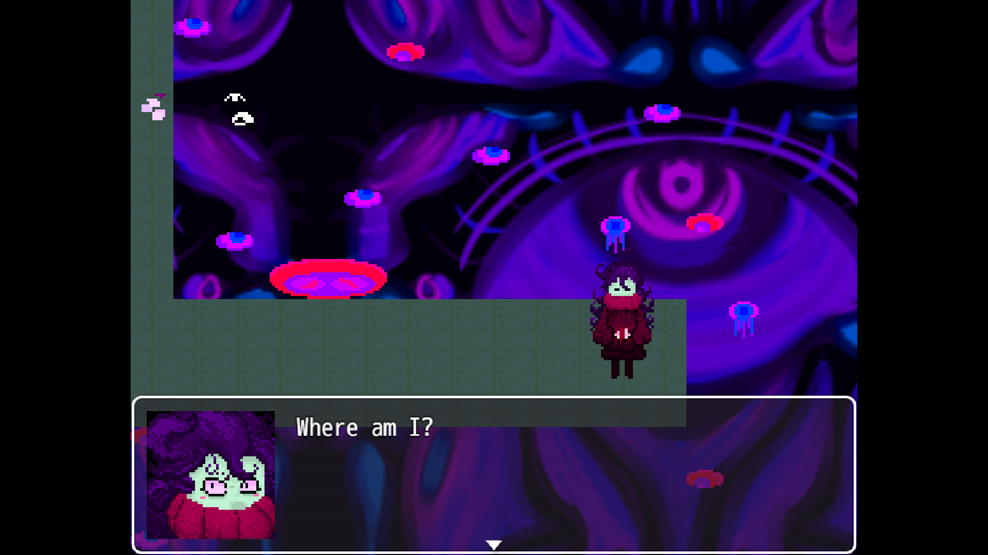
Finally, the opening scene of the game is implemented. I made it when I was getting sick, so this is actually older than everything else I've shown today! It was really weird and frustrating to make, but I think that was just because I was getting very sick and my head hurt at the time. Ultimately, it served to help me learn a ton more about event sequencing and effects, which helped me implement a lot of what I did today!

For tomorrow, I'm hoping to create 4-5 new areas. In these areas, I want to create two new characters to inhabit these areas! I'm hoping that an expansive environment like this will allow for a lot of secrets and exploration to be done and that over time it will reach a stage of complexity to the point where I can make the end point and then spend the rest of the jam polishing and adding additional content! Good luck again to everyone in the jam!!

1/17 - I got sort of sick 

I ended up getting sick while working on my game, but I took a day to recover and I feel ready to start again! I did make a very, very rough intro sequence while I was sick but it’s not very good. I may or may not take the time to improve it later. Regardless, I’m hoping that tomorrow I’ll be able to finish the tutorial aspect of Radish’s house and start working on the outside! The time loss definitely has me a little worried, but I’m hoping that I’ll still be able to finish the jam with a playable, though maybe short, game! If I’m lucky and get a bunch done tomorrow, I might even be able to add the first few NPCs!!

Your dialogue sprites are so cool looking!!

1/14 - Radish has a home!!

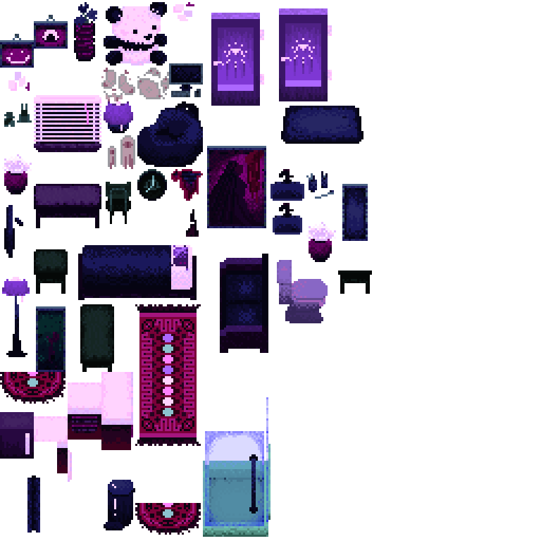
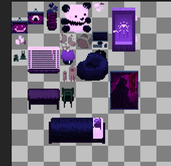
Today was a really tiring but productive day!! I spent the entire day drawing object sprites to construct Radish's house with. I'm really lucky in that my hope that the backlog of assets would make future development much faster proved true! By the end, I was able to sprite her entire bathroom with only a few unique assets that I'll be able to find more use for later!


This object sheet has grown so much

I especially enjoyed making the rug patterns and the new painting! The toilet is so ugly but it was the last thing I made so I guess I was sort of out of energy by that point.

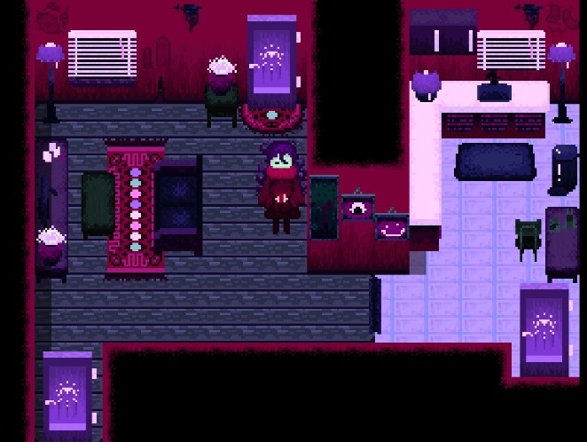
With all these assets, I was able to fully build Radish's apartment!! Building the apartment was fairly easy, but I did end up spending a decent bit of time fixing collisions and making sure everything meshed together alright.


This is her living room and kitchen! Seeing it all put together like this really makes me excited because it's starting to feel like an actual game!


I've also added more small dialogue interactions!

That's all for today! Tomorrow, I want to make the opening cutscene as well as use the apartment environment to create a basic tutorial to the puzzle mechanics of the game. I might also try to add custom parallax backgrounds if I have the time! Since I haven't made cutscenes in RPGMaker MV before, I'm not exactly sure how long it'll take to develop. We'll see, though! I'll update you all tomorrow ^^ <3

Thank you!! Good luck with your development too! •U<

I love the art!! That walk cycle is soooo good

I loved the concept already but this Todd was enough to win me over entirely. I can’t wait to see how it develops!

1/13

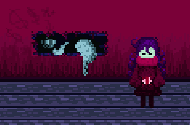
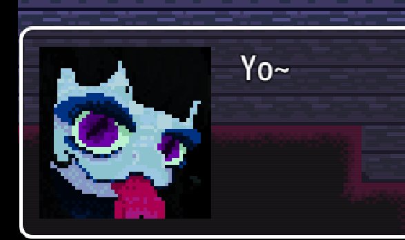
Today I focused mostly on getting Radish's portrait sprites done! I didn't realize how big dialogue sprites were at first, so I ended up redoing them a few times to get them to the point where they were good enough to be used. I had considered drawing them digitally and then pixelating them, but ultimately decided to draw them in pixel art from scratch. It was out of comfort zone, but I'm happy with the result!

I really feel like they give Radish a lot more character! I tried to make it clear that most of her face is tucked into her cowl, but I'm not entirely certain if that reads well. If it doesn't read well, I'll fix them later if I have more time!

Additionally, I made a lot of new sprites for use in the game! I was a bit busy today so I didn't have the time to make as many as I wanted, but I think tomorrow I'll have extra time to make more. I especially enjoyed making the big painting piece and the wall stains! I think that once I've made a sheet or two more of objects that I'll have enough miscellaneous items to mostly cover the rest of the game.


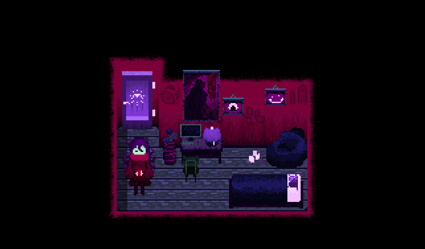
Finally, with all of these new sprites, I was able to construct the first official room of the game! Radish's bedroom has now been built!

I really adored getting to piece all of these sprites together so easily to make what feels like an actual room! Building it has made me way more exciting for when I have enough sprites to build more

!

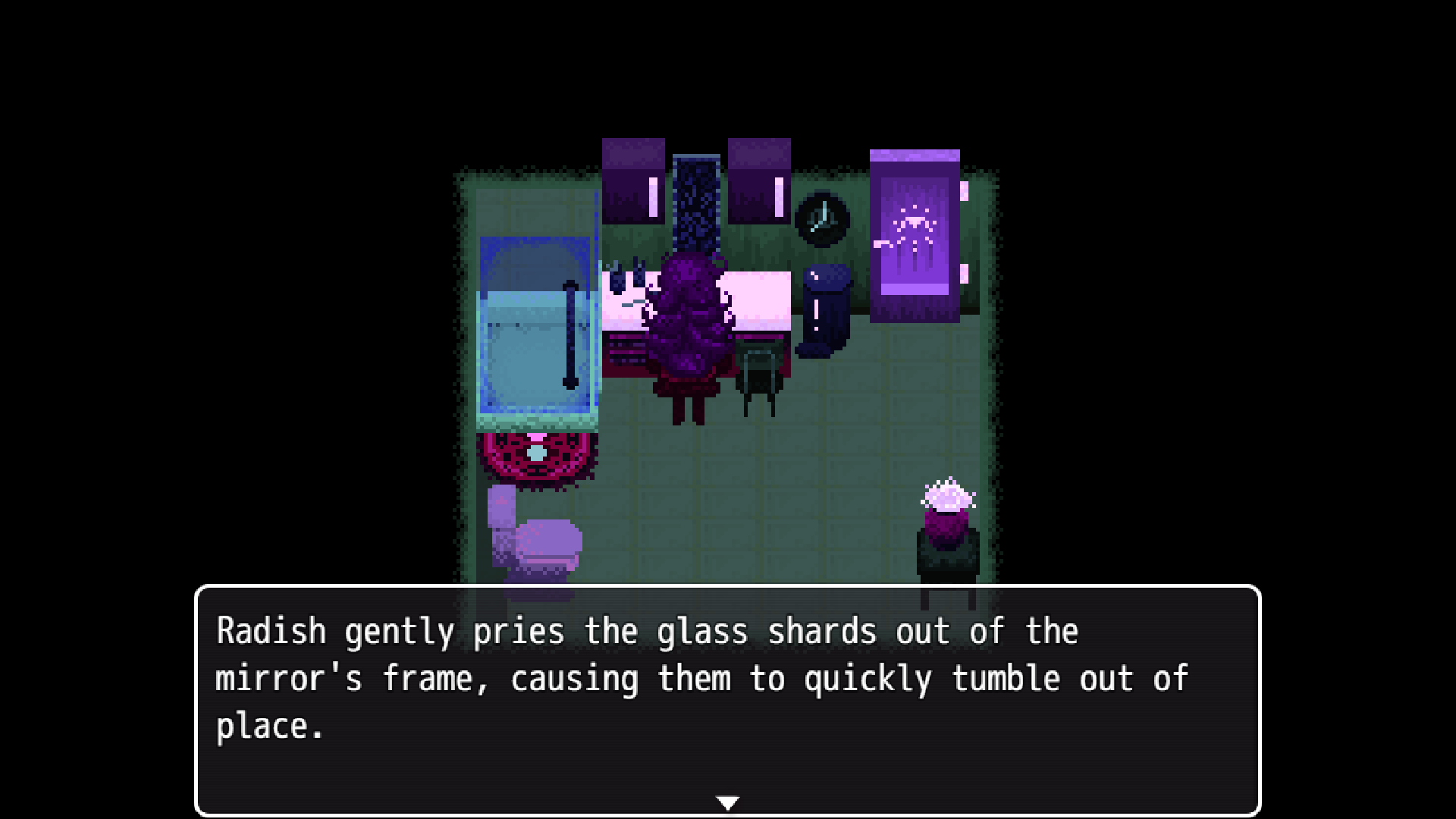
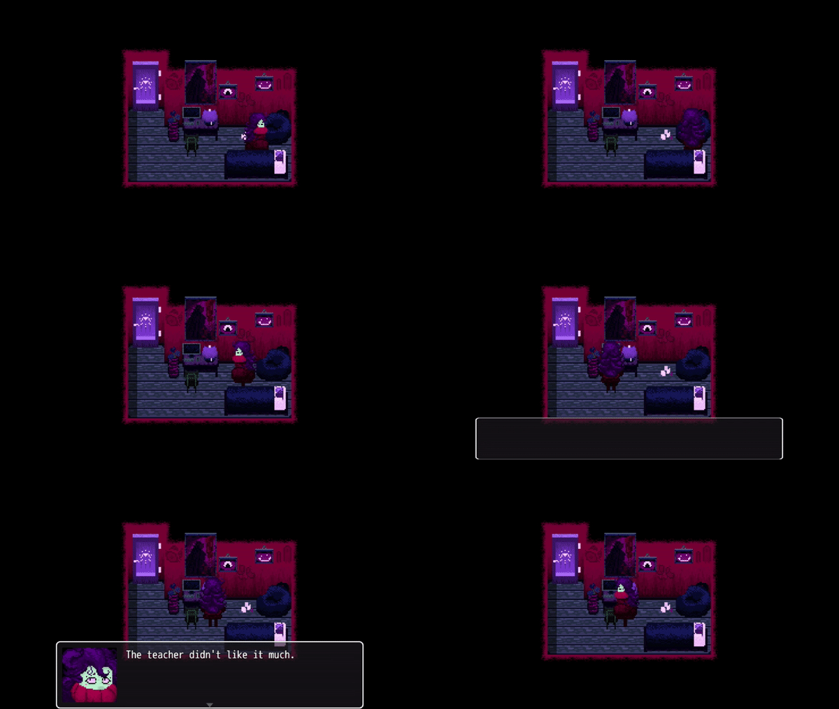
This is the rough build of dialogue and interactions in the room that I made to test the portrait system! The sprite restrictions in RPGMaker meant that for Radish to have a tall sprite I had to install a few plugins and alter her collision boxes, so a major part of building this room was fixing the collisions on events since I could finally see how they'd work with her sprite. While I really enjoy the black void effect from the small room, I'm also thinking about trying to make a parallax background (I think that's what it's called?) to have float in the background to create a more surreal vibe.

Overall, I'm very happy with today and how development is going! Tomorrow, I'm going to focus on object spriting and room building exclusively, with the goal of finishing Radish's living room, bathroom, and possibly the start of the outside of her house. Good luck to everyone else on their game projects, by the way!! It's really encouraging to see how everyone else is progressing and I love reading the devlogs!

The songs you've made for the game are really good! Also, I really love the way you drew the keys. That might sound like a really specific thing to like, but I think they match the atmosphere made by the music really well!

Seeing how it's developed so far from the concept drawings is really cool! The blender model is so cute, too! It seems like a lot of work but it's paying off really well!!

The concept, art, and GUI are sooooooooooooooo good!!! Your art especially!! I'm really excited to play this one!