What a gorgeous game! The bosses and music are great. It's too easy though.
Play game
'Til Depth Do Us Part's itch.io pageResults
| Criteria | Rank | Score* | Raw Score |
| WINNERS | #2 | n/a | n/a |
| BOSS DESIGN | #3 | 4.267 | 4.267 |
| SOUND/MUSIC | #3 | 4.044 | 4.044 |
| CONTROLS | #4 | 3.800 | 3.800 |
| Overall | #4 | 3.911 | 3.911 |
| FUN | #4 | 4.022 | 4.022 |
| ART/VISUALS | #10 | 4.333 | 4.333 |
| USE OF THEME | #31 | 3.000 | 3.000 |
Ranked from 45 ratings. Score is adjusted from raw score by the median number of ratings per game in the jam.
Game's take on the theme
The main mechanic and allure of 'Til Death Do Us Part is the ability for the player to arm themselves with their choice of the leftover scraps of the bosses they defeat.
Does your game utilize the PlusMusic plugin?
no
Did you use any third-party plugins other than PlusMusic?
no
Comments
A beautiful game!! great use of the theme. it was like a new age contra but the vertical aesthetic was fun.
I like the overall aesthetic of the game and how polished it is. The final transition was really nice as well. Also I'm not sure how I found this bug but after defeating the second boss it teleported me straight to the third boss before I selected a new upgrade. (I'm not sure if this was intended but after I died it forced me to re-do the tutorial). The music complements the game very well.
This game is very polish, it could easily pass as a complete product more than a gamejam entry, the only thing I was confused on was the fact that I didn't realize that I needed to press space to continue, Good entry overall tho!
Your art style is nice and polish, i really had a blast playing this game. Its a bit easy though. The are great i love the readability of their attacks. You have a great understanding of boss battles. The music works.
Great gg to you
Love the artstyle. The animation quality is great too, just wish the game was a little longer. Great work.
I've been waiting to play this ever since I saw it on discord! It looks amazing! Love the bosses, music, and how everything ties in together. Feels very polished, well done!
The gameplay is solid, though a bit too easy. I love how the mechanics of the bosses build on top of each other.
The only thing I'm critical about are the upgrades. I wish you could try out the upgrades before committing, and I also had trouble understanding how the 2nd upgrade I got worked (to the point I wished I only had my first gun instead).
Overall good solid polished game!
wow the boss design is ff AMAZING!! assuming you used GMS2 (because thats what I used and i recognize the loading screen lol), this game makes me proud to be a gms2 dev. the gameplay is super satisfying and fun, you did the falling effect rly well, the bosses are rly unique and smart, the transitions between bosses and after you beat the game are seamless and super polished, my only criticism is that the player is too strong (not the worst thing for a jam game tho) and that there needs to be morrre. rly good job :)
Quite a few different attacks on those. Especially the last one switching between night/day/water/whatever?
I don't think it was too easy but then it's not a type of game I play too much... Or maybe it is because I even managed to get to the end. But then I think if it's too hard to get there, all the fine work in creating it would be wasted?
This game is amazing! It feels exceptionally polished, and it's clear a lot of effort went into this. Sure, it's a bit easy, but I personally appreciate that, because I'm not great at this type of game. The visual style is stunning, and the music and sound design perfectly complements the action. I love it!
Wow, just wow. I love the downwell inspiration for the art style and the boss design felt really cohesive and well thought out, also the music and sfx fit it really well. I especially enjoyed the pong attack, it felt really original. The game felt a bit too easy though, you gave the player way too much health and/or damage, I could barely see the bosses before they were dead :c
Still, definitely one of the top games this jam, really well done!
Alright! As promised. Much of this review is gonna be tentative, because I'm not familiar enough with the engine to tell what's a mechanical limitation and what's a design choice. All crit is meant to be constructive- I did really like this one, I'm just digging in.
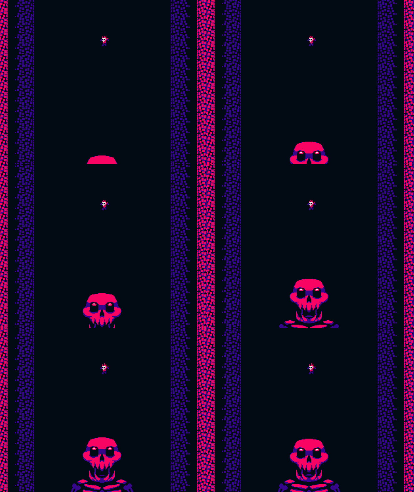
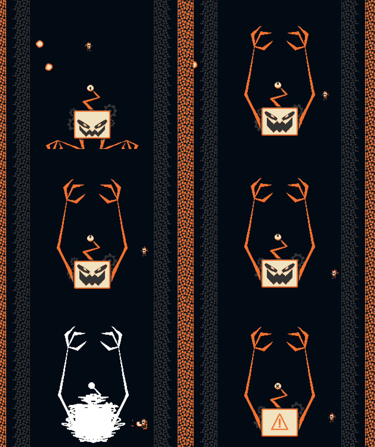
The bosses were fantastic- the callbacks on the third boss really made it for me, especially because the adaptations removed a lot of weaknesses of the previous versions- hiding behind the lower piece of the ping pong mechanic from boss 1 was no longer a good way to avoid damage, etc. The animations were crisp, clean, and choreographed the attacks well (look at that eye tracking on the second boss! wow!), at least after I'd seen each attack a time or two.
The animations and movement controls felt good, and just floaty enough to sell the falling part while maintaining tight controls. I will take some degree of issue with the walls however- at the speed of movement, the relative (normally good) monotony, and the bright colors required by the palette, it quickly became slightly dizzying and broke up my ability to focus on the foreground action or register player movements- this was worse with some boss palettes than others, though it remained an annoyance throughout.
I'm less a music person, so the most feedback I could give for the music is that it was great, and I very much appreciated the callbacks. If a volume / sound slider is possible within the engine, I would've liked that though, to turn the effects volume up a lil bit.
Balance prolly needed a little bit of work- I did two plays, once with the bones + arm and once with the eyes, and my second go of it was much easier than the first- as sometimes one of the bones would get lodged somewhere complicated and I wouldn't be able to shoot, nor reach the third boss where it was hiding under the... water? acid? for a while. I also wouldn't call the bosses easy per say- so much as legitimately well balanced for the size and scale of the game, though I will admit I spent a minute or two shooting the tutorial skeleton in the hopes he'd turn out to be a secret bonus boss or some nonsense.
I wasn't entirely sold on the theme fit at first, but between using bits of the former bosses that also recreate their mechanics and the nature of the third boss reusing the same, I wound up sold on it by the end. Good theme use on a very classic boss rush.
I do wish you'd done a bit more with the fact the player is falling more than just on the stylistic end, but as a gamejam game this is a super cool entry and definitely one of my favorites thus far! Really did like it, and hope it does well in the actual contest!
Amazing game, pulls you in right away with the stellar art and music and keeps you interested with an entertaining gameplay loop and a variety of weapon upgrades
Great game. Managed to beat it first try even on trackpad! One thing to note, I would like if the player was a little easier to see, perhaps like a white outline or something to distinguish it from the projectiles from the enemies, at time I felt like I got hit because I was confused as to what was what. Otherwise awesome game!


Leave a comment
Log in with itch.io to leave a comment.