Indie game storeFree gamesFun gamesHorror games
Game developmentAssetsComics
SalesBundles
Jobs
TagsGame Engines

omega797

80
Posts
11
Followers
3
Following
A member registered Dec 01, 2016 · View creator page →

Creator of

Recent community posts

Thanks for trying the game, Ani! 

Sorry about the performance issues. Game jams are great opportunities to try out different tech, and unfortunately the "goop" tech just didn't scale down to older graphics cards (at least not in our timeframe). If you'd like to comb through the writings without launching the lab scene experiments, you can press 1 through 5 on your keyboard to add each day's narrative.

Thanks for trying the game!

In experiment one and two, you're trying to prune the organisms exponential growth to achieve the required tissue size. (8 for the first level). Note that the tissue grows back differently after repeated prodding.

In experiment three and four, you use that knowledge to build circuits without short-circuiting.

If you get stuck or just want to move on to the more complex puzzles, you can hold F12 + enter to skip a level.

Hope you'll have a chance to give it another shot.

The visuals look incredibly polished for the time budget, very impressive! The work on the smooth camera and animations (particularly heal) do wonders for the vibes.

Gameplay-wise, I think you set yourself up for two tough challenges:

 (1) trying to make a compelling reason for needing two layers of battlefield, and

 (2) making an AI that could demonstrate it.

The idea of getting bonuses on the macro-level for micro-level control is a great one.. but I can't seem to figure out the impact. Maybe I just missed it after running on no sleep or it might just need some extra text on the store page if it's not documented in game.

AI, on the other hand is much tougher nut to crack. Asking a new AI to develop a strategy for an abstract board is not easy (in 96 hours or 960 hours)  I think you'd be more successful demonstrating the depth with staged "puzzle battles" (e.g. win in 2 moves) so that you can ensure that the player has to be engaging with the mechanics in order to win.

Thanks for sharing your game!

A fun use of the theme, and a great aesthetic. My arrangement of modules never got very big before physics got wonky, but I can see a vision where this expands to building maddeningly unstable scaling towers of weaponry. Hope you continue on with the prototype.

It's a great take on a classic block puzzle, fits the theme perfectly and is the right kind of zen for after a long jam.

I gotta admit that the screenshots weren't selling it for me (what can I say, I never had an 2600), but mechanically this really, really smart. You managed to create procedurally generated "levels" without making different levels, and I felt like despite having the same environment my muscle memory didn't save me. A interesting gem from this jam.

It's the lovely cohesive art style and animations that really elevate a simpler interpretation of the theme! You had me hooked at the first reload, and loved discovering all the weapons.

The addition of "BANG" was also a great option as it added a lot of stress to otherwise predictable combat. It's always fun to play something in a jam that doesn't take itself too seriously.

 If you were to take this further, I was really hoping that when I picked up a second die, it would get added to my roll, and then I could akimbo with left and right click (or something).

Every once in a while you get randomly assigned a game to review that just absolutely nails it. This is one of those games.

Loved the use of the theme, the randomness plus the roll as a physical weapon is fantastic. Strategic depth of play, fantastic art and that core gameplay loop of lining up and crushing your enemies just slaps. 

Even for a team of four the amount of polish you got in is super impressive. Hope to see you in the finalists.

Great artwork and a good use of theme. The strategic combinations did a nice job of requiring the player to make decisions. If you take this one past prototyping I'd separate out the movement mechanics from the dice rolls altogether (i.e. move & play an attack on one turn).

Nice low-poly horror atmosphere. I would have liked to see more use of the theme of probability.

Thanks for your feedback. When I made this I had very recently played "Carto"--its Story Chatlet was the biggest inspiration. That having been said, Recursed holds a place in my steam library, so no doubt it has an impact on my decisions even if not the game I meant to pay homage to.

(1 edit)

Hi Banshee, thanks for playing.  

If you want to give level 5 another shot, here's a  gentle hint:

The secret is in the "memory" tile that you gained during the interlude. You can drag a tile to your memory to remember it, which will allow a tile to stick around when it should otherwise be blinked out of existence. 

Or, here's the outright spoiler (paste this text into rot13.com to see)

Cynpr rnfg gvyr vagb zrzbel
Tb qbja ynqqre
Cynpr rnfg gvyr sebz zrzbel gb znxr oevqtr cneg 1
Cynpr rnfg gvyr sebz obneq gb znxr oevqtr cneg 2

Thanks for playing! Cheese is always an acceptable countermeasure to the absence of playtesting :)

Loved it. You know, I was surprised that very few entries really explored "joined together" as "supply chain" (It was my second choice of idea), and I'm glad to see one that did it really well.

If I'm going to nitpick, I think that it's possible that it would have been even more satisfying if you had the player to discover the inputs/outputs on their own... then again, for a jam in the absence of playtesting you probably made the right call. 

I hope you make a full game out of, there's a kernel of an immensely satisfying chill resource management game in there. And if you get a chance, play some of Carl Chudyk's "Innovation" for inspiration if it's not already in your physical game library.

It's a take on the theme I haven't seen anywhere else, and I've seen quite a few jam submissions at this point. Nicely done.

I love the idea of a taking a space that you think you "know", but then open up know traversal paths. The fact that you're on a time limit means that you're pressured to skip over the exploration until you've got a safe path back. It all works really well. 

The only criticism I have is that if you're going to put the player under that much pressure you have to make sure that the components like physics don't get in the way of the player's run. Games like Minit run with this theme but they have the benefit of that 2d grid precision. Your traversal shortcuts were designed with verticality, so 3d was a must, and it gave you extra work to do in the polish department.

Wonky physics aside, I think the gamble paid off and you delivered something unique and engaging. Best of luck in the jam.

Side note:  have you played "The Occupation"? You should try that out if you want to see where this concept could go.

Fits the theme perfectly, and more importantly, is a delight to play. Well paced puzzles and polished presentation prove that good edutainment is genuinely possible. 

My wishlist would be to adapt this to learning glsl to finally trick my brain into truly understanding shaders instead of copying off of stack overflow.

Best of luck in the jam!

Full marks for originality! In its constraints, it reminded most of a puzzle in Monkey Island -- the infamous underwater scene, specifically.

I loved the idea of being joined to a chair (and a bomb), but I what I was missing was how it impacted the mechanics of the character. That is, I could still "walk around" and pick up items as if it was a standard point and click, I just had to click more often.

If you were to expand on the idea, I would love to see you find a way to incorporate the chair either a unique constraint to standard mechanics to dream up never-before-implemented lateral thinking puzzles. I can imagine some really devious ones involving using your chair as a lever, or by holding an inventory item between your teeth (you can only hold one, and the items are limited).

Or.. to go the narrative route make the chair an extension of the character the way that Full Throttle implemented the "boot" as a verb.

I had a blast. Thanks for sharing and best of luck in the jam.

Fantastic presentation, and a great connection to the theme. I enjoyed the puzzles, my only criticism is that I would have liked checkpoints rather than a restart.

Some clever ideas in there -- I especially appreciated the fact that the chromatic aberration was not just a stylistic decision to make it feel "hacker-ish", but actually fed in into the mechanics.

I think that there's more that could have been in two areas:

(1) Depth of mechanics beyond "lock and key". Perhaps that would 2d metaphors for file copying, viruses/trojans, data corruption, etc. 90s hacker films are endless source of strange and wonderful ideas of what hacking would be like in the 21st century. 

(2) I would have loved to see a stronger connection to the theme of "joined together" beyond theming of combining the abstract cubes. Maybe it would be the connection of computer systems together or piecing together scraps of data to uncover a secret, etc.

A great first jam entry - best of luck!

A great unique concept, and I felt like it fit the theme well.... It seems easy at first, but you definitely managed to find the difficulty once you add in shooting and jumping for bullet avoidance.

There's a demanding level of multitasking in cube rotation I was really pleasantly surprised by.

I got stuck on the puzzle with the "two hooks". I wasn't sure if I was approaching the problem incorrectly or if I my reflexes were just off -- thanks for adding in the level select, because I was excited to see more of the game.

I love this entry for two reasons.

(1) It's clever, funny, has a great presentation and the ending actually made me laugh -- a true rarity in a jam game.

(2) It lets me be that pedantic jerk that mentions that a DVI-I and DVI-D connector are not compatible.

Thank you for both opportunities.

(2 edits)

Deceptive depth all around -- absolutely nailed it! There would be a place in my steam library for a casual puzzler with these mechanics. 

I was more of a fan of the crate/barrel puzzles than the 'pure rope puzzles', and I think it's because the pixel art style, combined with the zoom level, makes it difficult to clearly make out the over/under, especially when the rope is over the template. Putting the template with partial opacity over the rope, and adopting a textured approach to drive home the shadows would have made it way easier on my eyes.

"Crosses" was the big difficulty spike for me. I ended up going back through the earlier puzzles again to see if I missed a mechanic. It eased up after that, so I'd be curious to find out if that was a common pothole for players. 

I, of course, volunteer to playtest to help smooth out any difficulty spikes in your next endeavor :)

I spent longer on this than any other jam game so far, and I'm very happy with how I spent my reviewing time. Best of luck in the jam!

I really enjoyed this as a prototype --- there's a wonderful kernel of risk/reward of picking up more parts and cars and balancing speed with defensive capability. 

Most of what I read in the feedback I'd echo, with one exception: I actually liked that the it was difficult to pick up cars when you're moving too fast, because that means that even speed has negative tradeoff to consider. I wasn't expecting that from the outset and was pleasantly surprised by it. (The placement issues on the other hand were definitely genuine).

It could be the RNG that I got, but not many offensive turrets dropped for me. I would have loved if the demo had really gone a little overboard by the end (even at the expense of balance) to highlight a train decked out with turrets and a screen full of projectiles ---- Or, sell it in presentation with particle effects, screen shakes and other "juice" to make the scene of a 'chaos train' truly feel like power to be reckoned with.

Thanks for sharing and good luck in the jam!

(1 edit)

Thanks so much for your feedback!

And yep, you caught me. There is one cut level that was going to serve as the bridge between those two levels. 

In case you were curious about the reason: 

The definition of the floor isn't actually changing from floor-to-floor. What you're seeing is the golden rule is that the upper floor always produce a physically possible lower floor, even at the expense of the canonical floor map.

In other words, if the upper floor says that there is a ladder descending to the lower floor at X=2,Y=5, then when the player descends, there will be a ladder ascending at X=2,Y=5 regardless of whatever normally should be there.

The players subconsciously experiences this by ascending/descending, but they never take it into their own hands to purposely & actively override a lower tile -- that was meant to happen in the cut level.

Hope you had fun and thanks again for taking the time to write up your experience.

I like the concept, I think that it fits the theme well, and I get the SimCity for DOS presentation vibes for sure.

I recommend adding a section about controls if you get a chance. I had to press "space" to unselect a building (not sure if mouse was also an option, but didn't seem to work). Secondly, there's a bug that causes reset to fail. It worked on the very last level, but didn't work on an earlier one. You might want to add a note about it if you can reproduce the issue.

My only problem with it is that there's just not much depth to the decision making, because the cost/benefit analysis of 1:5 is just to simple. Easy ways to remedy that without blowing up scope would have been something like "solar powers in a radius, whereas power lines power linearly," or to have power output capacity that drives the placement of "hubs". 

I hope you get a chance to explore the concept more. I can definitely see a place in my Steam library alongside tiles such as Mini Metro for an endless power-grid simulation.

Fantastic presentation, and mechanically it feels like it could be the start of a blend of Battle Chef Brigade and Overcooked.

I would have loved to see the food "fight back", which would take the resource management mechanics to a new level. 

That having been said, I do think that the theme is a pretty loose fit. Minor tweaks could have made a big difference to bring it more inline with the theme (and add some mechanical depth to boot!)

 - Maybe the "food monsters" gets angry and aggressive as Velma gets angry

 - Maybe the food needs complex combinations to create recipes beyond heating/freezing/microwaving

- Make stunning is an optional mechanic rather than a mandatory one.. the food monsters actually DO escape and join together with the other food monsters so that you can't rely on the monsters being in the correct hallway each time. 

I think you've got a great kernel of a game. Thanks for sharing.

First off, let's talk about the fact that you made a magnet with a moustache. I love it.

It's a great execution of the theme, and it's filled with small personal touches and animations that really make it stand out. 

I don't know how much more mechanical depth you could squeeze out of the concept, but at the 5 levels you've shipped, you've picked the perfect balance of quality & quantity. Thanks for sharing.

There's a great concept in here. I would have liked the train to be a more integral experience, and the "bond" to be between the train and the player.

 I could see a lot depth coming out from really embracing the theme: 

(1) The player could be hooking/unhooking cars to sabotage bandits paths. (The bandits didn't actually unhook a car in my playthrough?).

(2) The player could armoring/building turrets and fortifications on the train 

(3) The speed of the train could throw bandits off into traps or around turns. 

I thought your presentation was the highlight, and that you were able to create a real sense of speed in your artwork. I would have loved to see that sense of speed applied in all aspects of presentation (a train whistle when max speed is reached, screen shaking, belching fire/black smoke particles, etc).

Thanks for sharing, and best of luck in the jam.

A masterclass in relaxing game-feel, the gorgeous pixel art and cute animations are elevated by the use of smooth scrolling and parallax. It's exactly the 5 minutes you want to play after being exhausted by a 48 hour marathon. Thanks for sharing.

One of my favorite mechanics in games is the harpoon/spear, where you can cause as much damage or more to any enemy on the return trip of the projectile. So I was excited to try this out!

But here's the thing: to make that mechanic compelling you need to use a level design and enemy design that complement it, and I think you ran out of time to flesh that out. Here's ways that you could run with this idea if you decided to keep going ---

(1) Consider adding in a backstab mechanic, where some enemies must be hit from behind with the return trip of a projectile

(2) Consider adding in a much higher number of enemies, but make them line up/clump together. This gives the player the satisfaction of wiping out an entire wave of enemies by pulling a projectile through them, or raking a physically-based projectile across the group.

I'm also a fan of synth/cyber presentation, but despite the cyberwave filter, it felt like the wolrd assets came from a variety of genres (the furniture, for example). I think that abstract shapes would be fit your aesthetic better without adding onto scope.

Lastly, the boss fight is where you have a chance to tie everything together. I wanted to see an opportunity for me to (1) throw a projectile to the back of the wall (2) pull the projectile through the boss. Instead, it seemed the right answer was just to shoot him from a 45 degree angle, which for me didn't take advantage of your unique mechanic.

Overall, I had a good time playing this and I look forward to seeing what you make in future. Best of luck in the Jam.

It can be difficult to find new mechanics in the programming game space, but I think that this demonstrates that there's still plenty left to mine.

I was concerned after the first two puzzles that there wouldn't be enough to build a game a from, but smart level design puzzles proved that you can build robust problems from a simple toolset. I particularly liked the 'reset' mechanic between zones.

The way that I judge a puzzle game is how it makes you feel -- the goal being to have a routine answer make the player feel like they just solved quantum mechanics. And to that end I think you definitely succeeded.

A puzzle game that forces you to make real-time decisions is a really tough thing to pull off. They usually fall into three categories:

(1) one where the player can adapt to the changing situation at hand (which usually means making the puzzle turn based so that they have time to plan ahead)

(2) one where the player can 'program' the movements in advance so that it's not a test of reflex, only planning

(3) a compact solution where the player can mentally plan out all of the physical actions and then be left to execute on them (puzzle platformers)

To that end, as the solutions got bigger they shifted from #1 --> #3, and what was reasonable to figure out in real-time ended up feeling like trial and error later. 

Level design is really difficult during a jam, especially since you have a limited playtesting window, so it can be a real challenge to figure out when you've crossed the boundary for how much forward planning a human can (and wants to) do.

For me real-time puzzles are really engaging (and potentially even preferable), but I think your level design necessitated a 'pause' button.

Mechanically, you fit the theme really well. I did encounter pathfinding issues (I think maybe you weren't supposed to be able to place a wall over the food itself?), but they did not detract from the game itself. 

I thought the story-book presentation was wonderful, even if the theme did not strike a chord with me personally. 

There's a great kernel of a game in here and I'd be excited to see it expanded on.

I admit I was skeptical that the mechanics would be fun over the span of a full game after the first few puzzles.

But I'm glad I hung in past a few more because it really really works -- congrats on proving me wrong with smart puzzle design!

I was also impressed by the level of polish. Specifically, including auto-restart prompt in a 48 hour game is not something I was expecting. 

Visuals didn't have quite the same level of polish for me as your mechanics and puzzle design --- which isn't really a criticism, It's an invitation to say I'd love to see what happens when you collab with an artist.

Thanks for the feedback! It's always a tough for me to decide to leave things on the cutting room floor, but here I left a lot to make sure the audience had time to try everything polished. There's a whole scratchpad of discarded puzzles (including 2 more introductory) and mechanics (instruction pointers, trojan flash drives, sql injection) to revisit at a later date if I pick this one back up.

If you  solved it thematically, it counts as a win and you can skip ahead knowing the problem was with that dang dev! There's a jump-to-puzzle link at the top to skip ahead.

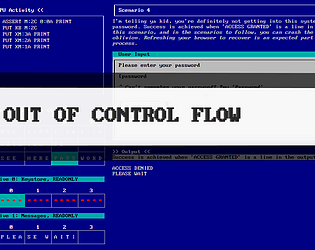
Browsers "chomp" spaces, so you're unable to see that the output of 'access granted' may actually have trailing spaces (or multiple spaces elsewhere for that matter) that are causing the answer validation to fail. I playtested a lot, but there's always something that will get you. The right answer should end in 'ant0000ed|' or similar.  

Hope it didn't detract too much from the puzzles and thanks for taking the time to try it out.

I like the aesthetics of this one, and endless runners are always fun, but I didn't feel out of control at any point -- I think there were opportunities to take control away from the player or make the world feel more out of control.

I really liked this concept, and that horror of anticipation of being crushed by a tetris piece is just right!

My platforming skills are not fantastic so I really struggled to make progress with the very precise platforming. I read that the floaty controls were intentional.. but I don't think that you needed it -- I felt the situation of being trapped inside of a tetris game pretty out-of-control by itself.

Presentation worked great - saturday morning cartoon meets chip's challenge? I'd echo that the difficulty ramp in the fireball room was too high, but I really enjoyed this one -- a fresh & creative take on the block pusher genre.

Love the low-fi presentation for this. The gameplay reminds me a kernel of one of my favorite one-input games "One More Line". There are two things that I think OML did that would be worth considering. First, centripetal force: I want to rocket off that disc out of control rather than a perfect air-control jump. Gives you a bit more depth rather just being about perfect timing. The second is strategy. OML pulls the camera out far enough so that you've always got a chance to see where your next move is. Here, sometimes I felt tricked by noticing something offscreen that was upcoming.

It's tough to make a single-input game that's really engaging, but I think you've got a great start!