Indie game storeFree gamesFun gamesHorror games
Game developmentAssetsComics
SalesBundles
Jobs
TagsGame Engines

Soulwithlife

75
Posts
1
Topics
2
Followers
A member registered Jul 04, 2019 · View creator page →

Creator of

Recent community posts

Hi gabrielfecury!

I played through Cutics, so here's some feedback for you:

  • I think the presentation of the game is really cool. Really harkens back to the old Fire Emblem games.
  • It says that Infantry > Juggernauts, but from what I saw, Infantry did basically no damage against Juggernauts, leaving their only weakness as being a bit slow. Is this a bug?
  • The music is giving me big time nostalgia, but I'm not entirely sure what for. I'm giving it a thumbs up either way.
  • It felt a bit strange to cancel a move with another left click and right click. For a while at the start, I was just making moves and was befuddled why it wasn't actually happening (because I hadn't clicked end turn yet). I'd probably have only right click be the 'rewind' button, for this reason.
  • Having the different terrain types around the map was pretty cool, though I'm wondering if hills might be a bit busted when combined with the mech.
  • The AI seemed to really love putting the infantry at the bottom of the map and then doing nothing with it, for some reason. That didn't tend to win it many matches.

Hope this helps!

Hi Crosser!

I've had a run through of Tower of Galdar, so here's some feedback for you:

  • I really dig the music!
  • I had a big problem figuring out how to use the sword, since the game doesn't tell you the controls (as far as I can tell). I ended up pressing every key on my keyboard, which included R and K, which restart the game or just straight-up kill you respectively. Why is there a button that just kills you?
  • I think the sprite work is pretty neat. I especially like the sprite for the main character.
  • The lives system felt a bit punishing, given that (from how far I got, at least), there are no checkpoints or ways to get more lives. Often times if I lost a life in an early-ish level, I'd just go, "Well, I may as well restart, since I know I'll need that life later on." Given that certain levels require you to explicitly wait for things to happen, I don't think this makes a good pair with a lives system like this.
  • I think the theming of the game is quite good. A knight has a sword power-up (of course!), and there's the obvious tie-in to the theme of the jam itself
  • The transition from running out of lives into returning to the title screen seems a bit too sudden. A longer 'game over' might help with this

Hope this helps!

We didn't have a team member who could do music either, but thankfully, there's some decent royalty free tracks up online. I'd recommend Incompetech as a first port of call, though we used PeriTune for our project. The latter's site is all in Japanese, though, so you might need Google Translate handy to navigate >.>'

Hi estebesz,

I played Darkest Maze, so here's some feedback for you:

  •  I love the main character sprite, it's very cute!
  • The sound effect beep upon choosing a level etc. seemed to be a bit too loud
  • The fire crackle in the background gives a nice soothing quality to the game
  • With that said, I think a little music (probably something quite simple and understated) could help to enhance the experience
  • I couldn't quite figure out why I was dying on one of the later levels—the death tile looked the same as the other ones, as far as I could tell. Was I just missing something obvious?

Hope this helps!

Hi xeno!

I played some Air Traffic Cop, so here are my thoughts:

  • I like the general concept of the game :>
  • I'll echo some of the other comments in that it felt a bit too difficult. Taking out the buses on the ground etc. felt like a bit of a pain. Reducing enemy density or the amount of shots it takes to kill might help with this
  • The sound design is pretty neat! I like how each shot increases/decreases the pitch of the damage sound on enemies. The music is also pretty chill
  • Given that there's no reason not to be shooting bullets all the time (as far as I can tell), it feels like you don't actually need a shoot button. Just have it always on.
  • I like the sprites, and the screen effect is pretty nifty
  • If you stay on the game over screen for a bit, it seems to keep printing the points earned a few times over

Hope this feedback helps!

Hi bondreal!

Super difficult platformers are uh...not my strong suit, but I hope this feedback is still helpful:

- I like the lighting the game uses :>

- I found that certain hitboxes didn't match up to the sprites. The lava hitbox seemed larger than it should be, and the spikes had hitboxes on the sides as well as the top. I'm not sure if this is an intentional design decision regarding the spikes (as a call-back to old platformers), but to me, touching the side of spikes feels like it shouldn't kill you.

- The music's pretty neat, though I wonder if it might work better if it kept playing after death, rather than always returning to the start.

- It felt a bit awkward to use WASD and E for the controls, specifically for the sprint. I'd recommend putting the sprint on SHIFT instead for that control scheme

- The sprite work is simple but effective. The slimes are quite cute!

- The birds sometimes got stuck inside the ground, usually when they were flying up into it

I didn't end up beating the game, but that might just be on my poor skills. An optional mode with checkpoints would be helpful, but that might go against the design ethos you're trying to imitate, here.

Hi moothodical!

I had a play of Jump Locke'd and uh...well, I'm not very good at platformers, so take what I'm saying here with a grain of salt.

- I think the general premise is quite interesting (i.e. a platformer where you can't initially jump)

- I found 1-4 and 1-6 to be substantially harder than the other levels. 1-6 in particular I gave up on after however many attempts.

- Having the padlock graphic change to open upon picking up a key is quite a clever visual shorthand for having your jump (and works in the theme quite well)

- The screen shake upon bumping into walls etc. was a bit much for me. It made me feel a bit nauseous, to be honest

- The music was nice and soothing, helped to quell the rage of repeated failure :L


Like I said, I'm not very good at platformers in the first place, so I don't know how helpful this feedback will actually be. Hopefully it's at least a little helpful ^^'

When we make the full release, we definitely need to do a complete pass on the GUI—I completely agree that some elements are hard to see at times. Thank you for the feedback!

(1 edit)

Hi Abzi!

I had a play of Key Collector, and I have some feedback for you:

  • The gameplay was simple in a good way, where each addition to the gameplay (more monsters) never felt like too big a jump. The difficulty was fairly well-balanced, too
  • The hitboxes on the ground enemies (the round things with spikes) felt much larger than the graphic seemed to indicate, so the vast majority of my deaths were just bumping into their vague general space
  • I appreciate that in a game like this, it's a very quick restart after a death. It might get quite frustrating otherwise!
  • I found the music to be a bit grating after a while. Maybe this is just a matter of variety?
  • I liked the designs of the monsters! Though I found the ground blobs more cute than scary, to be honest
  • Sometimes when I was moving along the outside edge of the map to get my bearings, I bumped into some invisible walls. Is this intentional?
  • The enemies that only moved when you weren't looking were really good :>
  • ...Though they were the only part of the gamer I found even slightly scary. I'd say this is more of a horror-themed puzzle game than a horror game
  • Also, on the final final level (that is, the level after the final level), the game almost crashed, but just about managed to recover. I wasn't sure if this was intentional or not, though.

Hope this feedback helps! ^^

Edit: oh, I forgot one thing! I couldn't actually see the door on 'the final level', so most of it was me just fumbling around trying to find it. Was this intentional?

(1 edit)

Hi yumehiko!

I had a play of your game, so here's some feedback for you:

  • I really like the art style!
  • I felt like the cutscenes could have used some music—it felt a bit empty without it
  • With that said, I did like the music used in the actual gameplay!
  • For the first two bosses, it felt like the direction an attack seemed to come from and the direction it actually comes from can be very different, so you have to only rely on the colour effect. Was this intentional?
  • I thought core mechanics wise it worked pretty well. Simple but effective!
  • I'm afraid I couldn't keep playing past the fight with the three stacked shadows because I just couldn't beat it. The timing required was very precise since the shadows were so close, and it was pretty much impossible to tell whether a shadow would fire twice in a row, which would always eat my meter. Maybe I'm just not good enough at rhythm games, but I feel like more of a visual indication of a repeated shot would make things more fair, because at the moment, the visual effects for the shots stack on top of each other to a degree that's difficult to see.
  • I think this was a good implementation of the theme :>
  • To exit the game mid-battle, I had to manually close it in my Windows. Some kind of pause function on hitting Escape that lets you exit the game would be appreciated.

I hope this feedback is helpful! ^^

Hi bropostol!

I did a playthrough of your game, so here's some feedback:

  • I really like the presentation! The chat interface really helped bring the illusion to life
  • The message received sound effect got a bit grating after a while. Maybe it's just too long?
  • The writing was consistently really good. It really felt like a Discord server, and I legitimately laughed at quite a few lines
  • It might be nice to control when the messages appear (at a click, maybe?). It would take away from the illusion a little, but sometimes I was just like, "Man, I wish these people typed a bit faster..."
  • Interpreting locked as 'shut-in' (and of course the protagonist's username) is quite a clever interpretation of the theme, I think

Overall, I had a good time with this one! I think it has a lot of promise for a full game, though I will admit that I didn't get much of an impression of the overarching plot. Something to do with the friends the protagonist was talking to, maybe with andyartpop getting in trouble again? Or is it even supposed to have an overarching plot to begin with? If not, I think that's totally fine—I was plenty absorbed when it was just random chatter.

Hi there!

I've played through Unlocked, and I've come up with some feedback for you:

  • I love the music! Really groovy, never gets old
  • Maybe it's a problem on my end, but I found the FPS of the game to be a little low. I think that could be a sticking point in a speed runner type game
  • The presentation is gorgeous! I love the little character, the pins, the colour scheme...everything!
  • The wall jump felt a bit strange to use, but that might be a skill ceiling issue rather than an actual problem with the ability
  • The tutorial is well-designed, in that it is happy to show and tell rather than just telling you all the different controls
  • It says that you can't use the charge jump on platforms, but if you drop from a higher platform to a lower platform while holding S the whole time, you will be able to use the charge jump on the lower platform. Is this intentional?
  • It definitely fits that sweet spot of 'easy to learn, difficult to master'. I'm not very good at platformers, but I did get through eventually (albeit with some pretty abysmal times)
  • Good use of the theme :>

Overall, I had a lot of fun with this one! I hope this feedback helps ^^

Hi ShootingDux!

I've had a play of Padlock Ranch, so here's some feedback for you:

  • I think the premise and scope was a good idea for the jam
  • The movement speed of the player character, as well as the movement speed of the cows, felt very slow for how large the field is. This made herding cows especially quite laborious
  • I liked the little message you get after the game is done ("You thought you did a good job, but...")
  • I think the zombies were a bit too tanky. Oftentimes I found myself starting by going to the barn and repeatedly stepping over the infinite ammo tile there, because I knew I was going to need at least six shots for even one zombie
  • I like the general art and aesthetics of the game, it's very cute :>
  • The SFX were mixed a bit too loud I think (and I didn't even realise the button in the top right unmuted, I thought that was just a notification of it being muted)
  • That said, I do always like a 'pew' for gun SFX :>
  • I think some music would help this game along a bit. Maybe something lilting and country-like?
  • During the in-game instructions at the start, I managed to swipe them entirely off-screen and couldn't swipe them back
    • Also, I didn't immediately recognise the symbol for left click. That might just be me, though

In terms of fun, I think the general low speed of the player character and the annoyance of herding the cows brought it down a bit for me, and it felt like when I got a higher score, it was usually because the cows happened to wander close to the barn, and the zombies happened to not, rather than any better play by my part. I did like the aesthetic and light-hearted nature of the game, though.

I hope this helped!

Hi cartyrs! I had a play of Apparition, so I think I've got some feedback for you:

  • I think I mentioned this when I commented on the dev log, but I really like the game's art! ^^
  • If you talk to Eden immediately after waking up (at the start of the game), it will replay the cutscene where Eden asks for Heather to get the Wilde off the bookshelf. This might have caused the possible softlock (more on this later).
  • I think the slow pan up to reveal Eden as a ghost at the beginning is really well done :>
  • The scream SFX when Eden is explaining about the occult stuff at the beginning may be a bit too loud?
  • I didn't find the library puzzle to be too difficult, once I realised I'd already picked up the first book and just didn't notice >.>
  • The tile to the right of the front door to Eden's house has no collision (the tile covered in papers). It doesn't seem to let you get out of bounds or anything, just something minor I noticed
  • I like the dynamic between Eden and Heather. I think it's nicely written!
  • I believed I ran into a softlock bug. Basically when I got back to Eden's room and started drawing the sigil, when I talked to Eden, she just went through the intro dialogue again (the one at the top). I've tried interacting with everything else in the room (including Eden), and I can't seem to progress, so I think I'm stuck? That, or I missed something obvious, in which case I apologise for that ^^'

I might have another playthrough tomorrow and this time stop putting my QA hat on (i.e. intentionally going against what is expected). I did like what I saw so far, at least!

Soul's Post-Mortem

Man...it's certainly been one hell of a journey. I think in retrospect, we could've reduced our scope a bit, but we did just about manage to get it done in time. That's worth celebrating, right?

Anyways, I'm going to keep this short, since you can see a lot of the dev troubles by looking over the previous log. Hope that's okay!


The Stuff That Went Right

Fun Factor

Having never done actual games development before, I wasn't entirely sure how much I would like it. Overall, though, I definitely had fun, and I think Aera did, too ^^

GitHub

Aera showed me how to use GitHub early on, and I swear, there's no way we would've released on time without it. Definitely recommended for others in game dev!

The Writing

I figure you're always the worst critic of your own work, but still, I'd say I'm pretty proud of what I did with the writing. It's nothing too mind-blowing, but I think it has some good funny moments, and the novelty of the plot might help carry it for some people. I wish I had time to add a few more scenes, but now the jam's over, I can do that at my leisure :>

The Art

I have some major self-confidence issues when it comes to my art, but I was surprised at my own ability to consistently pump out the art we needed. Aera did some of the item sprites and such too (I can't take all the credit), but I'll give myself a pat on the back for pushing my way through it.

The Coding (Mostly)

I think it was pretty few and far between that Aera had trouble with the code—anything that came up he tended to work out pretty fast. I'll leave him to detail that part, though ^^


The Stuff That Went Wrong

Scope

Realistically, I think it would have been more sensible to cut one of the dungeons, or maybe even two of them. As it stands, we were really cutting it close...

Music

I really wasn't expecting this one, but getting the music to work right was a pain in the ass. The actual tracks were fine (I'd planned to use PeriTune from the beginning), but Ren'Pys method of managing audio is really, really odd. When I was trying to implement quieter music during dialogue in the dungeons, I really wanted to rip my hair out.

Pixel Art

The main VN art is...okay, but I think my own pixel art could use a lot of practice. I mean, sure, this is my first time doing any major bit of pixel art ever, but I'm still not really happy with what I came up with. I'll be working on replacing some of the jankier sprites when I can.

Whenever I Had to Do Any Coding

Also known as 'Soul breaks something, then cries to Aera about how broken it is'. Oops!


Closing Comments

It's been a great experience taking part in this jam, and I think I owe that to the community! Everyone has been awfully sweet, and I'm really looking forward to playing everyone's games.

And uh, for anyone who's been following this dev log in earnest, thank you so very much. Your comments have really given me the motivation to keep going ^^

Anyway, that's about all from me, at least for now. Take care!

- Soulwithlife

Game Title/URL: Oh No, The Hero Glitched to the End!

Pitch/Information: A fantasy RPG/VN about the aftermath of a speedrunner beating the game in record time. The Demon Lord was defeated, but now his army has been taken over by his trusted lieutenant. Can you lead the remaining heroes to victory?

I'd like feedback on: Mainly mechanical stuff (did it feel good to play, too hard/too easy etc.), but any feedback is appreciated!

Day Ten

Time keeps ticking away, and I won't be able to spend much time on dev tomorrow due to prior engagements. With that in mind, I made a first pass on the vast majority of the enemy sprites (save the wolf, which Aera did, and the final boss, which I still need to do a base design for). I also got the battle sprites done for Robin and Gareth, which is pretty important.

However, despite all this progress, I don't want to barrage you with endless screenshots of mostly mediocre pixel art.

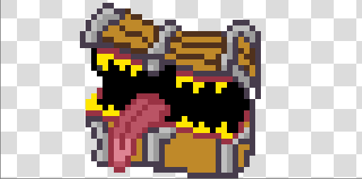
With that said, I think the mimic turned out okay ^^

There's still a lot to do going forward, but I think we might just make it without cutting anything too major. I'm gonna keep working hard! :D

- Soul

It's looking great already! I can't even imagine what it'll look like at the end of the jam...can't wait to play it! ^^

I admire the pink Todd's fabulous hat. Keep up the good work! ^^

Oh, seeing a dungeon generating in real-time is pretty neat! I've slowly been getting into roguelikes over the years, so I'm definitely looking forward to playing this one ^^

Whoa, that lighting is really nifty :O Pretty cool to see the inspiration behind a project. Happy to hear you're making good progress, and I wish you more continued success going forward! ^^

Once again, I have to say your art is 10/10 amazing! ^^

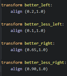
As for your sprite positioning problem, you'll want to define your transform positions somewhere, so then when you call a sprite, you don't have to set the alignment every time. It will probably look something like this (but with better names, probably):

You'll want to mess with the XY coordinates to get your sprites looking how you want them, but once you've done that, you can just say 'show X at better_center' or what have you. Apologies if you've already fixed the issue, just thought I should show how we've done it. Regardless, keep up the good work!

Oh noes, more delicious food! D:

But no seriously, this all looks amazing. Good luck on your animating! :>

Oh, I'm sorry to hear of your sickness :< Glad you're feeling better now, and I wish you luck with your remaining work!

Oh, I'm sorry to hear about your circumstances! If my house got flooded, I don't know if I could rally the strength to continue with the game jam. Liking how it looks so far, and I wish you the best of luck! ^^

Holy moly, those planets look great! I haven't been commenting so far, but I've popped my head in every so often—you've really come a long way from where you started! The audio is also giving me like...major nostalgia, but I'm not sure what for. Keep it up! :>

Oh wow, those death animations are brutal! But yeah, it's all coming together, isn't it? Thank you for the gifs, and keep up the good work! ^^

Day Nine

Got a bit more done today, thank goodness. This includes more VN art, story plans, and...pixel art? Hoo boy.

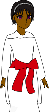
Gareth's sketch probably had to go through the most changes between that and the line art. I also changed his shades to be red, since that way, every party member has a little bit of red on them. That's like...visual theming or something.

Well, red is also my favourite colour, but that has nothing to do with this decision. Totally.


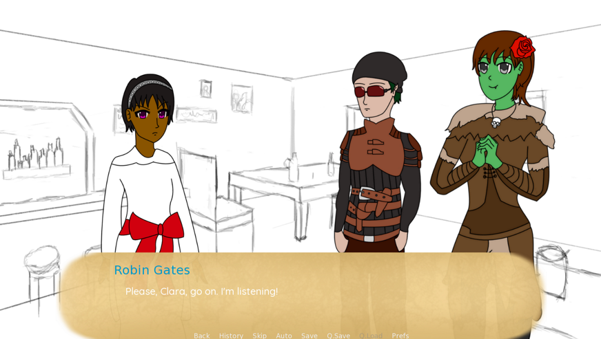
With all the sprites done, I also fixed all the align transforms so that the sprites aren't layered on top of each other. I could also mess around with layers but uh...nah. Priorities.

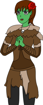
Also, yes, Robin is beeg. They could snap Clara in half, but they won't because they're a cinnamon roll. Please ignore the skull necklace, it's not important.

You don't want to see the code behind this, by the way. One of these positions is called 'better-left' and one is called 'better-less-left'. Why did we do this.

Pretty much all the core scenes have been planned (and 95% have been written), but that still left the finale to contend with. On reflection, I'm not planning to do multiple endings, since that would be outside the scope of this jam. I guess that technically makes this a kinetic novel now? Huh.

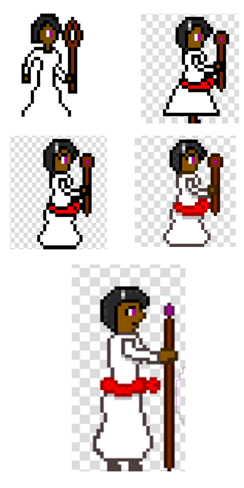
And finally...the pixel art. I've done pixel art like, two other times in my entire life, so this was a bit tricky for me. The first four were the progression of the 32x32 sprite for Clara, while the last one is as 32x64, since we thought the 32x32 looked a bit small next to the slimes. Personally I prefer the 32x32 sprite, but we'll see. We might end up going 32x32 in the end and just scaling it up more.

Aaaand that's it for today. Phew! We're really getting somewhere with the art stuff, huh? Aera's been hard at work on a few sprites himself (along with some other improvements), but I'll leave him to cover that. See you tomorrow, folks!

- Soul

Day Eight

Well, that should be all of Robin's sprites done!


No talk me im angy

I wanted to get Gareth's done today, too, but unfortunately things just kept piling up. On the other hand, I did make some really tasty donuts, so...hey. Small victories.

See you tomorrow!

- Soul

It's the thought that counts. Thank you for your support! ^^

Day Seven

It's been a very artistic day today.

First off, me and Aera had a talk over how we wanted the GUI to look. Different font and dialogue frame, of course, and I'll need to replace the font colour soon. An almost black should work okay.

In other art news, I got all of the sprites done for Clara here. I...wait. I just noticed that little triangle in the bottom left. What's going on there? Gotta go fix that tomorrow.


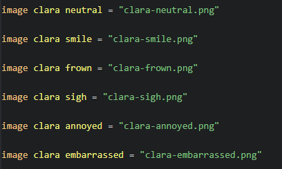
As it turns out, I hadn't been defining my images properly, so I had to get that sorted, too. This also meant replacing all instances of these in the scripts with the new versions which was...annoying. Thank god for find and replace. Oh, I also coded in the new transform values so sprites aren't allllll the way on the left/right. Handy!

Tomorrow, I'm planning to get Robin's sprites done, and maybe Gareth's (he only has three so it's pretty possible). See you then!

- Soul

Aw damn, that's some cool character animation! I'm looking forward to playing this after the jam :D

Whoa, this looks really neat! Keep up the good work ^^

I'm definitely down to do some testing once you've got that out :> Keep up the good work!

Getting to see more dev gifs is always cool ^^ I do also appreciate that your collaborator is called Earl Grey. That's a top-class username for sure

My goodness, your art is so nice! Very smart to put together a day plan for your development—for myself and Aera, we're basically just coming up with what needs doing the day before and then making it up as we go along. Keep up the good work :>

do think the working title is clever : D

I had no idea there were spritesheets generators available. Huh! Definitely gonna remember that if I end up doing something in that kind of style. Things are looking good already, so I wish you luck with the vaulting! ^^

I will be sure to include at least a few puns, then, in your honour. Thank you for all the supportive comments! ^^

It's very kind of you to say so! I have a lot of confidence with my writing, but my art...not so much. Thank you for your comment!

Day Six

Bit of a shorter one to report on this time, but I did actually get a decent done today. First up, vendor trash!

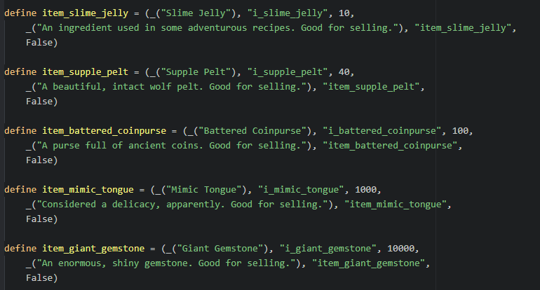
It took me a hot second to wrap my head around how this code actually works (with some supervision from Aera), but I think I get it enough to make a bunch new items, when the time is right. For now, I've focus on the boss drops (the last three) and some regular enemy drops (the first two). Yes, you loot a mimic tongue in this game. Tasty!

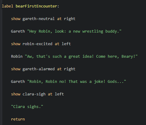
Other than that, I spent the rest of my day writing first encounter dialogue for the other two dungeons. Here's a sample when first fighting bears. I thought about doing a bear pun instead, but that would bearly pass quality testing ; )

We're gonna be doing a discussion on GUI at the weekend (because we seriously need to fix it), so for tomorrow, I think I'll work on getting some of the sprites actually done. Or at least, more done. I should also probably define some more positions for the image sprites, because at the moment [left] and [right] are a bit too extreme for what I'm going for.

Alright, that's all from me. See you tomorrow!

- Soul