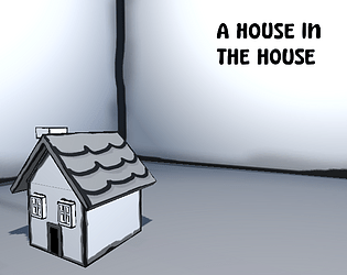
Super cute artstyle, great gameplay and mechanics. I can see this being expanded into a full game with shop management mechanics like moonllighter or other similar games, good job!
SoyVixterDev
Creator of
Recent community posts
Really nice concept! I really liked the art style and polish, it feels nice and snappy.
I would recommend having some sort of sound effect or having the "scaling" sound stop when the block can't be further scaled to make it more clear in situations where you can't see the block you're scaling, but overall a really fun game!
Wow this was really cool! Loved how the game shifts and zooms out when you break the walls, it felt pretty magical and unexpected.
Would've appreciated having more options like a roll, dash or maybe even shooting projectiles to intercept the ball from further away
I feel like this has the potential to be a cool simple game where you upgrade your character until you can start just kicking and kicking the ball making it bigger every time, a clicker style game but without the usual clicking mechanics lol.
Cool game!
The idea is very cool and I loved the puzzles but I feel like the execution of the controls and stuff feels pretty weird, it took me a while to understand exactly what I was doing, maybe with some small touches it could be polished into a very cool full game with more levels and new mechanics similar to the portal and all that.
For the movement of the weight guys I would recommend probably to borrow from the style of RTS games like Age of Empires, having you select the units you want to move and then right clicking a point to where they would move.
Well done!
Interesting Idea but I think the execution could be a little different.
I feel like the game would work better if you could manually change the scale of the objects and if the selection of shapes was better thought to allow a "perfect" intended solution that could resolve into a satisfying realization, something like a little to the left but more focused on simple shapes and filling the area.
Good job for the game anyways!
The game we made for this gamejam "Divemensions" received pretty good feedback and an impressive Rank 8 and Rank 10 in Game Design and Innovation respectively, so we decided to not only update to a full release with a level editor, community levels and tons of new mechanics, colors and levels but also went through the process of getting a steam release, and the page has been up there for about a month, we would really appreciate if you could add to your Wishlist and play the current beta of the game, and we are really happy for all the support we received during the jam. Thank you!
Check out the steam page: https://store.steampowered.com/app/2610540/Divemensions/
And the Itch page: https://soyvixterdev.itch.io/divemensions

We are constantly updating our game, with even an steam release set for 2024!
You can check out the current beta here: https://soyvixterdev.itch.io/divemensions
And Wishlist on Steam here: https://store.steampowered.com/app/2610540/Divemensions/
The concept is pretty interesting, the fish are cute and the map has some intriguing chests to find and that encourage somewhat exploration, I liked the idea.
I have to point out that the performance wasn't great and my pc is kinda decent so I guess it needs some optimization, and the controls sometime would kinda glitchout and ignore my input.
Overall a pretty cool submission, good job!
Hey there! Thank you for the detailed review!
We'll consider adding an option for moving the camera when pressing shift (Officially called peeking in code) to analyze the situation.
The "Double jump" was kind of an intended glitch, we noticed it pretty early in development but even though it was really easy to fix (Had to delete one line where the jumping state was resetting after letting go the jump button) we just let it there because it was fun for speedruns lol. We did fix it for an upcoming post-jam update we want to release very soon because it kinda breaks some puzzles in ways we didn't end up liking.
And about the other bug, I don't even know how you managed to find that, we never noticed it lol. But we changed how changing the layers works and apparently it got fixed.
Thank you again for the bug hunting and kind words!
Very cool turn-based RPG!
I think that having other abilities would've been nice, like a small heal or buffs and debuffs that enemies could use as well. This would ramp up the challenge and strategy a little bit more.
Also as some other commenters pointed out the pixelart looks blurry because of the filters applied to the image, you should check the filters so that it uses the correct point filter.
I'm usually not a fan of text based games but the idea here is pretty interesting.
I would've loved a little more interaction, maybe some sound effects or a different way of setting up the lies and analysis in such a way that they become necessary to progress, like pointing out a lie and then using it in different dialogues as a point to get more evidence.
Also, requiring some kind of evidence before giving an answer could prove more interesting than just having it available all the time, because then you can just try every possibility without any kind of real repercussion.
I am a simple being, I see a racoon and I play the game.
Very nice puzzles, I loved the concept of using the props as bridges, but sometimes the colliders would get a little funky and wouldn't like being in their spots.
The theme could've been implemented in a different way but overall it was a pretty fun game, good job!
Thank you for the feedback!
Yeah, we are trying to think a way to implement a visual indication for the current layer, most solutions come with drawbacks that are hard to solve, for example, if we change the color of the player it could be harder to know exactly where you are in general, because it could be confused with the background or level geometry colors.
Some other Ideas we had include changing the outline or adding a UI indicator of the current layer, like a colored arrow on top of the player's head.
The graphics, concept and gameplay are amazing, but the game is so long that it robbed a lot from the experience, making it artificially harder because of the limited resources.
I love the FNAF vibes of the sit and survive gameplay and the art style used for everything, I see a lot of potential here


