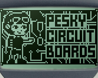
Cute n' fun, reminds me of the flash games of old! Those vertical lasers were surprisingly challenging haha
Zucchini3D
Creator of
Recent community posts
Thanks so so much for the kind words! The 1bit art was absolutely a struggle to understand at first, but it seems like all that trial and error (lots of error lol) paid off seemingly :)
And gosh I wish we had time to implement an actual leaderboard.. you would definitely be in the top ranks w/ a score like that!!
I had so much fun with this game, I just wish there was more! The rhythm-sidescroller hybrid was very surprising and very inventive, not to mention it mirrors the theme and title perfectly (ice for rhythm, heist for the scroller!). There's so many possibilities with just these two components. I personally would love to see the heist portion expanded on.. not just in enemy types but duration -- I'm a total fanatic for on-rails games sooo this part appealed to me greatly haha. Wonderfully done
Thanks! The beginning is definitely my favorite part of the whole game hehe
And thank you for the additional feedback. I do wish we used our "tutorial cutscene" in the beginning as well, but time constraints didn't allow for it sadly! It could totally benefit from that though. We'll keep that in mind for future projects; very easy to get wrapped up in your own mechanics to the point where you don't know how new players will respond.
Holy crap that animation was buttery smooth all throughout! I'm a sucker for all those extra wavy bits, really appreciate your attention to detail on every single sprite. And the lemming itself was very charming. The fact you used your OWN game engine too is jaw-dropping, seems really powerful and your passion for it is palpable! Great entry all throughout, I just wish there was a bit more to the freezing -- the main gimmick was waiting for a bridge to raise or gate to lower which got a bit same-y. But with this groundwork, there's a ton of different platforming possibilities.
And just for my own sake.. was that last flag in the sky reachable?? Felt like you were teasing us with that D:
Great little card game, it was really satisfying converting the other player's tiles with just a few spaces left on the board! However, the legibility of each card's power level made it a bit difficult to fully understand the game. Maybe having an extra ui element to clarify, or finding a way to make the whole board less checkered in the later stages? Was just a little difficult to parse, but the actual mechanics of the game were quite clear and quite fun! Great job!
Solid, polished little platformer. Was really satisfying freezing the enemies, especially the bats. Each gameplay element built on the other, and I think with just these few mechanics you could make some really fun levels. Those chain platforms could be especially chaotic if you wanted to expand on this more. Lovely cover art as well. Overall great job!
As others have noted, I did experience a bug with the camera not following the player. This happened quite frequently on the last level
Thoroughly enjoyed my little playthrough! Loved how Benny addresses the player directly, and the mashing of Z and C as a mechanic was a VERY welcome surprise -- I can vividly imagine the sound of the actual nokia keypad as im mashing it lol. Great job! Cute little end screen too, love little touches like that :]
Props for using GBStudio (im assuming?)! That program has brought me nothing but pain and tears so I have the utmost respect for anyone that attempts to use it outside of the default template. Very pretty color palette, and a nice cozy intro screen! I also liked the way the controls were displayed lol, its the little things that do it for me!
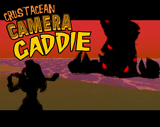
Did not expect the MMBN-esque combat! Very fun, minus the input lag! Overall didn't hinder the experience though. It was very cute and enjoyable and had a lot of crazy setpieces! I loved the visual gag where the camera pans to the crab and its just gone LOL. Did one of the monster attacks reverse my controls?? That's EVIL, but I love the variety of attacks. Give yourself a pat on the back, thank you for the short(ish) but sweet experience :]
A short, blessed experience. So much cohesion in the characters, music, ui, everything! With 4 people on a time crunch, that seems like such a difficult thing to do but y'all absolutely nailed that singular vision/aesthetic. Loved the little vignettes into everyone's lives too. Peak wholesome. Gave me flashbacks to when I worked at a local farmer's market and you'd hear just a sliver of someone's life, and then they were off -- Kind of a bittersweet transience to the whole exchange, and I think (intentionally or not) that feeling was perfectly captured. Great job everyone!! (copied this from my review, sorry in advance to the devs who have to see this twice lolo)
OK Obtain Heaven absolutely slaps, it seriously does feel like that LAST PUSH to the finale, really hammers home the gameplay in my mind. You just need to climb a little further, don't look back and don't give up!! And then the abrupt-ish halt (I say ish because that little change in tempo at 2:33 was a SUPERB way to bring the energy down) to a peaceful resting place. Just *chef's kiss*. I've listened to a couple of your previous tracks now, and the quality has been a consistent 100. Really inspires me to up my music game ( and start takin' notes omg), so fr thank you.
Well I can definitely hear the Touhou inspiration! I'm getting TH15 flashbacks just hearing this, all you need to do is change the accordion to ZUNpets and it's a stage 3 theme LOL. I can really hear the clashing of two worlds, the composition is beautiful. Love the contrast between the real, classical instruments and this warbling, synthetic bassline too. I just want this to be a full soundtrack, I've had it on repeat for the past 5 minutes... please do these jams more often, I would love to hear more from you bro!
Lots of different, otherworldly textures in this one -- I especially dig that midi flute lol. The massive distortion was unexpected but NOT unwelcome! I thought it added a lot to the track. Also, giving listeners the original file to edit is a super neat idea and a great way for noob tracker users like myself to learn how its done!
Really love how much thought you put into the lore of the game. This screams a high-octane, hotline-miami-esque experience that is brutal and unforgiving. As noted in other comments, I wish there was a liiiittle more bass to the whole thing, but the sound design and pacing really does make it perfect background music for a fast paced shmup
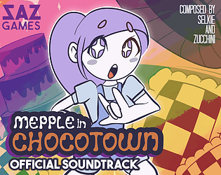
I am blown away by this level of compositional MASTERY! SO much energy in each track too, you went all out on this. Seriously incredible work. Personal fav is Purgatory Party. Those little bluesy riffs here and there.. like I'm actually mad inspired to pick up Dn-Famitracker myself (and probably give up after 5 minutes xd). Great work!!
Oh my god I love this sound design; Deep Within and Cave Monster could easily fit into the background of an ENA animation. Really dig those abrupt little chord changeups, creates a wonderfully ominous mood. The tempo increase in Deep Within was a SUPERB touch btw! Great transition to the boss theme... gah I have so many little compliments to give lol, just overall very well done game OST. Can't wait to hear more from you
This is a quality soundtrack, Bloody Storm is a particular standout for me. The progressions you chose and the arpeggios and aaaa it all comes together SO well. I think the off-time snares are a bit much at the beginning, but the track REALLY comes into its own afterwards. Very clever interpretation of the image theme too btw, seeing the red overlay as a literal oncoming storm rather than a sudden dimensional shift of sorts. I'm also a sucker for these synths... :v great work!
A lot of great dynamics at play here, your compositional skills are phenomenal!! You were able to do so much with that little bassline, I can easily see this in an actual game. With the exception of the snare rolls, it's very easy on the ears. I think simply adding some more variance/cutting the snare entirely from some parts would greatly enhance the overall feel of each world. And perhaps playing with the structure of the fusion track, while keeping certain flourishes from the cyber/nature world, would add some more intrigue. It gets a tad repetitive, but that's just a personal quibble! Overall, LOVE what you've got here.
P.S. BIG cranky stank fan. Tombo Combo got me groovin like none other fr fr
Okay that character design is totally an homage to Gunsmith Cats HAH I love it! Really great backgrounds and aesthetic. Maybe I just need to git gud but the combat felt a little unfair. Like, trying to repair was usually a death sentence, same with blocking. Maybe I'm missing something though, I just clicked the buttons and waited for my health to drop xd But yeah this is a fantastic demo entry and I'd LOVE to see more. Especially that UI...it's just begging to have lil animated bits everywhere!
Thank you SO MUCH for the kind words!! I tried especially hard to convey that low-tech feeling with the screen and controls -- really emphasizing that "spatial confusion" subtheme which i loved-- so this comment made my day omg. However there comes the challenge of making intentionally cumbersome controls, but...in a fun way? Kind of like that old Receiver game where it's stupidly complex to aim/reload/shoot the main weapon. I agree, though, the steering and looking up part of the mech definitely need tweaks to make it more responsive. Like I found my own head subconsciously hunching downwards to try and get a better upwards angle when I was in the mech LOL. The enabling steering was a hotfix to address concerns with the previous steering method, which was quite literally nauseating (the mech turned but your player didnt :I), so the lack of playtesting is definitely where that clunkyness comes from. Ideally we wanted the whole mech to have 360 degree intractability buuut we didn't get that far lol. I LOVE the idea of an optional steering system though, that seems like the perfect middle ground for what I want to go for. Really appreciate that suggestion, and thank you so much for the wonderful feedback overall! (btw love the angel's egg profile piiic)
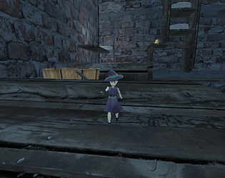
Dannnng that was crazy that EVERYTHING was done solo in such a short period of time. WELL DONE! I loved that there was a whole roster to choose from, and idk I just loved the way the mech turned lol. Fun stuff all around, only things I'd add are maybe some clearer indicators of where the objectives are (I spent around 8 minutes finding the last little square garrison i had to destroy lol) and pls buff Mortar. I shot like 25 rounds into one of those structures and it didn't explode! Overall though, a lovely experience.
Thanks! Daniel did an amazing job with the environment, I totally agree. And yes, a lot of the feedback so far has to do with the controls of the game. I definitely got carried away / got so used to the weird layout that I didn't consider the player's perspective aaagh. When I get back to updating the game, I'm 100% putting a little tutorial walkthrough in, because you're absolutely right that no communication is given towards what any of that is, save for the quick voice-over we threw in last minute, hah! In the meantime, I'll update the description to better explain things. As for the sculpture, I'll ask Dan! I would seriously not be surprised if he was able to throw in a quick 3D scan of his face, the man is a modeling wizard xD
Thanks again for the feedback and playing our game, I sincerely appreciate it. :^)
I'll take an 'almost'! Thank you so much for your feedback! There are definitely a LOT of bumps that need to be sanded down in order to make this fun (I think v7 is now reliably 'playable'...but the fun factor is definitely a toss up. In that version, I also made it so the intro plays just once!). If I get around to updating this project, I will surely include a small walkthrough of the mech's different abilities / the win condition, and make them more clear. You can actually mine inside the mech, but I wasn't able to get any sounds in for v4...so it's hardly noticeable. It's that little cannon button on the HUD. With that said, I really appreciate you taking the time to give such clear and concise feedback, and I'll surely keep this all in mind whenever another jam rolls around! Take care and I can't wait to play your game!


