Play MEGACHESS
MEGACHESS's itch.io pageResults
| Criteria | Rank | Score* | Raw Score |
| Judge's Choice | #1 | n/a | n/a |
| Overall | #9 | 4.417 | 4.417 |
| Gameplay | #11 | 4.348 | 4.348 |
| Originality | #43 | 4.374 | 4.374 |
| Presentation | #49 | 4.529 | 4.529 |
Ranked from 155 ratings. Score is adjusted from raw score by the median number of ratings per game in the jam.
Judge feedback
Judge feedback is anonymous.
- Fantastic game, feels very fleshed out, could be a steam release tomorrow
What do you like about your game?
I genuinely enjoy the concept of the game and the general feel, and I feel that I need to dig way deeper. I am beyond excited to showcase it to everyone !
Leave a comment
Log in with itch.io to leave a comment.


Comments
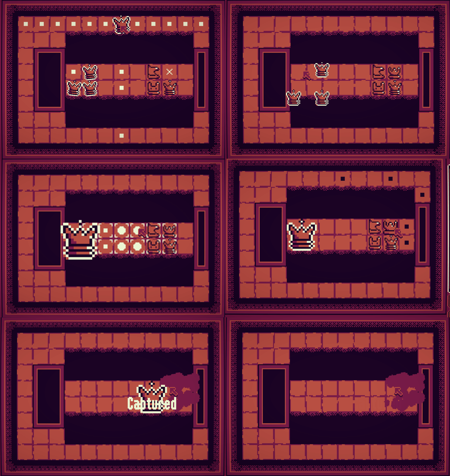
What a banger -- this engages my brain in a similar way as Into the Breach. I love the board layouts and level names, it really adds a ton of character to what would otherwise be a rather abstract game. The new pieces are interesting too. My only issue was some of the UI was a little unclear sometimes (I didn't always know whether it was my turn or the opponents and I made a few mistakes because the special ability button wiggled when it wasn't enabled which I thought meant it was active -- graying it out would be clearer IMO). But man, this game was a ton of fun, nice work.
Really fun! Looking forward to a full release. I was a little unclear how many moves I could make in a turn, but other than that I had a blast. I can imagine there are tons of fun puzzles you could come up with for this.
WOW! What a creative game! This game definitely has potential! Really fun!
Got around to properly play this (was a little overwhelmed my first time around). This is just straight up smurfing, how, how did you make it in two weeks? That's insane. It's so strategically deep and elegant—the par system, getting the first taken piece, naturally growing complexity; as a systems game designer, I'm both very inspired and very humbled. I've seen on your website that you was inspired by Into the Breach and Mosa Lina and as a big fan of both, you damn well nailed it. I loved the game, but the review is mostly critical (and fairly disordered).
I liked the melancholic main menu music, made for a very special, rare vibe; the rest of the music felt way less intriguing which is fine, just a taste thing. I loved the BADASSERY of the final sequence but the music was too active.
The last boss was kind of underwhelmingly easy, since there were like six completely blind spots for all of the enemy pieces; maybe in a true boss fashion the gigaking could randomly move one tile at a time to make the whole thing more exciting.
Didn't understand a lot of things even after beating the game. Why were some pieces green when I placed them? Why did some enemies previewed their movement as dots when they had crosses on the top-left scheme, and vice versa? How do I know if someone can leap over obstacles? Wish it was all explained better.
Some incentive to use as little pieces as possible would be nice, especially for the vampire class where I often got to win with very few pieces; just nice to be patted on the back when you feel like you did something smart.
The game generally felt too easy in the second half; levels took some thinking but I was never worried. I also never used like a third of my piece types. Makes me wonder if some semi-randomized limitations can work for the late game, like sometimes locking you out of your most used pieces or something. Also could be a smaller amount of obviously good safe spots, and enemies in harder to reach positions; in my winning run I only had to sacrifice a piece once or twice, and I wish the game forced me to tactically lure enemies out more. I only rocked the Vampire class yet so my gripes can be specific to it :)
My first run ended by a softlock where I couldn't reach any pieces and they couldn't reach me (and I ran out of money). Would like a "resign" button to at least see the death screen in such a case. Maybe the threefold repetition rule from chess can be a resign option :D
I wished for a little more sense of progression I guess, as in moving through the story and space. Swapping color palettes and showing N/6 counter are both nice tricks but for a full game I hope there's more—story tidbits, an overworld map, maybe short non-gameplay sequences and stuff like that.
"Shortcut" is an extremely sad ability, fundamentally hated it. The game is so insanely intrinsically fun, why would you make an ability that basically says that meta-progression is more important than actual gameplay? Also, a little odd that "passive income" costs the same as "+1 par", they basically do the same thing but the former is always better. Passives where generally hard to keep track of and I kept forgetting that I had them... Maybe "pins" that you can apply to a single piece type (and get a persistent visual indicator on that piece) would work better in that regard?
Various QoL that you probably know about but still worth mentioning:
I had a blast playing this. You're a wizard and I refuse to believe otherwise. Great job!
Hey, thank you so much for writing such a massive feedback. It really means a lot to me, really. It's the first time I receive such a huge message with a lot of thoughtful and very valid criticism and it will tremendously help me to make a better experience.
I planned something else for the last boss: I wanted to make different layouts and arenas, something a bit like Dungeon Crawl Stone Soup end floors (Old school roguelike, I really like the level design of it). Make it so when you arrive you have different variations with more pits and ennemies. Sadly, I got burned out (still had time left) and I was too scared to add another one, or to touch the fight, because the hour prior somebody softlocked themselves in the last level before the fight because I forgot to add pieces spawn points... This is something I really want to do in the future though !
The pieces are green or purple because they come from a different area. I wanted to make some kind of progression like this, thought it would be cool and mixing uup blood would be fun, I thought it was ugly the last day and wanted to removed it, and it's still there and I don't know why.
The targetting is broken, sometimes it does not show the correct information, sometimes the top left is wrong.... Again sorry for this. It's not possible to know which pieces can jump or not because of spaghetti code.
I do have to improve massively in all UI aspects. It's an area I struggle a lot into, and I really want to be better at it ! One of my goals this jam was to make something playable from start to finsh, and the user experience is still lacking to my taste.
The issue with incentivize the player to use as little pieces as possible is that it would make fights more tedious to me. You would have to spend more time to do more tedious strats, spending turn after turn and move a piec e at a time. This is something I want to avoid !
I want the player to make combos, do sacrifices if necessary to keep the turn as low as possible. I think it is funnier this way and why I added the par system. Unfortunately a lot of people didn't understand it (my fault of course definitely not theirs), and maybe it was not rewarding enough. Maybe I need to punish players for taking too long, but it would feel pretty arbitrary !
Game is not properly balanced after the first couple floors. I had very few feedback and test time for this and at the end I added extra pieces to the starting characters, which I feel makes a very high difference . The abilities might be overtuned as well. The last area may be too easy. But, maybe something about the formula is wrong, getting a piece each fight is too much and doesn't feel that good. These are things I would love to tackle on a bigger release than this.
I do want to make it so sacrifice are necessary for later levels, at least 0.8 pieces per floor on average, if not more. This is a tricky spot to balance and the first time I have to do something like this ! I'm excited for what the future brings on that part.
Softlocks and lose conditions needs to be elegantly adressed, and I'm still trying to figure out a way. Threefold rule is an idea but i feel like that would feel deeply unrewarding to not have a hard lose condition, not sure how to phrase that.
For progression I did not have anything planned like what you mention. What I thought was, after the shop, have 2 or 3 area choices, which would have very specific themes. The hole was an attempt at making this, an area with a lot of empty space ! Later on I want areas that only include some pieces, in order for the player to see as few different units in a game as possible (I'm trying to get that number under 15/20 but I'm not sure it would be feasible).
I like shortcut :( Basically says that you have less fights in an area, you get less money in the end but get to keep your resources ? I think it's an interesting trade, maybe a bit strong. Passives needs to be reworked in general, I ran out of juice at the end, feeling sad for these as they do not feel great and inspired. I like the pin idea, it might be interesting to add in a shop as a side purchase! I like the system, would want to experiment with that. Maybe even remove the other passives!
Thank you so much for the lengthy message again, and sorry for the long response. Feel free to ignore that i'm juste rambling for myself !
I don't like my idea about incentivizing using less pieces anymore after your explanation! It does sound way better to not overload the player with additional goals they would feel obligated to optimize for.
Choosing the next area thematically does sound like a good progression system, as well as limiting piece types in an area.
I also agree that Shortcut is strategically interesting, it just makes me sad that you essentially spend money to get less gameplay...
Also also went back and played a run as a Pawn, was way more hard and interesting, loved it! Had to make a lot of sacrifices, didn't have a ton of pieces and seeing the Reincarnation passive was awesome, hope there will be more synergies like that. Vampire just seems busted now compared to others, both as a class and a piece, it straight up solos multiple hard levels, would pick it over a queen any day and it's only $4 somehow :D
Now that I knew what differently colored pieces meant I liked them a lot, actually!
Also also also wish there was a free single-move undo like in ItB, was sad to lose money a few times due to a misclick.
So this game is really great. Are you planning to port the game to android as well?
Fingers crossed!
DUDE THE CONCEPT IS INSANE, PLEASE FULL RELEASE THIS I BEG OF YOU!!!1!!
I'm in the process of making the game from scratch with hopes to release to Steam in the future ! Will take some time but I'm hopeful
Genuinely a great game! Music is good, gameplay is very interesting. My favorite is when the colors change!
really well made but I messed up in the tutorial so had to restart :(
Really well made with great concept! Love it!
What a great game ! Easy to jump into, explanations and rules are clear and simple. Very addicting game ! I love the graphics, animations & the sound design. It looks like a well finished game, hard to believe it was done in only 2 weeks ! Congrats :D
I mean, do I even need to comment. phenomenal game with endless playability. You know on first glance I didnt really think it was that chess-like, but as I played more, I found it to be really well aligned to chess strategy. A worthy sequel at last. I think chess streamers especially would get a great kick out of this game.
Anyways, not sure where your mind is at with this, but if you have a steam release in mind, I'll def be following the progress and supporting via wishlist and word of mouth.
My brain is to small for this game, but it is incredible.
I love this so much, a chess roguelike is such an awesome idea!
Really impressive! It's amazing you managed to make this in only 2 weeks! I just wish there would be a little tutorial part for each new piece. I was quite surprised when I saw ships and a lizard xD Still, great work!
Good job on the idea and the polish! this is very put together, I loved it
I played your game.
It looks like a finished game! I only encountered one bug. And it is quite polished, good work!
really great work on the UI experience, the game feel is impressive
Very interesting concept and very well executed. The quality is very impressive for a game made in such short time.
My only complaints are that the friendly and enemy pieces appear too similar and sometimes I confused which are mine and which aren't, despite the white outline. Also I had some trouble when dragging the mega pieces, I often had to drag them a couple times before they finally moved.
Great game and very well implemented, great job indeed! I enjoyed playing it, it's a really playable and solid game.
I would question though, what is the connection to the theme? Admittedly, as great as the game is - my cynical part of my head feels like it's an idea or something that could've easily been concepted/done outside of the Jam, instead of it being driven by the Jam theme itself because it's so disconnected from the theme.
But in any case, it's still entertaining and exceptionally well made - great job! :)
Hey, nice question and great point !
I actually thought of this from the part of the definition "a departure from what is normal, usual, or expected, typically one that is unwelcome.".
I am rather not keen on doing stuff that are unwelcome to a player, though, and am not much into horror games and the like.
I spent one or two hour twisting the idea in my head and went "What if I could try to ""subvert"" the player's expectations by hijacking an existing game and trying to get something else out of it ? It's not a clever idea, it's not something that hasn't been done already it's like all the "What if x but instead it's y" stuff.
But I still wanted to have something that stayed true to the core game's principle. This is why at the base it's a chess game, and it's trying to stay as true as possible to the core loop "turn based strategy with planning"!
Also at the start it was more meant to be a Chess X hotline miami game but I'm not good at graphics so the only thing left from that idea is the blood splatters.
Thanks for replying - I see the rational, it's tricky one isn't it? It's hard to come up with an entertaining fun game which is actually unwelcoming to the player... I see the thought process of taking an existing game and then making it different enough that it's unexpected, I get that :) For me, I went full-on with the theme. in a (hopefully) comedy way so there was no question it was driven by the theme for the Jam...
Like I say, the game is awesome - I love it, it's a great achievement! However, I'm sure you can also see how the end result can be viewed as being outside of the theme completely, and could've been implemented separately... I don't think it has been, but you did such a good job on the polish and presentation of the game it's kind of sparked that kind of cynicism.
Good job, impressive for 14 days