Play game
Build Mode Play Mode's itch.io pageResults
| Criteria | Rank | Score* | Raw Score |
| Fun | #31 | 3.955 | 3.955 |
| Theme | #43 | 4.045 | 4.045 |
| Originality | #102 | 3.750 | 3.750 |
| Presentation (graphics, audio) | #167 | 3.500 | 3.500 |
Ranked from 44 ratings. Score is adjusted from raw score by the median number of ratings per game in the jam.
How does your game represent Mode?
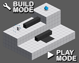
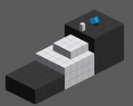
The player switches between "Build" mode to place objects and "Play" mode to move in the created level.
Leave a comment
Log in with itch.io to leave a comment.


Comments
A simple idea executed really well. I love how you were able to ramp up the difficulty with additional elements added in. My only recommendation would be to rotate the controls since moving what feels like forward requires forward and left/right. Otherwise great work!
Brilliant work! Unique mechanic, great use of the theme! Good level design, clever puzzles :)
I really liked the game, the 3d grid reminded me of classic marble madness!
Interesting solid game. I like the mechanic - other than the fact that magenta is, well, weird. Could really do without it. With the addition of camera controls, I'm sure it'd be really great!
This was an interesting one.
It was a simple concept and you made it true without unneeded clutter, resulting in a rather fun small game. I especially liked your use of particles, those words at the start of every level, and the other areas of polish to place around. It feels finished, which not all Game Jam entries can contest to being.
I would, however, have liked some camera controls. The fact that the player moves adjacently, but the camera is diagonal, was… difficult. The movement also, although fun, felt out of place for the game.
If this wasn’t a puzzle platformer, I would have liked the floating movement. However, as this is a puzzle platformer, I must say that precise platforming is much more valuable than icey movement.
90% of my deaths were due to those two things: camera and icey movement. However, that may just be a problem with me. You did have a death indicator at the end, so perhaps all of that was intention game design on your part?
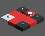
The magenta block’s only purpose seems to be to confuse the player, too. That’s a game mechanic that I don’t like. After all, confusion is not difficult. Confusing is just increasing the player’s learning curve. In my opinion, I think games should aim to decrease the learning curve as much as possible.
With the risk of sounding arrogant, perhaps making it so you can see the outlines of the magenta during building mode, but not in play mode, would improve things? I would say that, since your levels are short, it shouldn’t be too burdensome on the player’s memory while still enacting a bit of artificial challenge.
Also, a small nitpick, that magenta color hurt my eyes.
Anyway, great job! As I said, you made a fun product. Thank you for sharing.
Love the minimalist aesthetic and the snappiness of the controls and modes. It feels like nothing was wasted, well done!
Simple concept, well executed, pretty fun, just wish it had some more to it. I.e. other building concepts. Since its a platformer, something like a spring or a moving platform or a launch pad, etc. could be good additions.
simple concept but super fun. the sounds made the game pop just a little bit more as well. good job! i liked it!
I'll say one thing... You know how to take a simple concept and run with it. I respect how much variety you managed to squeeze into the level design.
fun game, level and puzzle design is really good, audio is a bit ouch but its not gonna make my ears bleed so, nice job!
I really like the game, I wish there was some subtle music and less jarring sounds, but it was still a very "aha" kinda game!
A fantastic game, the puzzles are cleverly designed and allow for some cool experimentation and creativity.
Clean! I like the minimalism. Sometimes I got killed for touching a wall surface, but it was hard to understand exactly where, felt like it was under something I built. It was fun, nice puzzle design. Great job!
this aesthetic is clean af, great sound design, and cool mechanics, 5 stars all around!
Best submission I've played so far, the puzzles are great and I love the transition screens. The one thing that bugged me were the magenta blocks, but I guess they were confusing on purpose
Great game!
This is probably my favourite game in this jam I've played so far. Love how the level titles give hints on how to solve the puzzles, and the puzzle design is great. I also like how you introduced all the mechanics in a way which made it easy to learn. The only thing I found slightly frustrating was the magenta blocks not being shaded which made depth perception a little difficult.