Indie game storeFree gamesFun gamesHorror games
Game developmentAssetsComics
SalesBundles
Jobs
TagsGame Engines

SoulsTogetherX

92
Posts
9
Followers
A member registered May 21, 2022 · View creator page →

Creator of

Recent community posts

(1 edit)

This was a cute game. The art style is constant in its sense of humor and it follows a standard theme of power or control. I had to beat all ends, and die in all ways, to see how the game would react.

The dialogue was, also, definitely this game’s main attraction. Although I do feel that the humor was rather forced in some areas, it was consistent and good for a game jam.

The fact that you had an option’s settings, however, is great! Not many game jam games have time to even implement that, even if it’s mostly overlooked. Great job!

I do have a few criticisms. For one, I do not know how the paring works exactly, but I do know it is hard. And, since the boss doesn’t take extra damage (from what I know) out of parrying, and the fact that you aren’t even guaranteed to hit the boss after a parry, it’s pretty much useless. I ignored it 90% of the time, besides when I was trying to be cool.

The dialogue reset each time I wanted to replay the game/died was also a bit annoying. It might be better to break up your scenes a little more so that “resetting” the entire scene wouldn’t perform this behavior.

Speaking of scenes, I would recommend you attach those vine spikes to the game scene, instead of the boss, so they don’t move while the boss moves. In addition, the telegraph of those spikes was a circle, but their actual hitbox is a full-on cylinder, which is a bit misleading.

Those projectiles the boss fires also appear from nowhere, leading to unfair undodgable attacks sometimes. Meanwhile, the boss’s melee attack was dispositionally unfair above than below, and honestly just felt consistent rather than fun to dodge.

To be exact, the entire boss was just “go around and around while shooting” to me. It’s not really difficult, but more tedious, especially with the absurd amount of health given.

Also, there was no feedback to the player whenever they hit a boss. It was rather dull and unrewarding for something that will take up 95% of a player’s playtime.

I am also disappointed that both dialogue options for the evil route game the same ending… But, well, that’s game jams for you.

Nevertheless, as I said, the game has its humor, its art is good, and the theme is there. It’s a great game jam game. Thank you for sharing.

(1 edit)

The art was great and the lighting gave the whole scene a nice atmosphere vibe.

The Bosses were a bit lacking, however, and some attacks were literally impossible to dodge (the second boss beams while moving down. Also the ice dragon summons spikes [with weird hitboxes] while snow is falling and while icey-movements prevent quick dodges.). Attacking also didn’t feel rewarding at all. Also, I could not skip the text in-between scenes.

Also, since the skip button and attack button are the same, I tended to skip a few lines of the boss-dead dialogue due to my spamming of the button. In addition, ice physics…

However, for an unfinished game (as the ending said), this is pretty good. A little more juice and polish and I’d say you’d have something fun. Thank you for sharing.

Speaking of which, I’d recommend just giving the player a double jump from the start, instead of only after the first boss. It wouldn’t affect how the player attacks the first boss either way.

Nice!

(1 edit)

Excellently crafted. A bunch of the tiny, almost invisible details you put in the game really give a lot to the whole thing when summed up. All of the Boss’s attacks were amazingly telegraphed (though, that one spin-the-lazor attack can instantly hit the player in an unfair way at startup).

If I made any complaint over the boss, it would be how the rockets just disappear into nothing instead of, maybe, exploding or fading. Other than that, great!

The lack of any sound effects or particles was a little jarring though.

Also, bugs…first off, sometimes the boss just stops working when you reach another phase. Not sure why this occurs. Also, if you place a turret directly at the far end of one side of the room, and teleport to it, then you go out of bounds (infinitely falling).

Anyway, great submission. Thank you for sharing.

(6 edits)

“I do not know who I am, I don’t know why I’m here, All I know is that I must kill.” is the perfect quote to describe this game, in my opinion.

I normally choose to say what I like about the game first.

To begin, the number of bosses is refreshing and enjoyable. You seemed to shift a lot of effort into that, and it shows. You did a lot of giving a great diversity of not only bosses but also weapons! It’s never dull moment with how much I have to get used to all at once. You really kept me on my toes.

The boss’s attacks, arenas, and colorful art style really fit together like pieces of a constructed puzzle. For screenshots, it is perfect. I, especially, like the boss fights that did not have a cluttered and moving background. The final bosses, primarily, had mostly black backgrounds, which worked the best.

And please allow me to praise the art once more. The character portate you have at the corner, also, really added to the experience. Maybe you could consider doing more with that?

Now, please allow me to say a few criticisms. I don’t wish to be disrespectful, but I do wish to help you grow as a game designer. Simply put, I see an extremely large amount of potential in your work here (A LOT OF POTENTIAL even), but…it all feels wasted. Cluttered. Maybe even lost.

Please take what I say with a grin of salt too. I’m no expert, after all, and I thank you for putting out a game in the first place. This is leagues better than about 99% of all humans can hope to make (I’m serious about that. I can see how much effort you put into this as a solo dev. In a month no less! Seriously amazing.).

For one, visual and sound clutter is a serious problem here. I had no clue what was happening, where it was happening, why it is happening, or ANYTHING really. …and that is a very consistent theme by the way. It was my first few attempts where I decided to just forget learning any of the bosses’ attacks and, just, well, button mash…

I got to the final boss in hardcode mode with just button mashing, by the way. It was not very engaging gameplay.

I disliked how, in hardcore mode, your gun picks are randomized (since it felt less like an exchange). I even more disliked that I could not even test my weapons beforehand to see how they worked. I had no clue what anything did, or what damage it did. Randomized guns made that problem worse.

It was not fun to spend seven entire minutes spamming the shoot button to kill a snake boss with a peon gun (I still don’t really know that boss’s attack pattern, despite spending so long on it). Speaking of which, I recommend allowing players to hold the shoot button instead of requiring continuous presses. Arthritis, am I right?

Obviously, the boss transitions feel discontented, but that’s not really that big of a deal, honestly. The visual effect you put for the bosses made a lot of headway in that regard. I just wished you were less over the top on them and did more particle effects instead. Moving background can be disorienting, and there was no “color language” presented to the player. No one color is bad. No one color is good. No one color contrast can be used by the player to differentiate what they need to pay attention to. The background is overly colorful, while the projectiles are dull and hidden, while sometimes it is the exact opposite. This isn’t really a good idea for most bullet hell games.

Since a lot of bullets are coming the player’s way, bullet hells tend to try their best to have it obvious what is a projectile and what isn’t. This is done for a reason, but that was not present in this game.

For example, in the worm boss, I can see you were trying to make the foreground black, while the background all colorful. That’s a very good cinematic effect for cutscenes, but not so much for moving boss fights. Not unless you give the player an extra handicap or visual information, I mean. Though, admittedly, it was a cool effect.

I really liked the fights, closer to the end of hardcore, for that reason. The background is dark, the attacks are clear, and the boss patterns are actually learnable. It was amazing! I loved it!

Except when the final, final boss started and I got the Lazor cannon weapon…

The Lazor cannon does 20 damage…attacking like once per 1.0 seconds (I don’t know the exact cooldown, but it is around that ballpark. Probably closer 2.5)…and the boss had 5000 HP…

The game expected me to shoot the boss (5000 / 20) = 250 times consecutively! Now, (1.0s * 250) = 250s. That’s 4 entire minutes and 10 seconds of continuous shooting, assuming you don’t miss and don’t need to heal at all…AND assuming you don’t die!

Maybe that was just bad RNG on my part, but if you are randomizing the guns, there should probably be something in the code to balance them a bit. No offense.

OH, also, I really dislike how your energy drains as time goes on. It punishes the player for being good. I couldn’t stay back, learn the bosses’ attacks, and dodge them. No, I had to charge head-first into the boss to survive at all. This mechanic actually made the final, final boss impossible to complete too (the one that would take 4 mins. Yeah, I was actually willing to go through that, since I like 100% completing games, but quickly realized that it was impossible without some trick…or maybe I just have no clue how to play the game? Both are equally likely.).

For some reason, in later bosses of hardcore mode, your energy recovers slower. I don’t know why this is. Maybe I was experiencing a bug, but yeah…it was impossible because of that. I really tried too, and I normally like hard boss battles. Still, even if I spent 100% of my time just getting energy (no shooting at all), I still died from lack of energy! Sad face…

Speaking of, it might benefit the game more if you had more solid bonders for the arenas. Currently, if the player falls out of the map, the entire room resets. That…is a bit annoying. This is especially so when the arena’s limits are not clearly presented. For example, in that boss with square bonders, I moved toward a wall (expecting to be blocked), but the entire boss completely reset!

Sad face times 2…

Oh, also, the final, final boss of Hardcord for some reason didn’t have these out-of-bound barriers…and the boss could leave the screen because of it…

Also, as I mentioned before, I had no clue what was happening or anything at the start. Honestly, in my opinion, if you don’t have a tutorial, it may be best to rely on more self-explanatory mechanics. That text in the first boss of classic mode was good…if I didn’t start with hardcore mode first.

Okay, maybe that one was my fault. Still, Energy typically is used for extra powers and abilities. It is a bit confusing if you use “Energy” as a replacement for the common term “Health” so suddenly. Though, honestly speaking, this criticism is more of a nitpick than anything. You can ignore it if you want.

Anyway…

…I’m sorry. I know I sound like a Negative Nacy here. I really do mean it when I said that I see potential here, and that you did something that 99% of all humans can’t even hope to do. But, as it is, I just didn’t find the game very fun.

I can, however, admire all the effects you put into the game. As a programmer myself, I know how difficult some of that stuff can really be. Good job. Truly.

Thank you for sharing. Well done.

I’m glad you enjoyed yourself! Thank you for the praise.

(5 edits)

Well, that was a blast. Your art style is everything I wished mine was and more. It is so cute and lovable. The small details you put in the background (it getting progressively worse) was also great detail.

Correct me if I’m wrong, but the letters the customers’ attack you with also are the exact letters used in their dialog. That is a very good detail. The dialog each character had was also nice to read.

Ahem. Don’t think I didn’t read all the dialog, by the way. Speaking of, you misspelled “groceries” during the blond-haired Karen boss. Also, the single mother seemed nice, albeit overworked. Those poor coupons…

Ah, also, 2 dollars an hour!? Get the Labor Union gurl!

Anyway, it was, overall, very engaging. I do, however, have a few criticisms as well. Mainly bugs.

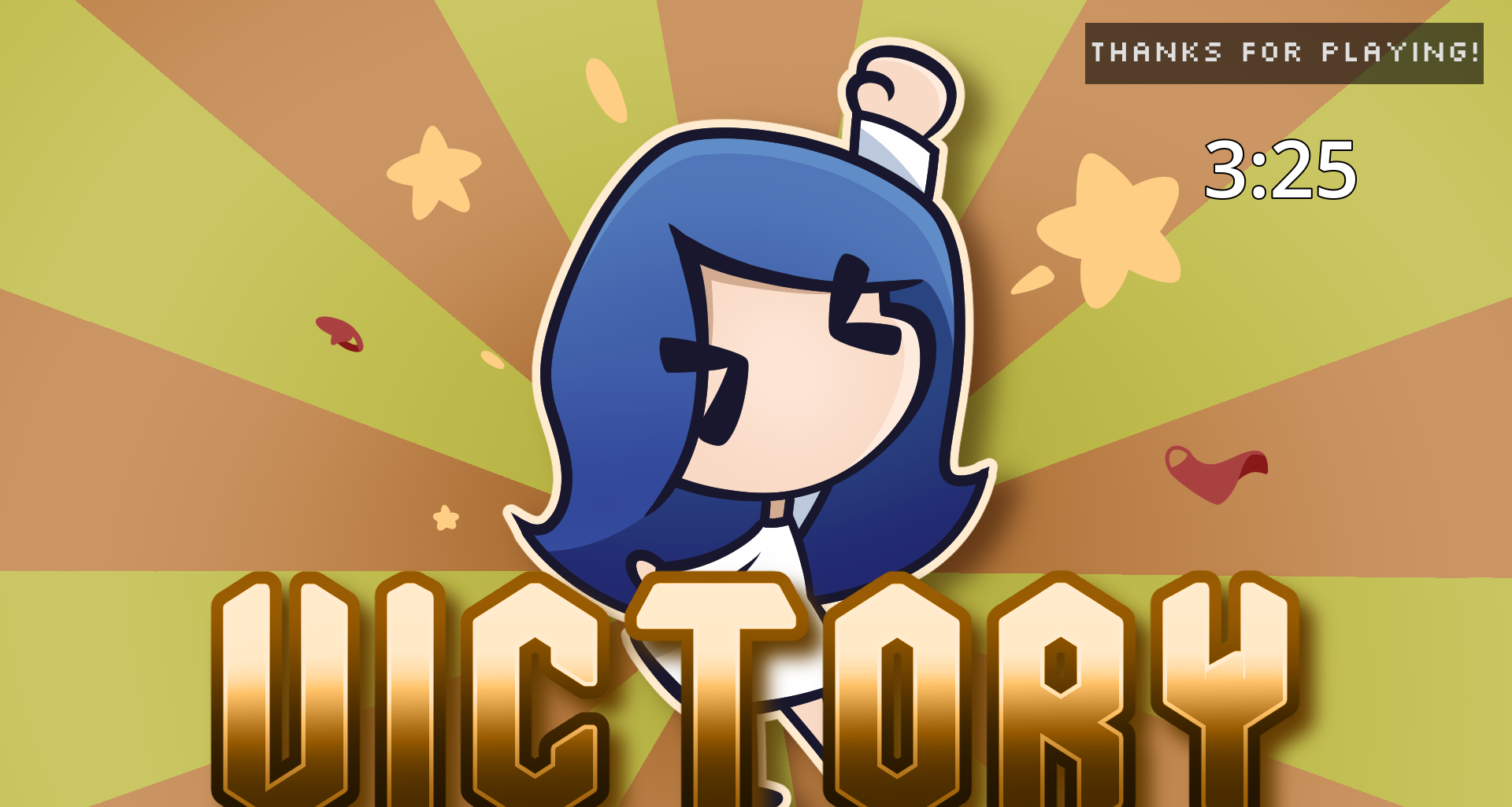
I got softlocked like 6 times at the final boss. It was fine though. It helped perfect my speed-running method. 3 minutes and 25 seconds! New record.

image.png

I think I can get faster too, if I try some more.

Anyway, let me explain a few of the bugs I experienced. Keep in mind that I, overall, rated your game highly because it deserves that. I’m just mentioning a few problems I experienced.

First, you can place items off of the table. What I mean is, if you go all the way to the left, and drop the item to the left, the item becomes completely offscreen. In addition, during the final boss, the item pickup radii are too small to recollect anything if they are placed outside the player’s movement area. …they are also too small to recollect if you, accidentally, place them on the paper contract without scanning them too. Since I could not walk over the contract, this was the main cause of most of my soft locks.

In addition, there was this bug if you wait to the end of a customer’s dialog, then after finishing the boss at a certain interval of time, their repeated dialog will continue playing even after the new customer comes. This new customer will, then, no longer speak no matter what. This means that no dialog trigger will occur to drop the items, soft-locking you.

Strangely, this isn’t a problem for the final boss, since the pen is already on the battlefield the moment the boss begins. I thought I was lucky then, as no dialogue means no attacks…until I realized that dialogue was needed for the game to end at all. Even if you spelled “I quit”, the game doesn’t end. Sad face.

You can also get hit during customer transitions, as the letters do not disappear.

Also, the final Boss’s dialogue covers your HP metter.

Now, for more fun glitches that I used to speedrun. Apparently, you can scan items while carrying them, defeating most of the challenge of the game! It’s a bit of a convoluted science, however.

First, you need to start scanning. then you need to pick up the item. It should still be scanning by this time. However, if you press any new input at this time, then the scanning will reset. You’ll need to press the scan button again in those cases. Thus, you can move while scanning so long as you are already holding the move button while scanning it. In addition, if you were holding any moving button at all, then even if the progress gets canceled somehow with a changed input, you can just press “E” again (while still carrying the item) to restart the scanning most of the time (something this doesn’t work, so you do need to quickly drop it in these cases).

This is a very helpful technique, as it meant I could just run into an item, keep holding the “D” button, press “E” to scan, press “space” to pick it up and continue moving to the basket while scanning. Since you heal a bit with each item you scan, you don’t even need to worry about dodging. Just charge straight through. The main holdbacks to the speedrun are the unskipable intro dialog and the time it takes to transition scenes/drop the items. …also RNG. Can’t get past RNG.

Also, you can fullscreen godot with “DisplayServer.window_set_mode(DisplayServer.WINDOW_MODE_FULLSCREEN);” I’m not sure if the large screen was intentionally made to avoid doing an actual fullscreen, or not, so I’m saying this here anyway. Though, admittedly, if you don’t use an actual fullscreen, the game window may get cropped on some devices.

Anyway, as I said, your art style sold this for me. Thank you for sharing this. It was fun.

(2 edits)

That was a really fun use of my time. I liked the art, how you animated the character portraits in the corners, as well as the overall feedback you gave the player. It was really immersive overall. It can easily be a game that can suck someone in since, although difficult, there is just something that just screams “one more” every time you lose.

Heck, I lost like 5 times, each round taking about 2-6 mins (I don’t know exactly. I wasn’t counting), and finally prevailed after a lot of strategies and, ahem, bug exploiting. Still, I would willingly play it again.

Giving the player a bit of healing was a good choice, by the way.

I also liked the small bit of dialog you gave. The character’s, well, character added some to the experience.

The way you incorporated the theme was great too. You strongly emphasized a strong fast-placed gameplay and encouraged it greatly. The fact that guns the Boss has used, and not reloaded, have less than max bullets is also a great detail.

Now, for the criticisms I had. Please excuse me if I sound nitpicky. I honestly really enjoyed your game overall, no matter what I say below. You got a great rating from me!

Anyway, first, there were a few bugs. Ignoring the obvious one (the boss can teleport in the walls, unable to even attack you), I also noticed that if you reset the room with “R” while in the dead cutscene, the game is softlocked.

In addition, having the reset button so close to the “pick up” button might not have been the best idea… Luckily, I didn’t need to use “E” that often, since you made guns automatically pick up when you’re gunless and nearby (great design choice), so I didn’t have many opportunities to make that mistake luckily.

Also, also. After you press “R”, there are a few moments where you can’t move, but the boss can still shoot you. This basically just gives them a free, unfair, shot at you.

Also, about the bosses’s design. I like difficulty, I do, but it feels…unfair. Artifical difficulty. Please allow me to explain.

Basically, the game is a 2D platformer with some movement patterns that let you traverse upwards on the map. That’s good on its own (very fluid controls, albeit a very insignificant-feeling dodge), however, it is important to know that moving upwards is slower than it will ever be to just fall down, or even just run horizontally.

Considering that you are being shot at constantly, this is an important distinction to make. Ultimately, you are punished for trying to go upwards, at any point, and instead incentivized to stay in your lane. …except you’re not, because it feels like some guns just spawn at the top parts of the map, leaving you stranded without a weapon if you miss your gun toss.

In other words, you are punished for ever going up but also are forced to go upwards to get more guns. Meanwhile, you fall off a small bit, and you are right back in comfort at the bottom.

Also, there is this circle bomb attack near the end of the Boss. These bombs happen constantly and pack an extremely unforgiving punch (1/6 of your max HP [keep in mind that the player will likely only have 2/6 of their HP left at this time]). These are supposed to keep the player moving. To always be on the go. To always be in a race to dodge and attack. In that aspect, I think this mechanic is amazing.

However, when moving up the map is both required and already punished, it starts becoming a bit unfair when the player is even more punished for moving slowly upwards. Again, I like difficulty, and I defeated the boss, so it’s not UNFAIR unfair, but it is still a design flaw worth considering.

Speaking of those blue bombs, they are way too calm of an occurrence. They eventually just, you know, fade into the background with how consistent they happen and how insignificantly they look. One time, I even forgot they existed mid-fight and got hit twice over. There should probably be some more feedback to the player for that attack (something more different than the boss teleport telegraph). A bigger sound or visual effect maybe?

OH. Also, +1 for anime demon girls. …n-no, I’m not biased. Shush you.

The bug should now be fixed. Apologies for the inconvenience, and thank you for the bug report.

Thank you for the comment kind stranger.

There is, indeed, a Windows build. It’s downloadable on the Itch.io page. As a team, we took down the HTML build since it was laggy, but the original Windows build is still there.

Oh, wow. I did not know that was even possible. I’m glad you liked it! Such kinks shall be worked out in future games.

That was a fun break from reality. The art was amazing as well.

Thanks for sharing.

This is a very good game. It’s learning curve was just right, and its mechanics were engaging. It “sucked” me in. Hehehe..

…okay. I’ll show myself out.

I will say that the camera only seems to move when you start a level, and when you enter a new level though. This means that, if you die and your last checkpoint is on another screen, you pretty much lose all sight. I had to restart the game once because of this.

Also, on level 6, there was one air duct that literally would not work for some reason. It might be something on my end, but I had to end my playthrough there for that reason sadly.

Good game. Thanks for sharing.

Ah. I see now. Thank you for explaining.

And also, no, thank you for sharing your game.

A nice, calming autorunner for when you want to take a procrastination break. Reminds me of the dino-game, but slightly more complex.

I liked your addition of the intro cutscene and the transitions you put between starting the game and dying. However, I will say that I…honestly do not know what the intro cutscene meant, and the transitions between dying and playing again felt long. Especially for a game where you are expected to die and try again.

There was a bit of a learning curve to all the modes, but I got the hang of it quickly. I see what you did with your modes. The first mode quickly moves you to the ground after a long air jump, giving the player back control over their verticle movement. The second mode gives increased airtime, which is needed for some obstacles. And the third mode gives extra points if you can hit something with it.

Each has its benefits and uses, but I believe the problem here is how unnatural it is to switch between abilities.

Each mode only really shines when working with another mode. The first mode is best used after a large double jump. The third mode works well for all obstacles, but is useless most of the time. You almost always want to be in the third mode to recharge it, but it’s hard to swap between the third mode and the second mode fast enough to react to most obstacles.

Hence, the obvious solution here is to just ignore all except the second mode, as that’s the easiest one to use. Plus, it’s the only one you need most of the time anyway.

It feels like the theme “mode” hurt your game more than it did help. If all these modes were combined with separate keybindings, and could be activated whenever, then they would add onto each other beautifully. However, as it is, switching modes felt cumbersome.

Other than that, great work, honestly. This was a fun product to break up my day.

(1 edit)

This was an interesting one.

It was a simple concept and you made it true without unneeded clutter, resulting in a rather fun small game. I especially liked your use of particles, those words at the start of every level, and the other areas of polish to place around. It feels finished, which not all Game Jam entries can contest to being.

I would, however, have liked some camera controls. The fact that the player moves adjacently, but the camera is diagonal, was… difficult. The movement also, although fun, felt out of place for the game.

If this wasn’t a puzzle platformer, I would have liked the floating movement. However, as this is a puzzle platformer, I must say that precise platforming is much more valuable than icey movement.

90% of my deaths were due to those two things: camera and icey movement. However, that may just be a problem with me. You did have a death indicator at the end, so perhaps all of that was intention game design on your part?

The magenta block’s only purpose seems to be to confuse the player, too. That’s a game mechanic that I don’t like. After all, confusion is not difficult. Confusing is just increasing the player’s learning curve. In my opinion, I think games should aim to decrease the learning curve as much as possible.

With the risk of sounding arrogant, perhaps making it so you can see the outlines of the magenta during building mode, but not in play mode, would improve things? I would say that, since your levels are short, it shouldn’t be too burdensome on the player’s memory while still enacting a bit of artificial challenge.

Also, a small nitpick, that magenta color hurt my eyes.

Anyway, great job! As I said, you made a fun product. Thank you for sharing.

This game feels like it has a lot of potential. You developed 4 different modes, each with its own abilities, and developed multiple levels that centered on using those abilities in an intuitive way. In addition, the art and animations were top-notch.

However, I must say that this felt more like an unfinished prototype than a game.

There was a large difficult curve that the game did not ease the player into. The controls felt awfully stiff and constricting, which isn’t a good thing for a platformer. The modes, in my opinion, were not incorporated as well as they could have too. Their uses were limited, as if this was a puzzle game, but their uses seem too obvious in levels to be a puzzle (which is a strength in itself. But, in this context, it means that this is more of a platformer game with stiff controls, instead of a precision puzzle platformer. The difference between those two is quite large).

In addition, the game could use a few more sound effects and juice effects.

However, as I said, this merely feels like an unfinished game, not a bad game. There is potential here, if polished well.

Thank you for sharing.

This game has a lot of potential. Its mechanics are solid and consistent, and you gradually ramp up the complexity with more mechanics at each level. The difficulty curve feels right, and you manage to keep the player engaged with new fun ways to mess with ice cream.

I will say that the fact the game does not pause during cut scenes is a bit of an issue. Sometimes the spikes wouldn’t kill me. Those donut launchers were annoying (they punish you for trying to aim your next shot ahead of time, which a bounce should not do). And the aim indicator is inaccurate sometimes.

Also, although I love the sense of permanence each room has, it can become clustered quickly. I would have recommended making all the ice cream remainders be drawn behind the aim indicator strictly, so as to not confuse the player.

Anyway, nice game. Thank you for sharing.

(1 edit)

Yeah, that’s kind of what I meant. Most of the controls are keyboard-focused and require two hands. Thus, I let go of my mouse as a result. But then you need to move your mouse to select the reset button the moment you get stuck, which was a bit troublesome.

Pretty good game. It’s graphically all there. A few sound effects were annoying (the turret sound effects can get overwhelming when you place too many of them), but it was overall good and felt polished.

The difficulty I had at the start could not be stated in full, however. The whole thing railroaded me into placing all the Turrets in the world to produce all the money in the world. I probably missed something, but I felt like that was my only path forward.

Anyway, thank you for sharing. Great game!

(1 edit)

Fantastic game! I fully enjoyed my playthrough.

I was also interested in how it was possible to complete the entire game without craft mode. I tried it as a fun challenge, and it somehow worked out.

The platforming was a bit tricky sometimes, but that’s just me being a fool. I would have liked it if the craft mode played a more vital role, however. I would have also liked a quick access button to reset a level section. In the first section of the second level, for instance, it’s possible to mess up the first up and have to restart manually, which is a bit annoying. Other than that, great submission.

Thank you for sharing.

This is one fun and quirky game. Where most people saw the negative side of this theme, you saw comedic and arcade fun. I respect that.

Your game is very hard but also fair. All my mistakes were my own and I feel like I can improve if given time. It was soild and addicting. Great work.

Fun and solid game. You played it safe, and it went well. I liked your use of sprites. No need for animations when you can just make the characters wiggle. It saves more time to polish the really important parts.

Well done.

(2 edits)

Now this was fantastic.

I’m not typically a horror type of person, but you really nailed down the feeling. Giving the people different personalities when talking, as well as the mini-puzzels that not only contained hard riddles but also questions with answers controlled by the player, was genius.

After my third playthrough, I managed to beat it with 222.6854 time left to spare.

I did have a few issues with this one, however. For one, I had no idea how to read the time. …y-yes, I know how to read analog clocks. I just had no clue where the hands needed to point to for my time limit to be reached. I would have liked some indication of that.

In addition, the controls felt very floaty. I get that’s what you were going for, which added to the challenge, but it also made it a bit annoying to leave/enter the shop. Keyword “annoying”, not “difficult”.

Other than that, fantastic work.

Oh! Also, those typing challenges were the bain of my existence.

Now this is a game I didn’t expect to see here. A trivia game with so many references!

Honestly, this is a very fun take. I will say, however, that the pause between your answer and the response, as well as the pause between switching questions, was annoying to deal with. There is also no reliability in this since all the questions are the same (but this is mainly a game-jam-exclusive problem).

Other than that, amazing job.

A nice, simple game. I found that the strategy is to allow the ghosts to take your heart since you can eliminate them with a meow if they are carrying it. This kind of disincentivize “protecting” your heart, which I don’t know if that’s a good or bad thing, but I had fun nonetheless.

Thank you for sharing.

Beautiful art.

:)

Thank you! The team really did well in the game! I hope to improve my craft.

Thank you! I appreciate the feedback!

(1 edit)

Thank you for the feedback!

Is there anything in particular you struggled with the puzzels? Was there a mechanic not explained well enough? Were you confused about what the goal of each level was? Were there too many choices to make and got choice paralysis? Were you confused about what button/switch was attached to where? Was the platformer too heavy for a puzzle game?

Was there a particular reason (which can be improved) the puzzels were hard for you, is what I’m asking.

I see. All valuable feedback.

The velocity platform jumps were meant to be introduced later on, but were also incorporated later in level 2. You see, although I planned for it, the Orbs were kind of a second-playthrough type of thing. Going in blind, a player shouldn’t know there are Orbs unless they are very good explorers (or just wanted to try to break my game in the first level), so I made the orbs with the idea of a second playthrough in mind. Still, I also tried to design them such that, if the player plays around a bit, things can click.

Level 2, for instance, I imagined there would be someone who tries to mess with the platform while on it, and then thinks to jump. If they do, boom! Secret! Instantly rewarded.

Also, that sidenote is interesting. I also had more mouse click icons next to the “No” when it becomes relevant again in level 8, but that would be a problem. Thanks for the feedback.

Tricky, tricky. Good puzzle, and thanks for the solution.

Fun game. You included a few simple, easy-to-understand mechanisms, and made a whole puzzle game around it. That’s good puzzle design 101.

I will say that moving often felt a bit slow, and I did not like how platforms could fall off from under you after waiting some time. That kind of made it hard for me to plan ahead.

Also, for this review, keep in mind that I got stuck on level 10, so I might be missing something at the end. Other than that, great job! You had an idea and implemented it well.

(2 edits)

Cute game with solid movement. Some of the dust bunnies got stuck in walls when an enemy was killed too close to a wall, but everything is nice otherwise. The level design, specifically, was fantastic. The whole thing is polished greatly, and I enjoyed it a lot.

I do have to question the theme’s representation in this, however. In this game, you start with no dust bunnies and then try to gain all dust bunnies. That’s the exact opposite of what this Jam is about. Is the theme related to the timer? You start with all the time, but end with none of it?

Thank you for sharing.

Really high quality.

There is not much other to say than that. Really well done!

Beat it in hard mode! Woo!

A nice, simple, platformer game that kind of reminds me of Doodle Jump. For the sake pf this game’s concept, I will not comment on the ending, however.

One thing I would have liked is a bit of consistency in the controls. Select in the menu, and jump, did not need to be two separate buttons. Other than that, I think this game does what it needs to do fine.

Some platforms are harder to cross than others, but if you time your jumps to land on the ends of platforms, it works out fine. The hitbox of the player is also big enough that a coyote isn’t needed.

Thank you for sharing.

(2 edits)

Now this is a cool and challenging puzzle game. There are only a small amount of levels, but they are made in a way not too challenging, but still engaging. There were also many cool mechanics (spike, spinning platforms, walls that block the boxes, teleports, etc.), which invited more complex level design.

One problem: it’s a bit hard to see the theme of “Start with Everything, End with Nothing” here. I get you hide the cubes are the end of each level, but that’s not really “nothing”. After all, you can just move the cubs out of their hiding place as good as new.

Thank you for sharing though.

A simple game about collecting floating objects and avoiding money.

This is definitely a good skeleton for a game. I would have liked to see a little more than just a black void, however.

Thank you for sharing.

(1 edit)

Yep, just tested it again in case I broke anything. Level four is definitely still beatable.

I’ll work on easing the player into the mechanics more seamlessly in future games.