Very impressed! Quite a large game for a jam, and it feels pretty polished. Adding movement was a nice touch.
Play game
Shadow of the Storm's itch.io pageResults
| Criteria | Rank | Score* | Raw Score |
| Innovation | #36 | 3.861 | 3.861 |
| Game Design | #43 | 3.944 | 3.944 |
| Fun | #52 | 3.917 | 3.917 |
| Audio | #52 | 3.833 | 3.833 |
| Overall | #78 | 3.713 | 3.713 |
| Graphics | #150 | 3.972 | 3.972 |
| Theme | #700 | 2.750 | 2.750 |
Ranked from 36 ratings. Score is adjusted from raw score by the median number of ratings per game in the jam.
How does your game fit the theme?
A devil is about to perform a ritual, you must stop him before he unleashes the blood storm and destroys the world.
Did you write all the code and made all the assets from scratch?
Sounds and music from Pixabay
Made in Godot
Comments
This game is amazing, honestly I am super impressed! The artstyle and sound design really brings the world to life, but more importantly, the game is FUN! Yes there are some areas of improvements (seeing the monsters in the dark, the UI hiding the pentagram...) but if you just round up these rough edges you really have something great here! Amazing work.
The artstyle is nice. I liked the music a lot. Keep up with the good work <3
Getting stuck on a level where all the monsters are killed or the pentagrams are destroyed unfortunately did not allow me to complete this game. I also join the comments about the difficulty of finding monsters, especially black slugs, and found a problem when the hero cannot get to the place where he is supposed to explode, the explosion occurs separately from the hero. Despite all this, the game is very cool, the music and drawing style kept me playing even despite the above mentioned flaws, a great project that needs some small fixes.
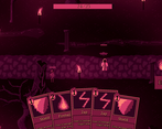
Love the concept of adding movement to a deck building game. Also the game look/music is super cool. Could be interesting to be able to see enemy intentions, but I found not knowing what will happen next to be kinda cool (kill closest enemies first worked well enough for me to not need to worry about what exactly the enemy wanted to do). Would love to see the bug free version (needing to randomly restart was a bit of a bummer)!
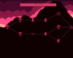
This game is incredibly cool! I love how the paths change every time you play it, and the deck building mechanic is really well implemented. Also the art is fantastic! Great work.
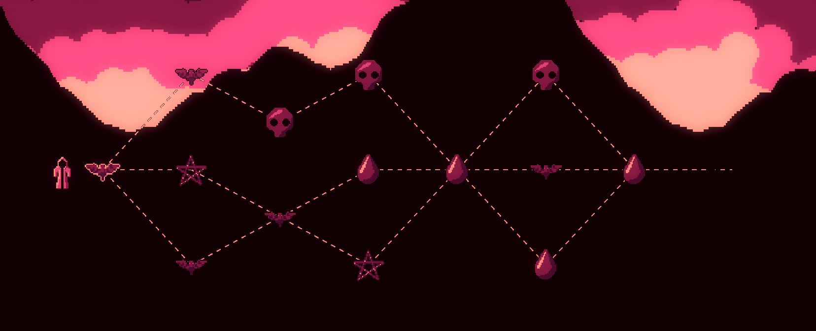
I had great fun playing this game! Most impressive one I've seen so far! I like everything about it, the color palette, art, music, card gameplay mechanic combination with player position. You mention about the bug and yes it is very unfortunate, I got stuck 4 times before my playing rng by reloading the game leads me to the above map structure (I only take bats and blood ) so I could experience the boss battle stage. I love it! Good job!
Great game concept really fun and interesting, art also was really nice liked it the game a lot
This is seriously impressive design. The 2D card-slinging feel is awesome and a really neat twist on a Slay The Spire style game. Sometimes a level would fail to complete after defeating all enemies, and I do wish I could see the exact health values of each enemy. Regardless, I really enjoyed this and would 100% buy it as a standalone game. Fantastic art and sound design too!
Thank you so much! I did kind of have "slay the spire with movement" in my head while I was making it. :p
When im allowed to update it I'll be sure to make it easier to see health amounts.
You can already see it as a tooltip if you hover a health bar with your mouse but it's a bit hard to notice if you don't know it's there.
Thanks heaps for the feedback ^.^
I enjoyed the mix of overworld movement and card effects that were aided by some of the map types. It added a nice layer of complexity on top of the phenomenal graphics and sound design.
i really like the turn-based free movement/ability use, but in the end i couldnt really finish the game cause sometimes ending combat just wouldnt trigger after you complete objectives. Also the dark sludge enemies in the pentagram levels are extremely hard to see, and sometimes arent highlighted by hovering over them, though seemingly only when theyre right next to you.
interesting idea, but pretty buggy (in terms of a game made in one week)
Great game concept really fun and interesting, art also was really nice liked it the game a lot
THE MUSIC AND SOUND DESIGN IS GOATED!!
As a metal head I NEED the soundtrack on youtube PLEASE! Pixabay you're the goat!
Thank you :D
It wasn't easy to find music that fit the vibe I was going for but it worked out pretty nice.
I was originally looking for slow heavy doom but I couldn't find anything that was free to use :P
If you wanted to find the music, you can find most of them in this search https://pixabay.com/music/search/sinister%20metal/
Amazing game, I was so close to beating it! I liked the turn based strategy combat a lot. The music also fit really well, great job!
Really like the concept of the game. It's a cool idea that you can move the player freely with some cards.
Really nice game!
I really like the gameplay loop where you need to use the cards each turn, it's a really nice concept.
There was only 2 things that I spotted, first of all some enemies were really difficult to spot and I had to use the zap ability to spot them correctly. I often had jumpscares seeing 5-6 enemies within 5 "meters" from me ^^. Maybe making a slight outline could have prevented that?
Also for the mana, I didn't see any place where is was displayed? Maybe making it so you can always see the mana left and see how much each spell uses, it would greatly help the decision making on which spell to use :)
I really like the concept good job for your submission!!
You are right about things being hard to spot.
The shadows I made intentionally hard to see, but the other guys are hard to see mainly because of the restricted colour palate. I think an outline on characters would be a good idea.
The mana should be displayed just above the end turn button, and how much the card costs is on the top left of the card. I will make this more obvious in the future though :)
Thanks for the feedback ^.^
You've made deckbuilding a new way of playing
That's a good idea
Art is good, but the atmosphere is well delivered
It was a fun game



Leave a comment
Log in with itch.io to leave a comment.