Play game
Dog Finder 1.0's itch.io pageResults
| Criteria | Rank | Score* | Raw Score |
| Innovation | #373 | 3.381 | 3.381 |
| Graphics | #411 | 3.560 | 3.560 |
| Audio | #420 | 3.201 | 3.201 |
| Overall | #535 | 3.248 | 3.248 |
| Theme | #550 | 3.418 | 3.418 |
| Game Design | #714 | 3.090 | 3.090 |
| Fun | #882 | 2.836 | 2.836 |
Ranked from 134 ratings. Score is adjusted from raw score by the median number of ratings per game in the jam.
In what way does your game fit the theme?
Having to jump off of your past self to progress and having to restart from the very beginning after every death to continuously have to jump off of your past self to progress and sometimes being forced to die in a location so that you can jump off of your past self to reach the platform you are trying to get too.
Did you write all the code yourself and made all the assets from scratch?
I downloaded freely available assets which are allowed for commercial/personal use and are referenced if you follow the 'Credits' button from the launcher. I followed some tutorials to get some of the code but not a lot of it.
Leave a comment
Log in with itch.io to leave a comment.


Comments
I really quite like this game, the artstyle and graphics is great, the music is great, and the death physics thing is quite interesting and fun! at least to me the progress bars are slightly confusing and some stuff like when you press space during a dialogue the text just keeps repeating, but again still really nice!
hey thanks for the kind words! It is a little rough around the edges but i will remedy that after the game jam is done! :)
looking forward to it!
I love this! The art and music fit so well together, I love the colours and animations. I think once the jump cooldown is shorter it'll be so much more fun!
Thank you! The jump cooldown and the attack cooldown will be fixed when i release a patch after the game jam is done!
Thoughts before meeting the female NPC:
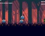
The graphics look great on their own but I feel like the style is quite consistent. For example, the grass has no outline but the player does. I feel like this is due to combining art from different asset packs
I’m not a fan of the background. I feel like it would look good normally but it looks a bit blurry. I assume that was done intentionally (since the other art isn’t blurry) to keep the player’s focus on the foreground but it just feels off with the pixel art aesthetic
Pretty minor but sometimes there are gaps between tiles
I don’t like the color of the progress bars. I think they could work if the entire game was of a similar style and used a similar color scheme but here it doesn’t feel very cohesive. I’d recommend using a site like Lospec, it has some really good pre-made palettes that could help with this
I’m also not too sure what the two progress bars represent. It seems like one of them is a jump cooldown but it’s pretty confusing. (I’m aware there is an issue with the jump cooldown judging by the game’s tagline)
LMB makes the player render above the grass which I’m not a fan of. I think the player should always render above it. I also don’t like the animation. Assuming it is attacking, it doesn’t really look like it. It just seems like it gives the player an angry facial expression
I don’t like how the player isn’t as mobile in mid-air. It makes it feel pretty clunky. Definitely my biggest gripe with the game. I think it might have just been a bug though
I feel like the music is too loud but the music itself isn’t bad. Nothing spectacular or anything but I feel it works well for this game
Thoughts after meeting the female NPC:
The dialogue box looks good but I don’t think it fits with the rest of the game’s style (although it’s not as jarring as the progress bars)
The “continue” button hitbox is quite small. I’d personally prefer a hotkey to continue with the dialogue (that way the game would be keyboard-only as well which is always nice)
I just realised the “female NPC” is actually a man. Sorry Mr Tutorial Man, no offence intended
The green bar seems to be a jump cooldown and the red one an attacking one. There’s a delay between the player pressing the input and the bars starting to deplete which I think looks weird. I also don’t like how it vanishes and instantly reappears when the cooldown finishes. Personally, I’d prefer an animation of the progress bar increasing as the cooldown comes to a close instead as I feel like “a progress bar increasing” has more positive connotations
I won’t be able to critique any of the audio past this point as my headphones are currently being used by my dog unfortunately
Someone else mentioned this but the tutorial man keeping track of my deaths gets annoying. I like the death counter in the top right though. I wish it says “Deaths: [number]” instead of “Death - [number]” though as at first I thought it was talking about negatives and thought it was a bug
The player kind of floats when walking over the clones
After meeting the first enemy (wizard-like guy):
At first, I didn’t realise it was an enemy. I thought they were just an NPC so I just walked into them. I feel like this could be made a bit more clear
The enemy’s idle animation is quite blurry. (I would record a video of it but you can’t see it when the fps is low)
I think there should be more visual feedback. When the enemy dies they just vanish. Perhaps an exploding animation of some sort?
The tile edge is a cleanly cut vertical line which breaks immersion a bit
I like how the map has decorative objects like trees and what I think are tombs dispersed throughout. It definitely makes it feel a bit more lively
The cliff (see screenshot above) was very frustrating to get past since I restarted back at the tutorial man every time. Someone else described this as a rage game but I don’t really agree. This particular sequence just feels a bit frustrating and repetitive
I encountered an invisible wall at some point but it fixed itself when I jumped
After the cliff:
Extra thoughts:
The game feels quite slow-paced which I don’t think works very well in a game jam setting
Overall, a pretty solid entry!
Edit: After talking to the dev on Discord turns out you’re not supposed to be able to progress much past the cliff. Here’s how I did it though and found that walk-through tiles bug:
Holy bananas this is the most detailed comment ive seen xD
I prefer rating few games but spending a lot of time on each one over rating loads but only playing each one for a couple minutes
Hmm a pretty good idea actually and better than those people who just say "game is good" for everything.
Really appreciate this comment, thanks for the indepth review, I'll be sure to use this for when i do a patched version of the game after the game jam!
Really nice game! love it but though the cooldowns was too slow (just remindin). It's a nice rage game because mr tutorial man keeps reminding me of the number of deaths and it's annoying
Mr Tutorial Man is a jerk lol , i'm glad you like it :)
Well done! Well-made game with great graphics and audio effects. I liked the idea of using the bodies of your dead people to your advantage! In fact, my game is similar!
Thanks for the nice words! :)
Good rage game. The jump and attack cooldown seemed a bit too slow however. I did like that the previous failures are physics-based and can be pushed into spike pits to help build a bridge.
Glad you like it! The jump/attack cooldown is a bug that will be fixed after the jam is done :)
Loved the game! i like the idea. The graphics, music and characters are cool! but the Mr. Tutorial Man was a bit annoying counting how many times i've died lol. But it's a really cool game!
Mr Tutorial Man is just a jerk :)
Super glad you enjoyed the game! And yea i'm glad you noticed that it was a bug! I will iron that one out after the jam!
Great concept and I really love the graphics :) The color palette is very pleasing to the eye!
Thank you! :)
Okay, first of all this is a really interesting concept. I love the art style in general, the ground tiles, the background and the animations (the front grass covers a lot of them though)! The music is beautiful too! The only thing that i don't like is that the cooldown bars (especially for the jump) are taking too long for no particular reason.. Also, you didn't "close" the left side of the game and you can easily fall til' infinity, but this is minor. Overall, the main idea of usefull deaths is great and i hope you will dig more into that! Great job!
Thanks for the feedback, the jump cooldown length is a bug, it isnt meant to be that long. It's shorter for some people and for other people it is much longer. And thanks for letting me know about the gap! I'll be sure to fix it after the jam is done :) Thanks for liking the game!
The idea is very, very interesting ! I'd love to see a fuller/shipped version !
That's kinda funny cause I've remember very well the core idea of using your own corpses as a bridge in the belgian comic named "Kid Paddle" from Midam. I searched the the exact page for a bit but can't manage to find it. I always thought it would be a good idea for a real videogame.
I only wish there was more checkpoints, it's kind of frustrating of starting at the beginning everytime. Especially in a game where the very goal and way to finish it is to actually die.
But there's definitely and idea to explore right here, are you going to continue making it ? Or was it just for the gamejam ? :)
Most likely going to make this into a full thing with checkpoints! No promises though :)
It was fun breaking your game. :)))))
Glad you found ways to break it so I can patch it out! XDD Thanks for telling me on Discord :)
Interesting game!!
Thank you!
Interesting idea!
Thank you!
Nice art and interesting idea. But sometimes it seems that the jump button is not pressed.
There is a cooldown for the jump button, it's the red bar :)
The art is stunning and the idea of using your dead bodies to progress is something I've never seen in any game. Great job on coming up with that idea. Unfortunately, the jump timer and the lack of checkpoints took a lot of the fun out of it for me.
The checkpoint thing is intentionally not in there because I wanted to mess with the player a little bit by having the NPC at the start annoy the player with the death counter, without it looking like its trying to annoy the player if that makes any sense. The jump timer is not meant to be so long, its a bug that came up that i just did not realise. I put it in the disclaimer at the top.
Thanks for the kind words also I do really appreciate it! :)
Cool concept, love the design, art and sound! Great work! It just needs that extra bit of polish for the jumping and attacks but the idea of using your past self to progress is neat!
Thank you! Happy you enjoyed it :)
Nice game, good looking, nice soundtrack . Jump cooldown is way to long and the colliders of objects are very stange.
Yeah i agree the cooldown is a little too long and the colliders, it is going to be something i fix if i make this into an actual full project which is looking quite promising currently :) Glad you enjoy it though! :)
Great execution on this! I appreciate that you took a simple mechanic and then explored it really well, and the art and music are great! Everyone has mentioned the long cooldowns so I won’t say anything more about that, but yeah giving the player more freedom to play around with the system without waiting or travelling a far distance could make this a really great game, I hope you keep up with this!
I did not intend for them to be this lengthy, it's a bug which i will iron out if i make this into a full project which is looking promising to be a thing. Appreciate the kind words too ^-^
Nice looking game! Things i would change:
-On the beggining, you have the "intro cinematic". I would put 2 black bars on the screen to show that it is a cinematic. I got confused thinking the character was moving alone.
-Cooldown on jumping is WAY too long in my opinion. Of course it makes the game a bit more challenging, but it also slows the pace a lot and is frustrating.
-Sound for killing enemies... Feedback for the player.
Other than that, its a pretty solid game :P
Totally agree on the black bars thing. I think that would be a really good idea to indicate that the player is in a cutscene, surprised i didn't think of this myself! The sound for killing enemies is also a great idea and the cooldowns are an issue which i will have to get around to fixing. They aren't intentionally this long XD