Play game
ItemFinity's itch.io pageResults
| Criteria | Rank | Score* | Raw Score |
| Theme | #139 | 2.727 | 2.727 |
| Audio | #217 | 2.455 | 2.455 |
| Visual | #226 | 2.545 | 2.545 |
| Overall | #246 | 2.364 | 2.364 |
| Fun | #282 | 2.000 | 2.000 |
Ranked from 11 ratings. Score is adjusted from raw score by the median number of ratings per game in the jam.
Are you using any third party assets?
i made everything except the launcher and the perfbullet godot plugin
Are you using any AI generated assets?
no
Did you use BulletFury?
No
Leave a comment
Log in with itch.io to leave a comment.


Comments
Wow okay this game is crunchy for sure, like cool crunchy like a taco but regardless crunchy. First off a few questions I got, why is there a notepad system for this game? Why is there a rotating display launcher system that opens the new scenes in a new window? Why when I start the game do I get another window showing me all these stats wouldnt you just have the game in one window one scene and then load the next scene instead and render stats on a togglable tab button or something?
Alright that's enough questions here's my thoughts on what I liked/wanted changes for:
Fun/Gameplay:
I'm not sure id call this game fun but I definitely wouldn't call it boring if anything I might say that this game lacks substance or has pacing issues other than not fun. From what I can tell the gameplay loop is that you spawn in and explore a pseudo randomly generated dungeon (well done on this btw looks like you took tiles and made the map generate off of those I think) and look around for the nearest wizard to kill you (most likely) of which there were only two types I managed to see because of how much I suck at this game being the red wizard and blue wizard. From the games screenshots it looks like there is more wizards to end my run but I never got far enough to see them which could either fall on the game is too difficult for a casual player or I just really suck at games. Both could be totally true so all id say is rebalancing the games combat system would be an important thing to look at for future builds. As per the many comments on this game It looks like some wizards need a nerf of which I agree. I also think bullet size needs a nerf as they seem about 50% too large. its up to you to make those changes and see how your player base feels about them to really nail down that good feeling while playing the game.
The blue wizard insta-killed me but I'm not too worried as this is just a jam build balancing of a game is hard when you are the only person looking at it.
I see a lot of comments here abut how you should add a ranged attack and honestly I tend to disagree, and here's why:
Being up close and dodging bullets is sick and considering from what else ive read is that this plugin you use (you 100% do not need to use plugins and can code bullet logic yourself in Godot) doesn't allow it why not instead allow the player to parry the projectile back at the enemy. Replace the wifi attack or whatever it is supposed to be and throw in a sword asset that you swing on hit. If you perfect parry the bullet gets reflected back and poof problem solved. As for it needing a target you could totally just ray cast it (https://docs.godotengine.org/en/stable/tutorials/physics/ray-casting.html) with its current velocity and throw some logic on there that if it hits an enemy it does some damage or whatever. Again I am unsure how this plugin works and I wrote my own bullet logic (my bullets don't function anything like yours so maybe its more complicated for you)
Visual:
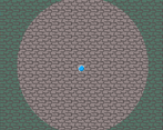
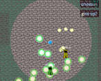
This game is pretty pixelated which is fine the art here is nothing to write home about but its not some terrible quick drawing I can tell you spent some time on the assets used for the game. Style wise this game totally has an identity crisis. The menus look like a completely different game in comparison to the actual game. I cant place the menu slider thing I'm looking at but it does have a retro feel, however the idea that its all bright and blue where as the game is dark and dungeony so there is some visual clash. In terms of actually being in game the tiny cobblestones or bricks or whatever feel a bit too small for easier readability but I'm not one to judge my tile set consisted of one boring tile so this is still a plus but might need some small tweaks for sure. Also the dungeons feel a bit disconnected with the sprites for the wizards. The wizard sprites are fine I just think they need to match their environment a bit more, kind of like if you color grade a video so the colors don't look off the same needs to happen here. Since the general theme of these dungeons is kind of muted it might be a good idea to desaturate some of the colors of the wizards and see if that still causes visual clash. Another thing I wanted to point out is that dungeons feel pretty empty other than enemies maybe I didn't get far enough or see enough but maybe some ground clutter or dead wizards or something could really sell that you are in a dungeon.
I want to touch on the whole opening a new window thing, and to be frank it feels like you discovered it was a feature in Godot and wrapped your game around including it as many times as you can. I'm not against opening a new window but consider how its used and does it really aid player experience? I think the best example of opening more windows as a feature that is well executed is how oneshot does this by making their puzzle based around this new borderless window piece of paper that interacts with the main game see screenshot below: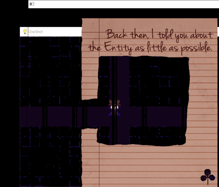
So to wrap up opening new windows in the game feels unnecessary in its current state when you could just load the scenes in a chain or loop. main menu -> main game -> fail/win screen -> back to main menu
If it is a feature you do really like you need to learn how to optimize the loading time so players stop complaining about it, or not whatever its a jam build.
Audio:
I feel like the music in the main menu is far too repetitive of a chord progression if that is even the case I'm not much a music person so I cant exactly tell other than its just too repetitive/simple to be interesting enough for me.
Theme:
While this game is for sure a bullet hell im not sure if it has consequences per say but then again I didn't get very far into the game so maybe I just missed it, and for that reason I don't have much to say here.
Overall:
Itemfinity is a neat idea on a traditional bullet hell game mixed in with some rougelike dungeons. Nothing it does past its menu system and constant opening of windows is really shining as a cool mechanic or brings others to say "You got to play this game because of xyz feature" However given the time frame of this jam and what this game came out to be id say you did a decent enough job of adding features and making a solid game that functions which you can be proud of. I hope none of this feedback comes off as too harsh or mean which is not my intent whatsoever I think the fact you made a submission is beyond good.
the stats are in another window since i didnt want to clutter the main screen area but some people like the window thing so an option to toggle it is probably a good tradeoff. also the launcher is more just because i wanted to have a side-thing where you can read about how to play without making it part of the core gameplay loop and the notes are for taking notes of things like where to go on certain areas since its all pre-made chunks randomly loaded. also i dont really play bullet hells so i was unaware of the fact that large bullets are not good but that is something else i can tweak and dying to reds is a skill issue but blues are just kinda op. definitely not a bad idea with adding things lying around and desaturating the wizards but having them saturated also helps with visibility in my eyes and i do currently think that i should place more items around the map aswell. also you are kinda right about the window thing but its more about learning about it in my other game and i despise that oneshot puzzle and how tedious it was. the launcher is not part of the actual game itself but more just a file opener that i downloaded and tweaked a little. the consequence is that items are your health so when you take damage you lose an item and i kinda wanted to add a particle that shows the item falling off of you but i didnt have the time. i quite literally cannot do anything about the loading time btw since every time it loads an enemy it creates a new shader and multimesh and if i try to pre-assign those things it breaks the plugin. im nowhere near a good musician so all the music is pretty basic but the main menu music is a lot simpler than the game track since you arent meant to be in the menus for long. and no i cannot code bullets myself i am very not good at coding it was in this project that i learned that you can do export_enum at all this is my third godot game ever. i will probably add the dark circle from the gameplay onto the menu or smth. if i knew how i would have added actual lighting but like i said before its my third godot game ;-; this reply is all over the place but parrying sounds kinda possible maybe and pretty cool but i dont enjoy working on this game at all so i probably will just leave it to rot but yeah the main menu is a completely different program that just runs the files in the files folder or opens a link for the manual. if i didnt have school all week the game would have probably been a lot more thought out with more potential randomized areas and items all around and better balancing but i have 0 connections to anyone who might be willing to playtest and i suck at bullet hells and honestly just assumed my difficulty would be standard. if i do work on it again i will probably update the tileset to have bends in corners tho and also the other feedback comment i left on the game. i did not open itch intending to write an essay in response to yours but i did and have to do other things now so im cutting myself off and thanks for the feedback
I usually don't mind a little jank in games, but this one... is a little much
here is how i have compiled all the feedback so far:
nerf yellow guys and blue guys
buff player speed
make areas load in sequence before gameplay
refine the visuals a bit more
ranged attacks somehow
option to make stats show on-screen instead of popup menu
more placed items
fix bugs like why is hp kinda freaky like that
is this accurate?
Definitely one of the more challenging entries, I don't typically play bullet hells but the effort that went into this is not missed by me. Got a bit glued into it. I like the HUD and the music, definitely a game that if refined visually it would definitely be even greater. I like the system you got going for taking notes, the manual, reminds me of like note taking in D&D one might do.
Some good menu there! Nice art and concept with that, very creative. Also gameplay is challenging but i like this kind of stuff the skill with slowing time was giving good vibes when there was a lot of bullets. Great!
nice game, it's very challenging. the sub-windows concept is cool. keep up the good work mate!
It's a cool concept the creativity is there but man this game really needs some tinkering under the hood because the performance is pretty bad. Everytime a new window comes up the game takes a painful pause until it loads, and I have a pretty good PC. You could've definitely had the launcher and windows be made in-engine/game and the performance would be way better and probably way easier to manage. The concept of only having close attacks for bullet hell enemies is cool but player attacks really need fine tuning also because it was really hard to actually make it connect to what you're trying to attack. Otherwise the game looks cool and other than needing polish its neat.
unless your talking about loading new areas which i actually cant do anything about due to how the bullet plugin i use works i dont really notice any lag? also if i could i totally would add a ranged attack. and i dont get what you mean by launcher and windows be in engine/game? its all godot although the launcher is just an edited mmbundle thing that was made in godot 3. and the idea of close ranged attacks was never really part of the core philosophy but more just a technical limitation due to the bullet plugin i used. keep in mind that the hitbox for attacking actually appears as soon as you hit it and that the animation is just for visuals and that the attack speed stat is not used for anything because i forgot lol. but yeah i guess my pc might just be goated or smth because i dont really get any lag besides loading new areas which is unavoidable sadly. if i could pre-load all of those without godot crashing i totally would tho! actually thinking about it while typing this i probably could have just made it so that each area loads in sequence before actually letting you play and that could have worked but its too late now lol
i have seen all of the replies saying that a ranged attack would be nice and i agree! its just that the godot plugin i used for this since nothing else worked, perfbullet, needs every spawner to have an assigned target whether its homing or not otherwise it crashes and im not sure if i can do ranged attacks in that context unfortunately
The main menu is great.
Popup windows is an interesting idea, but I'm not sure if it serves the gameplay.
The game was very difficult for me. The attack is very close range, but the speed of the character makes it very hard to weave between projectiles to get close enough to enemies. I killed a few enemies but always took damage. never found an additional item. I think giving the player a ranged attack would greatly improve the gameplay.
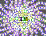
Incredible main menu design, it takes me back to the retro console days. The visuals are really good but I can easily get blinded by the bullets (if this is the intention: good job!) . The procedural levels are the icing on the cake and add replayability. Good entry here!
How did you make it 144 mb? Thats wild! And different windows popping up? kinda sketch.
But the game is really creative. With a little presentation and polish, it can be amazing!
Very Interesting Game tbh, here is my feedback:
-The Main menu is one of the most creative ones i have ever seen, and it really caught my attention so really good job on this point.
- I also loved the system of the stats and the idea of having the stats in a different menu.
-The Art style , the music, and the SFX are really decent
-I believe that you have to work more on the fairness of the game, For instance if the player has encountered either the blue or the yellow enemy, The player is guaranteed to be hit regardless, in other words it doesn't give the player a chance (the slow time feature wouldn't help much), while on the other hands some enemies are rather surprisingly easy like the green one.
-I also didn't like that the melee attack was very range-shorted and i have to almost stick to the enemy to damage it
-Good job also on the procedural generated dungeon !
Looking forward for future updates !!
heres my answers to some of this: the main menu is like that because i didnt want to add another menu after it for some of that stuff, its not procedural genration although i wish it was its 3-6 pre-made chunks for each area (11 areas total including the dark path), if i knew how i would have made the player able to shoot projectiles but i dont know how i could do that with perfbullet, some enemies are meant to be easier than others but i will admit i probably placed too many blues and yellows especially since yellows initially werent homing so that was a change a lot of the early areas didnt consider, the stat window thing is kinda just because i didnt want to clutter the main screen with info and also i enjoy the aesthetic of windowkill having multiple windows. i honestly really dont enjoy working on this game much so i probably wont update it again but if i do i will consider your feedback.