Play Axobatl
Axobatl's itch.io pageResults
| Criteria | Rank | Score* | Raw Score |
| Theme | #24 | 3.800 | 3.800 |
| Audio | #70 | 3.467 | 3.467 |
| Fun | #74 | 3.467 | 3.467 |
| Overall | #92 | 3.333 | 3.333 |
| Visual | #163 | 3.067 | 3.067 |
Ranked from 15 ratings. Score is adjusted from raw score by the median number of ratings per game in the jam.
Are you using any third party assets?
Yes
Are you using any AI generated assets?
No
Did you use BulletFury?
No
Leave a comment
Log in with itch.io to leave a comment.


Comments
Great game with the gameplay. visuals and sounds were also good or ok but the first part defenitely stood more out for me. Gave you a nice rating! If you like to check out our game too! :)
This was fun, the concept is solid, and the art absolutely has a nice charm to it. Always can appreciate a cutscene that actually draws you in!
Like other players have said, after a while it was just an endless onslaught of unarmed zombies chasing me, which wouldn’t have been so bad if it had auto-fire, but it sure did tire me out, haha.
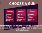
I absolutely loved the upgrades and the enemies getting the ones you didn’t pick. Perfect implementation of the theme; however, two or three times, I was so busy just clicking away that it auto-selected whatever my mouse was on in the area before I even got a chance to read it. I would have loved (either auto-fire from the beginning solving the constant clicking) or maybe a confirm button before continuing with the upgrades.
But all in all this was really fun, really smooth, and I enjoyed it a lot!
Thanks for your feedback. Other players also mentioned about them, in fact, they are simple things that can be fixed very easily. But due to time constraints etc. there was not much time to test them... and, here we are.
But we're happy if we helped you have fun.
Really fun frantic gameplay. I really appreciated the opening cut scene, that does a lot to pull the player into the game world and lets your imagination fill in a lot of gaps for the basic level design. The pacing in the first 5 min was superb! Loved how crazy an chaotic it felt yet I was able to come out on top. After the 5-minute mark tho the difficulty curve took a nose dive, and I was just spending my time walking around in circles with only unarmed zombies spawning, so there was no more challenge. But that's all good, the first 5 min were really fun! I loved the upgrades animation where the cards spin into view. You also really felt the consequences of each choice. I liked the balance of upgrades/tradeoffs you designed. The music was also really great at setting the tone of the game. Great work!
Really appreciate the feedback. I'm not sure but you may miss the necromancer thing. They spawn those unarmed creatures and if you don't kill them, they will continue to spawn enemies forever. But it is a joy to see you liked our gameplay. Thanks for the comment!
Great job on this! It was a fast paced, frantic shooter. My only critique of the game play was that the shooting was per click, rather than just holding down the mouse button - especially for the fastest gun. The art was cute, reminded me of Kirby, and the music was great :) Great job on this entry!
We received this feedback a lot, but frankly, for some reason we didn't think of the hold-and-shoot feature. That's on us.
Thanks for your feedback and nice comments, we are glad you like it.
Woowee your animations were golden! The story was extremely immersive! Great job on your game
Thanks for your kind words. Glad you like our game!
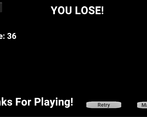
I got a score 1269!
Things I liked:
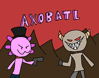
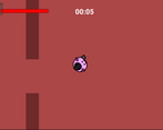
I really liked the simple art style as it was silly, like you knew you weren't trying to make perfect circles or have a consistent art style other than everything is quickly drawn, lines don't match up, and generally wackiness.
Music, sounds, cutscenes, and text flow was really well polished for a jam game, going to Oklahoma for a milkshake just to end up having to fight demons is a silly concept and the cutscene sold that.
Builds and upgrades system was well done I was wishing the auto gun fired auto instead of every click or in a burst since its an auto gun but no matter was still a fun.
Things I wanted to see:
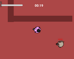
I would have really appreciated a view upgrade I felt like I could be shot by enemies before I saw them which really ramped up the difficulty.
Map variation, the red map works fine but if were in Oklahoma I thought I would have been fighting on some streets or in an office building, maybe there is some changes once I get to a high enough score but I am not good enough at the game to see if there is a change in level.
How to play? button has no function which is okay I guess the game is relatively straight forward but seems like a feature that would lead you to the tutorial that never made it.
From reading the comments on this post there was a dash mechanic I had no idea maybe I did need to know How to play.
A change to enemy bullets sprite or the output of bullets, at some point I couldn't progress because no where was safe I couldnt stand behind a wall because there was more I think the wave system needs some more fine tuning or the enemy does or maybe I just suck all could be true.
Well done game for the jam!
I am so glad you liked our game! I found out that the How to play button cant be pressed until you press it on the left side somewhere after the submission part. I am happy you liked our game.
Wow, what a fun game! I died pretty quickly . I loved the upgrade system and the intensity of the game. I also think you did the game jam rule well about consequences! Well done!
You should try different builds, this game is literally designed for it!
Thanks for your great comment! Glad that you liked our game!
Love the design of the enemies taking the guns you don't take.
Dash on right click or right shift would be very neat
Since we also use the mouse, I thought that players would prefer WASD instead of the arrow key, so the left shift key seemed to be more suitable for dash. But I noted your feedback, thanks for the nice comment.
I won! Score : 5627
I was so bad at choosing my upgrades that the one time I won was also the one time I clicked too fast and chose a random one at one point (although I think it refilled my health but did not affected my walking speed too badly so it wasn't bad).
The game is fun. The introduction is catchy. Enemies getting the weapons you did not choose is a very cool implementation fo the theme and make your game stand out among the mass of games which also implemented upgrades with drawbacks. The roster of upgrades with drawbacks is fine though, I like that your movement speed can get super slow. I really like the character's face when it shoots and the game is pretty fun to play with the perfect difficulty for me.
That's a very cool entry, thanks for sharing.
Thank you for your kind words.
Actually, it would have been better to wait for the end of the animation for the cards to become interactable, but I didn't think that such a problem could occur in that limited time interval, I realized that while testing. And I'm glad the difficulty didn't bore you out. I had to do some balancing before uploading, it was really hard at first.
Also you made a good score. When I was testing, I usually finished with a score of around 4000. We're happy that you liked it.
The art style is wild! How did you paint it?
Since the artist that we agreed let us down in the middle of the jam, our other developer had to continue the project as an artist and this is what we ended up with. I can say that we liked this version more, it is much more interesting this way.
I enjoyed the animation at the beginning and I am looking forward to seeing what you are going to do with your creation.
That's one of my favorite parts, too! With the music, it is really a banger.
Cannon to oklahoma got my heart :D
Really like the top-down concept with this art. Also giving weapons which i did not choose to enemies as a consequence - niceee.
Button for "How to play" for me is a little tricky looks like his event is from the left to the middle so i can't click after :D Just small UX things.
The animations for menu - great job, really like them.
Good job!
Yeah, realised that the interactive box for texts in the main menu is not aligned correctly after posting the game.
We are glad you like it!