Play game
Descent into Lost Dimensions: Part 1's itch.io pageResults
| Criteria | Rank | Score* | Raw Score |
| Sound | #39 | 3.710 | 3.710 |
| Aesthetics | #39 | 4.290 | 4.290 |
| Story | #41 | 3.839 | 3.839 |
| Theme | #84 | 4.129 | 4.129 |
| Mechanics | #112 | 3.661 | 3.661 |
| Fun | #119 | 3.694 | 3.694 |
| Music | #212 | 3.371 | 3.371 |
Ranked from 62 ratings. Score is adjusted from raw score by the median number of ratings per game in the jam.
How many people worked on this game total?
1
Did you use any existing assets? If so, list them below.
Models, art, and textures were made for this game jam. Font , base floor texture + sound effects were modified from free resources online (links referenced on main page)
Leave a comment
Log in with itch.io to leave a comment.


Comments
Congrats on the high scores! Out of all that I played you really nailed atmosphere and story.
Thanks! Looking forward to seeing what you do next
Your art is AWESOME.I took my time playing the game sorry focusing on the art not the story but in the end i took time to play the story and it was good.
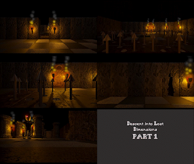
Breathtaking atmosphere. The art is gorgeous. One of the most cool and creative interpretations of the theme. Cant wait to play part 2 and see what other puzzle mechanics you'll come up with. Definitely a contender for my favourite submission.
Thanks for the feedback! Aiming to put out part 2 next week if all goes well.
Compelling!! This was really cool, and your puzzles were the perfect blend of intuitive and challenging! Great Stuff
nice puzzle game! it was very well paced, and right amount of challenge. Nice job!
This is really a very interesting game.
All the elements (musics, sounds, lighting, story, animations, level design, Visual Art) are so well orchestrated that create a majestic atmosphere... This game has true potential for even sell very well on Steam (or at least a sequel of it). Please think about it.
The only thing I would try to improve for now, is the Player Controller (I mean: maybe the Character should only walk in the 'forward' direction, and you could use a quicker animation for the Rotation, so the player should no wait for that to happen - resulting in a smoother movement for advanced players).
Thank You for sharing this Gem with us, I am glad I played your game.
Thanks very much for the feedback. Agreed about the controls - playing around with some modifications, but will likely have to stay close to the original design for the purposes of pt 2's puzzles
Gorgeous art style and unique mechanics to match, would love to see what you could do for further levels, what's already present has so much potential for a lot of puzzles
A very interesting and uniquely looking game. It's quite polished, and I really liked the puzzles that required you to flatten your character.
Wow this was a great game! I really liked the art style that you had width it. Haha get it. Uhmm There was actually another game that had this same mechanic but didn't use it in the context of a puzzle game. I really really liked that nob switch puzzle at the end. I thought that was so inventive. really cool game :)
This a great game to play, loved the atmosphere, the controls, the story, all great.
Can't wait for part 2!
PS, Could you make a windows download version?
Thanks! And yes, I'll upload a windows version next time I'm at my main PC
I really loved you game, I've played it twice already. I hope you can add all the parts together into a full game for everyone to play.
FYI - if you'd still like a windows version, it's now available :)
Thank you, just got it!
The visuals are amazing, from the models to the fonts used, and the story telling was great as it kept me interested. The music and SFX were perfect as well. Good job! :D
Beautiful game that evokes an old school title like Ultima-Pagan. As others have mentioned, the mechanics and gameplay suit the theme of this jam to a tee.
How did you get the graphics to look so cool and old school, but also beautiful? I was really impressed by the visuals. I'll definitely be following your work.
Excellent game. Thanks for sharing!
Yes! I love those classic PC isometric games, glad you liked the look of it.
I had to play around a lot with the visuals until I could get the right feel, but I kept the models fairly low poly and created 2 or 3 textures via shaders that I could adjust settings on for different objects, so that they had some consistency.
Then I did some reading & watching to learn how to create a post-processing effect to simulate a resolution of choice - that way both the models and particle effects have that look to it.
For the particle effects, I kept to using quads to give it a pixely-feel, though I think the death effect could have been worked on a little more as it might look a little too modern. Something that I ran out of time on and couldn't quite figure out was how to get the button prompt icon to look a little lower res. If I had time, I probably would have just made it a low pixel-count sprite.
Thanks for all your feedback!
Nice gameplay and it fits really good in this jam. ^^
The monster killed me, because I thought I had to lurk it into the trap xD
Ah yes, I wish I could have spent more time on the monster section and made it more clear how to approach it. Next time :)
Thanks for your comments!
Wow amazing graphics and awesome ambiance, well done.
The environment and models are awesome. I love the feel of it. Good job!
I love the enviroment and plot of this game! The graphics are gorgeous and the gameplay + the puzzles are really neat too! Nice work
Looking forward to a part 2 (ノ◕ヮ◕)ノ*:・゚✧
So glad you enjoyed it!
I really love the look of this game a bit like Planescape Torment! Would love to see this developed further
Thanks - slowly plucking away at a pt2 this weekend.
Nice game! The puzzles were in that good spot between challenging and frustrating, really well balanced. The only real comment I have is that I don't fully understand the movement system, I think the game would flow much better with a fluid movement. But that's a detail
Nice done!
Thanks for the feedback! Totally agree - movement needs some more thought put around it
I'm really biased but I think the power in this game is very neat! Ahaha.
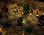
You used it very well for the puzzles, I especially liked slipping between the circular switches to turn them. I also liked doing similar with the spike traps, however I found it difficult to tell which set of spikes were up or down at any given time.
The look of the game is also nicely distinct with fits perfectly with the journal's writing of exploring an ancient and dark tomb, getting perhaps a bit corrupted along the way.
This is a great game it's addictive and fun to play I like the game models used in this game, great job. Would you mind trying out my game and rating it according :).